
這些代碼是經常用到的,比方說一些特殊的效果,圓角邊框,CSS透明度,梯形環繞,CSS小三角等,希望對你有用
1簡單又好的 Blockquote 樣式

CSS代碼如下
blockquote { background:#f9f9f9; border-left:10px solid #ccc; margin:1.5em 10px; padding:.5em 10px; quotes:"\201C""\201D""\2018""\2019"; }blockquote:before { color:#ccc; content:open-quote; font-size:4em; line-height:.1em; margin-right:.25em; vertical-align:-.4em;}blockquote p { display: inline;}2圖像在水平或者垂直方向的絕對定位
css代碼
img { position: absolute; top: 50%; left: 50%; width: 500px; height: 500px; margin-top: -250px; /* Half the height */ margin-left: -250px; /* Half the width */} 3用PHP壓縮CSS代碼
<?php ob_start ("ob_gzhandler"); header("Content-type: text/css; charset: UTF-8"); header("Cache-Control: must-revalidate"); $offset = 60 * 60 ; $ExpStr = "Expires: " . gmdate("D, d M Y H:i:s", time() + $offset) . " GMT"; header($ExpStr);?>body { color: red ; }4如何用css實現小三角形符號
具體代碼如下 首先是html代碼
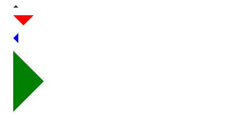
<div class="arrow-up"></div><div class="arrow-down"></div><div class="arrow-left">< ;/div><div class="arrow-right"></div>
css代碼
.arrow-up { width: 0; height: 0; border-left: 5px solid transparent; border-right: 5px solid transparent; border-bottom: 5px solid black;}.arrow-down { width: 0; height: 0; border-left: 20px solid transparent; border-right: 20px solid transparent; border-top: 20px solid #f00;}.arrow-right { width: 0; height: 0; border-top: 60px solid transparent ; border-bottom: 60px solid transparent; border-left: 60px solid green;}.arrow-left { width: 0; height: 0; border-top: 10px solid transparent; border-bottom: 10px solid transparent; border-right :10px solid blue; }5.翻轉圖片
CSS代碼
img { -moz-transform: scaleX(-1); -o-transform: scaleX(-1); -webkit-transform: scaleX(-1); transform: scaleX(-1); filter: FlipH; -ms-filter: "FlipH";}用這些代碼可以實現圖像的360的翻轉,效果如下,沒有翻轉前的圖片
翻轉後的圖片
6 Clearfix
.clearfix:after { visibility: hidden; display: block; font-size: 0; content: " "; clear: both; height: 0;}.clearfix { display: inline-block; }/* start commented backslash hack \*/* html .clearfix { height: 1%; }.clearfix { display: block; }/* close commented backslash hack */7 在IE6中的固定定位
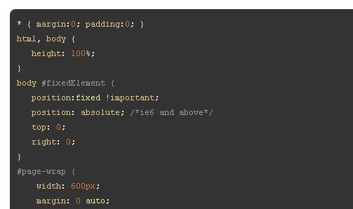
8 隱藏和文本文字縮進
h1 { text-indent:-9999px; margin:0 auto; width:400px; height:100px; background:transparent url("images/logo.jpg") no-repeat scroll;} 上面CSS代碼設置text-indent 為負值,正好文字移到了左邊,可以實現部分文字隱藏
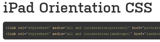
9在iPad當中定位CSS代碼
10根據不同的文件類型,展示不同的鏈接,看下面的代碼
/* external links */a[href^="http://"]{ padding-right: 20px; background: url(external.gif) no-repeat center right;}/* emails */a[ href^="mailto:"]{ padding-right: 20px; background: url(email.png) no-repeat center right;}/* pdfs */a[href$=".pdf"]{ padding-right: 20px; background: url(pdf.png) no-repeat center right;}此代碼段經常被用來增加用戶體驗的。經常在互聯網上我們發現一些鏈接移動到上面的時候會顯示不同的小圖標。可以使用此代碼段,你告訴用戶是否它一個外部鏈接、 電子郵件、 pdf、或者其他圖標
11 邊框圓角
.round{ -moz-border-radius: 10px; -webkit-border-radius: 10px; border-radius: 10px; /* future proofing */ -khtml-border-radius: 10px; /* for old Konqueror browsers */}12 去除textarea在IE當中的滾動條效果
textarea{ overflow:auto;}13 使頁面在中央
.wrapper { width:960px; margin:0 auto;}14 CSS文字陰影效果
p { text-shadow: 1px 1px 1px #000; }15 CSS透明度http://www.1stwebdesigner.com/design/useful-css-snippets/
一談到透明度問題,這個真是令人頭疼,明明在火狐和谷歌瀏覽器當中效果看到好好的,在IE當中瀏覽就變了味,好在可以通過下面的CSS代碼解決
.transparent { filter:alpha(opacity=50); -moz-opacity:0.5; -khtml-opacity: 0.5; opacity: 0.5;}16 垂直居中http://css-tricks.com/snippets/css/sticky-footer/
.container { min-height: 10em; display: table-cell; vertical-align: middle;}17 Min-height in IE
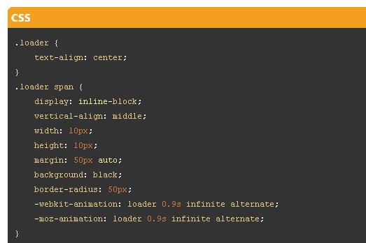
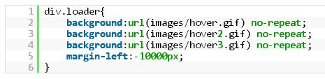
.box { min-height:500px; height:auto !important; height:500px;}18 使gif圖像可以來回蹦跳
19 打印分頁符
.page-break{ page-break-before:always;}20 固定頁腳位置
#footer { position:fixed; left:0px; bottom:0px; height:32px; width:100%; background:#333;}/* IE 6 */* html #footer { position:absolute; top: expression((0-(footer.offsetHeight)+(document.documentElement.clientHeight ? document.documentElement.clientHeight : document.body.clientHeight)+(ignoreMe = document.documentElement.scrollTop ? document.documentElement.scrollTop : document.body. scrollTop))+'px');}21 文字旋轉
.rotate { /* Safari */ -webkit-transform: rotate(-90deg); /* Firefox */ -moz-transform: rotate(-90deg); /* IE */ -ms-transform: rotate( -90deg); /* Opera */ -o-transform: rotate(-90deg); /* Internet Explorer */ filter: progid:DXImageTransform.Microsoft.BasicImage(rotation=3);}22 A鏈接偽類(按順序)
CSS代碼
a:link {color: blue;}a:visited {color: purple;}a:hover {color: red;}a:active {color: yellow;}23 設置ul陰影效果和邊框圓角
CSS代碼如下
ul.box { position: relative; z-index: 1; /* prevent shadows falling behind containers with backgrounds */ overflow: hidden; list-style: none; margin: 0; padding: 0;}ul.box li { position: relative; float: left; width: 250px; height: 150px; padding: 0; border: 1px solid #efefef; margin: 0 30px 30px 0; background: #fff; -webkit-box-shadow: 0 1px 4px rgba(0, 0, 0, 0.27), 0 0 40px rgba(0, 0, 0, 0.06) inset; -moz-box-shadow: 0 1px 4px rgba(0, 0, 0, 0.27), 0 0 40px rgba(0, 0, 0, 0.06) inset; box-shadow: 0 1px 4px rgba(0, 0, 0, 0.27), 0 0 40px rgba(0, 0, 0, 0.06) inset;}ul.box li:before, ul.box li:after { content: ''; z-index: -1; position: absolute; left: 10px; bottom: 10px; width: 70%; max-width: 300px; /* avoid rotation causing ugly appearance at large container widths */ max-height: 100px; height: 55%; -webkit-box-shadow: 0 8px 16px rgba(0, 0, 0, 0.3); -moz-box-shadow: 0 8px 16px rgba(0, 0, 0, 0.3); box-shadow: 0 8px 16px rgba(0, 0, 0, 0.3); -webkit-transform: skew(-15deg) rotate(-6deg); -moz-transform : skew(-15deg) rotate(-6deg); -ms-transform: skew(-15deg) rotate(-6deg); -o-transform: skew(-15deg) rotate(-6deg); transform: skew(-15deg ) rotate(-6deg);}ul.box li:after { left: auto; right: 10px; -webkit-transform: skew(15deg) rotate(6deg); -moz-transform: skew(15deg) rotate(6deg) ; -ms-transform: skew(15deg) rotate(6deg); -o-transform: skew(15deg) rotate(6deg); transform: skew(15deg) rotate(6deg);}24圖片預加載功能
25 設計梯子型文字
h1 { font-size: 72px; background: -webkit-gradient(linear, left top, left bottom, from(#eee), to(#333)); -webkit-background-clip: text; -webkit -text-fill-color: transparent;}文章為用戶上傳,僅供非商業瀏覽。發布者:Lomu,轉轉請註明出處: https://www.daogebangong.com/zh-Hant/articles/detail/25%20powerful%20CSS%20codes%20which%20are%20said%20to%20be%20tricky%20codes%20that%20developers%20often%20encounter.html
 支付宝扫一扫
评论列表(196条)
测试