Western Normal University Edition First Grade Mathematics Volume 1
Beijing Normal University Edition Seventh Grade Mathematics Volume 1
People's Education Press First Grade Mathematics Volume 1
People's Education Press Second Grade Mathematics Volume 1
Beijing Normal University Edition Seventh Grade Mathematics Volume 2
People's Education Press Third Grade Mathematics Volume 1
Beijing Normal University Edition Eighth Grade Mathematics Volume 1
Qingdao Edition Seventh Grade Mathematics Volume 1
Beijing Normal University Edition Fifth Grade Mathematics Volume 1
Hebei Education Edition Third Grade Mathematics Volume 1
Hebei Education Edition Seventh Grade Mathematics Volume 2
People's Education Press First Grade Mathematics Volume 2
People's Education High School Mathematics Edition B Compulsory Course 2
Qingdao Edition Seventh Grade Mathematics Volume 2
Beijing Normal University Edition Fifth Grade Mathematics Volume 2
Western Normal University Edition Fifth Grade Mathematics Volume 2

| Category | Format | Size |
|---|---|---|
| People's Education Press Sixth Grade Mathematics Volume 1 | pptx | 6 MB |

"Selection of Statistical Charts" Sector Chart PPT
2024-11-22
Copyright statement: This material is compiled and released by the user of Daoge Resources. The copyright belongs to the author. For commercial use, please contact the copyright owner. If there is any infringement, please contact the webmaster to remove the resource.
Download Points: 0.00
Free Download
Upgrade VIP
Favorite
Views: 3123 / Downloads: 468
Description
"Selection of Statistical Charts" Sector Chart PPT
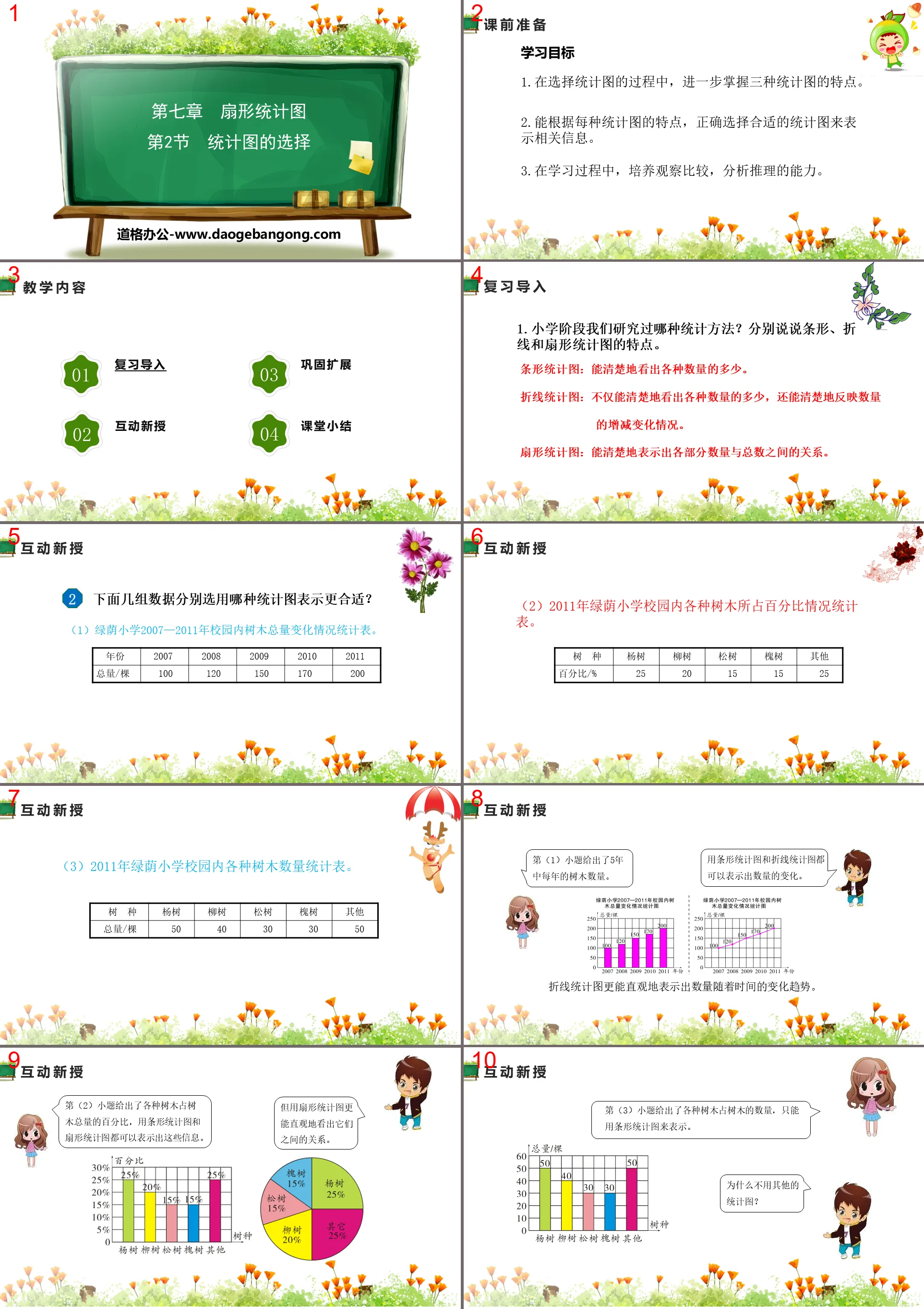
Part One: Learning Objectives
1. In the process of selecting statistical charts, further master the characteristics of the three statistical charts.
2. Ability to correctly select appropriate statistical charts to represent relevant information based on the characteristics of each statistical chart.
3. During the learning process, develop the ability to observe, compare, analyze and reason.
Selection of statistical charts PPT, part 2: review import
1. What kind of statistical methods have we studied in primary school? Let’s talk about the characteristics of bar, line and fan charts respectively.
Bar chart: Can clearly see the magnitude of various quantities.
Line chart: Not only can you clearly see the amounts of various quantities, but it can also clearly reflect the increase or decrease in quantities.
Fan chart: can clearly show the relationship between the quantity of each part and the total number.
Selection of statistical charts PPT, the third part: interactive new teaching
Which statistical chart is more suitable for the following sets of data?
(1) Statistical table of changes in the total number of trees on campus of Luyin Primary School from 2007 to 2011.
(2) Statistical table on the percentage of various trees on the campus of Luyin Primary School in 2011.
(3) Statistical table of the number of various trees on the campus of Luyin Primary School in 2011.
Selection of statistical charts PPT, Part 4: Consolidation and expansion
In forestry science, trees are usually divided into different types according to the length of their growth period. The following is the area composition of each age group of arbor forests in my country.
What statistical chart can be used to describe the above information? Which one is more intuitive?
You can use a bar chart or a fan chart, with the fan chart being more intuitive.
There are 250 students in the sixth grade of Weimin Primary School. The distribution of participating extracurricular interest groups is as follows.
①How many more students participate in the sports interest group than in the music group?
Solution: 250×34% - 250×18% = 40 (people)
Answer: There are 40 more students participating in sports interest groups than in music groups.
②How many students participate in other interest groups?
Solution: 250×(1 - 18% - 26% - 34%) = 55 (people)
Answer: There are 55 students participating in other interest groups.
Selection of statistical charts PPT, Part 5: Class summary
What did you discover through the previous study?
Summary: When only counting the amounts of various quantities, bar charts are the first choice; when you want to clearly see the trend of quantity changes, the line chart is the first choice; when you want to visually present the relationship between the quantity of each part and the total, the first choice is Fan chart.
Keywords: Free download of PPT courseware for sixth grade mathematics from the People's Education Press, PPT download of selection of statistical charts, PPT download of sector statistical charts, .PPT format;
For more information about the PPT courseware "Selection of Statistical Charts and Sector Charts", please click the Selection of Statistical Charts PPT Sector Chart PPT tab.
"Selection of Statistical Charts" Data Collection and Organization PPT Download (Lesson 2):
"Selection of Statistical Charts" Data Collection and Arrangement PPT Download (Lesson 2) Part One: Knowledge Points Basic Knowledge Point 1 The illusion given by the line statistical chart 1. Two automobile sales companies A and B are based on the results of recent years. The sales volume is divided into statistics as shown in the figure..
"Selection of Statistical Charts" Data Collection and Organization PPT Download (Lesson 1):
"Selection of Statistical Charts" Data Collection and Arrangement PPT Download (Lesson 1) Part One: Knowledge Points Basic Knowledge Points 1 Bar Chart and Line Chart 1. The picture below shows a domestic brand mobile phone store this year 8~ December high-definition large-screen mobile phone sales line statistics...
"Selection of Statistical Charts" Data collection and organization PPT download:
"Selection of Statistical Charts" Data Collection and Arrangement PPT Download Part One Content: Learning Objectives 1. Understand the characteristics of different statistical charts, and be able to select appropriate statistical charts based on actual problems. (Key Points) 2. Be able to obtain effective results from statistical charts Information, correct decision-making. (Difficulty...
File Info
Update Time: 2024-11-22
This template belongs to Mathematics courseware People's Education Press Sixth Grade Mathematics Volume 1 industry PPT template
"Selection of Statistical Charts" Sector Chart PPT Simple campus recruitment activity planning plan summary enterprise and institution recruitment publicity lecture PPT template is a general PPT template for business post competition provided by the manuscript PPT, simple campus recruitment activity planning plan summary enterprise and institution recruitment promotion Lecture PPT template, you can edit and modify the text and pictures in the source file by downloading the source file. If you want more exquisite business PPT templates, you can come to grid resource. Doug resource PPT, massive PPT template slide material download, we only make high-quality PPT templates!
Tips: If you open the template and feel that it is not suitable for all your needs, you can search for related content "Selection of Statistical Charts" Sector Chart PPT is enough.
How to use the Windows system template
Directly decompress the file and use it with office or wps
How to use the Mac system template
Directly decompress the file and use it Office or wps can be used
Related reading
For more detailed PPT-related tutorials and font tutorials, you can view: Click to see
How to create a high-quality technological sense PPT? 4 ways to share the bottom of the box
Notice
Do not download in WeChat, Zhihu, QQ, built-in browsers, please use mobile browsers to download! If you are a mobile phone user, please download it on your computer!
1. The manuscript PPT is only for study and reference, please delete it 24 hours after downloading.
2. If the resource involves your legitimate rights and interests, delete it immediately.
3. Contact information: service@daogebangong.com
"Selection of Statistical Charts" Sector Chart PPT, due to usage restrictions, it is only for personal study and reference use. For commercial use, please go to the relevant official website for authorization.
(Personal non-commercial use refers to the use of this font to complete the display of personal works, including but not limited to the design of personal papers, resumes, etc.)
Preview
Related Search:
"Selection of Statistical Charts" Sector Chart PPT
2024-11-22
Copyright statement: This material is compiled and released by the user of Daoge Resources. The copyright belongs to the author. For commercial use, please contact the copyright owner. If there is any infringement, please contact the webmaster to remove the resource.
Download Points: 0.00
Free Download
Upgrade VIP
Favorite
Views: 3123 / Downloads: 468