Western Normal University Edition First Grade Mathematics Volume 1
Beijing Normal University Edition Seventh Grade Mathematics Volume 1
People's Education Press First Grade Mathematics Volume 1
People's Education Press Second Grade Mathematics Volume 1
People's Education Press Third Grade Mathematics Volume 1
Beijing Normal University Edition Seventh Grade Mathematics Volume 2
Hebei Education Edition Third Grade Mathematics Volume 1
Beijing Normal University Edition Eighth Grade Mathematics Volume 1
Qingdao Edition Seventh Grade Mathematics Volume 1
Beijing Normal University Edition Fifth Grade Mathematics Volume 1
Hebei Education Edition Seventh Grade Mathematics Volume 2
People's Education High School Mathematics Edition B Compulsory Course 2
Beijing Normal University Edition Fifth Grade Mathematics Volume 2
Hebei Education Edition Fourth Grade Mathematics Volume 2
Qingdao Edition Seventh Grade Mathematics Volume 2
People's Education Press First Grade Mathematics Volume 2
| Category | Format | Size |
|---|---|---|
| People's Education Press Seventh Grade Mathematics Volume 2 | pptx | 6 MB |

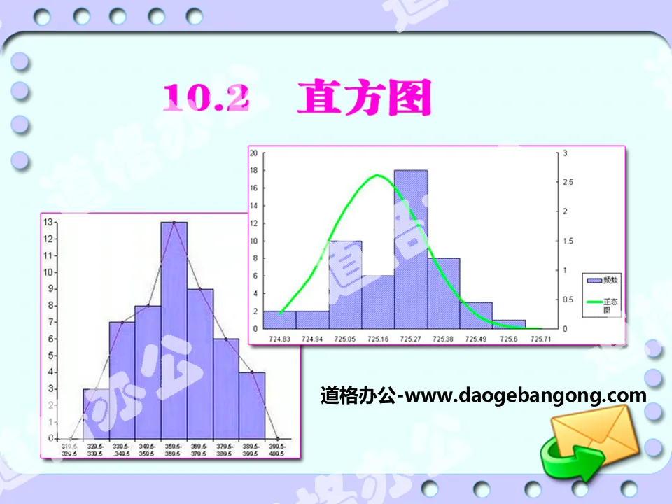
"Histogram" data collection, organization and description PPT courseware
2024-10-22
Copyright statement: This material is compiled and released by the user of Daoge Resources. The copyright belongs to the author. For commercial use, please contact the copyright owner. If there is any infringement, please contact the webmaster to remove the resource.
Download Points: 0.00
Free Download
Upgrade VIP
Favorite
Views: 4704 / Downloads: 259
Description
"Histogram" data collection, organization and description PPT courseware
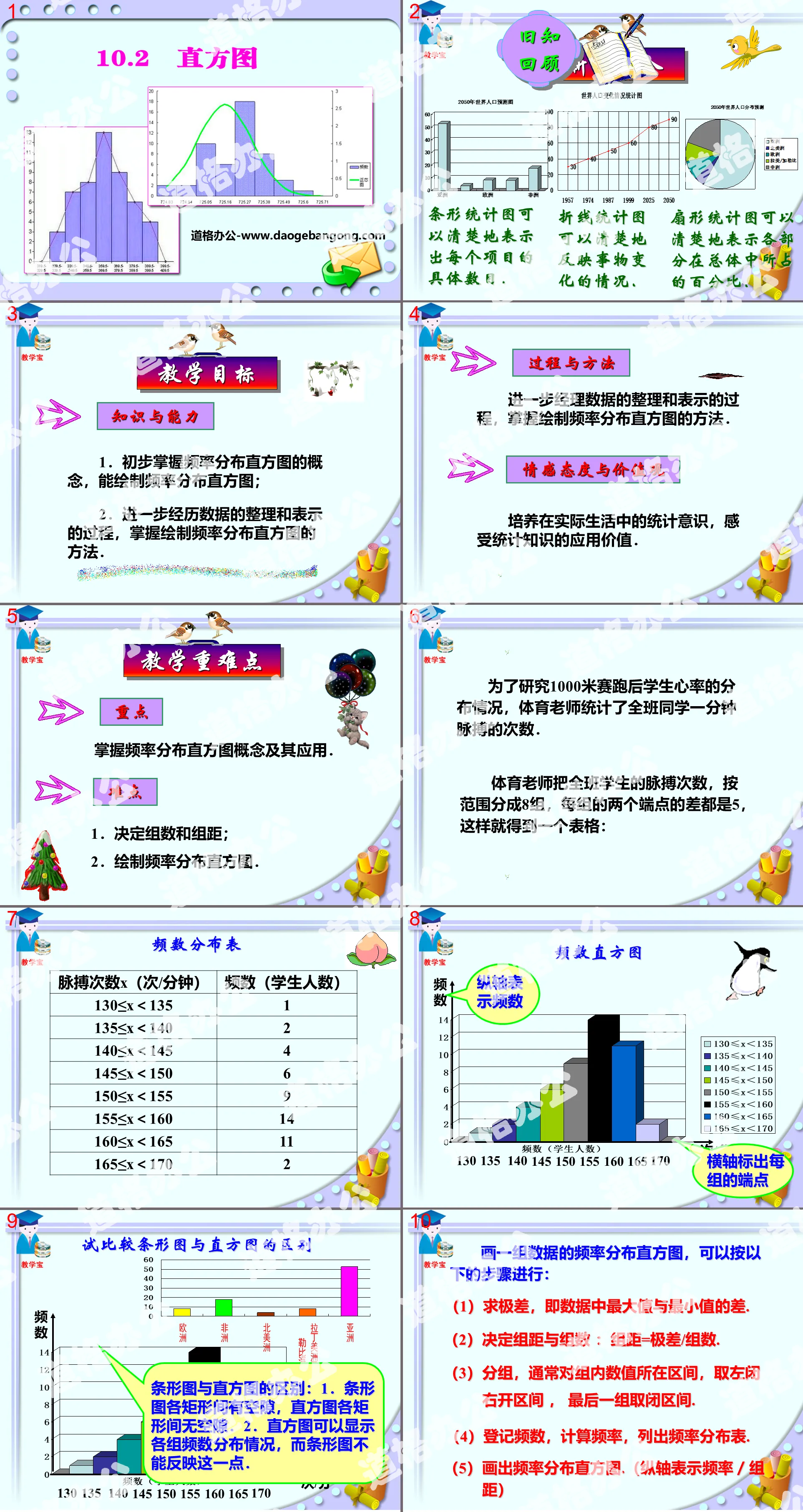
teaching objectives
knowledge and abilities
1. Preliminarily grasp the concept of frequency distribution histogram and be able to draw frequency distribution histogram;
2. Further experience the process of data organization and presentation, and master the method of drawing frequency distribution histograms.
Process and Method
Further manage the process of data organization and presentation, and master the method of drawing frequency distribution histograms.
Emotional attitudes and values
Cultivate statistical awareness in real life and feel the application value of statistical knowledge.
To draw a frequency distribution histogram of a set of data, you can follow the following steps:
(1) Find the range, that is, the difference between the maximum value and the minimum value in the data.
(2) Determine the group distance and number of groups: group distance = range/number of groups.
(3) Grouping, usually for the interval where the values in the group are located, the left closed interval and the right open interval are taken, and the last group is taken as the closed interval.
(4) Register frequencies, calculate frequencies, and list frequency distribution tables.
(5) Draw a frequency distribution histogram. (The vertical axis represents frequency/group distance)
Summarize the method of drawing a histogram:
(1) According to the size of the drawing, draw two mutually perpendicular rays and add arrows at both ends;
(2) On the horizontal ray, appropriately allocate the positions of the bars and determine the width and spacing of the straight bars;
(3) On the ray perpendicular to the horizontal ray, determine the unit length according to the size of the data, and then draw straight bars of different lengths according to the size and note the number.
1. Calculate the difference between the maximum value and the minimum value
In the above data, the minimum value is 56, the maximum value is 88, and their difference is 32, indicating that the range of changes in mathematics competition scores is 32.
2. Determine group spacing and number of groups
Starting from the lowest score, every 5 points is divided into a group, then the maximum value-minimum value/group distance=32/5=62/5
So we need to divide the data into 7 groups, and the number of groups and the distance between groups are 7 and 5 respectively.
in conclusion
The frequency distribution table data is detailed, specific, clear and easy to refer to.
The frequency histogram is intuitive and has a strong contrast effect.
The frequency line chart can reflect the trend of development and change.
Example 1 The picture below is a histogram of the number of sit-ups in a physical fitness test of a class of students in a physical education class. Please answer the following questions according to the picture:
(1) Which group has the most reps?
(2) How many people in the class have done more than 40 sit-ups (including 40 times)?
(3) How many people in the class can do less than 30 sit-ups with their knees bent?
(1) The group with times 30 to 35 has the largest number of people, with 10 people.
(2) Both groups 40~45 and 45~50 are more than 40 times, with a total of 6+6=12 (people).
(3) Both groups 20~25 and 25~30 are less than 30 times, and there are a total of 6+7=13 (people).
Example 2 A store made a histogram of its sales for 300 business days, as shown in the figure below. Please answer the following questions based on the figure:
(1) What percentage of the total business days does the number of days with a turnover of less than 300,000 yuan account for?
(2) How many days have the turnover been less than 300,000 yuan?
(3) How many days did the turnover exceed 400,000 yuan?
(1) As can be seen from the above figure, the percentage of days with a turnover of less than 300,000 yuan to the total business days is 10% + 9% + 28% = 47%.
(2) Since the total business days are 300 days, if the turnover is less than 300,000 yuan, there are 300×47%=141 (days).
(3) Those with a turnover of more than 400,000 yuan account for 12% + 6% + 1% = 19%, so there are 300 × 19% = 57 (days).
Class summary
Through the study of this section, we understand the meaning of frequency distribution and the general steps to obtain the frequency distribution of a set of data:
(1) Calculate the range;
(2) Determine the group distance and number of groups;
(3) Determine points;
(4) List the frequency distribution table;
(5) Draw a frequency distribution histogram.
How to draw a frequency distribution histogram:
(1) How to make a frequency distribution histogram;
(2) There is no standard for group spacing and number of groups. When the data is within 1,000, it is usually divided into 5 to 12 groups;
(3) If you take the midpoint of the upper side of the rectangle, you can get a frequency line chart;
(4) Find the average of the two breakpoints of each group. These averages are called group medians.
Keywords: data collection, organization and description teaching courseware, histogram teaching courseware, New People's Education Edition seventh grade mathematics volume 2 PPT courseware, seventh grade mathematics slide courseware download, data collection, organization and description PPT courseware download, histogram PPT Courseware download, .ppt format
For more information about the PPT courseware "Collection, Organization and Description of Data Histogram", please click the "Collection, Organization and Description of Data ppt Histogram ppt" tab.
"Frequency Distribution Table and Histogram" PPT download:
"Frequency Distribution Table and Histogram" PPT Download Part One Content: Review Do you still remember the characteristics of each statistical chart: Bar chart can clearly show the specific number of each item. Line chart can clearly reflect changes in things. situation. Sector..
"Frequency Distribution Table and Histogram" PPT courseware:
"Frequency Distribution Table and Histogram" PPT courseware Part One: Preparation before class Questionnaire: Books are the ladder of human progress. What kind of books do students like to read most after class? A. Literature ( ) B. Comics ( ) C. Popular science ( ) D. History ( ..
"Frequency Distribution Table and Histogram" PPT:
"Frequency Distribution Table and Histogram" PPT Part One Content: New Lesson Exploration In order to understand the market share of different brands of beverages, Xiaoliang and Xiaoming chose a supermarket to conduct a survey and recorded the brands of beverages purchased by 50 customers that day. Use the letters K,B,L,C...
File Info
Update Time: 2024-10-22
This template belongs to Mathematics courseware People's Education Press Seventh Grade Mathematics Volume 2 industry PPT template
"Histogram" data collection, organization and description PPT courseware Simple campus recruitment activity planning plan summary enterprise and institution recruitment publicity lecture PPT template is a general PPT template for business post competition provided by the manuscript PPT, simple campus recruitment activity planning plan summary enterprise and institution recruitment promotion Lecture PPT template, you can edit and modify the text and pictures in the source file by downloading the source file. If you want more exquisite business PPT templates, you can come to grid resource. Doug resource PPT, massive PPT template slide material download, we only make high-quality PPT templates!
Tips: If you open the template and feel that it is not suitable for all your needs, you can search for related content "Histogram" data collection, organization and description PPT courseware is enough.
How to use the Windows system template
Directly decompress the file and use it with office or wps
How to use the Mac system template
Directly decompress the file and use it Office or wps can be used
Related reading
For more detailed PPT-related tutorials and font tutorials, you can view: Click to see
How to create a high-quality technological sense PPT? 4 ways to share the bottom of the box
Notice
Do not download in WeChat, Zhihu, QQ, built-in browsers, please use mobile browsers to download! If you are a mobile phone user, please download it on your computer!
1. The manuscript PPT is only for study and reference, please delete it 24 hours after downloading.
2. If the resource involves your legitimate rights and interests, delete it immediately.
3. Contact information: service@daogebangong.com
"Histogram" data collection, organization and description PPT courseware, due to usage restrictions, it is only for personal study and reference use. For commercial use, please go to the relevant official website for authorization.
(Personal non-commercial use refers to the use of this font to complete the display of personal works, including but not limited to the design of personal papers, resumes, etc.)
Preview
Hot Tags:
Related Search:
"Histogram" data collection, organization and description PPT courseware
2024-10-22
Copyright statement: This material is compiled and released by the user of Daoge Resources. The copyright belongs to the author. For commercial use, please contact the copyright owner. If there is any infringement, please contact the webmaster to remove the resource.
Download Points: 0.00
Free Download
Upgrade VIP
Favorite
Views: 4704 / Downloads: 259