Western Normal University Edition First Grade Mathematics Volume 1
Beijing Normal University Edition Seventh Grade Mathematics Volume 1
People's Education Press First Grade Mathematics Volume 1
People's Education Press Second Grade Mathematics Volume 1
People's Education Press Third Grade Mathematics Volume 1
Hebei Education Edition Third Grade Mathematics Volume 1
Beijing Normal University Edition Seventh Grade Mathematics Volume 2
Beijing Normal University Edition Fifth Grade Mathematics Volume 1
Qingdao Edition Seventh Grade Mathematics Volume 1
Beijing Normal University Edition Eighth Grade Mathematics Volume 1
Hebei Education Edition Seventh Grade Mathematics Volume 2
People's Education High School Mathematics Edition B Compulsory Course 2
Jiangsu Education Edition Fourth Grade Mathematics Volume 1
People's Education Press First Grade Mathematics Volume 2
Qingdao Edition Seventh Grade Mathematics Volume 2
Beijing Normal University Edition Fifth Grade Mathematics Volume 2

| Category | Format | Size |
|---|---|---|
| Hebei Education Edition Fourth Grade Mathematics Volume 1 | pptx | 6 MB |

"Using Statistical Charts to Represent Data" Average and Bar Chart PPT Courseware
2024-09-27
Copyright statement: This material is compiled and released by the user of Daoge Resources. The copyright belongs to the author. For commercial use, please contact the copyright owner. If there is any infringement, please contact the webmaster to remove the resource.
Download Points: 0.00
Free Download
Upgrade VIP
Favorite
Views: 4437 / Downloads: 53
Description
"Using Statistical Charts to Represent Data" Average and Bar Chart PPT Courseware
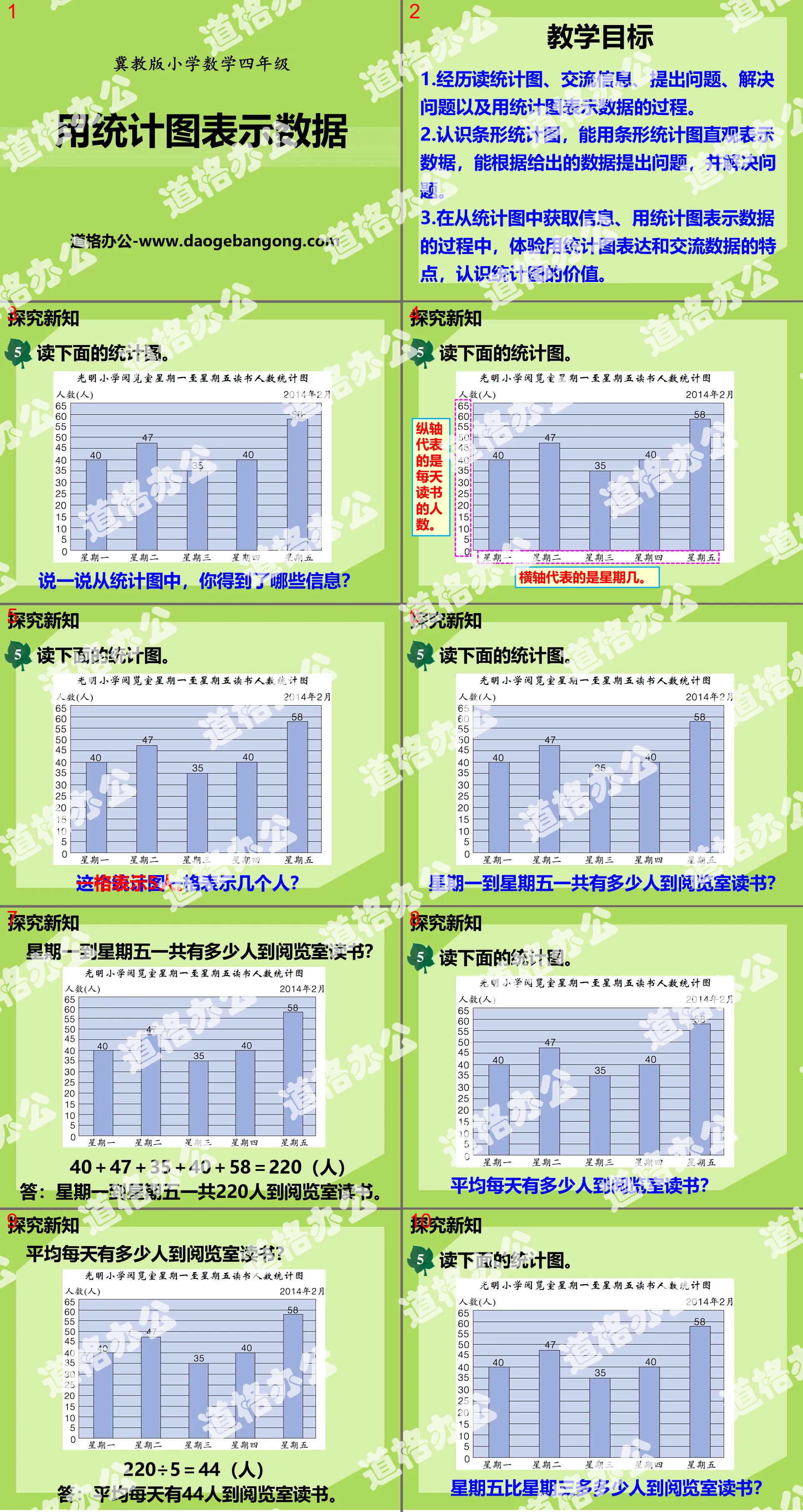
teaching objectives
1. Experience the process of reading statistical charts, communicating information, asking questions, solving problems, and using statistical charts to represent data.
2. Understand bar graphs, be able to use bar graphs to visually represent data, and be able to ask questions and solve problems based on the given data.
3. In the process of obtaining information from statistical charts and using statistical charts to represent data, experience the characteristics of using statistical charts to express and communicate data, and understand the value of statistical charts.
Explore new knowledge
Read the chart below.
Tell me what information you got from the statistical chart?
The vertical axis represents the number of people reading every day.
The horizontal axis represents the day of the week.
How many people come to the reading room to study from Monday to Friday?
40+47+35+40+58=220 (person)
Answer: A total of 220 people come to the reading room to study from Monday to Friday.
Consolidate application
practice
1. Wenhua Road Primary School launched a book donation activity to primary schools in mountainous areas. The book donation status of each group in Class 4 (3) is as follows:
(1) Try to use a bar chart to represent the above data.
2. Design a questionnaire yourself to record your reading of extracurricular books in one semester.
Keywords: teaching courseware of averages and bar graphs, teaching courseware of using statistical graphs to represent data, download of fourth-grade mathematics PPT courseware of Hebei Education Edition, download of fourth-grade mathematics slide courseware, download of averages and bar graphs PPT courseware , use statistical charts to represent data PPT courseware download, .PPT format;
For more information about the PPT courseware "Averages and Bar Charts Use Statistical Charts to Represent Data", please click the Average and Bar Chart ppt Use Statistical Charts to Represent Data ppt tag.
File Info
Update Time: 2024-09-27
This template belongs to Mathematics courseware Hebei Education Edition Fourth Grade Mathematics Volume 1 industry PPT template
"Using Statistical Charts to Represent Data" Average and Bar Chart PPT Courseware Simple campus recruitment activity planning plan summary enterprise and institution recruitment publicity lecture PPT template is a general PPT template for business post competition provided by the manuscript PPT, simple campus recruitment activity planning plan summary enterprise and institution recruitment promotion Lecture PPT template, you can edit and modify the text and pictures in the source file by downloading the source file. If you want more exquisite business PPT templates, you can come to grid resource. Doug resource PPT, massive PPT template slide material download, we only make high-quality PPT templates!
Tips: If you open the template and feel that it is not suitable for all your needs, you can search for related content "Using Statistical Charts to Represent Data" Average and Bar Chart PPT Courseware is enough.
How to use the Windows system template
Directly decompress the file and use it with office or wps
How to use the Mac system template
Directly decompress the file and use it Office or wps can be used
Related reading
For more detailed PPT-related tutorials and font tutorials, you can view: Click to see
How to create a high-quality technological sense PPT? 4 ways to share the bottom of the box
Notice
Do not download in WeChat, Zhihu, QQ, built-in browsers, please use mobile browsers to download! If you are a mobile phone user, please download it on your computer!
1. The manuscript PPT is only for study and reference, please delete it 24 hours after downloading.
2. If the resource involves your legitimate rights and interests, delete it immediately.
3. Contact information: service@daogebangong.com
"Using Statistical Charts to Represent Data" Average and Bar Chart PPT Courseware, due to usage restrictions, it is only for personal study and reference use. For commercial use, please go to the relevant official website for authorization.
(Personal non-commercial use refers to the use of this font to complete the display of personal works, including but not limited to the design of personal papers, resumes, etc.)
Preview
Related Search:
"Using Statistical Charts to Represent Data" Average and Bar Chart PPT Courseware
2024-09-27
Copyright statement: This material is compiled and released by the user of Daoge Resources. The copyright belongs to the author. For commercial use, please contact the copyright owner. If there is any infringement, please contact the webmaster to remove the resource.
Download Points: 0.00
Free Download
Upgrade VIP
Favorite
Views: 4437 / Downloads: 53