Western Normal University Edition First Grade Mathematics Volume 1
Beijing Normal University Edition Seventh Grade Mathematics Volume 1
People's Education Press First Grade Mathematics Volume 1
People's Education Press Third Grade Mathematics Volume 1
People's Education Press Second Grade Mathematics Volume 1
Beijing Normal University Edition Seventh Grade Mathematics Volume 2
Beijing Normal University Edition Fifth Grade Mathematics Volume 1
Hebei Education Edition Third Grade Mathematics Volume 1
Qingdao Edition Seventh Grade Mathematics Volume 1
Beijing Normal University Edition Eighth Grade Mathematics Volume 1
Hebei Education Edition Seventh Grade Mathematics Volume 2
People's Education High School Mathematics Edition B Compulsory Course 2
Qingdao Edition Seventh Grade Mathematics Volume 2
Jiangsu Education Edition Fourth Grade Mathematics Volume 1
People's Education Press First Grade Mathematics Volume 2
Hebei Education Edition Fourth Grade Mathematics Volume 2

| Category | Format | Size |
|---|---|---|
| Beijing Normal University Edition Fifth Grade Mathematics Volume 2 | pptx | 6 MB |

"Compound Line Statistical Schema" data analysis and organization PPT download
2024-10-05
Copyright statement: This material is compiled and released by the user of Daoge Resources. The copyright belongs to the author. For commercial use, please contact the copyright owner. If there is any infringement, please contact the webmaster to remove the resource.
Download Points: 0.00
Free Download
Upgrade VIP
Favorite
Views: 1092 / Downloads: 460
Description
"Compound Line Statistical Schema" data analysis and organization PPT download
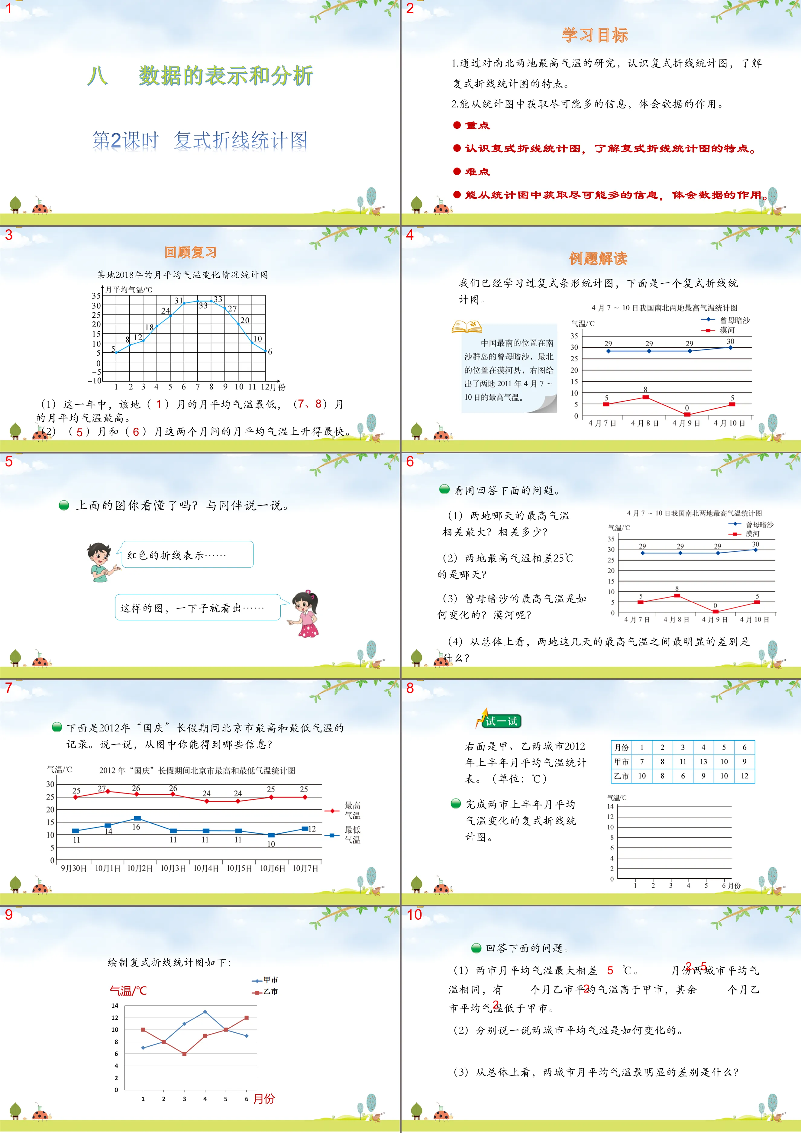
Part One: Learning Objectives
1. Through the study of the highest temperatures in the north and south, understand the compound line statistical chart and understand the characteristics of the compound line chart.
2. Able to obtain as much information as possible from statistical charts and understand the role of data.
focus
Recognize compound line statistical charts and understand the characteristics of compound line statistical charts.
difficulty
Able to obtain as much information as possible from statistical charts and understand the role of data.
Polyline statistical diagram PPT, part 2: interpretation of examples
We have already studied the compound bar chart, and here is a compound line chart.
Do you understand the picture above? Talk to your companions.
The red polyline represents...
From a picture like this, you can immediately see...
Look at the picture and answer the questions below.
(1) On which day does the maximum temperature differ the most between the two places? How much difference?
(2) On which day does the highest temperature differ by 25°C between the two places?
(3) How does the maximum temperature in Zengmu Shoal change? What about Mohe?
(4) Overall, what is the most obvious difference between the maximum temperatures in the two places over the past few days?
Answer the questions below.
(1) The maximum monthly average temperature difference between the two cities is ______℃. The average temperatures of the two cities are the same in ______ months. In ______ months, the average temperature of City B is higher than that of City A. In the other ______ months, the average temperature of City B is lower than that of City A.
(2) Let’s talk about how the average temperature of the two cities changes.
(3) Overall, what is the most obvious difference in the monthly average temperatures between the two cities?
Polyline statistical diagram PPT, the third part: summary
The difference between a compound line chart and a single line chart
(1) A single line chart represents one set of data, while a compound line chart can represent two or more sets of data (indicate the legend).
(2) Compound line statistical charts facilitate visual comparison of the changing characteristics of two or more groups of data.
Polyline statistical diagram PPT, the fourth part: quiz in class
1. The picture on the right is a statistical chart of the number of people suffering from dental caries in a school from 2006 to 2012.
(1) Do you understand this statistical chart? Talk to your companions.
(2) The most dental caries cases among boys and girls occurred in _______ years, with a total of _______ people.
2. Statistical chart of sales of color TVs of brands A and B in a shopping mall in 2018
(1) The total sales volume of color TV sets of ( ) brands is the highest throughout the year.
(2) The sales volume of brand A color TVs increased the most from ( ) to ( ) month; the sales volume of brand B color TVs increased the most from ( ) month to ( ) month.
(3) From August to September, ( ) brands of color TVs showed a downward trend.
Polyline statistical diagram PPT, part 5: homework
1. Select from the after-class exercises;
Keywords: Free download of Beijing Normal University edition fifth grade mathematics PPT courseware for volume 2, complex polyline statistical diagram PPT download, data analysis and organization PPT download, .PPT format;
For more information about the PPT courseware "Data Analysis and Sorting Compound Line Statistical Chart", please click the Data Analysis and Sorting PPT Complex Polyline Statistical Chart PPT tab.
"Compound Line Statistical Schema" data analysis and organization PPT courseware:
"Compound Polyline Statistical Chart" Data Analysis and Organization PPT Courseware Part One: Learning Objectives 1. Further study the compound polyline statistical chart and be able to make analysis and judgment based on the data in the statistical chart. (Key points) 2. Draw a compound line statistical chart. (difficulty)..
Analysis and organization of data in "Polyline Statistical Chart" PPT:
"Compound Line Statistical Chart" Data Analysis and Organization PPT Part One Content: Review and Import Earlier we studied the compound bar chart. Think about the characteristics of the compound bar chart? If we want to express the temperature change in a certain place within a year What situation should we draw...
File Info
Update Time: 2024-10-05
This template belongs to Mathematics courseware Beijing Normal University Edition Fifth Grade Mathematics Volume 2 industry PPT template
"Compound Line Statistical Schema" data analysis and organization PPT download Simple campus recruitment activity planning plan summary enterprise and institution recruitment publicity lecture PPT template is a general PPT template for business post competition provided by the manuscript PPT, simple campus recruitment activity planning plan summary enterprise and institution recruitment promotion Lecture PPT template, you can edit and modify the text and pictures in the source file by downloading the source file. If you want more exquisite business PPT templates, you can come to grid resource. Doug resource PPT, massive PPT template slide material download, we only make high-quality PPT templates!
Tips: If you open the template and feel that it is not suitable for all your needs, you can search for related content "Compound Line Statistical Schema" data analysis and organization PPT download is enough.
How to use the Windows system template
Directly decompress the file and use it with office or wps
How to use the Mac system template
Directly decompress the file and use it Office or wps can be used
Related reading
For more detailed PPT-related tutorials and font tutorials, you can view: Click to see
How to create a high-quality technological sense PPT? 4 ways to share the bottom of the box
Notice
Do not download in WeChat, Zhihu, QQ, built-in browsers, please use mobile browsers to download! If you are a mobile phone user, please download it on your computer!
1. The manuscript PPT is only for study and reference, please delete it 24 hours after downloading.
2. If the resource involves your legitimate rights and interests, delete it immediately.
3. Contact information: service@daogebangong.com
"Compound Line Statistical Schema" data analysis and organization PPT download, due to usage restrictions, it is only for personal study and reference use. For commercial use, please go to the relevant official website for authorization.
(Personal non-commercial use refers to the use of this font to complete the display of personal works, including but not limited to the design of personal papers, resumes, etc.)
Preview
Related Search:
"Compound Line Statistical Schema" data analysis and organization PPT download
2024-10-05
Copyright statement: This material is compiled and released by the user of Daoge Resources. The copyright belongs to the author. For commercial use, please contact the copyright owner. If there is any infringement, please contact the webmaster to remove the resource.
Download Points: 0.00
Free Download
Upgrade VIP
Favorite
Views: 1092 / Downloads: 460