
Recently, as the number of new two-dimensional products released has gradually increased, speculation and discussion about these new games have gradually become lively among the player community. Among them, I found a very interesting topic - the discussion of these game icons.
For example, when the Mingchao game was released for the first time, many netizens got excited because the character's face in the game icon was facing the opposite direction to the "Zhan Shuang Pamish" icon.
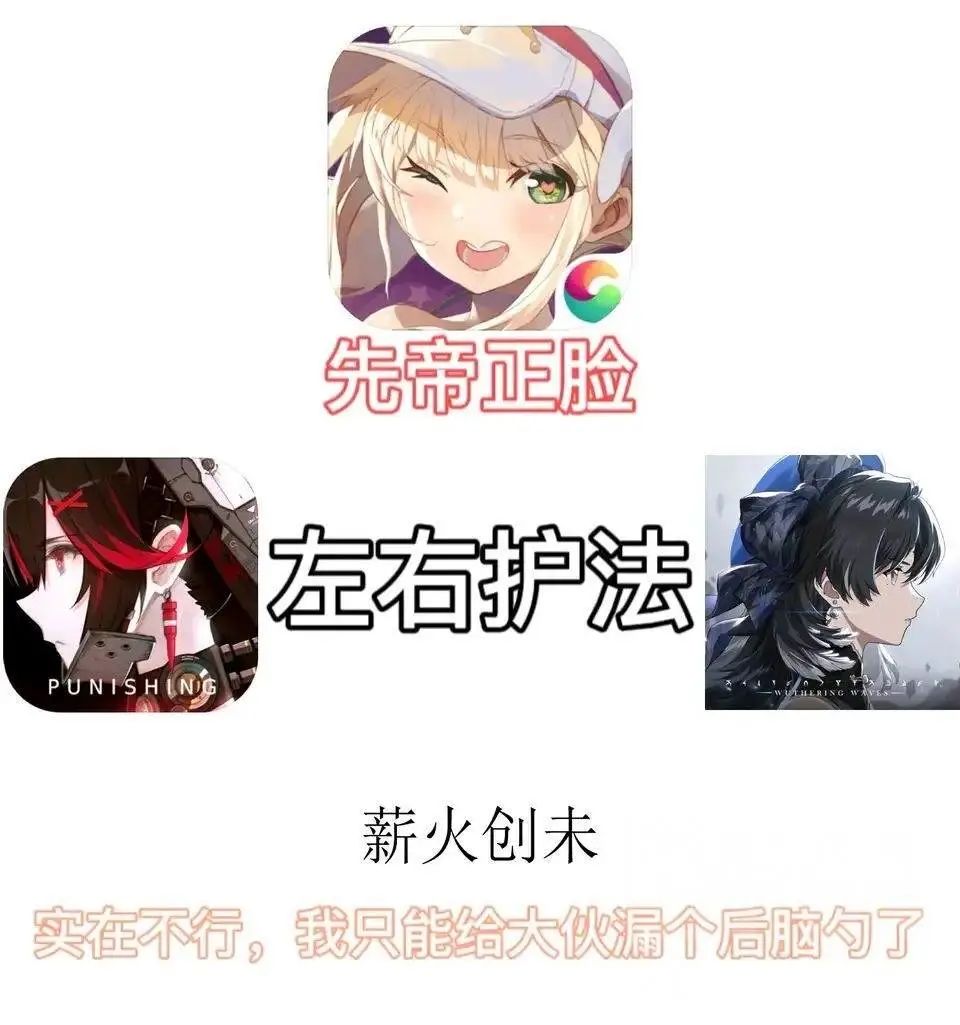
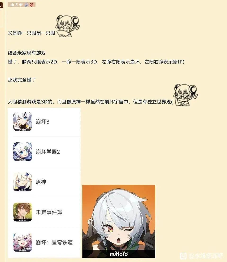
As for MiHoYo's new product "Zero Zero", even before the trailer was released, netizens had already "solved the case" because of the character's expression on the icon: because the icon's left eye is closed and the right eye is open, it must be using 3D game with new IP.
These discussions may sound ridiculous, but they seem to make some sense, which aroused my curiosity: Is there any secret in the icons of these two-dimensional mobile games?
01 Two-dimensional game icon, a world of "looking at faces"
Obviously, today's two-dimensional game icons are almost a world of "face-based". If you enter any game store and choose the two-dimensional category, you will see hundreds of "photo stickers" of characters with various expressions and postures. ".
Of course, the reason why everyone chooses to use character faces as icons is also easy to understand: for two-dimensional games, the level and style of character art is one of the most critical factors in attracting users, so simply displaying the character on the icon will It's just a natural choice.
Although the faces of handsome men and beautiful women are used as icons, after browsing hundreds of faces, I found that there are still many differences between them.
For example, the difference in expressions. If we classify the expressions of the icons, we can probably distinguish them into "serious face", "smiling face" and "thoughtful face".
If the character in the game icon has a "serious face", it may mean that the world in the game can be saved: this world is in some big trouble, but as long as we resist firmly, everyone can still win, so the characters are fighting tenaciously .

Part of the "serious face" icon
And if the character in the game icon has a "thoughtful face" or a "forced smile", then the world in the game may have reached the edge of hopelessness: a huge disaster has destroyed the civilization on this land. The confused surviving humans (or other species) can only wait for the player's leadership.
The icon of this expression may be the most famous one from "Arknights". Perhaps it is because this kind of serious and melancholy expression makes the game theme look high-end. As apocalyptic themes become more popular in the domestic market, more and more beautiful girls are worried in the icons. .

Part of the "thoughtful face" icon
But in general, the beautiful girls in most of the icons are still in a happy mood. "Smiling face" is the most common choice for icon design, but because of the universality of the smiling face, it is difficult for you to determine what kind of world is hidden behind this smile. The icons of "Honkai Impact 3" and "Clover Theater" look like they are smiling happily, but the stories behind the two games are completely different.

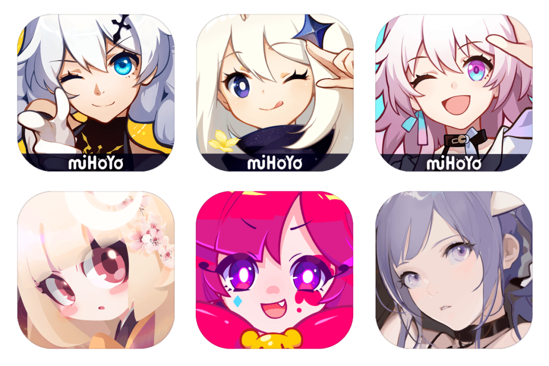
When it comes to the icons of "Honkai Impact 3", we have to mention two very special types of "smiling faces", which I call "closed eyes face" and "open mouth face" - the characters are either facing the player wink, or open your mouth cheerfully, or even both.
MiHoYo's icons are good at this. Starting from "Honkai Academy 2", "Honkai 3", "Genshin Impact" and the just-announced "Zero" are all like this. At the same time, including "Onmyoji" ", "Azur Lane", "Princess Connect Re:Dive", "Jockey Girl" and other popular products also use this type of expression. Therefore, there is occasionally a myth that "icons with eyes closed and faces open can help products become hits".
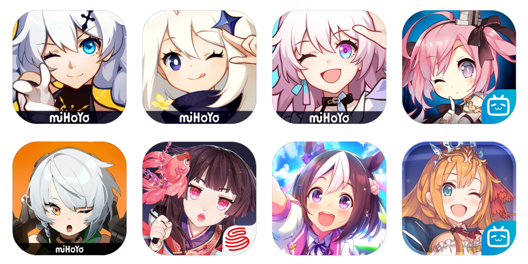
"Close eyes/open mouth" luxury lineup
In addition to expressions, the appearance of iconic characters also seems to have some tricks.
Based on my cursory observation, both black-haired and white-haired characters are pretty popular choices, with white-haired characters having a slight edge. There are not only the several miHoYo products and "Clover Theater" just mentioned, but also a large number of well-known movies such as "Girls' Frontline", "Arknights: End of the World", "Heaven and Earth Tribulation", "Food Talk", etc. Two-dimensional products.
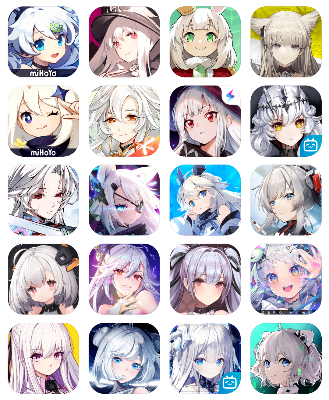
There are just too many gray hairs...
In addition, pink hair is also popular, such as "7 Days in Forever", "Honkai Impact: Star Rail", "Azur Lane" and "Ash Front" and so on.

The degree of pinkness varies
Considering that so-called white hair is often not pure white, but white with a certain color cast, if the standard of white hair is lowered, some of the pink hair just mentioned, as well as "Blue Files" and "Fantasy Tower" , "From Stardust", "Backlight" and other games' iconic characters can basically be included in the category of white hair.

Don’t be so strict, gold can also be a kind of white
Why are there so many white hairs? There may be traces of this reason. As early as four or five years ago, there was a saying in the two-dimensional circle that "Chinese people are all white-haired". Whether it is animation, games or virtual idols, white-haired characters are generally welcomed by domestic users. And when this stereotype became a hot meme, it intensified the user group's attention to the element of "white hair".
Moreover, in the design of two-dimensional characters, hair color is often bound to the character's personality, such as blonde and tsundere characters, black and straight characters, royal sister characters, pink hair and black belly characters, etc. High-brightness white hair is most often associated with positive characters such as kindness and positivity. Pure white hair carries implications such as "spotless" and "pure and noble", so it is more popular.
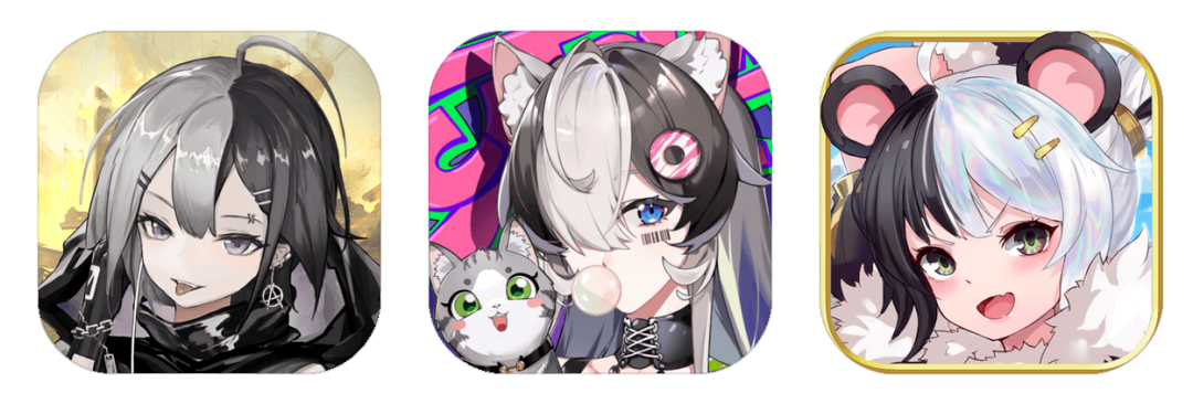
Yin and yang hair colors are also very popular recently
02 Considerations beyond “face”
In addition to the appearance of the character, the identity of the iconic character is also an interesting topic.
If the player is called the protagonist, then the most common iconic character is often the "first supporting character". She is often the player's assistant/guide, and is also the main character in the story.
Since this character has a strong presence in the story, many resources will be tilted towards him. Using such a representative character as an icon also allows the game to capture some potential users who have "seen the game characters but don't understand the game."
But we can also find that the iconic characters of some games are not that "first supporting role". Especially "ship-like" mobile games, whether it is the ancestor "Kantai Collection", or "Kantai Girls R", "Girls Frontline", "Steel Waltz", "Azur Lane", etc., because there is not necessarily an absolute first in the story. There is a supporting role, so there are more choices, for example, due to the appeal of the character artist, the charm of the character, etc.; maybe it is also because the first supporting role is not Bai Mao, so you need to find another Bai Mao to take over.

Icons not only have roles, they usually also need to have a background. The design of these background panels also highlights a "fine-tasting" aspect.
First of all, we can find that in the two-dimensional mobile games in the early years, there was a common preference to use scenes as background boards, but in recent years, the trend has become a preference for solid colors, with at most some decorative textures added.
Not only that, as the two colors with the largest proportion in the icon, the relationship between the main color of the character and the background color is mainly a contrasting relationship or a harmonious relationship. The two design ideas are evenly matched, but for now, the coordination faction has the upper hand.
Eagle Point is one of the manufacturers that likes to use color coordination to match icons. Three of their games all use this coordinated color scheme, giving the entire icon a unified tone.

MiHoYo's idea of solving problems tends to "eliminate the problem": as long as the face is big enough, the background is not so important. Products with similar ideas include "Elastic Jelly", "Meowth Run", "Mobile Sentai Battle", etc.
Cover everything with your face
In general, whether it is to coordinate the colors or directly eliminate the background color, the purpose is to narrow the hue range as much as possible to make the icon look more vivid and attract attention.
From this perspective, it may also explain why white hair is so popular among icons. White hair with a certain color cast is similar to the facial skin color and can be unified with the background color, thereby playing a transitional role.
Nowadays, the so-called contrastists are actually reducing the number of colors. If the background color contrasts with the hair color, it will often coordinate with the eye color.
Now that everyone's icons are moving in the direction of reducing the hue range, the choice of warm and cool colors has become a new problem. But in general, colors are often just like expressions, rendering the atmosphere of the game theme. Therefore, with the popularity of apocalyptic themes, "cold color + white hair + thoughtful face" has become a popular icon design.

But another street style that is gradually becoming popular nowadays prefers to use bright warm colors to express the trend and vitality of the street.

Of course, it may still be open to question whether the above trend characteristics are really established. In addition to character modeling and story themes, icon design may also be motivated by considerations of other product features. But the ultimate goal is to differentiate among competing products and attract more users.
What do you think are the trends in icon design for 2D games today? What kind of icon design attracts you more? Please leave your comments below the article.
Articles are uploaded by users and are for non-commercial browsing only. Posted by: Lomu, please indicate the source: https://www.daogebangong.com/en/articles/detail/zuo-yan-bi-you-yan-zheng-zhe-yi-ding-shi-3D-yuan-chuang-IP-you-xi-er-ci-yuan-you-xi-tu-biao-bei-hou-dou-cang-zhe-shen-me-mi-mi-pu-tao-shi-dian.html
 支付宝扫一扫
评论列表(196条)
测试