
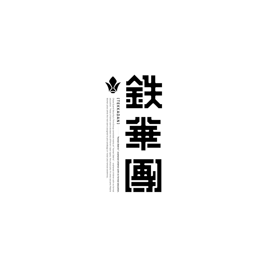
Font design works Design Director
Tokyo, Japan
As a kind of square character, Chinese characters follow some basic rules in the glyph space in order to achieve visual balance, which can be simply summarized into three structural expressions: tight at the top and loose at the bottom, thin horizontally and thick vertically, narrow on the left and wide on the right. I will not elaborate on these rules here, but what needs to be emphasized is the focus of the font.
The center of gravity of Chinese characters is different from the geometric center of gravity that we usually understand. The center of gravity of a font refers to the center point of a word that attracts the most attention, also known as the visual center of gravity. In short, the visual center is located above and to the left of the geometric center. For example, in a square meter grid, the intersection of the diagonals is the geometric center, while the true visual center is slightly to the upper left.
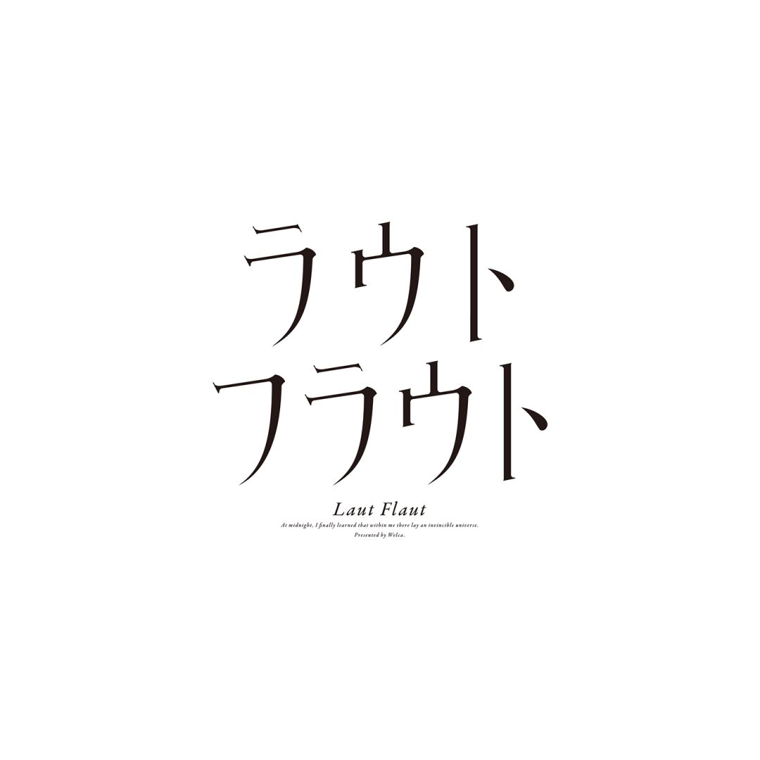
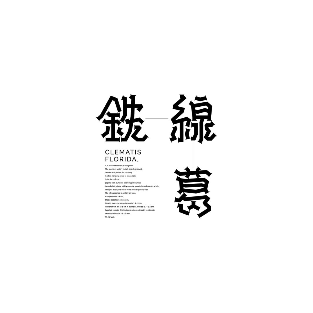
Articles are uploaded by users and are for non-commercial browsing only. Posted by: Lomu, please indicate the source: https://www.daogebangong.com/en/articles/detail/zi-ti-she-ji-zi-zhu-shi-jie-jue-fang-an.html

 支付宝扫一扫
评论列表(196条)
测试