Okay, let’s stop talking nonsense and start today’s font design tutorial. Today I will mainly teach you 8 ways to make calligraphy. Let’s take a look at the general framework of this tutorial.
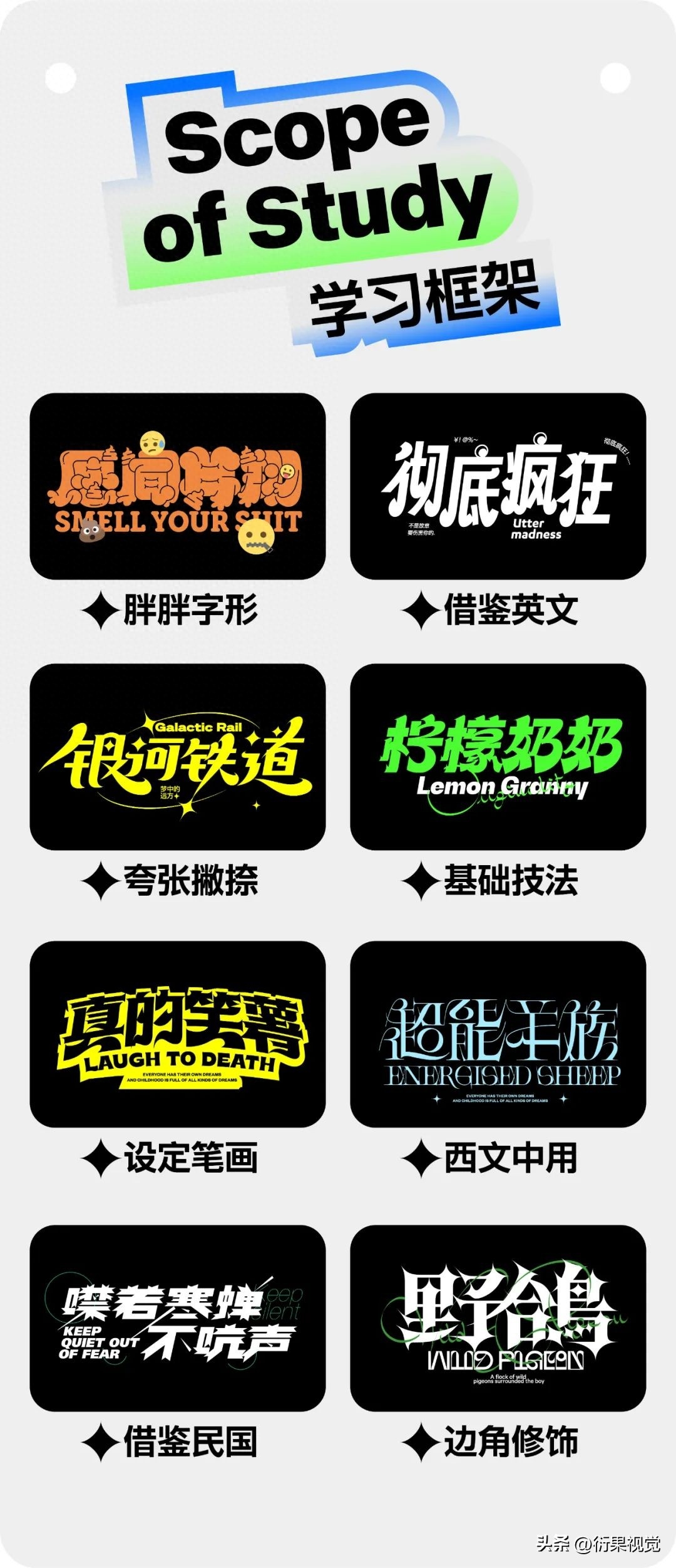
Not much No nonsense, let’s demonstrate and explain them one by one.
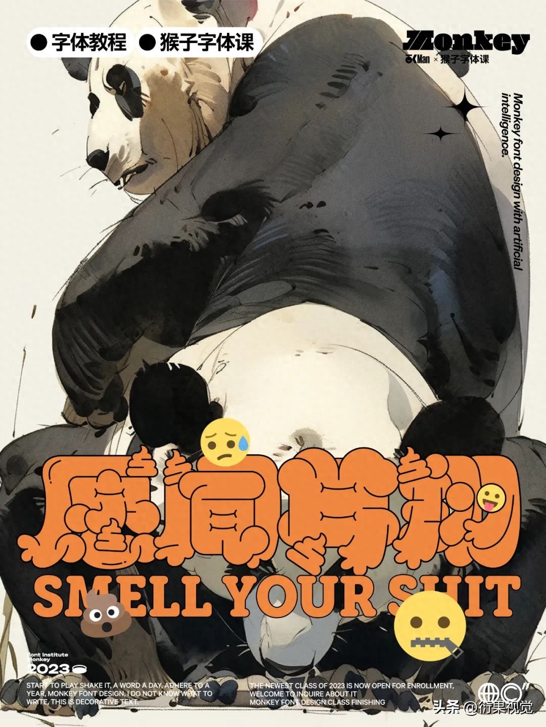
First of all, we Let’s break down the characteristics of this kind of character. As the name suggests, the character is very fat, so fat that there is no white space inside, and the strokes are relatively rounded.
There are some strokes inside Interspersed on the top, and some thin lines are used to express strokes to ensure recognition.
Finally, you can ensure On the basis of recognition, add some changes in styling, or even incorporate some features and elements to strengthen the theme or concept.

Then the next step is official Entering the practical part, orderly analysis can ensure that every step we follow is controllable. The most fearful thing about writing is that you will not have a clear mind when writing. In the end, you will not be able to control the final result. Don't have too many ideas. The more ideas you have, the better. The more confused my mind is, we are not briquettes, so why are we so pretentious?

Select a circle When it comes to structural reference characters, any one will do, they are all similar, try to choose a thicker one.


Then use the Pen Tool Start drawing the line and connect it with rounded end points and rounded corners. The purpose of this step is to make sure that there is as little negative space as possible inside the glyph. Pay attention to try as much as possible. It’s okay to miss it a little bit. Pay attention to aligning the outside with the bottom words, otherwise the fonts will not be the same size when finished.


It looks like one Shit, right... It looks like that to me, but it doesn't matter. Let's copy it, expand it, and add a white stroke to all the strokes in the whole, so that we can have a rough identification, but it's still It's a shit, but the recognition is still not high enough, so the next step is to deal with this.


Continue to copy Grouping, this step is the key, by adjusting the before and after relationship of the strokes, dealing with the interspersed relationship between the strokes, and adding some thin lines to express the strokes.
Adjust the before and after relationship+ To deal with interspersed relationships, some strokes can be merged appropriately.

In some spoken words Add thin lines inside and make some more intersperses between strokes to further enhance recognition.


Identification is almost enough It's done, but it doesn't look good, so we can change some local shapes, add some curves or add some changes at the beginning and end of the stroke.


Finally change the whole A color scheme, and you can add some small decorations in some corners.

What about this method? It does not directly use English letters to spell words, but it needs to be more flexible and has a wider scope of application. This is actually related to the sentence I mentioned in the method above, that is, it does not require so many ideas, what needs to be done Well, just grasp a core point and try it out.


Like what I was looking for As for this English library, its features are relatively complex, with various turns, rounded curves and sharp corners, etc. If you don’t make any modifications, it will be fine, but it may not be very friendly to students who are easily confused. There are too many shapes, too many details, too complicated.


So we can extract It doesn’t take a lot to bring out one of his characteristics for our use. Generally speaking, one or two are fine, and three are also fine, but the more they are, the more difficult it is to control.
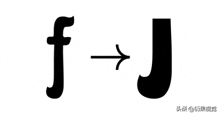

We can Make a second adjustment on the basis of this step. This step mainly depends on the feeling you want to express, or try more, and finally choose the one you are satisfied with.
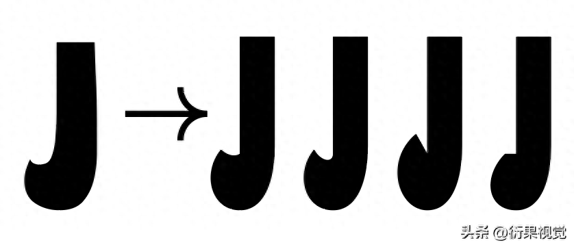

Choose what you are satisfied with A feature can be built by combining the bottom characters. Here we are doing a boldface, so just choose Siyuan Black to make it. I have raised some characters here.


You can see, Except for the characteristic strokes just extracted, the other parts are basically the same as the bottom characters. There are no changes. Some small dots replace circles. This is a relatively normal process and not worth mentioning.
The same is true, In fact, this method can be applied to various references, not just English, and everyone can spread it out more.

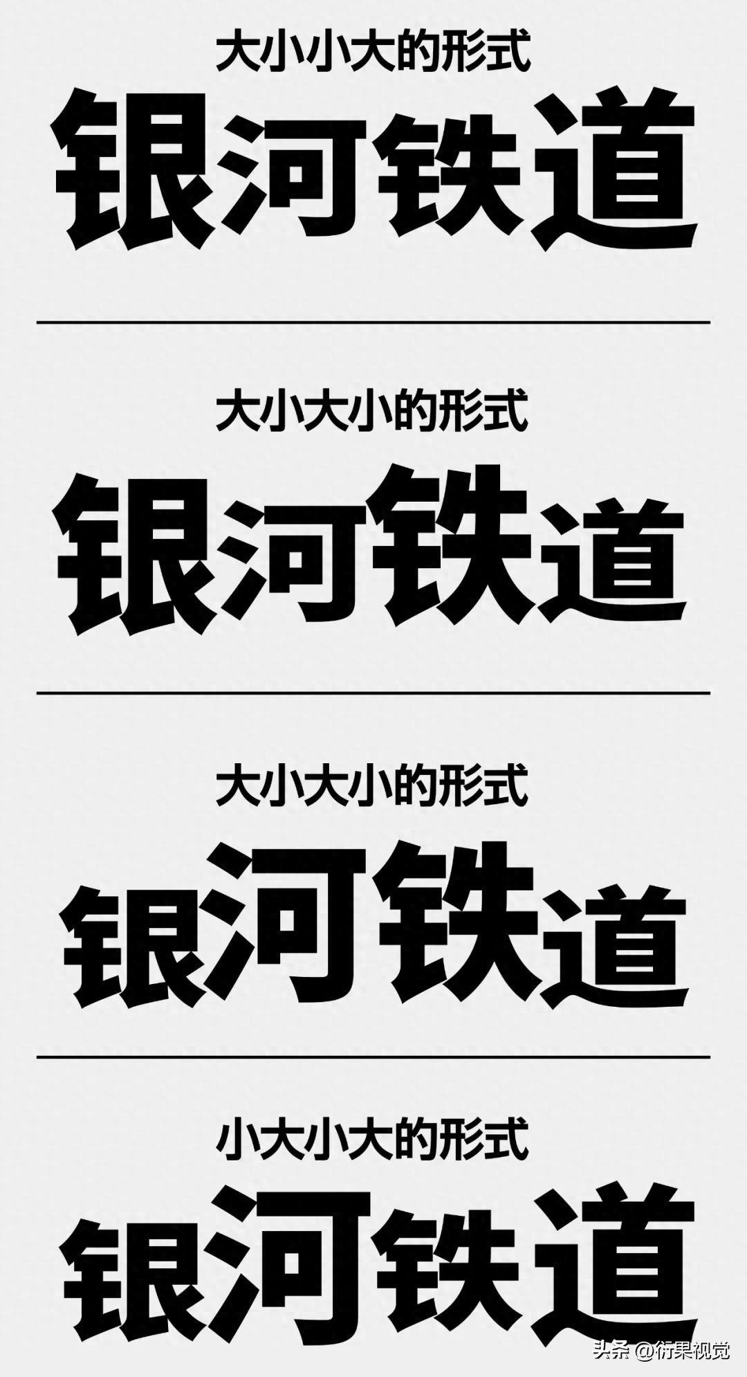
The third method Well, it's mainly an exaggeration technique, so here it's basically an exaggeration for strokes like nip.
This trick is very Commonly used and relatively easy-to-use ideas can often bring about strong visual effects, and are very suitable for making some headlines. By making different shapes of strokes, or different degrees of exaggeration, different effects can be obtained.

If you choose to wait For large characters, you don’t need to do this step. You can start by directly adjusting the characters. However, we can also adjust the character groups appropriately. What I do here is to make the middle two characters a little smaller and the outer two characters slightly smaller. Larger, this will give the whole a sense of rhythm and be more flexible. Of course, it can also be set in more different forms.

Choose what you are satisfied with A group of letter forms, start making some sketches with a brush to try to make exaggerated parts.


Everything here The strokes can be made more conventional, because the strokes have been highlighted, so there is no need to make redundant designs. The more features there are, the more chaotic it will be.


Basic structure and strokes Everything has been set up, and even the general idea has been tried out through sketching, then you can start spelling.


Like this group The characteristics are relatively elegant, so here we combine this curved outer frame and add a little star shape related to the theme.


This method is relatively simple , but it is also a method with a relatively wide scope of application. It mainly completes the glyphs by setting the overall stroke characteristics and shape.

What is done here is still It is a bold body, and the setting of the strokes is not very complicated. The horizontal strokes are slightly thinner, and the horizontal strokes are slightly thicker. In fact, there are not many complicated changes. It is just a form that gradually becomes thicker from top to bottom. Although it is relatively It is common, but it is still a very useful way to deal with it. Because the overall stroke settings are relatively simple, a lot of decorations are added to enrich the whole.
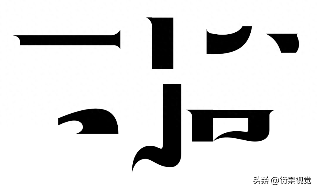

This method is relatively simple , there are no fancy steps. As long as the stroke settings are sufficient, you can basically do it directly. The strokes here are also relatively common forms. You can basically understand it by reading some references.


Because of this group of words It's relatively simple, so we can add some effects to the whole thing to deal with it. It doesn't need to be too complicated. Some of the transformations and techniques that come with AI are basically enough to satisfy us.
Use the Free Transform tool (shortcut key E), perspective distortion, drag the upper right corner to shrink inward.

Select the font again, Effect-Deformation-Arch

Select the font again, After expansion, then add text layout to facilitate our subsequent production steps.

Select the whole object -Path-Offset path, the purpose of this step is to add a background color that conforms to the outline of the whole, and at the same time replace the color of the background color.

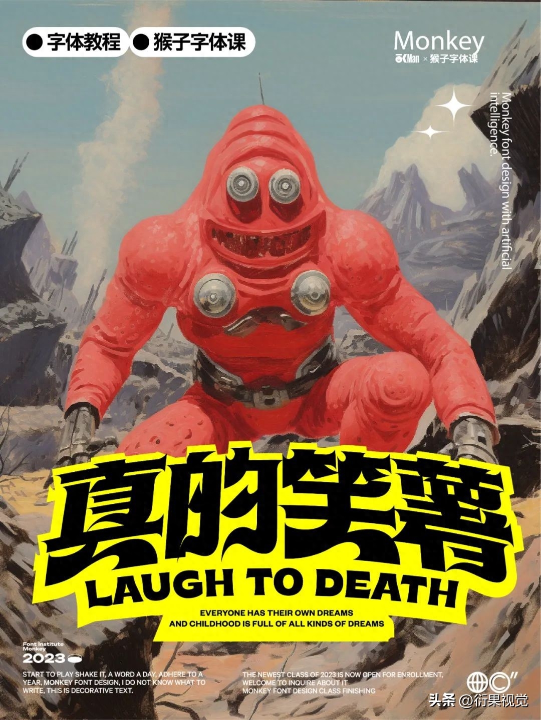

The fifth method Well, it’s somewhat similar to the previous one, but the focus is on different knowledge points. Here we mainly use some common basic techniques. What are basic techniques? They can be used in various glyphs and belong to a general purpose. , basic does not mean bad.

First you need to build A basic glyph, an ordinary, featureless glyph is enough. Just set the thickness of the strokes.


Continuous strokes are very It is easy to use and one of the most commonly used techniques. The form of continuous strokes can be tried based on our usual handwriting habits, and then replaced with the previous basic glyphs.
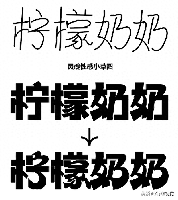

There are generally three cuts The first one is used as a pure decoration without any other practical function, the second one is to express some meanings, such as reflecting the sense of speed, or the expression of some competitions, events, sports, etc., and the last one is It is to solve the problem of uncoordinated negative space in the font or excessive grayness in a certain part. All in all, this is a good technique, easy to use, and I love using it.
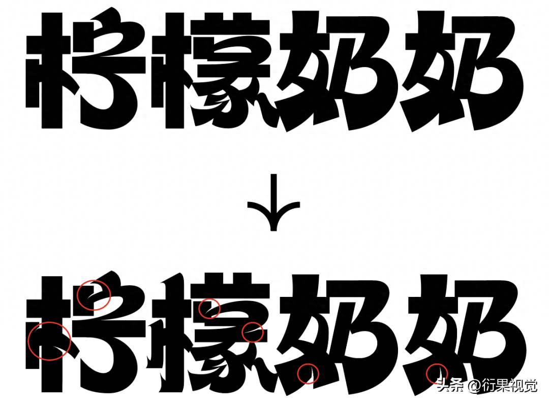

Finally, you can Add some modifications to the corners to make the overall effect stronger. This kind of modification is generally used to enhance visual expression. As for expressing meaning, it also has a certain effect. Add decorations of different temperaments according to different meanings of words. .

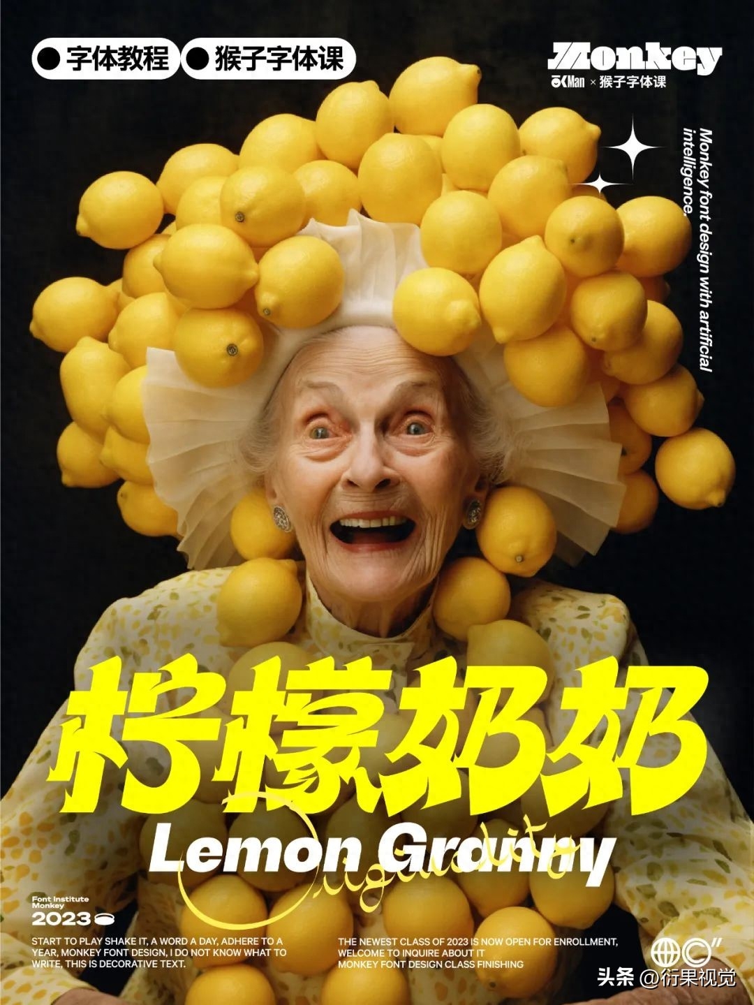

The cliché method, It is also very easy to use. Why is it easy to use? Because it is not difficult to use at all... It belongs to the calf of the third class, it is not an ordinary cow!

The selection here is A rather fancy English word, which has been very popular in the past few years. You may have seen it many times. It is a goat farting like a sheep. It is both foreign and coquettish. Let’s not talk nonsense for now. Let’s combine it with our words. Find a suitable letter or part of a letter, and then sketch the shape and combine it with the underlay to try the effect.
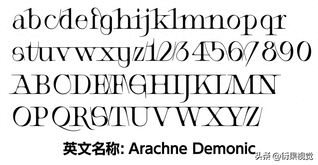

Maybe everyone is here It feels a little too fast, doesn’t it? It’s okay, who am I! I am fooling the monkey! When visiting a grave, he burns newspapers to show off a fool...! @%*&~¥
No kidding, Let me break it down word for word using a bullshit color that is invincible in the universe and rare in the world. We pay attention to people.

How about one After a while of dismantling and analyzing, do you feel more confused? If so, read it again. If you look carefully, you will find that it is very detailed.

Sketch pull out pad Below, just operate the English letters and you're done.


Second to last Okay, this time we are talking about the characters of the Republic of China. In fact, the characters of the Republic of China are not a certain type of glyphs, but a period. Therefore, there were many excellent font works during that period. The artistic calligraphy we make now are basically derived from Here is a selection of the great creations of that period.


Since the Republic of China characters are basically They have all passed the copyright protection period, so for something like this here, we can directly cut out its strokes. It is a small loophole, but other things cannot be done. Don't be ignorant and cut out the pictures. other words.


This group of words The strokes are actually very simple, but their characteristics are very distinct. The most important thing is that the strokes here have two thicknesses. We need to use both thicknesses when we are doing it. Just pay attention. Overall coordination is enough.


Finally, give Just make a little extension of the strokes, add a simple layout, and give it a tilt, and it's basically done.
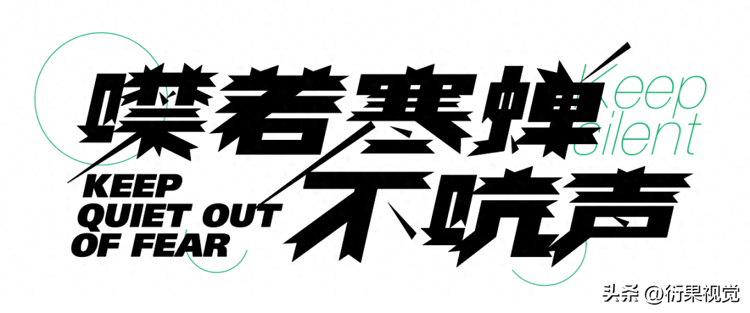
The last one is very simple , in fact, this method is also a kind of basic technique, but this effect is also a relatively strong form, so it can be discussed separately.

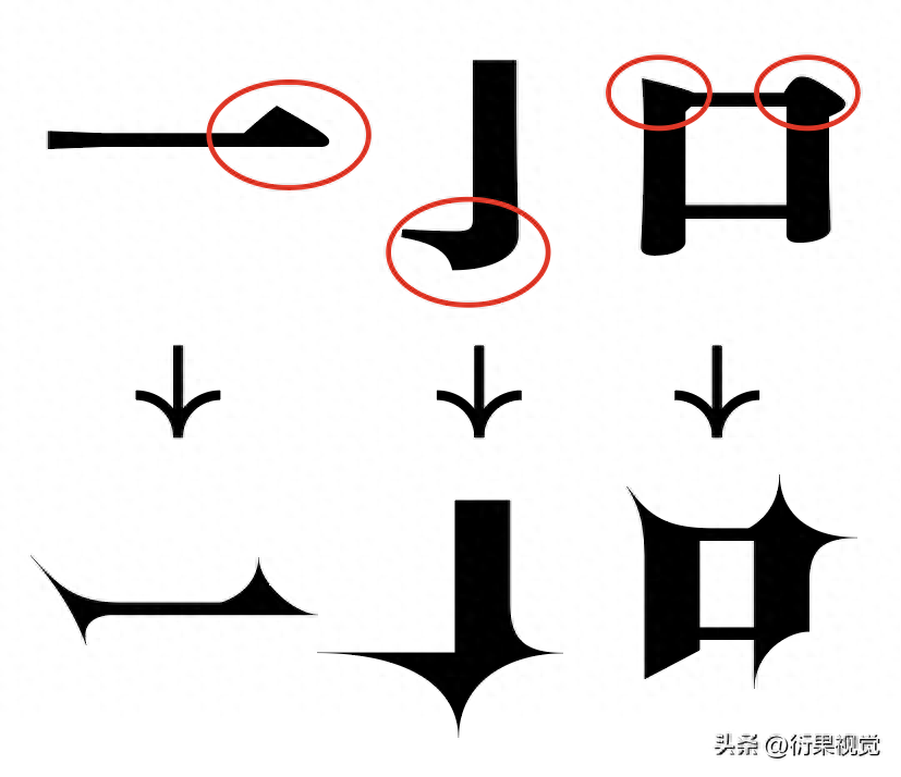
This is not required If there are too many skills, just do it and it will be done. The specific method is to enlarge the corners of Song Dynasty. However, there are certain simplifications. Let’s talk about it in detail with the following case.

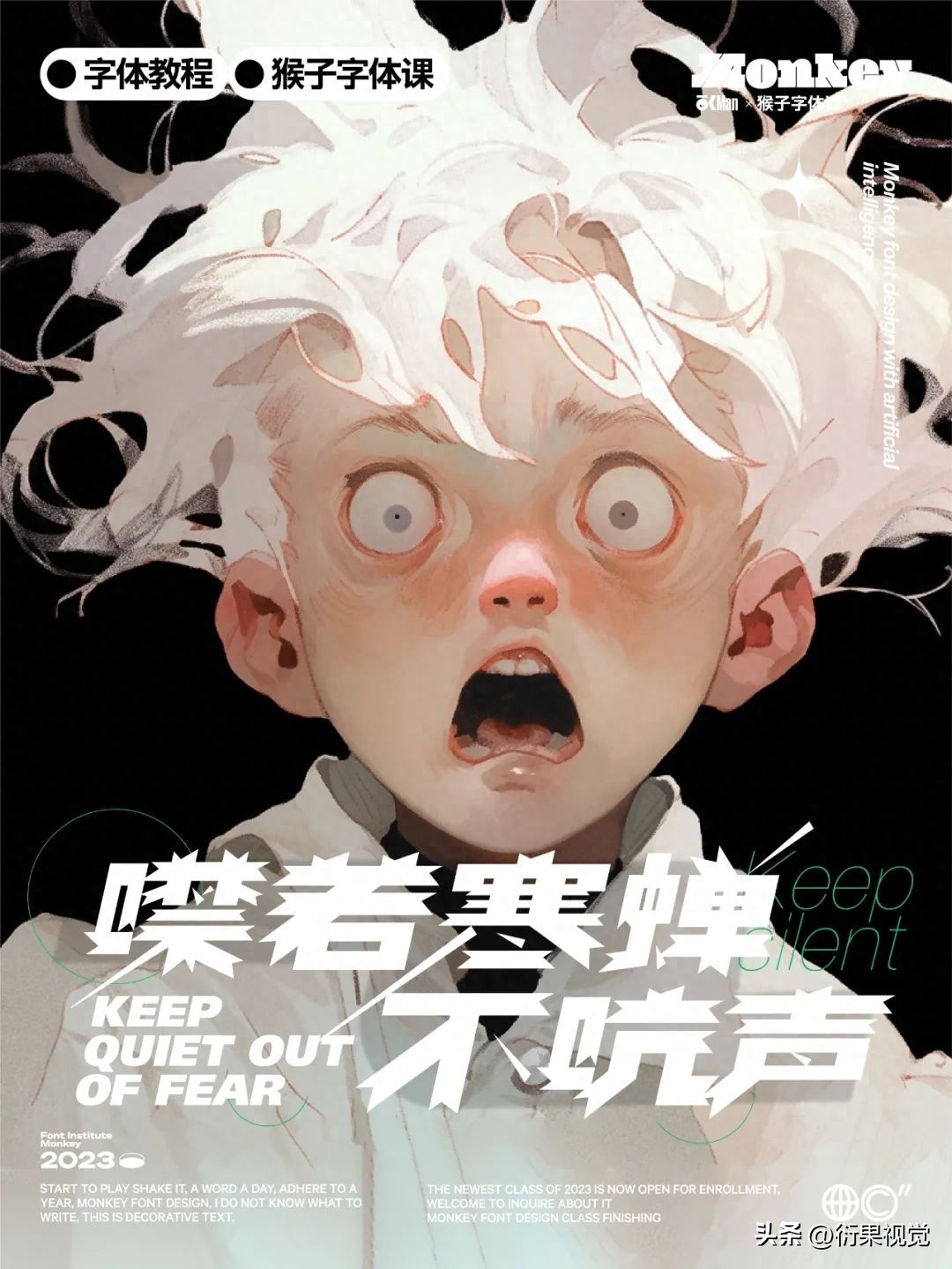
The main thing here is The triangle at the end of the horizontal pen is exaggerated and has a sharper shape, somewhat similar to the shape of a star. The other positions are also treated in the same way, without too many difficulties.

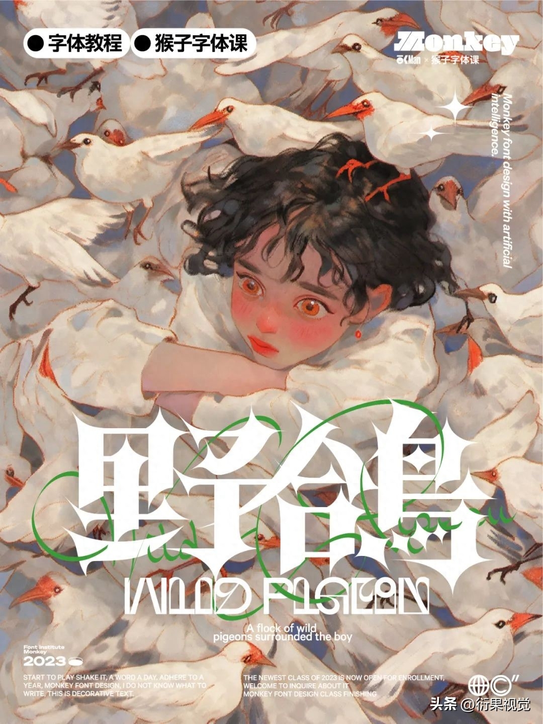
The font is relatively bold That kind, so adding this kind of squiggle can further enhance this temperament, but be careful not to overlap it with the font too much. You can make some appropriate contextual relationships to make the font recognition we make higher.


Eight cases, Eight methods are brought to you, I hope it will be helpful to you.
Articles are uploaded by users and are for non-commercial browsing only. Posted by: Lomu, please indicate the source: https://www.daogebangong.com/en/articles/detail/zi-ti-she-ji-ba-zhong-fang-fa-jiao-ni-zi-ti-she-ji.html

 支付宝扫一扫
评论列表(196条)
测试