For example, to write the following type of font into an aesthetic and good-looking character, you can start from several aspects.
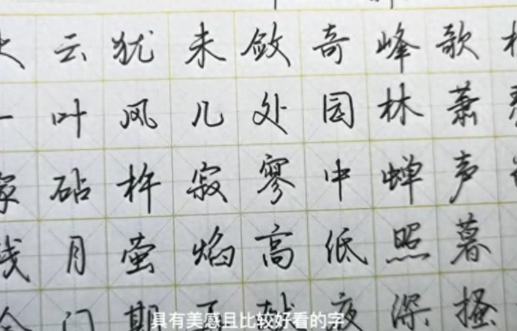
The first aspect is the most important way, which is the lines. The lines must be smooth, smooth and smooth.
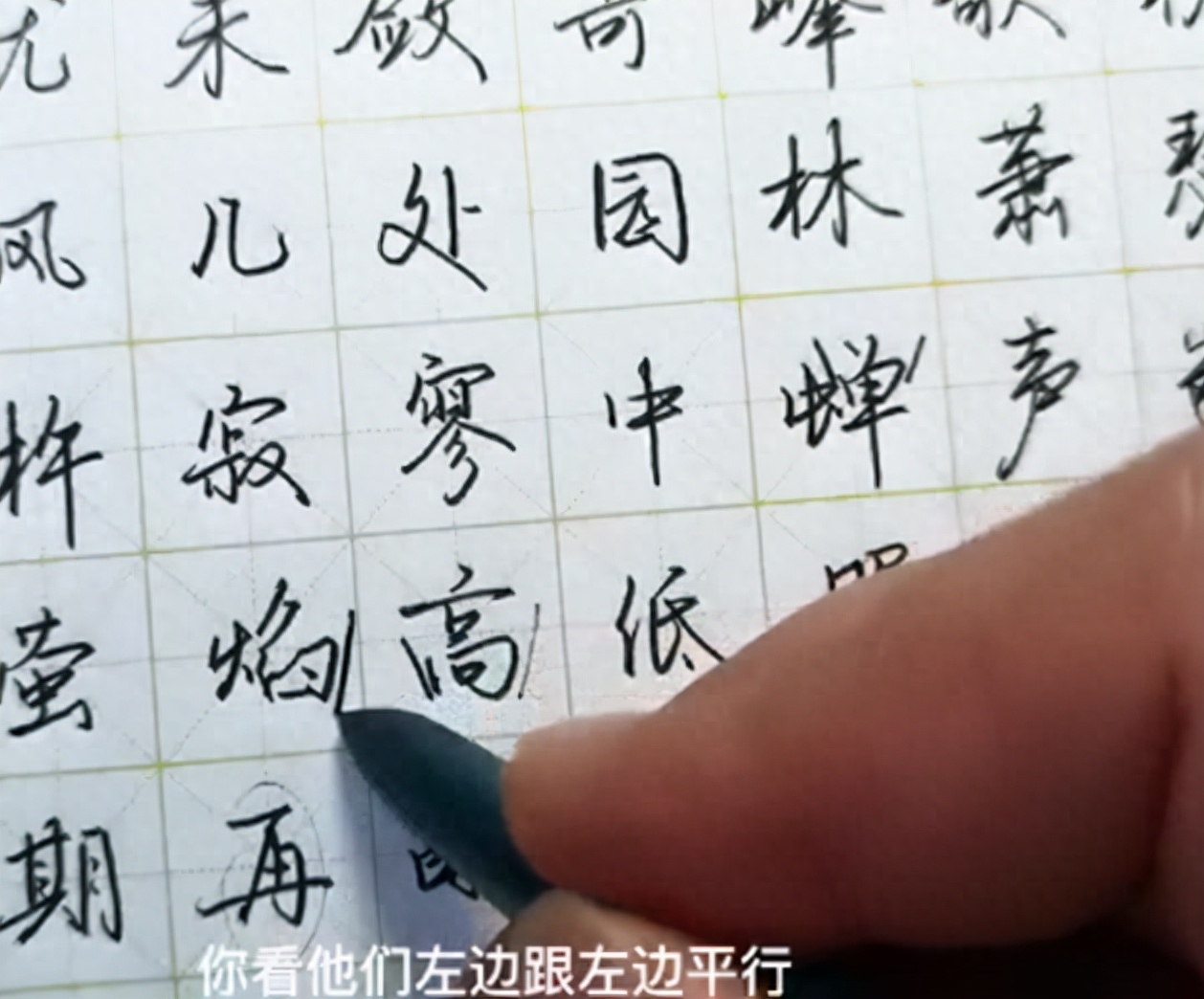
The second is the direction: for example, if a vertical painting is in the middle, it should be written vertical, and other strokes of the same type must be vertical and parallel. Relationships are either essentially vertical or parallel.
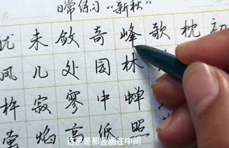
There are two situations for vertical paintings on both sides. The first one is straight, the same is done when folded horizontally, and the folded one is also vertical.
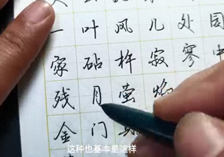
One is oblique, with the left side parallel to the left side and the right side parallel to the right side. The strokes are unified horizontally and vertically, and the turning method is unified. This is the unified stroke size and direction.
The third part is the unification of writing techniques such as starting, transferring, closing, and hooking.
There are many ways to start a pen, and there are many ways to start a pen. However, among hard pens, there are relatively few ways to start a pen, and it is relatively easy to unify. Therefore, how to unify the beginning of a pen, we must have a fixed way, the turning point, and how to come out. How to turn the hook, how to release the hook, and the unity of the movements.
The fourth part is the distance between strokes, which controls the size of the characters and is also related to the length of the strokes.
In each of our characters, the gap between the strokes should be 60% close. What is close? For example, in the part with fewer strokes, there will be a gap. There are not many strokes. This gap , the gap with the few strokes should be appropriate. Those with relatively more strokes have their own gaps, and they also have a specification. Therefore, the number or complexity of similar strokes is different, and the angle gaps between strokes are different. Generally speaking, it should be more than 60%, which is a comparison. unified.
This is our self-contained method. Of course, the most important thing about the self-contained method is the unification of writing movements such as specifications, direction length, and details. You can establish your own unique font style.
Today’s tips for practicing calligraphy are shared here. If you have any questions you want to know, please comment.
Zhang Beimo's hard pen is highly efficient and makes calligraphy practice easier
Articles are uploaded by users and are for non-commercial browsing only. Posted by: Lomu, please indicate the source: https://www.daogebangong.com/en/articles/detail/zi-ti-ru-he-qu-xing-cheng-mei-guan-tong-yi-de-feng-ge.html
 支付宝扫一扫
评论列表(196条)
测试