
In the previous two issues, we introduced the style characteristics of different fonts and their application effects in design cases. When designing, you can choose the font type based on factors such as the target audience, project tone and industry attributes to ensure that the font matches the layout style. After selecting the font, you should follow the principles of limiting the number of fonts, establishing visual hierarchy and unifying style and temperament to match the font. In this issue, we will deepen our understanding of these principles through case practice.
The first case is a promotional poster design for a fitness club.
Case Analysis
Before designing, refer to excellent sports poster design works and analyze their font selection and matching, as well as picture selection, color matching, spatial composition, etc.
Font selection and matching
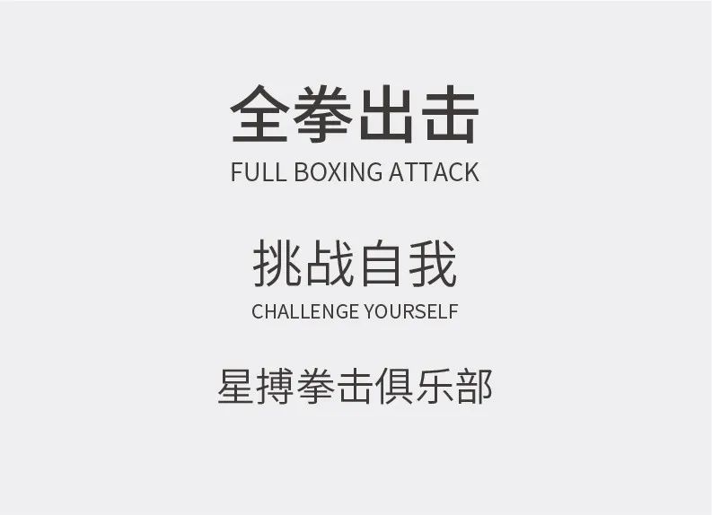
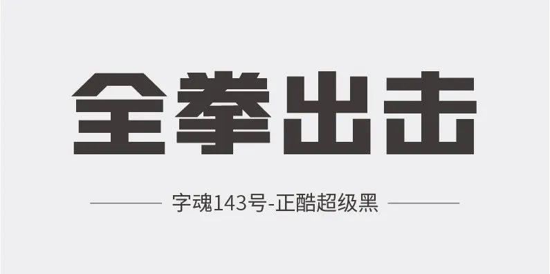
Boxing is a masculine sport, so the main title should be in a bold, tough and powerful black font. In this case, the main title is "Zihun-Zhengku Super Black", which has thick strokes and sharp edges.

The English font "Champion" was chosen, which is characterized by extremely thick strokes, tight spacing, and narrow internal space, which conveys a strong sense of power and is commonly seen in sports events.
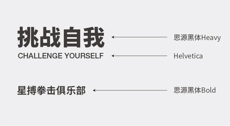
The secondary title and club name use "Siyuan Hei", and choose the "Heavy" and "Bold" fonts with thicker strokes. The English version is paired with the “Helvetica” font of a similar style.
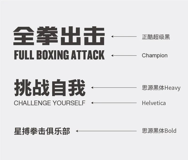
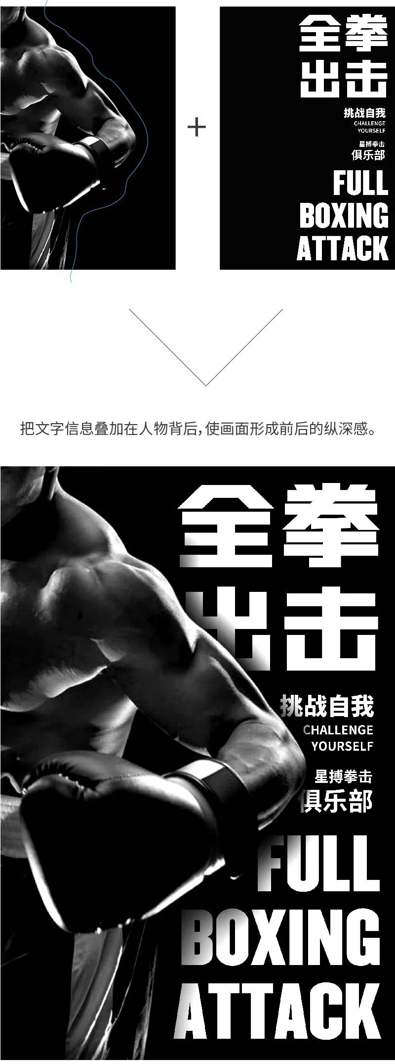
Use font size and thickness to distinguish between primary and secondary and establish visual hierarchy.
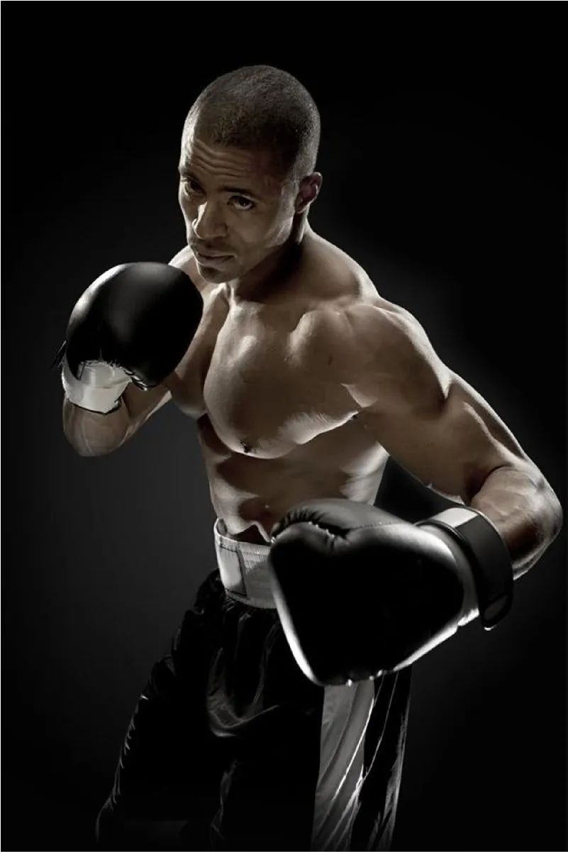
Image selection and processing
When selecting a matching picture, search for the keyword "boxing" and choose a picture of a boxer with good visual effects. The oblique composition of the picture increases the dynamic of the picture, and the movements of the players show the confrontation and power of boxing.
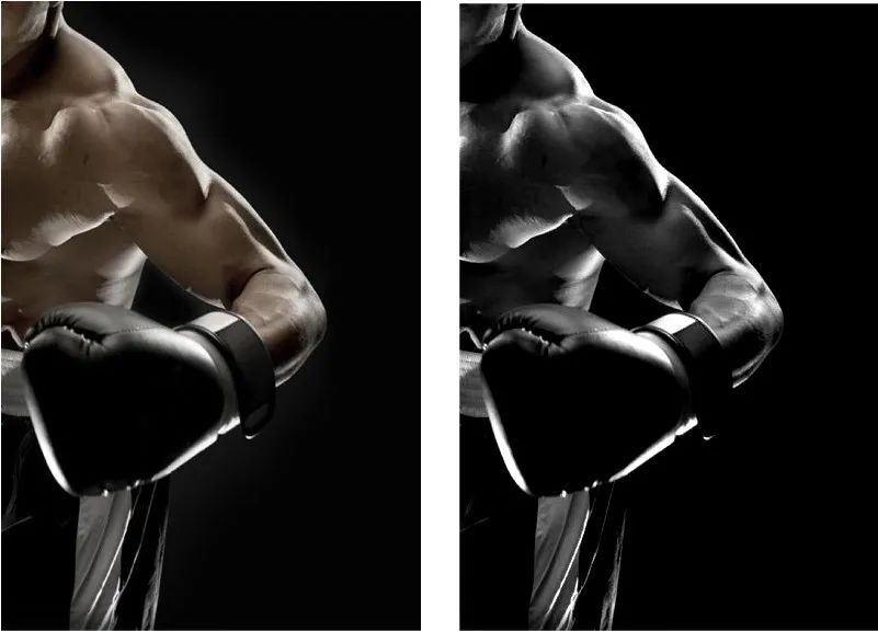
Place the image on the left side of the screen, with full proportions, leaving space on the right for text information layout, forming a left-right composition. Adjust the image to black and white and enhance the contrast to enhance momentum and texture.
Articles are uploaded by users and are for non-commercial browsing only. Posted by: Lomu, please indicate the source: https://www.daogebangong.com/en/articles/detail/zi-ti-da-pei-shi-cao-yan-shi-jiao-cheng-shang-pian.html
 支付宝扫一扫
评论列表(196条)
测试