
Text/Suo Xiaohong and Qiao Jinglu
As a tool of visual communication, fonts have the function of conveying emotions and can give people a feeling of beauty. Excellent font design can make people unforgettable, achieve the purpose of visual aesthetics, and obtain a good psychological response. 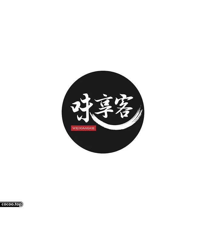
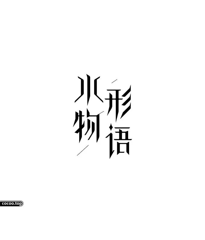
From the perspective of graphic design, text is a visual graphic symbol that spreads information. The graphic qualities of text have been said to have the same origin as calligraphy and painting in China since ancient times. Therefore, the pictographic and symbolic nature of Chinese characters have graphic characteristics. 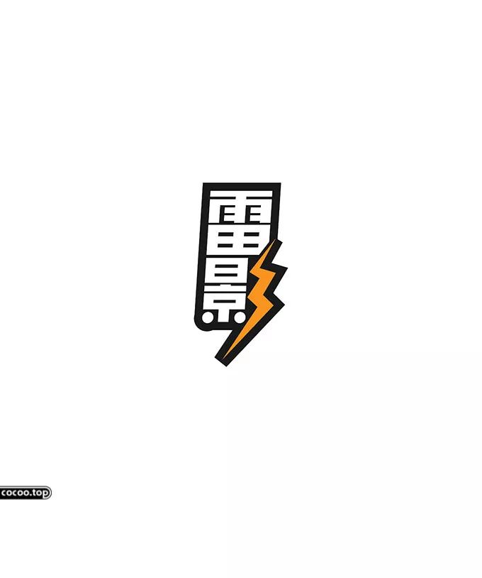
Font design considerations
①The position of the text must meet the overall requirements. There should be no visual conflict between text and text in the picture, and overall factors must be taken into consideration. Otherwise, it is easy to cause confusion in the visual order on the screen. This is a very subtle problem, and a single pixel difference may change the taste of your entire work. 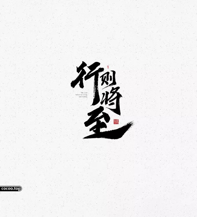
②When designing the text in the plane, you must take into account the various realistic factors that the work faces and the different requirements for the text. Generally speaking, creativity should be highlighted to enhance visual appeal.
③ Designers should combine text design elements with local culture to achieve more and better communication with the audience. 
④In design, it is necessary to choose different fonts according to different contexts and needs. In addition, the horizontal, left, back, fold, hook, etc. of the characters can all reflect the charm of the image. Graphic designers should be able to find the best fit of fonts in design creativity in order to achieve unique charm. 
⑤ Avoid text becoming a decorative element and losing its original meaning. In graphic design, it must not only exert its existence value, but also form a perfect whole. When designing, the design of the text must not be separated from the design of the advertisement. If the original meaning of the text is ignored for the so-called beauty, it will only be superfluous. 
⑥In graphic design, text should avoid unnecessary complexity and clutter, and avoid designing for pure design. The main function of text is to convey various information to the public and give people a clear visual impression, so the purpose of text design is Improved readability is one of the key aspects of creativity. Recommended reading: The shape of the font is beautiful! Tangible, sound, and meaningful
⑦Treat text as a basic element of design, because text is a part of graphic design. Do not simply regard text as something other than creativity. You must consider the entire article when designing. The effect also needs to consider the different manifestations of words, etc.
⑧Create unique fonts to highlight the personality of text design and facilitate the expression of design intentions. Design should be repeated
Articles are uploaded by users and are for non-commercial browsing only. Posted by: Lomu, please indicate the source: https://www.daogebangong.com/en/articles/detail/zi-ti-cui-lian-she-ji-bei-hou-de-ao-miao.html
 支付宝扫一扫

评论列表(196条)
测试