
Each Chinese character He is a great hero who came from thousands of years ago. As the carrier of Chinese characters, fonts are like the armor of these heroes, accompanying and dependent on them, leaving their own unique mark in the long history.
About 4000 years ago , it can be traced that Chinese characters appeared until Fuxi and Cangjie invented the first text; about 2200 years ago, the same text appeared in books; about 1300 years ago, the emergence of woodblock printing marked the entry of font creation into the era of writing; about 1000 years ago, it was known as Movable type printing, one of the four great inventions of ancient China, greatly improved the efficiency of printing and made it possible to spread books and knowledge widely.
Today, font creation Ushering in the "desktop era", electronic screens such as computers and mobile phones have become the stage for presenting various fonts.

From Oracle to electronic screen
Chinese characters come through thousands of years
Chinese characters are the world The oldest writing in the world is also the youngest writing in the world.
as an ideogram Representatively, Chinese characters can be transformed into oracle bone inscriptions with a history of three to four thousand years, or they can be transformed into simplified characters that have only appeared and been used for a few decades. They are of the same origin and have a long history, just like a virgin forest, building the "underlying algorithm" of Eastern civilization.
Chinese characters have traveled through thousands of years Here, between the horizontal and vertical lines, the dots and folds, there are hidden the past events that the predecessors carved with swords, golden bamboos, and put into writing, as well as the unrestrained penmanship and ink writing of the Spring and Autumn Period.
Chinese characters have a long history, and each Each writing font carries the history of an era.
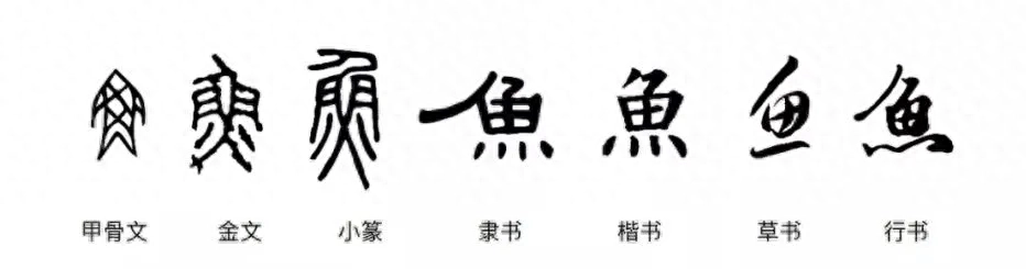
From Oracle, to Large seal script, small seal script, official script, and the well-known cursive script, regular script and running script. The characteristics of each writing font are deeply influenced by the writing carrier and writing function at that time, and are also deeply marked by the times.
Chinese characters are written from The transformation from calligraphy fonts based on engraving and movable type printing to traditional printing fonts based on engraving and movable type printing, industrial printing fonts based on lead type, and fonts based on screen display is inseparable from changes in technology and technology.
With technical means Changes occurred, and the randomness of writing was weakened. In the era of woodblock printing, fonts had greater room for development. After the rise of movable type printing in the Song Dynasty, the fonts became horizontal and vertical due to the need for standardization. This font is called Song Banshu, which is closer to the modern Song Dynasty.
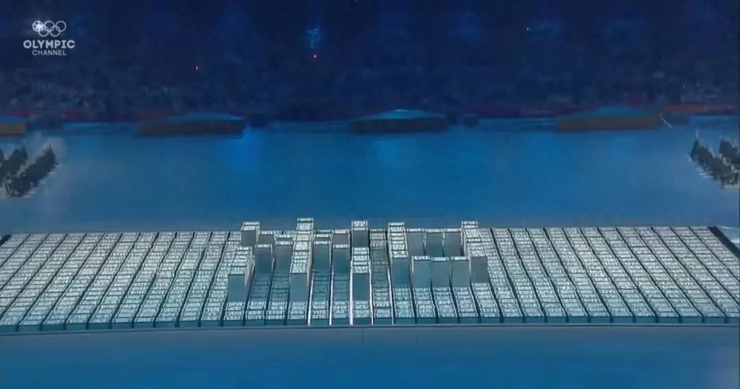
2008 Beijing Olympics He used movable type printing as inspiration to organize the performance program for the opening ceremony.
The inheritance of modern industry The design of Chinese fonts is inevitably influenced by Western sans-serif fonts and Japanese Gothic fonts. Blackface characters gradually appeared in Chinese printed newspapers and periodicals, and they were often used in titles. The design of the boldface retains some features of handwriting, for example, the design of the corners has some features of regular script.
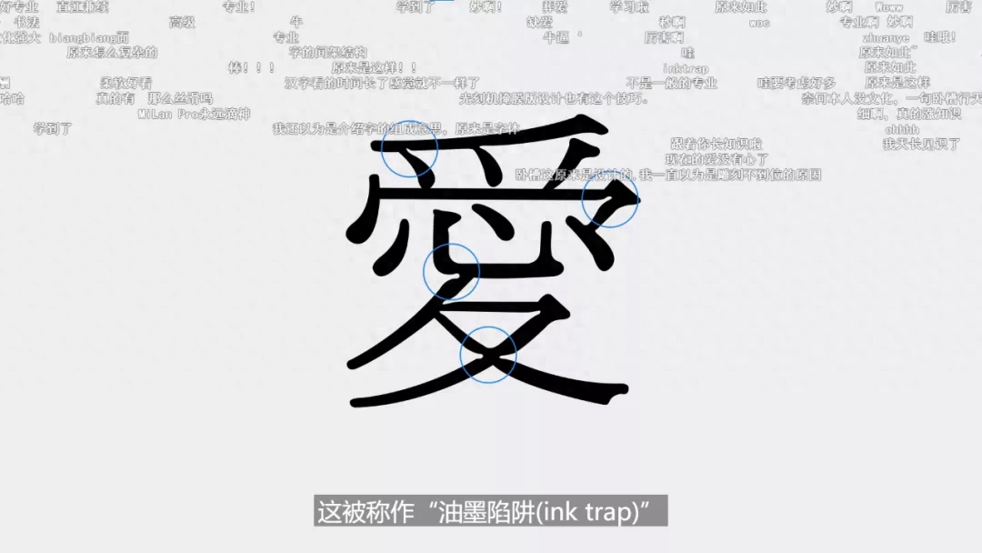
Subject to printing technology Limitations: Early font designs would have some negative notches at the corners of Chinese characters, because ink infiltration would blur the edges of the printed text. Design these gaps so that when the ink soaks in, these gaps will just be filled. This is called an "ink trap."
In the 1970s s, printing was replaced by photographic typesetting using film. In the era of phototypesetting, because repeated photography would distort the strokes, a slightly protruding structure was designed at the end of the strokes, which is the "flare mouth".
With the development of technology , font design is also constantly updated and evolving. /Bilibili@ooooohmygosh
Nowadays, although " Ink traps and bells are no longer necessary, but many typefaces retain these features.
In the information age, The task of text design and typesetting is largely left to computer software and browsers. In the screen era, fonts have also experienced changes from bitmap fonts in the BP era to vector fonts and then to screen display fonts.
Without technology restrictions, designers will consider more humanities, aesthetics, and practicality. /《Abstract.The.Art.of.Design.》
The font design is no longer Limited by technology, how to balance the practicality and beauty of fonts, how to transfer the beauty of Chinese characters from paper slips thousands of years ago to LCD screens, and how to let the general public feel the cultural pride of being Chinese at any time , becoming an ultimate problem facing contemporary font designers and wider cultural inheritors.

Every Chinese character is a condensed aesthetic
Each Chinese character, It’s all a super LOGO.
Design an English Font needs to be designed with 52 characters. But if you want to design a Chinese font suitable for mobile phones, you need to trace the specific shapes of 27,533 Chinese characters one stroke at a time, and the workload is 529.48 times that of the former.
strokes in a new font Taking the design of Huawei's Hongmeng companion font HarmonyOS Sans as an example, the design work lasted for more than a year. At the beginning of the project, Huawei also hesitated internally about whether to spend a lot of effort designing its own font. Ultimately, in order to meet the requirements of HarmonyOS for all scenarios and multiple devices and reflect the characteristics of HarmonyOS, Huawei decided to design a font belonging to HarmonyOS.
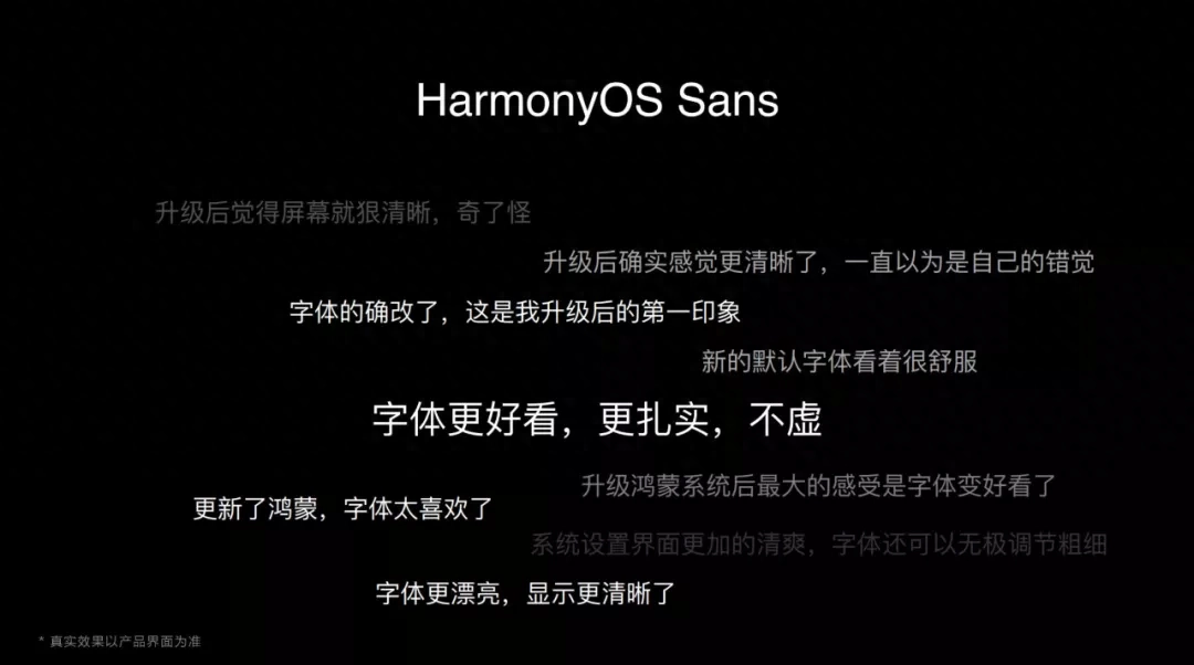
Get used to electronic products We have not lowered our aesthetic standards for words.
Unique and easy to read , universal are several major characteristics followed when designing HarmonyOS Sans. As a universal font, how to balance and choose between universality and uniqueness is also the biggest difficulty encountered by the font R&D and design team.
The design team followed "Twenty-eight Principles" - 80% of the new font follows the design of traditional boldface, and 20% draws on the characteristics of regular script. It not only embodies the sense of humanity and shows the calligraphy aesthetics of returning to the origin, but also prevents the font from being too artistic, achieving a clever balance between reading functionality and humanistic feelings.
For example, in a In these strokes, HarmonyOS Sans follows the regular script aesthetics of curved hooks - the long curved strokes are soothing, warm and curved, the vertical hooks absorb the calligraphy strokes and rise slightly, the oblique hooks are elastic and changeable, and the horizontal hooks are integrated into the curves. The handwriting is beautiful and warm.
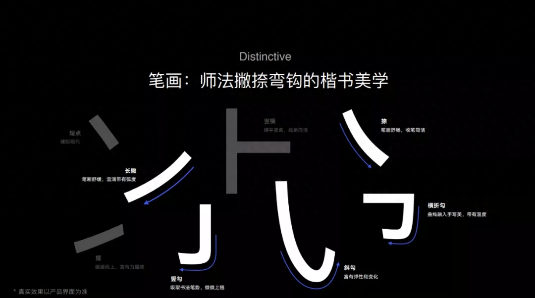
Each spacing The curved hooks all hide the font designer’s pursuit of excellence.
During the design process , the HarmonyOS Sans font has been modified many times. In the process draft, some font styles with mature designs appeared, but in the end many personalized parts were abandoned because of the need to take into account versatility, which made the designers a little regretful.
On legibility In terms of aspect, the design team also optimized the "grayscale" feel of the font through technical means. For example, the details of strokes that seem to be disconnected, parts where the strokes are too concentrated, and places where the strokes are complicated are processed in detail.
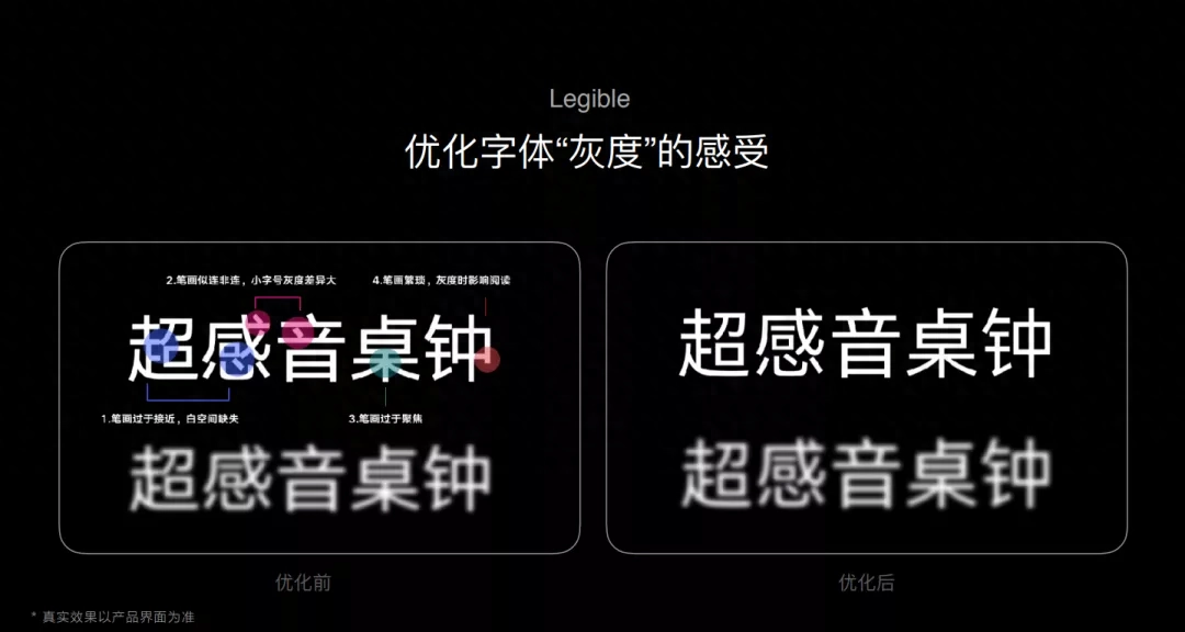
A small adjustment , can change the look and feel of the entire font.
There are a large number of Chinese characters The two vertical lines of the "口" character part in the traditional boldface font will slightly exceed the horizontal lines at the bottom, playing a role in supporting the glyph. But for the word "口" that is not located at the bottom of the Chinese character, if the same design is still used, the glyph will be too squeezed and cumbersome. Therefore, designers specially optimized the "口" parts that are not located at the bottom of Chinese characters to make the overall font more refreshing and orderly.
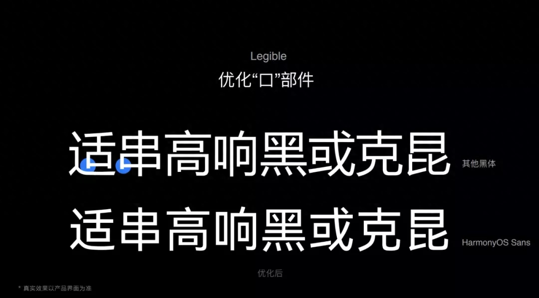
"口" Whether the head is comfortable or not determines to a certain extent whether the style of the Chinese font is harmonious.
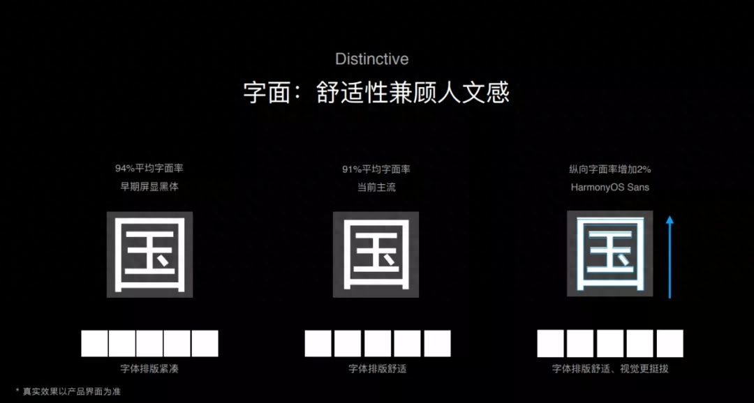
Font design in progress, All Chinese characters are embedded in a box, which is called the "character body box", and the part that is stained with ink and actually has text is called the "literal character". The literal does not fill up the character body, but determines the maximum area of the character body frame occupied by the Chinese character.
Literal box occupancy The ratio of body to frame is the literal ratio, which determines the text spacing by default. The average literal rate of early screen blackface was 94%. Because the screen resolution is not high, in order to make the fonts clearer, the font rate can only be increased appropriately, but this will cause the font layout to be too compact.
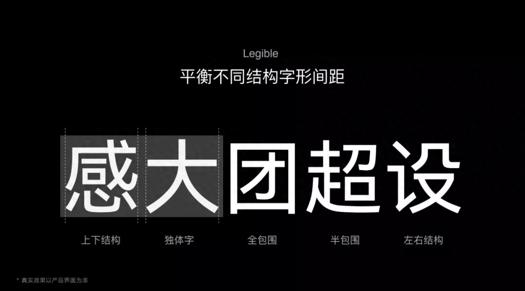
Glyphs with different structures , also require different spacing settings to maintain balance.
With the advancement of technology With iterations and improvements in screen resolution, font size is no longer the primary consideration in font design. The current mainstream average font rate is 91%, and the font spacing is relatively more comfortable.
HarmonyOS Sans is on The vertical font rate has been increased by 2%, making the font more straight and more suitable for reading on vertical mobile phones.
Today’s font design Must adapt to the reading habits of the electronic age.
HarmonyOS Sans efforts , are actually answering various specific questions about font design and cultural inheritance: integrating the font advantages of bold and regular scripts, carrying out detailed visual optimization for the screen reading experience, and balancing the design needs of clear and easy-to-read fonts and elegant and beautiful fonts. The wisdom and accumulation passed down by our ancestors are presented in a way that is more in line with the needs of the general public.
The intersection of ancient and modern, elegant and popular - It's never easy, and that's why it's all the more respectable.

Loyal to the ideal, the fonts are all romantic
For ordinary people In other words, fonts and words appear together. The two blend together like fish and water, inseparable and ubiquitous.
To online store owners For , KOL, and UP owners, a free commercial font that is both beautiful and practical plays an extraordinary role.
Many online store owners Everyone has experienced claims for using copyrighted fonts in product detail images. Two years ago, an intern at a company commercially used the Microsoft Yahei font, which caused the company to be sued by Founder and Adobe, resulting in a loss of 18.6 million yuan and 42 layoffs, causing a sensation on the entire Internet.
2007, Founder Sued Blizzard for 100 million yuan for font infringement. The other party used Microsoft Yahei font. In May 2012, the court made a final judgment and ordered Blizzard and other defendants to pay compensation of 2 million yuan. In 2020, the book "History of the Ghost Tribe", a prop used in the movie "Nine-Story Demon Tower", used 7 characters from the calligraphy work without authorization and was ordered to pay 140,000 yuan in compensation, 20,000 yuan per character.
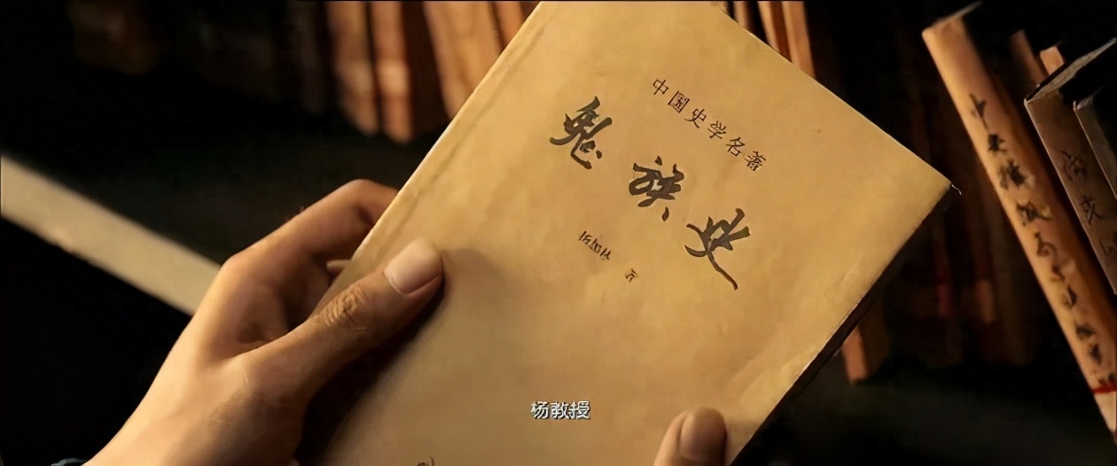
Font infringement case It happens all the time, and this is the minefield that media practitioners are most likely to step into. /Screenshots from the movie "Nine-Story Demon Tower"
It turns out that we are here Fonts used in Windows systems are infringements as long as they are separated from the Windows platform. Under Windows systems, any commercial behavior is not allowed.
HarmonyOS developed by Huawei Sans is not only open to everyone and free for commercial use, but also the font thickness can be adjusted, making it convenient for designers to use. An open ecosystem allows more partners to join, allowing all partners to use unified fonts.
This is the same as OpenHarmony The open source concept continues in one continuous line. On the Hongmeng developer website, all third-party developers can see a full set of design guidelines, which support 105 languages in Chinese, Latin, Cyrillic, Greek, and Arabic languages for free use. .
HarmonyOS Sans is open, Free, making fonts available to more people.
Chinese characters are related to all things in the universe Ersheng embodies the Chinese people's understanding of the universe and their infinite imagination. The highly condensed Chinese characters are endowed with more beautiful meanings, just like the concept of HarmonyOS Sans "the universe is in the heart, the words are infinite", and all of them are the ultimate in fonts. A romantic expression of imagination.
Everything is interconnected and harmonious Symbiosis is Hongmeng’s ideal and the fulcrum of Hongmeng’s design. It clearly points to a future that not only takes into account practicality and efficiency, but also contains romantic and grand ideals. Chinese characters are a good medium, which allows Hongmeng’s pursuit to be realized and spread for thousands of miles.
When we Searching for innovative expressions that blend the ancient and the modern, in addition to explaining to the outside world who "I" am, I also gain the courage to face the future.
✎Author | Zhou Dieyao
✎Proofreading | Alu
✎Typesetting | Fang Yongxin
Welcome to share with friends
Reprinting without permission is prohibited
Articles are uploaded by users and are for non-commercial browsing only. Posted by: Lomu, please indicate the source: https://www.daogebangong.com/en/articles/detail/zhong-wen-zi-ti-yuan-lai-yi-zhi-zhe-me-ku.html
 支付宝扫一扫
评论列表(196条)
测试