How to design a PPT with large text? This is a problem faced by many professionals. Today, I will solve this problem for you by modifying Tencent’s product introduction page. The screen is full of text. How should I design this PPT page? Just think about it briefly.
When the time comes, I guess your first impression is that you want to make it more beautiful, such as finding a good-looking picture as the background. If I guessed it right, congratulations, this video will definitely be of great help to you, I suggest you save it first. In fact, in my opinion, to design a PPT of a text, you can use the following three-step method: analyze the copy structure and visual expression.
The first step is to analyze the copywriting. The first step in our design is not to look beautiful, but to understand the content. Let's read this text. After reading it, we can logically divide it into two parts: definition and function. It is difficult for beginners to understand the logic of copywriting.
Let me share a little tip: logically split the copy into subject, predicate, object and other elements, which will make it easier to understand. Looking at the sentence pattern, the definitional sentence pattern is usually "what so-and-so is", while the functional sentence pattern is usually "what so-and-so provides". This division is not detailed enough and needs further refinement.
Let's look at them one by one, starting with the definition part. It is a long text that can be divided into levels of information. For example, highlighting the "same-sex point" can improve recognition through the division of text levels. For the definition part, I recommend not to overexplain it. Because definitions are often condensed, each word contains special information and meaning. Therefore, this level of splitting is sufficient.
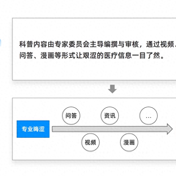
Let’s look at the functionality part. When it comes to functions, it may be difficult to understand intuitively simply by looking at text, so key information can be displayed graphically. For example, this graphical form is much clearer. It means medical information, most of which are professional, but Tencent can present it in a more vivid form. For example, videos, news, comics, etc., to allow the audience to better understand. Comparing before and after, you will find that the graphical display is clearer.
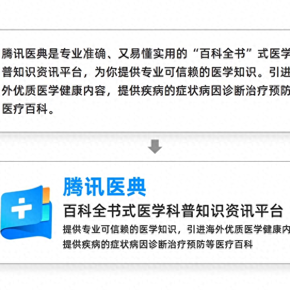
·Function 2 If you finish reading this text, you will find that it contains many parallel words. For juxtaposed words, it is very simple to deal with them: remove the head and tail, and you can see the essence of the content. To sum it up in one sentence: Isn’t it clear that Tencent Yidian can provide so many services?
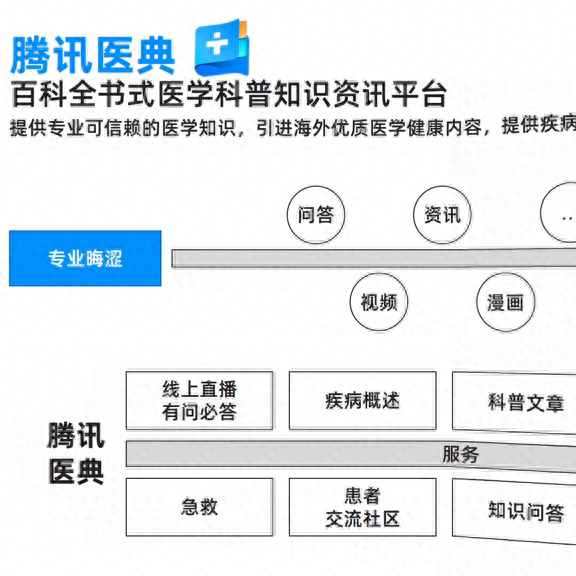
Let’s sort out the paragraphs we just extracted so that we can display large sections of text graphically. Isn’t it clearer? However, a new problem arises at this time. Each part is relatively independent and lacks clear logical connections, making it difficult to quickly grasp the theme and core content of the page. Therefore, we need to enter the second step, which is structural design. How to find a clear line of logic? What I do is extract the main content and classify it as professional medical information. Through Tencent's Yidian product, information can be made clearer and easier to read. Next, fill the structure completely and you can see that professional medical information has been formed.
Professional medical information is actually compiled by a committee of experts, while Tongxinyidian is a product that provides services. What is its definition and what services does it provide? Finally, it can transform this difficult information into clear and easy-to-read popular science knowledge. In this way, we successfully connected the information to form a structured page. Finally, we need to beautify the design to make it more beautiful.
Let's take a look at my first version of the completed draft. According to the logic just now, the left is gray and blue professional information, and the middle is the product through Tencent Yidian, which provides Various presentation methods such as services and definitions. Finally, we get a clear and easy-to-read popular science knowledge. There is no logical problem and the principle is very simple. I wonder how you will react to this page.
However, this version was not adopted simply because its space was not fully utilized. We can see that most of the information is concentrated in the center of the screen, which appears crowded and messy. Therefore, I made certain modifications, such as making the ring larger so that the information in the center was stretched out. However, there is still some white space in the upper left and upper right sections and looks a bit empty. Therefore, I simply removed the connecting rings and distributed the services directly across the screen. In this way, the page breathes more.
However, due to the lack of links to the rings, the spheres appear scattered, so we need to find a curve to reconnect them. This not only fills the gaps in the page, but also makes the overall feel stronger.
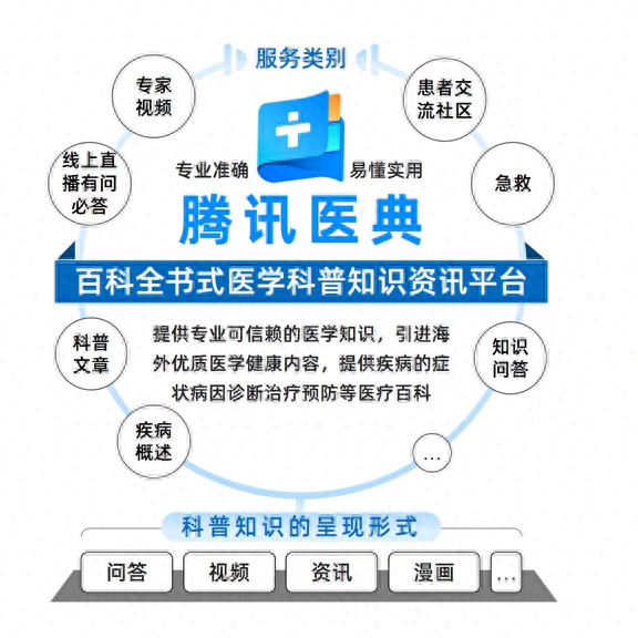
At this time, a new problem appeared on the page. The rounded corners at the top were relatively scattered, which was not conducive to reading. So I came up with a compromise that utilized hexagons to lock the various services into a dove pattern. In this way, the hexagons are relatively concentrated, echoing the molecular structure in medicine. This kind of design serves multiple purposes.
At this point, the general form is complete, and we can further refine the design. I added some illustration elements at the bottom of the page, but if you look closely, you will find that the illustrations are richer in color and look a bit messy. In order to better present the illustration, I unified its overall color scheme and complexity in multiple dimensions to match the visual style of the original page. At the same time, I added expression packs of crying faces and smiling faces to highlight professionally drawn medical knowledge and clear and easy-to-read popular science knowledge. The two echo each other and form a more vivid expression. Finally, I made some detailed adjustments to complete the final design.

Comparing the before and after effects, I graphically displayed the content of the page and used a ring to reconnect it, which not only filled the gaps in the page, but also enhanced the overall sense. However, the rounded corners at the top of the page are relatively scattered and not conducive to reading. Therefore, I found a compromise based on the basics, which is to directly use hexagons to lock various services into a pattern. In this way, the hexagonal shape echoes the molecular structure in medicine, making the design more focused. At this point, the design is mostly complete and I can refine it further.
I added some illustration elements at the bottom of the page, but if you look closely, you will find that the illustrations are rich in color and appear a bit messy. Therefore, I refined the illustration, unifying it based on proportion and complexity to match the visual style of the original page. At the same time, I added expression packs of crying faces and smiling faces to highlight professionally painted medical knowledge and clear and easy-to-read popular science knowledge. The two echoed each other and formed a more vivid expression. Finally, I made some detailed adjustments to complete the final design.
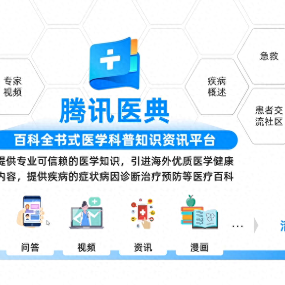
Compare the before and after effects. Through visual representation, I connected the scattered information and got a page like this. Finally, I made it more beautiful through visual representation.
Articles are uploaded by users and are for non-commercial browsing only. Posted by: Lomu, please indicate the source: https://www.daogebangong.com/en/articles/detail/zhi-chang-bi-bei%EF%B8%8F-teng-xun-zhe-ye-PPT-quan-shi-zi-wo-yong-zhe-3-zhao-rang-ta-sheng-hua-le-ppt.html
 支付宝扫一扫
评论列表(196条)
测试