Many friends like to use templates when making PPT because they are beautiful and convenient.
The reason why the layout is beautiful is that color matching is an indispensable factor. If the color scheme is used well, the style will be distinctive and eye-catching; if it is used incorrectly, the audience's desire to read will be reduced.
But there are thousands of colors and what should I do if I don’t know how to use them? Today, let’s talk to you about how to quickly become a “color matching master”.
If we want to match the color correctly, we can refer to three color matching types: Single color, similar color, contrasting color
Monochrome
Monochromatic colors are colors with the same hue but different brightness or saturation.
Using this method for color matching can make the PPT picture look neat and the theme stand out.

For example, below, the color is bright yellow. By adjusting the transparency of the color block, it adds a bit of hierarchy to the minimalist page.
The lively color of bright yellow also highlights the theme of "creative templates".

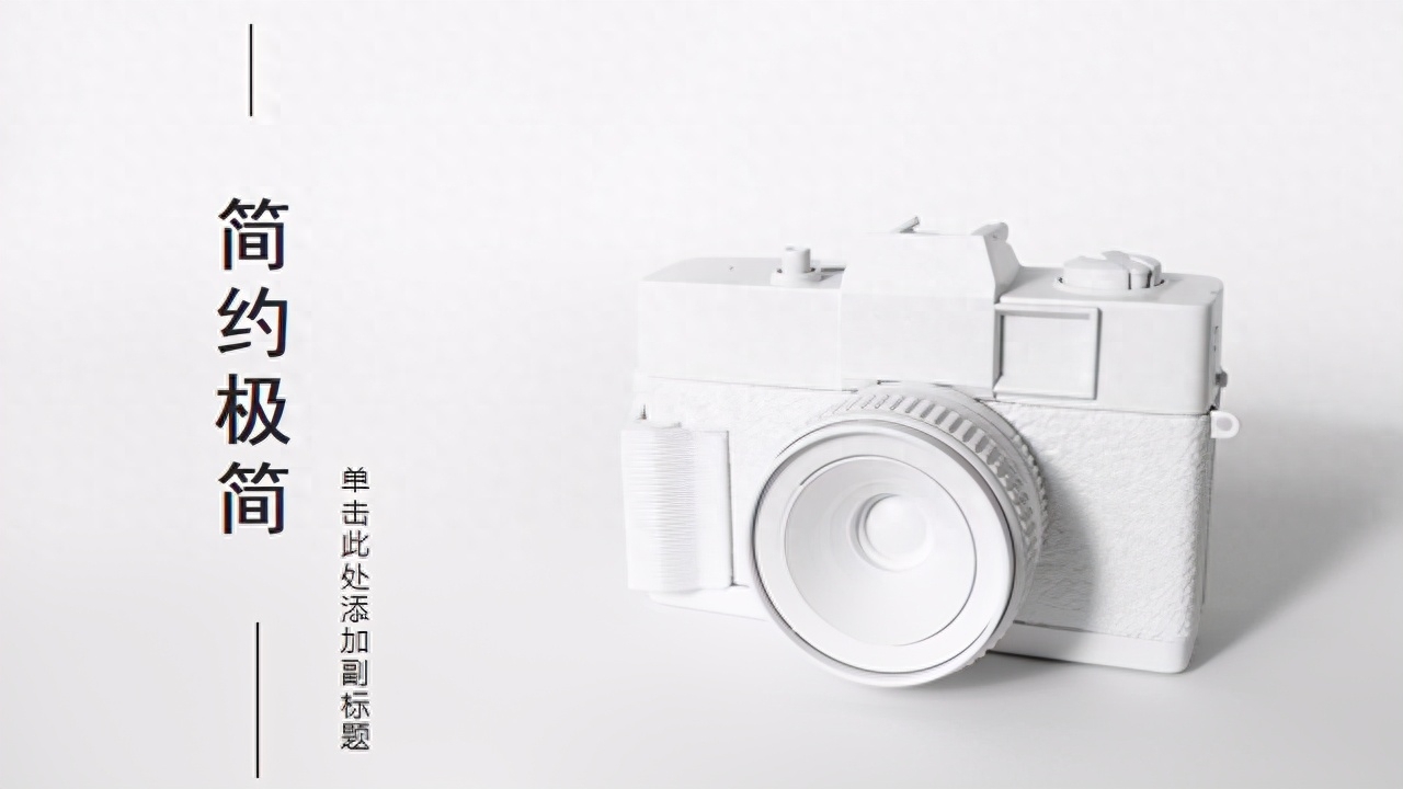
In the layout below, the designer uses white as the theme for a large area, and the outline and shadow of the camera make the layout more three-dimensional, fully displaying the minimalist style.
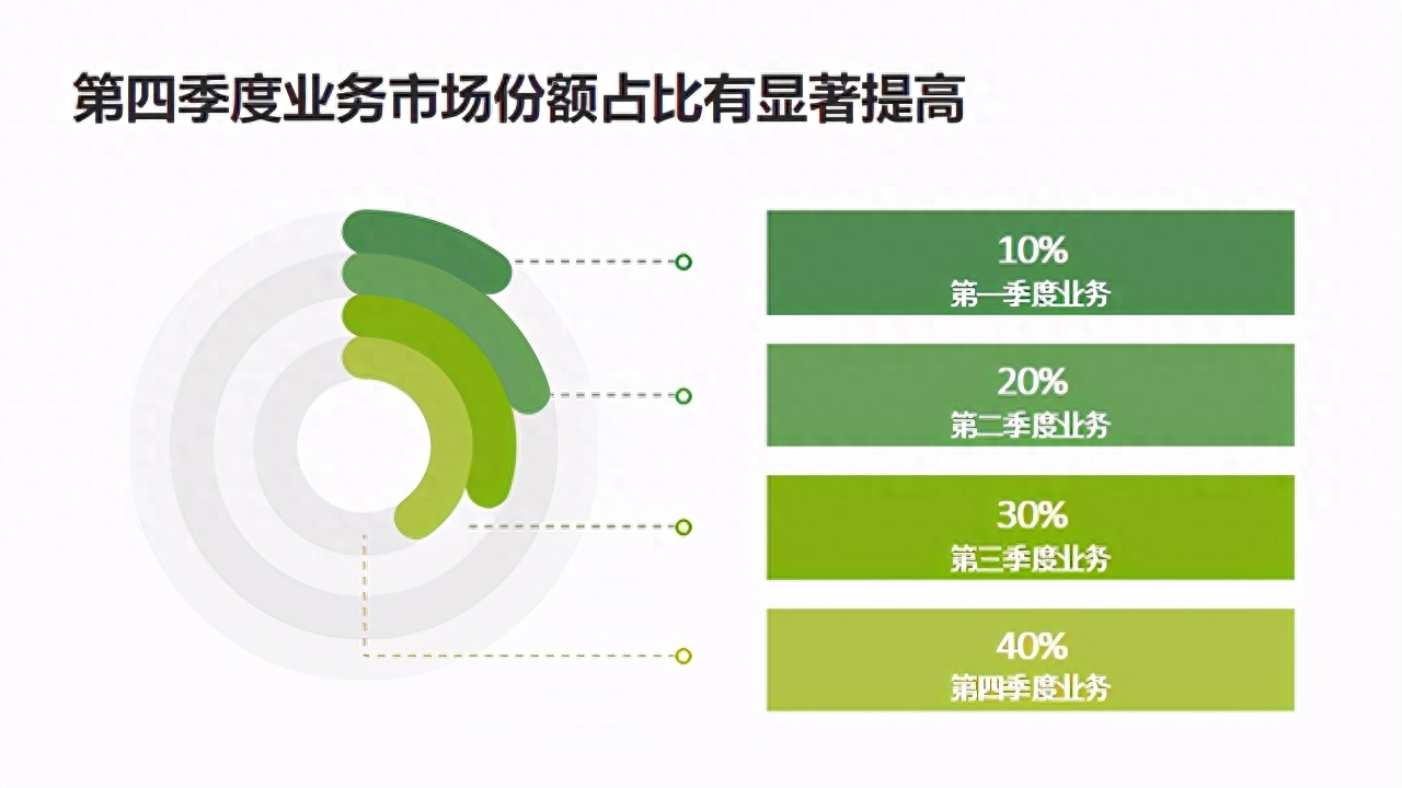
Learn to Adjust the brightness/saturation of colors , not only helps you beautify your PPT page, but also displays data or other information well.
For example, this PPT uses different brightness to clearly display the differences in business data between different quarters. Is this much better than directly listing the data?
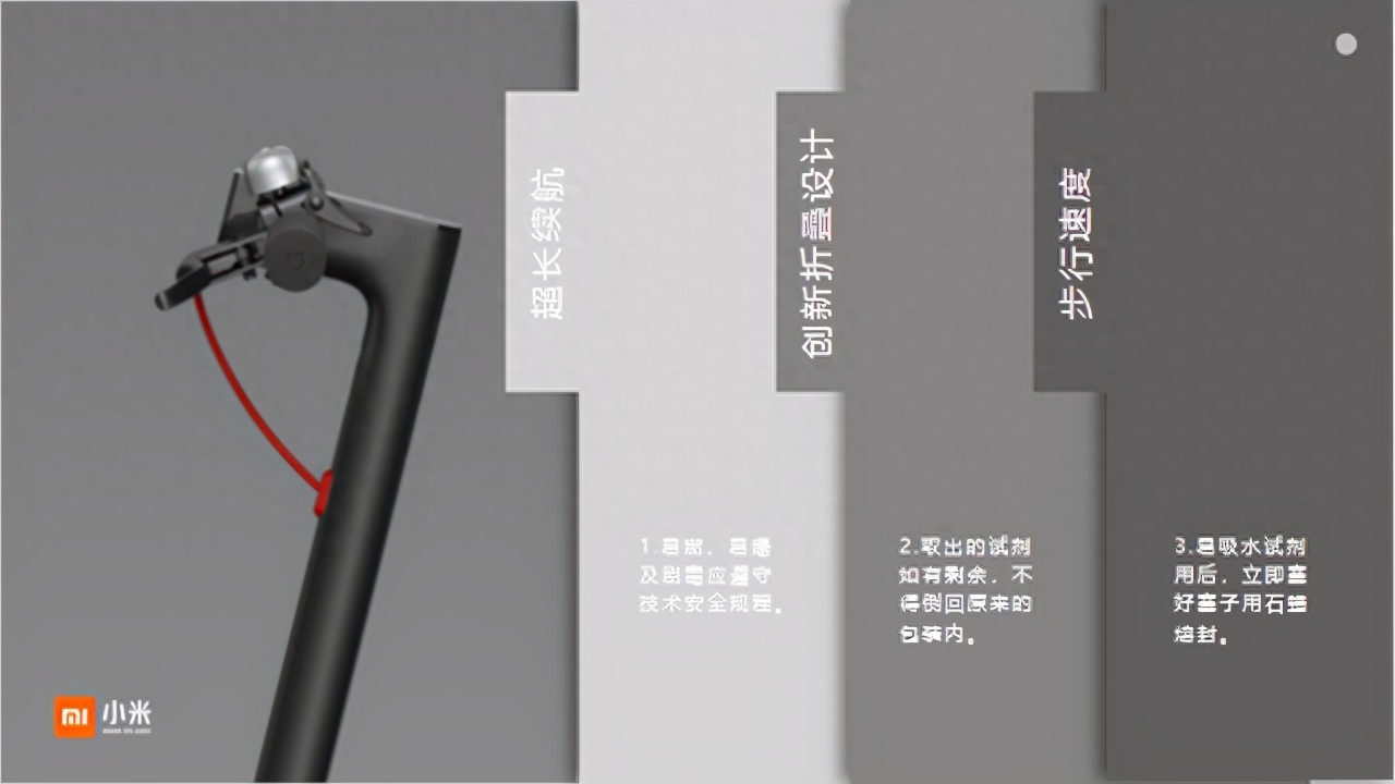
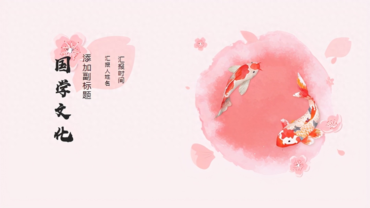
We can also refer to excellent design cases:

But if monochrome is not used well, it is easy to overturn. We You should try to avoid using highlight colors in large blocks of text, as they can create a dazzling effect for the audience.
As a more extreme example, the text is also in the same bright yellow as the decoration. Not only does it fail to highlight the text content, but it also causes reading trouble because the color is too dazzling.

Let's try it out. Keep the decoration in bright yellow and change the text to dark black. All the important content will be clear. If you are not a color matching expert, you can choose this safe method.

Approximate color system
Approximate color systems refer to any adjacent colors on the color wheel Three colors, such as yellow + green, yellow + orange, green + blue...

This PPT uses a green + blue combination, using different color blocks to divide different areas.
This division method is naturally not rigid. We can use this method when dividing the content of different paragraphs in PPT.


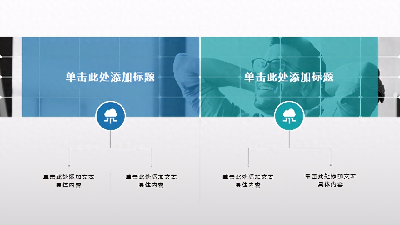
Using similar colors (blue + green) in relationship diagrams can make the logic clearer.

You can also use similar colors to achieve gradient The effect makes the layout cool.



Contrast colors
Contrast color refers to a distance between 120 and 180 degrees on the color wheel The left and right color groups are composed of two colors that can be clearly distinguished. Common contrasting colors include black and white, red and green, etc.
Due to the large range of colors, it will bring people a bright experience. Let’s take a look at what kind of visual impression these PPTs using contrasting colors will bring to us:

The combination of black and white is a representative of cool colors. We can use black and white inScience and technology product release, summary report and other scenes can well reflect the sense of technology and give people a simple and powerful feeling.

The use of warm colors to form contrasting colors will make the picture full of lively and enthusiastic visual effects. It can be used inEducational courseware, event display and other scenes:
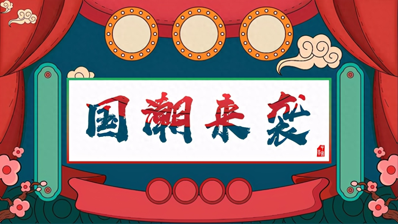


Trick Easter Egg
Some friends may feel that "the eyes have learned it, but the hands have not", and it takes time to match the color by yourself. Is there a more convenient way?
Of course, in WPS PPT full text beautification function , it provides everyone with the function of intelligent color matching.
Not only can you change the color of a single page, but you can also unify the color of the entire text.
In smart color matching, there are also a variety of colors< /span> for us to choose from. If you are a handicapped person and want to make excellent PPT, this function is perfect for you.

How to find this function? 1. Click [Smart Beautification-Full Text Beautification] below 2. Select the slide with the desired color matching 3. Preview the color matching effect 4 .Application Beautification
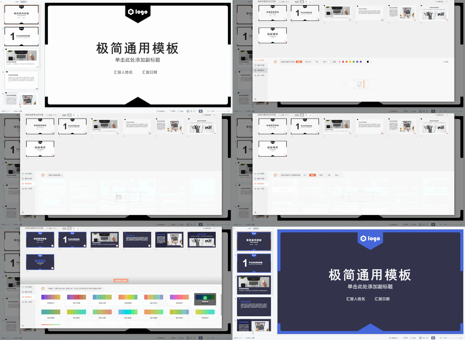
Let’s take a look at the comparison before and after the application
Before applying:

After application:


Before applying:

After application:

Summary
Color matching is an important factor in forming the style of PPT. If you want to make your PPT more elegant, you can use the three color matching techniques mentioned today:
1. Monochrome matching, neat and clean layout
2. Similar color matching to enhance the layering of the layout
3. Contrasting color matching, bright and powerful
There is also a function that can turn all of you here into color matching masters instantly, that isSmart color matching of WPS,Everyone can try it!
Articles are uploaded by users and are for non-commercial browsing only. Posted by: Lomu, please indicate the source: https://www.daogebangong.com/en/articles/detail/zhei-xie-PPT-pei-se-ye-tai-gao-ji-le-xue-hui-zhe-ge-yi-miao-jiu-neng-Get-tong-kuan.html

 支付宝扫一扫
评论列表(196条)
测试