
Hello, everyone, I am Xue Hai.
Today I will share with you aBusiness report themed PPT.
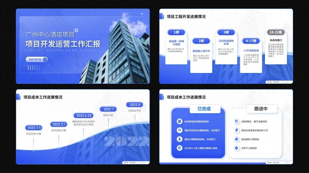
The following is a four-page manuscript, including the layout of the cover page, multi-paragraph content page, timeline page and comparison page.
01
Design specifications
First of all, let's take a look at the PPT whose title is about business reporting. We directly use the most representative business blue as the main color.
We use Siyuan Blackbody as the font, which is square and grand.

Next we will create it page by page.
02
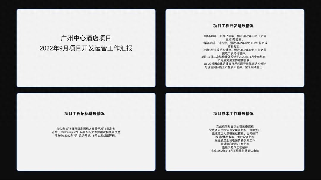
Cover page

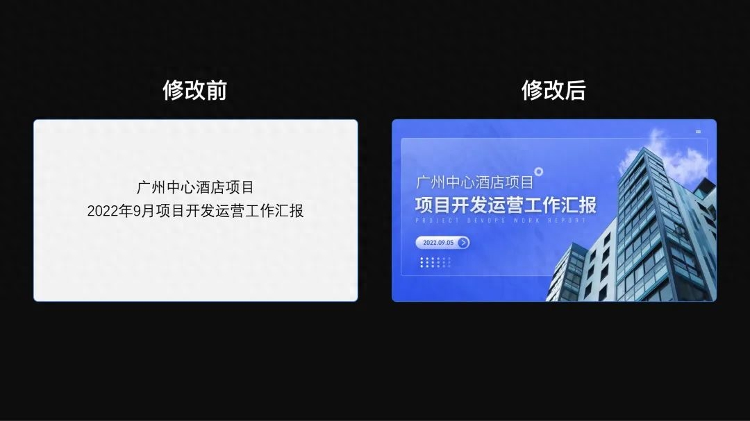
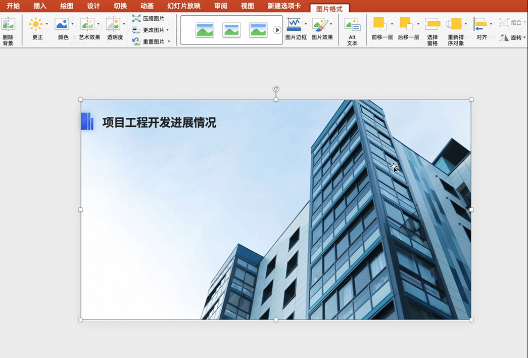
We can use the layout of text on the left and image on the right for the cover. First, change the font to Siyuan Black, and then create a hierarchy between the main title and the subtitle. feel.
Then find a picture of a building.
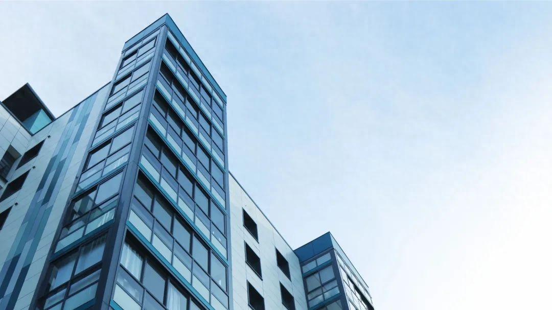
Send it to background and adjust the opacity.
Add a translucent mask to highlight the subject.

Insert the picture on the right side and place it on the right side of the screen to increase the visual proportion and balance the left and right sides of the screen.

Add a little detail at the end and the page is complete!

The modification has been completed, you can take a look at the finished product
03
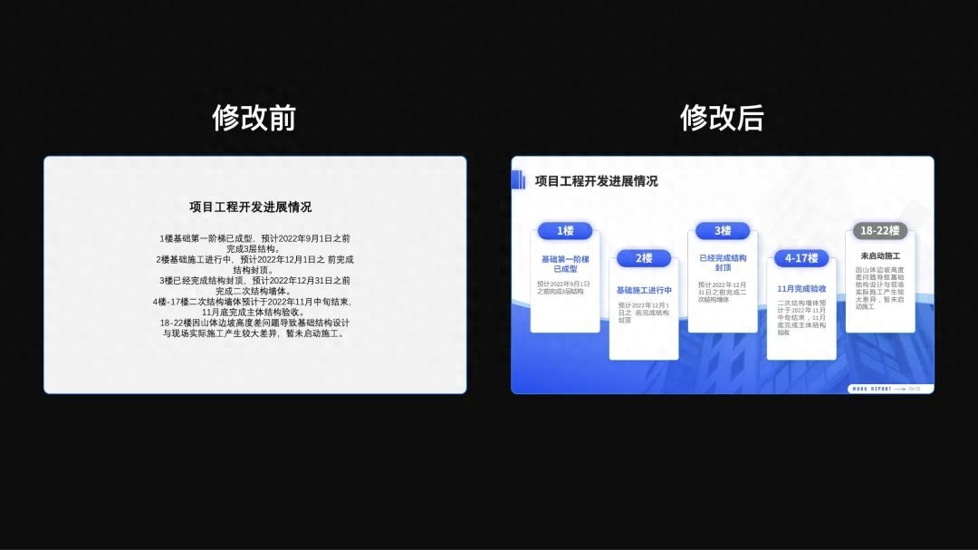
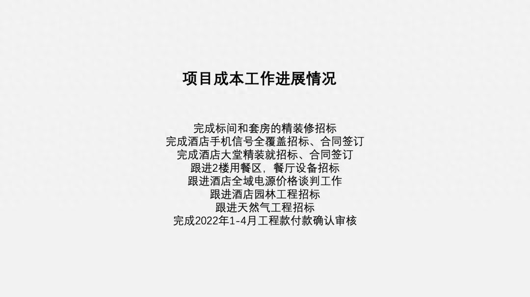
Multiple content pages
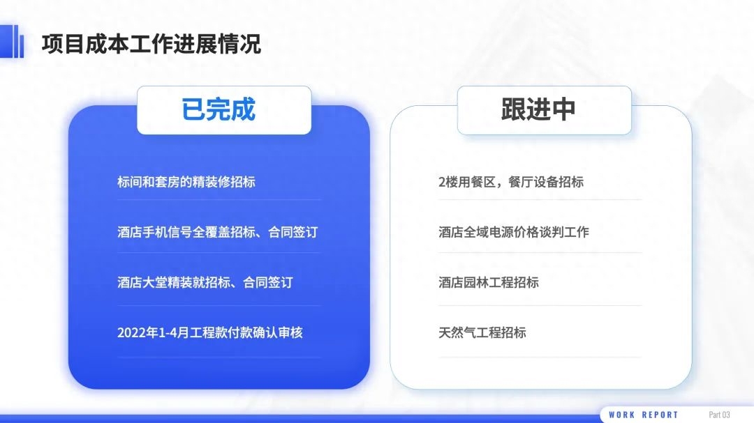
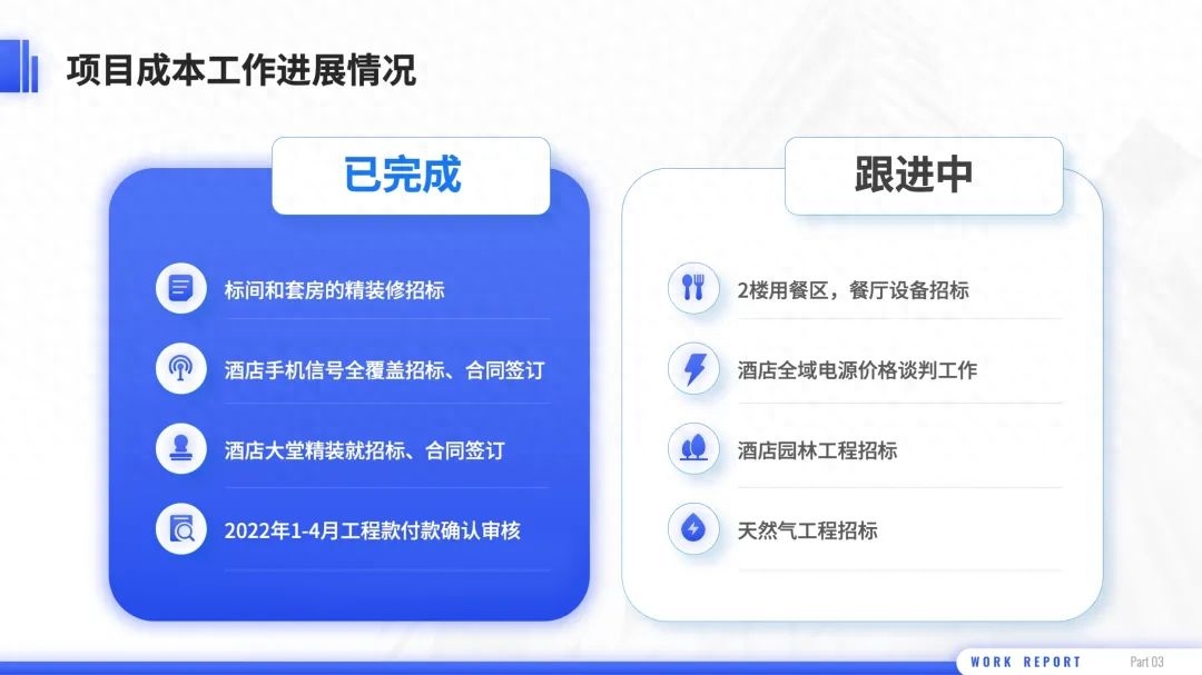
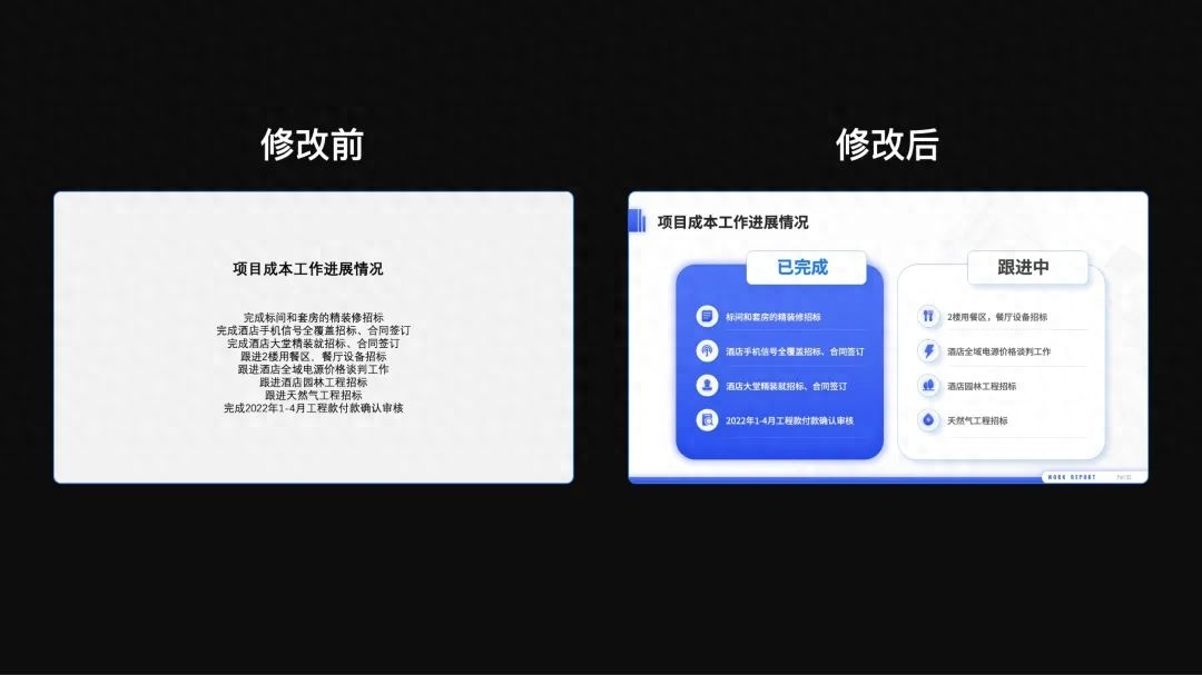
First adjust the color and transparency of the image and place it on the bottom layer as the background of the inner page.
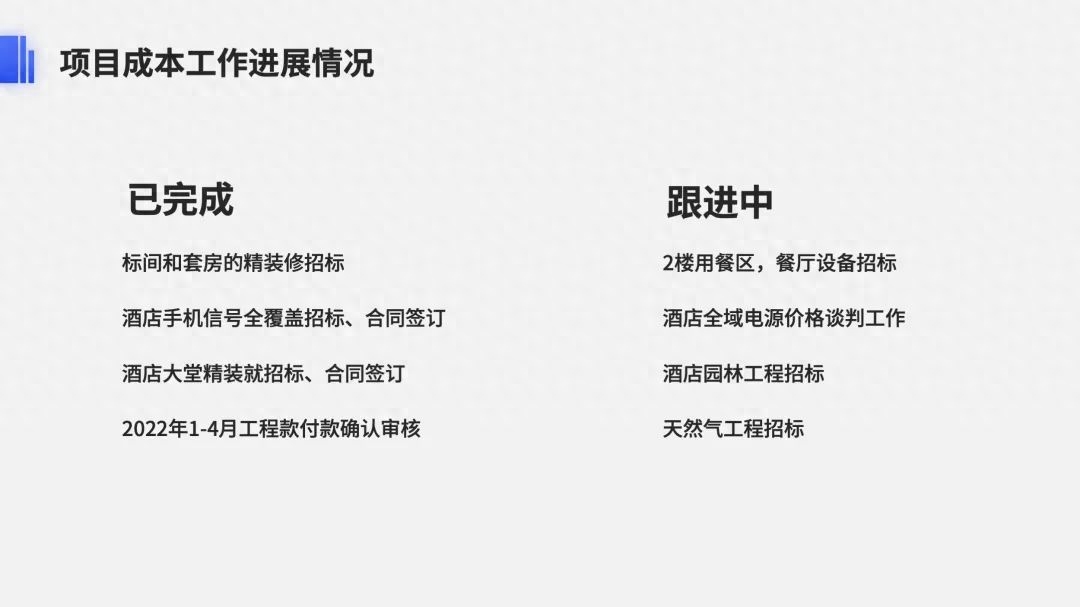
Then, first extract a subtitle for each piece of content to make the relationship between primary and secondary more obvious and facilitate readers’ reading:
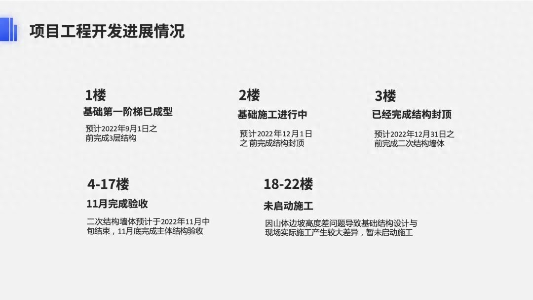
Add shape underlays to the content, standardize their styles, and set different colors for the titles< of the "Worked" and "Not started" modules. /strong> to better distinguish different content:
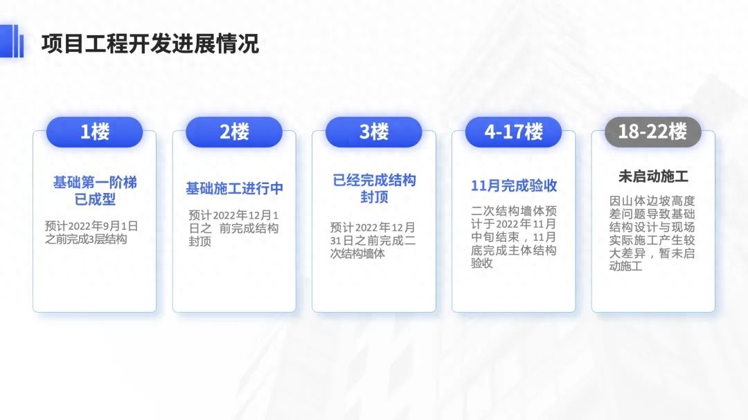
Then add a curved color block at the bottom.

Combining the two together is done.
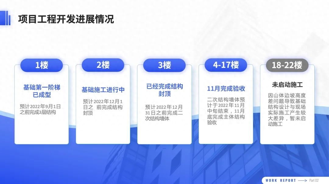
If you want to add a little more movement and layering, you canarrange the color blocks staggered.
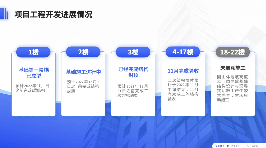
The modification has been completed, you can take a look at the finished product:
04
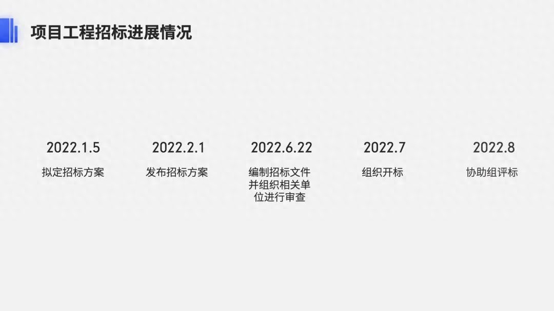
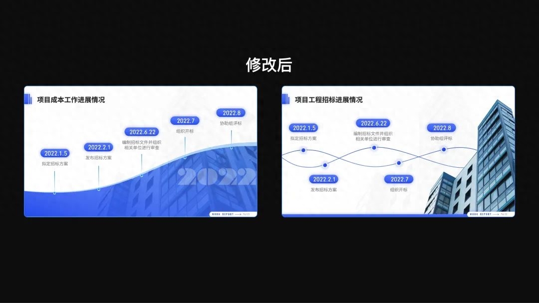
Timeline page
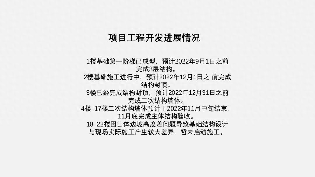
This page shows the progress of the project bidding, but there is only a short paragraph of text that looks really monotonous.
How to beautify?
First, extract the time information as a title and emphasize it in bold :
Then insert a PPT's own [wave] shape color block at the bottom of the page. After setting the transparency, you can also overlay part of the picture.

Then place the time information above the shape:
It can also be made into a conventional curve timeline:
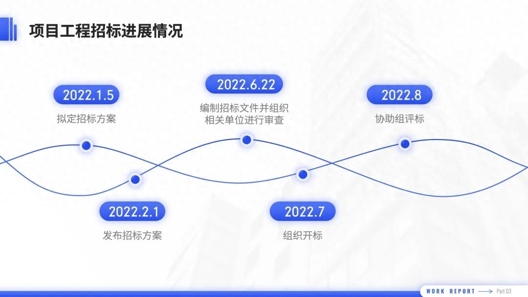
Inserting the buckled pictures is also very design-friendly.
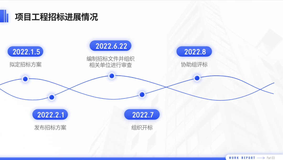
Let’s take a look at the modified results:
05
Comparison page
It’s still a large piece of text, so we can still use the same processing steps as before.
The first step is to sort out the information and refine the key points.
For example, the content of this PPT page can be extracted into the following two paragraphs and titles.
For two-part content like the one above, the easiest way is to use color blocks (that is, ordinary shapes) to connect the two parts of the content.
In order to highlight the contrast, the two color blocks are made of different colors:
Finally, add some icons to make the text more visual.
Let’s take a look at the before and after modification comparison:
The following is the final effect of the four revised pages:
That’s all for today~
I am Xue Hai, I look forward to seeing you in the next issue!
Articles are uploaded by users and are for non-commercial browsing only. Posted by: Lomu, please indicate the source: https://www.daogebangong.com/en/articles/detail/zhe-fen-hui-bao-PPT-tong-shi-quan-cheng-jing-ran-zhi-yong-yi-zhang-tu-pian-wan-cheng.html
 支付宝扫一扫
评论列表(196条)
测试