

Hello, everyone , I am Brother Li, and today will give you a super useful information.
We make PPT, We often encounter various charts, especially some data reports, and charts are definitely indispensable.
Some time ago, we In order to solve the trouble of repeatedly designing charts, I made a PPT chart manual.
In this design manual , including50+ kinds of design charts that we will use when making PPT.
All designed with PPT , can be edited.
If you make charts There is no inspiration, or the chart does not look good, like the picture below.

Then, you You can look at this chart manual to find a good-looking chart and apply it directly.
For example, we How to design a regular line chart?
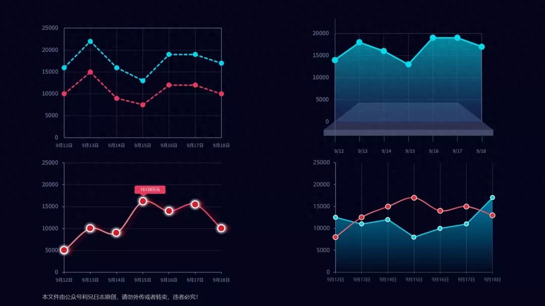
I have written before Some tutorials.
For example, how to divide the polyline Change it to a curve, select the line, and in the line format window, check the Smooth option.
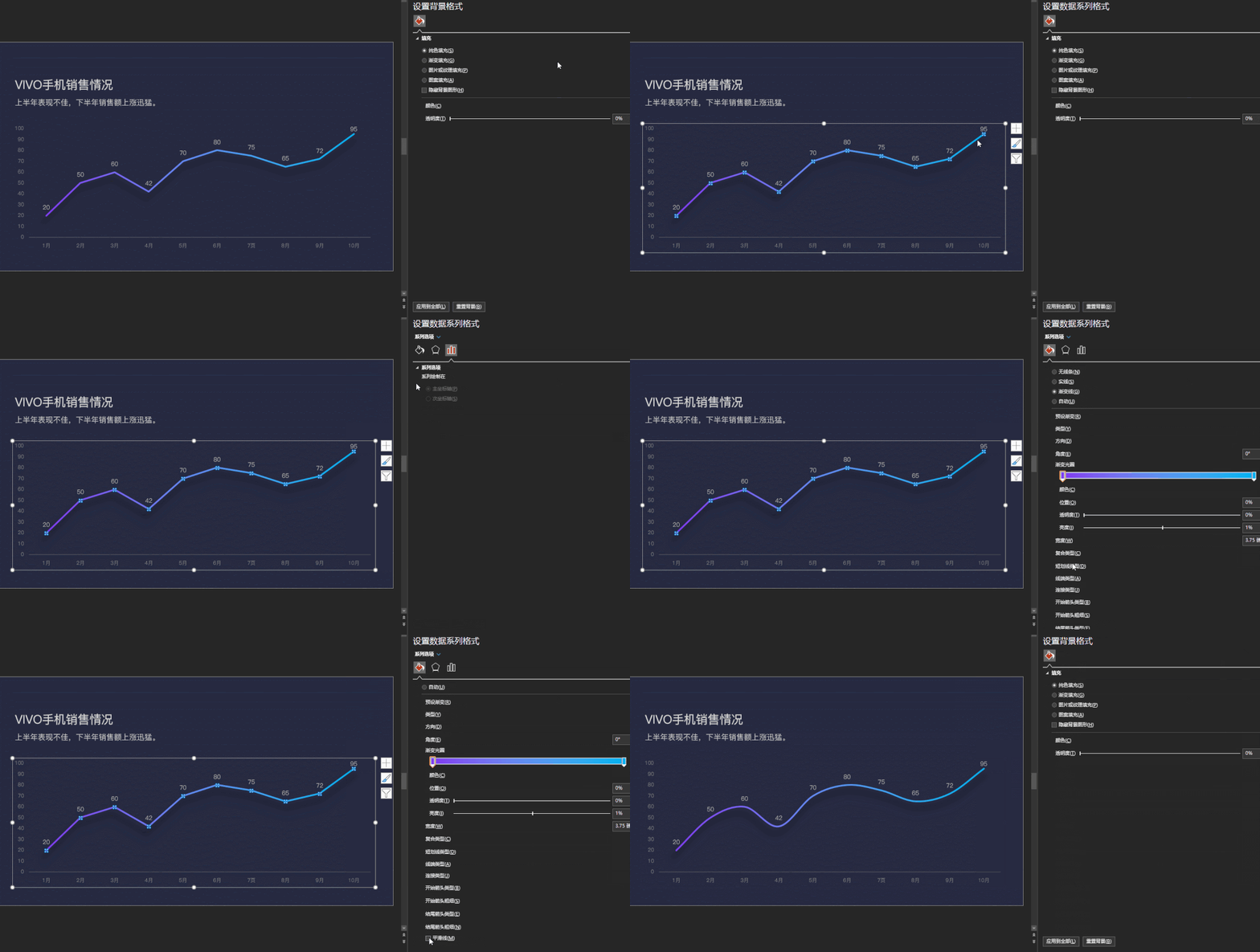
There is also an area chart way of doing.
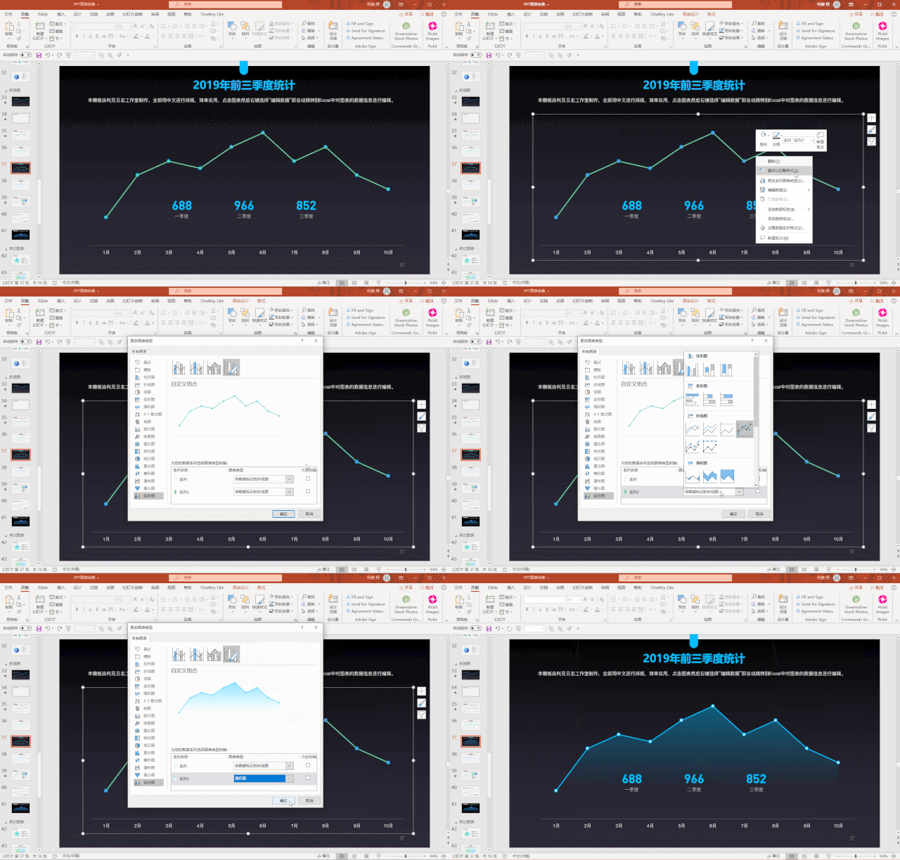
We just need This can be achieved by inserting two sets of charts with the same data, then changing one of the line charts to an area chart, and then adjusting the gradient of the area chart.
Our histogram, How to beautify it?
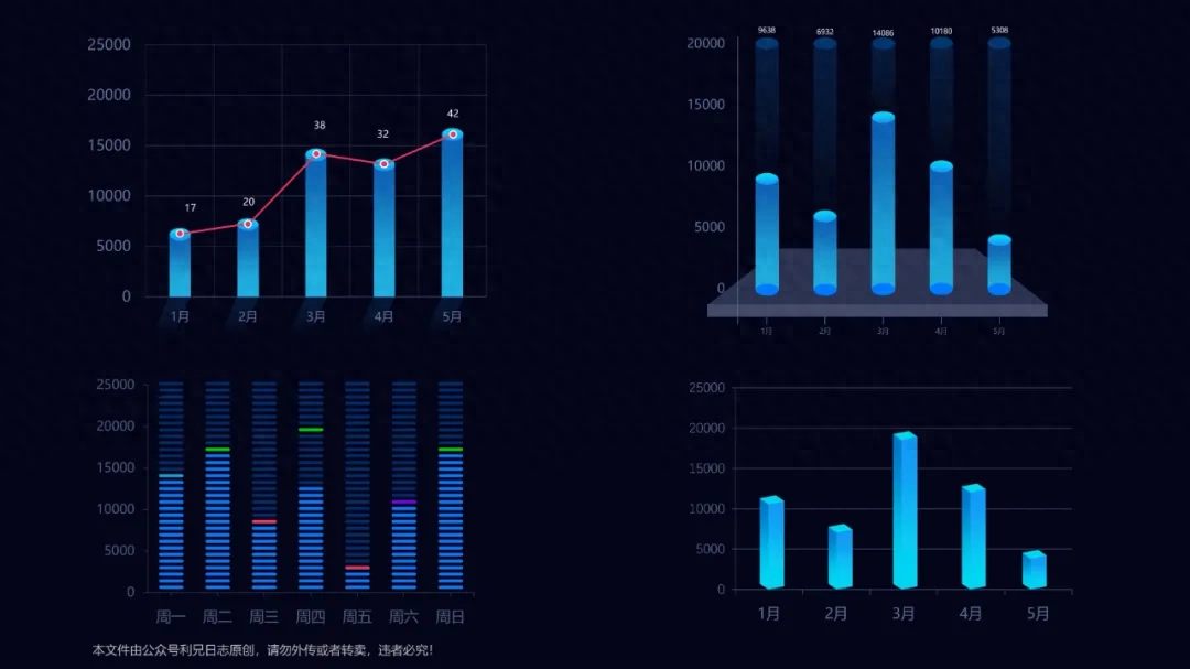
And our 3D charts.
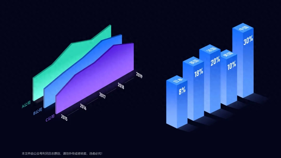
Tutorial: Using PPT Make 3D charts, so cool!
And ours What are the design methods for pie charts and donut charts?

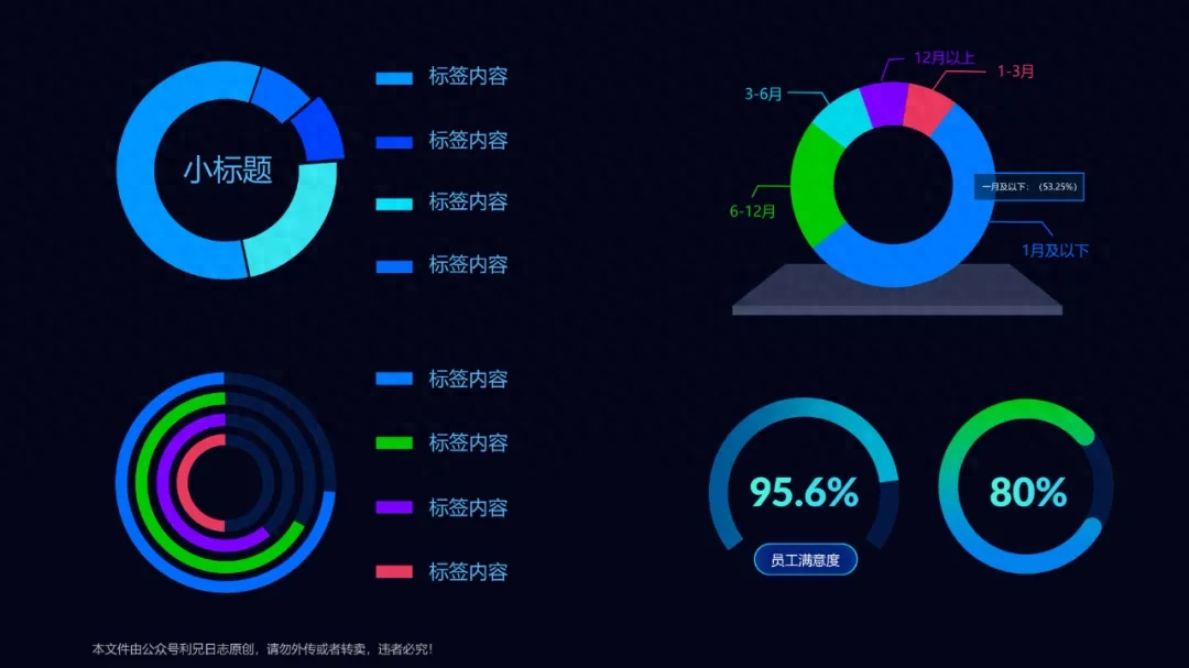
We have taught you these in some previous articles, so I won’t repeat them again.
This PPT chart is so beautiful!
The appearance of this chart is too high!
There are also some charts we drew through shapes, which are also easy to change.

There are also cone diagrams , pyramid charts, these are all drawn.
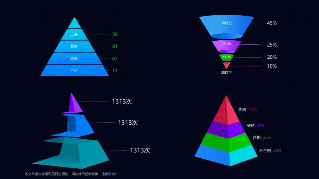
For example, this inverted pyramid , this is how it is designed.

Also, we How to design a radar chart
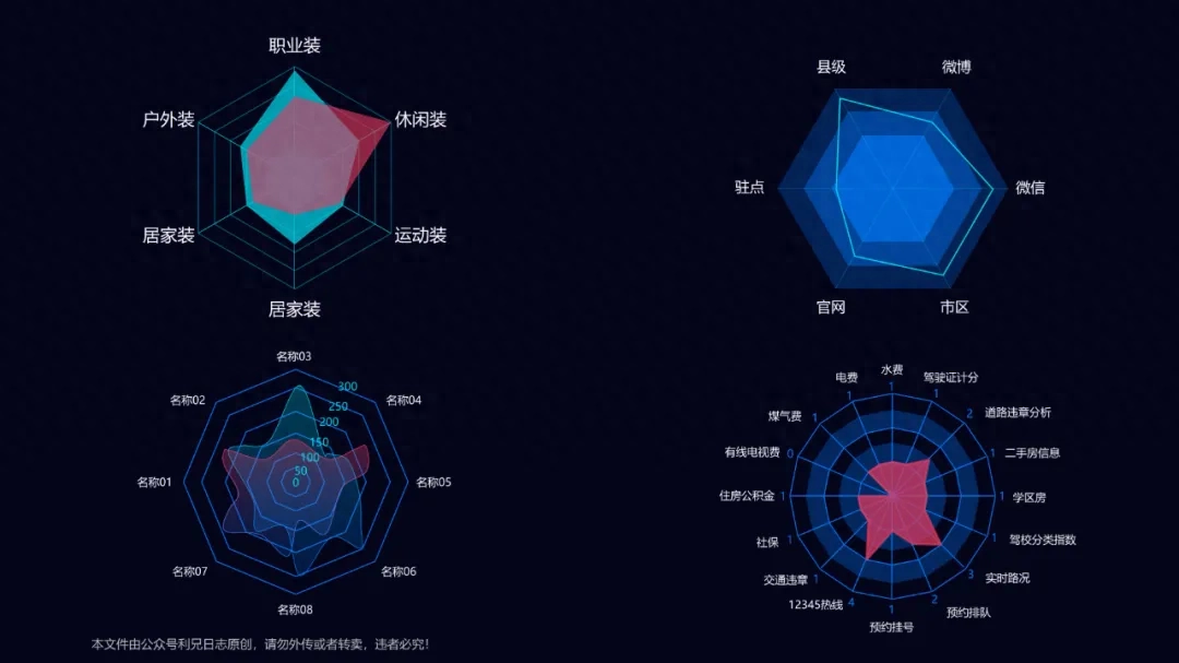
There are some special The creative diagram was also drawn using PPT.
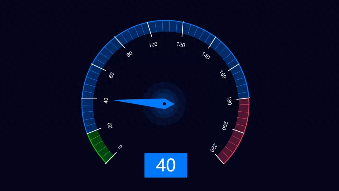
For example, the dashboard chart.


These charts Drawing with PPT is quite complicated and takes time, but it is easy to use.
This chart, in fact It is a combination of multiple shape elements.
And some others chart.

Many charts, everyone You may have seen it on some large data screens. However, most of these large data screens are produced by professional design software.

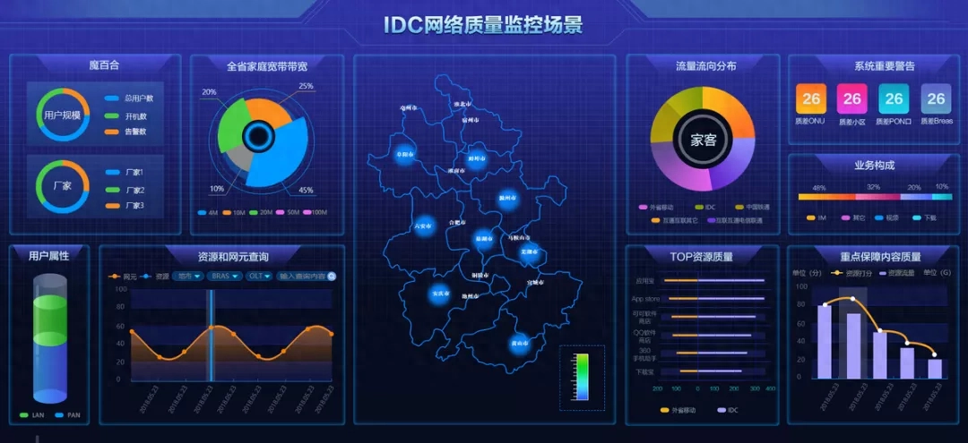
Today I will give you The PPT data chart manual is all produced using PPT software. Some are based on the data disk and then reproduced using PPT, so they can be edited in PPT.
Let’s take a look at the whole , there are a total of50 chart components.

ThisPPT chart manual, we will enrich it in the future. When we see some new chart types and ideas, we will add them.
If you have a set Data, then just take it and use it. Such as this group.
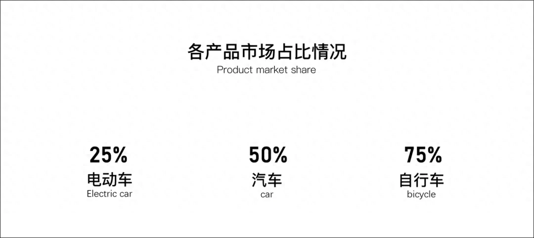
Apply it a little. The Chart component will do the trick.
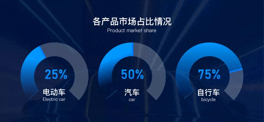
This is actually very good Use it. If you don’t have any ideas when making PPT, you can take it out and take a look.
The above is today’s main content.
PPT chart manual meeting Upload toLiyouquan PPT Learning Community.
If, you don’t have It doesn’t matter if you join, you can also download the PDF version of the PPT chart manual.
Watch the picture below to receive the file

Articles are uploaded by users and are for non-commercial browsing only. Posted by: Lomu, please indicate the source: https://www.daogebangong.com/en/articles/detail/zhe-PPT-tu-biao-zuo-de-ye-tai-piao-liang-le-ba.html

 支付宝扫一扫
评论列表(196条)
测试