Cutting APPX Founder font library is jointly released!
With the explosive growth of short videos, content dissemination has entered the "National Short Video Era". As an important visual element of short videos, fonts are also valued by more and more creators. . In order to provide the majority of short video creators with richer and higher-quality word choices, and at the same time promote the inheritance of China’s excellent traditional culture, Founder Font has reached a cooperation with Douyin’s official all-round editing tool - Jianying APP: Powered by Founder Font The first batch of 7 fonts of the "Chinese Premium Font Library Project", which is responsible for the design, has officially landed on the screen.
The "Chinese Quality Font Project" is a project supported by the inheritance and development project of China's excellent traditional culture. The project is sponsored by the China Federation of Literary and Art Circles and the National Language Working Committee Under joint guidance, the representative works of 100 famous Chinese calligraphers from past dynasties will be selected and developed into a computer font library. The Chinese Calligraphers Association will be responsible for the selection and quality review of the developed fonts, and Beijing Peking University Founder Electronics Co., Ltd. will be responsible for the development of the font library.
This joint launch includes Founder Liu Gongquan’s regular script, Founder Wang Duo’s running script, Founder Cuan Baozi’s regular script, Founder Lu Xun’s running script, Founder Shen Yinmo’s running script, Founder Qigong’s running script, and Founder Liu Bingsen 7 premium fonts including official script. During the 3-year font authorization period, all users can use the above fonts for free when editing videos with "Clip" and sharing them on "Douyin" (Only in "Clip" Use and publish in "Yingying" and "Douyin Short Video").
Font application demonstration in the clipping APP
Step summary:
1. Open the software, click "Start Creating", import the video or picture to be edited from the album, select "Add" to enter the editing interface.
2. In the editing page, find "Text" on the bottom toolbar, select "New Text", and enter the text you want to add in the input box.
3. After entering the text, click "Style" to bring up the subtitle style toolbar, and you can select the newly launched "Chinese Premium Font Project" series fonts!
Douyin short video publishing effect display

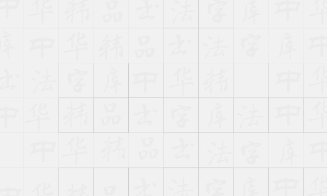
Liu Gongquan (778-865): Calligrapher of the Tang Dynasty. The courtesy name is Chengxuan, a native of Jingzhao Huayuan (now Jiezhou Town, Yuncheng, Shanxi). Official to Prince's Young Master. Gongshu and block script are especially famous. I started learning from Wang Xizhi and read all over modern brushwork, and learned from Yan Zhenqing and Ouyang Xun. The bones are strong, the structure is tight, and it has its own appearance. It had a great influence on later generations, and he was called "Yan Liu" together with Yan Zhenqing. There are many book steles, among which "Mysterious Tower Stele", "Diamond Sutra" and "Shence Army Stele" are the most famous ones. The calligraphy includes "Inscriptions and Postscripts on Sending Pear Posters".
Font features: The "Mysterious Tower Stele" and "Shence Army Stele" are the main development basis. The strokes are strong, solid, and clear, and the fonts are steady, straight, and free, reflecting the overall style of being rigorous yet clear.
Font design arrangement:Su Xinshi
Reviewer:Hu Dijun
Applicable scenarios: Classical, Chinese style, film and television, travel, emotion, VLOG

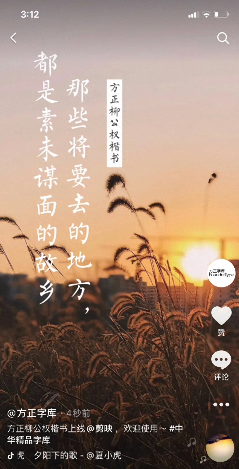
Wang Duo (1592-1652): A calligrapher of the Qing Dynasty. The courtesy name is Juesi and the nickname is Songqiao. He is a native of Mengjin, Henan. Gong Xing's cursive script went deep into the pavilion script, and he also benefited from the cursive techniques of Yan Zhenqing and Mi Fu as well as the past dynasties. I have adapted the ancient method to make it bigger. I have strong penmanship and good at white cloth, and I have unveiled my new chapter in large-character cursive writing. It can combine landscape, orchid and bamboo. There are many ink inscriptions handed down from generation to generation, including the collection of "Xianshan Garden Tie" engraved with his calligraphy.
Font features: It is developed based on Wang Duo’s main ink writings handed down from ancient times. The writing is smooth, vigorous and free, full of variety and graceful.
Font design arrangement:Zi Xiaofeng
Reviewers: Xu Hai, Lin Jinghui
Applicable scenarios: Blockbusters, trends, stuck points, e-commerce, ancient style, games

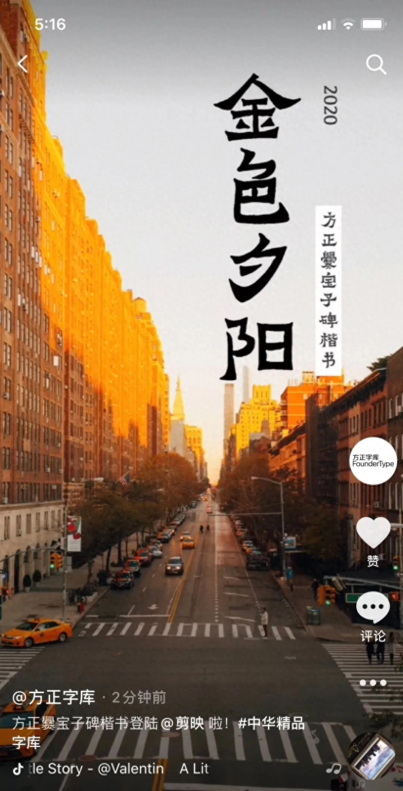
Cuàn(cuàn) Baozi stele: The stele of the Eastern Jin Dynasty, the main book, the forehead of the stele is inscribed "The tomb of Cuanfu Jun, the prefect of Jianning, General Zhenwei of the Jin Dynasty". It was established in the first year of Yixi (405 AD. At this time, the era name had been changed to Yixi, or because of the border blockage, the author of the monument still wrote the era name as "the fourth year of Tycoon"). In the 43rd year of Qianlong's reign in the Qing Dynasty (1778), it was unearthed in Yangqi Tian, 70 miles south of Qujing, Yunnan. It was first recorded in "Yunnan Tongzhi" in the 15th year of Daoguang's reign (1835). It was moved to the Wuhou Temple in the city during the Xianfeng period. The style of the calligraphy is between official script and regular script, which shows that the writing style evolved from official script to formal script.
Font features:Cuan Baozi Monument regular script is developed based on "Cuan Baozi Monument". It is simple, majestic and ancient, as clever as clumsy, frank and tough, powerful and full of strange postures, completely natural. The body posture, mood, and mood are all between official and regular script.
Font design and arrangement:Su Xinshi, Wang Wen
Reviewer:Guo Wei
Applicable scenarios:Variety shows, games, animation, travel, scenery, cover images

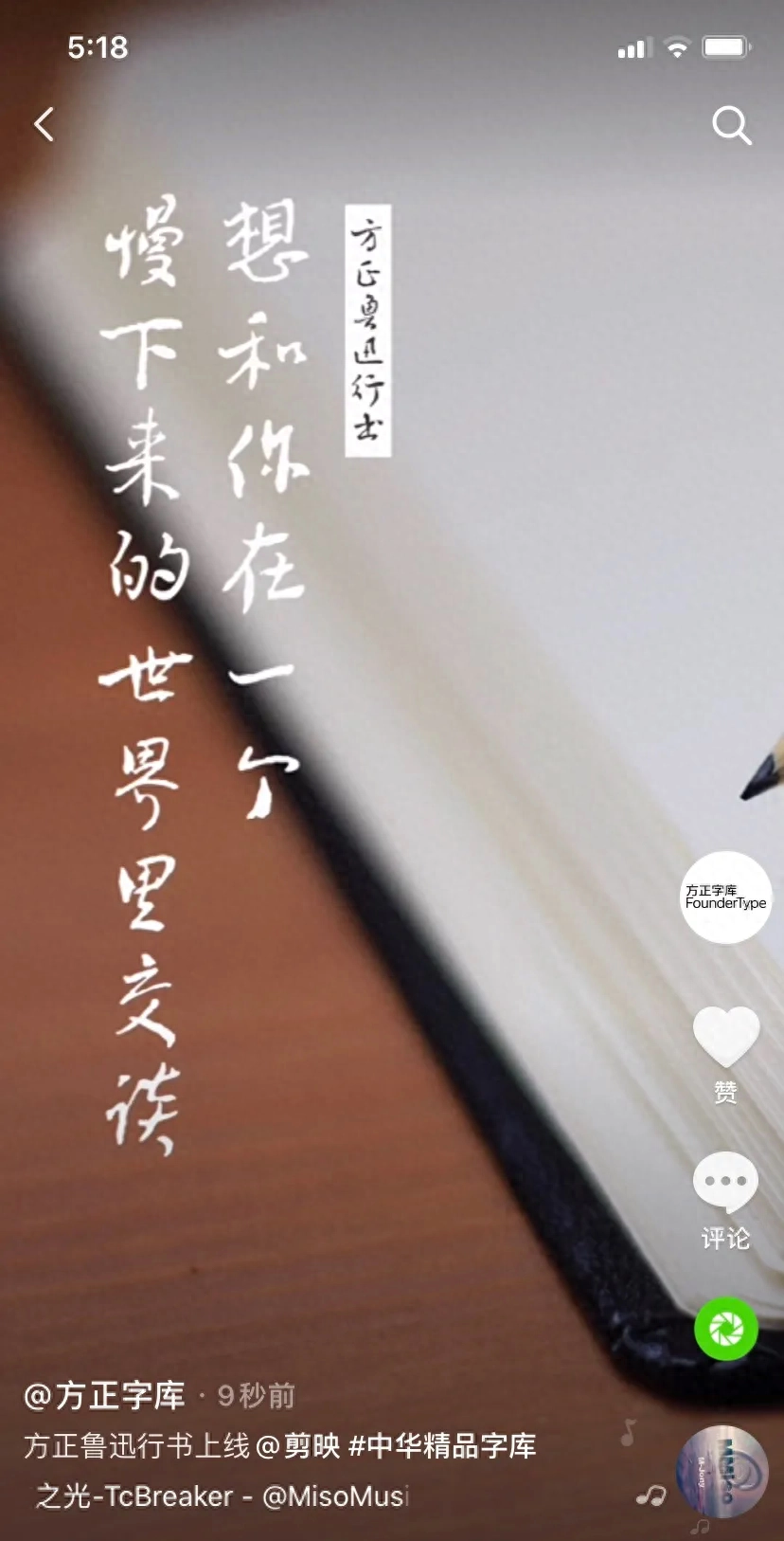
Lu Xun (1881-1936): His real name was Zhou Shuren, and his courtesy name was Hencai. A native of Shaoxing, Zhejiang, he is a famous writer, litterateur and thinker in modern China, one of the leaders of the New Culture Movement, the founder and pioneer of modern Chinese literature. Lu Xun's calligraphy is mostly running script, with an artistic style that is simple and vigorous, soft on the outside and strong on the inside, sparse and elegant, free and easy. His large-scale calligraphy pays attention to composition, steady structure, dignified and simple brushwork, and neglects details to focus on the main body. The slowness of the spirit, the broadness of the meaning, and the charm of the Wei and Jin Dynasties are straight forward, which shows his profound cultivation of calligraphy art. Small letters and manuscripts can be picked up easily, and the hands are familiar with them. They change according to the time, and the ancient methods are still there. They often have an innocent and innocent interest, which shows his great achievements in calligraphy in Linchi in his early years.
Font features: Lu Xun's running script is mainly developed based on letters and essay manuscripts from the mature period of Lu Xun's calligraphy style ("Book of Two Places", "Selected Manuscripts of Lu Xun"). Simple but not restrained, free and easy but lawful, pure and elegant, full of humanistic flavor and aesthetic value. It is sparse, elegant and clean, slow and relaxed, free and natural, with a strong bookish flavor.
Font design and arrangement:Guo Yuhai
Reviewer:Chen Xinya
Applicable scenarios: Film and television, variety shows, e-commerce, education, culture, handwriting

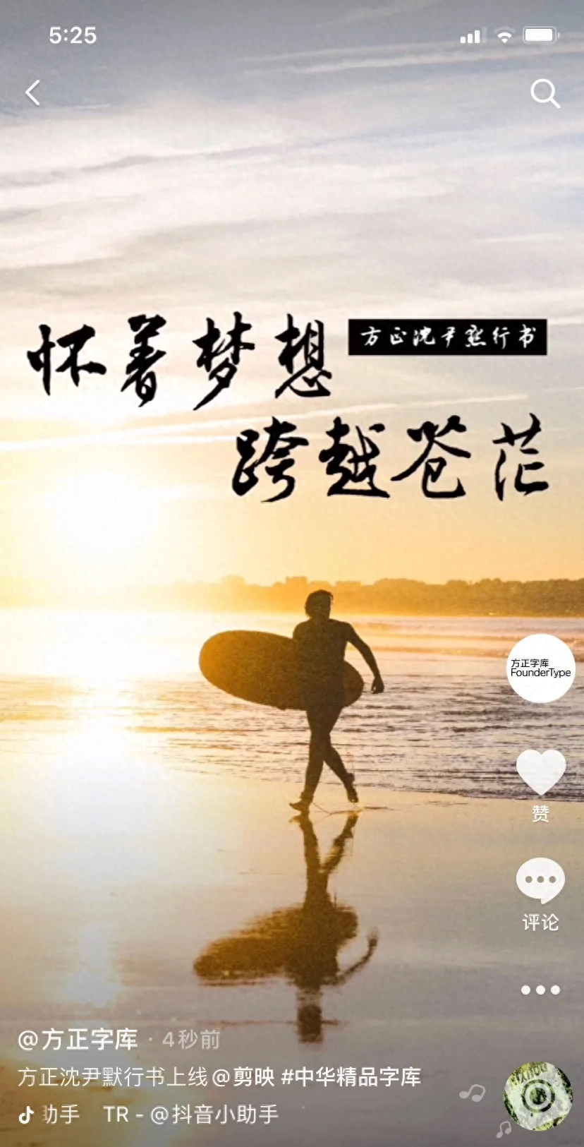
Shen Yinmo (1883-1971): Contemporary calligrapher and poet. His original name was Junmo, with the courtesy name Qiu Ming, and he was a native of Wuxing, Zhejiang (now Huzhou City). He studied in Japan in his early years. Before liberation, he served as professor of the Literature Department of Peking University and president of Peking University. After the founding of the People's Republic of China, he served as deputy director of the Central Museum of Culture and History, member of the Shanghai Municipal People's Committee, and representative of the Third National People's Congress. Gongzheng is famous for his cursive script and is especially famous for his cursive script. He first studied Chu Suiliang, then studied famous masters in Jin and Tang Dynasties, and in his later years he studied with Su Shi and Mi Fu. He is good at using brushes, with a clear, round, graceful and vigorous appearance. He advocates writing with the wrist instead of imitating the structure. He has elaborated on the brushwork and gestures. He has written "Interpretations of the Experiences of Famous Masters in Calligraphy", "A Look at the Calligraphy of Two Kings", "Qiu Ming Poems", etc.
Font features: Shen Yinmo’s running script is based on a variety of Shen Yinmo’s ink strokes. The brushwork is free and flowing, like flowing clouds and flowing water, naturally and smoothly. The word knot is full of ups and downs, clean and elegant. It is full of ancient charm and has a unique appearance of harmony and harmony.
Font design arrangement:Yang Longlong
Reviewer:Zhao Weiping
Applicable scenarios: Chinese style, games, animation, calligraphy, positive energy

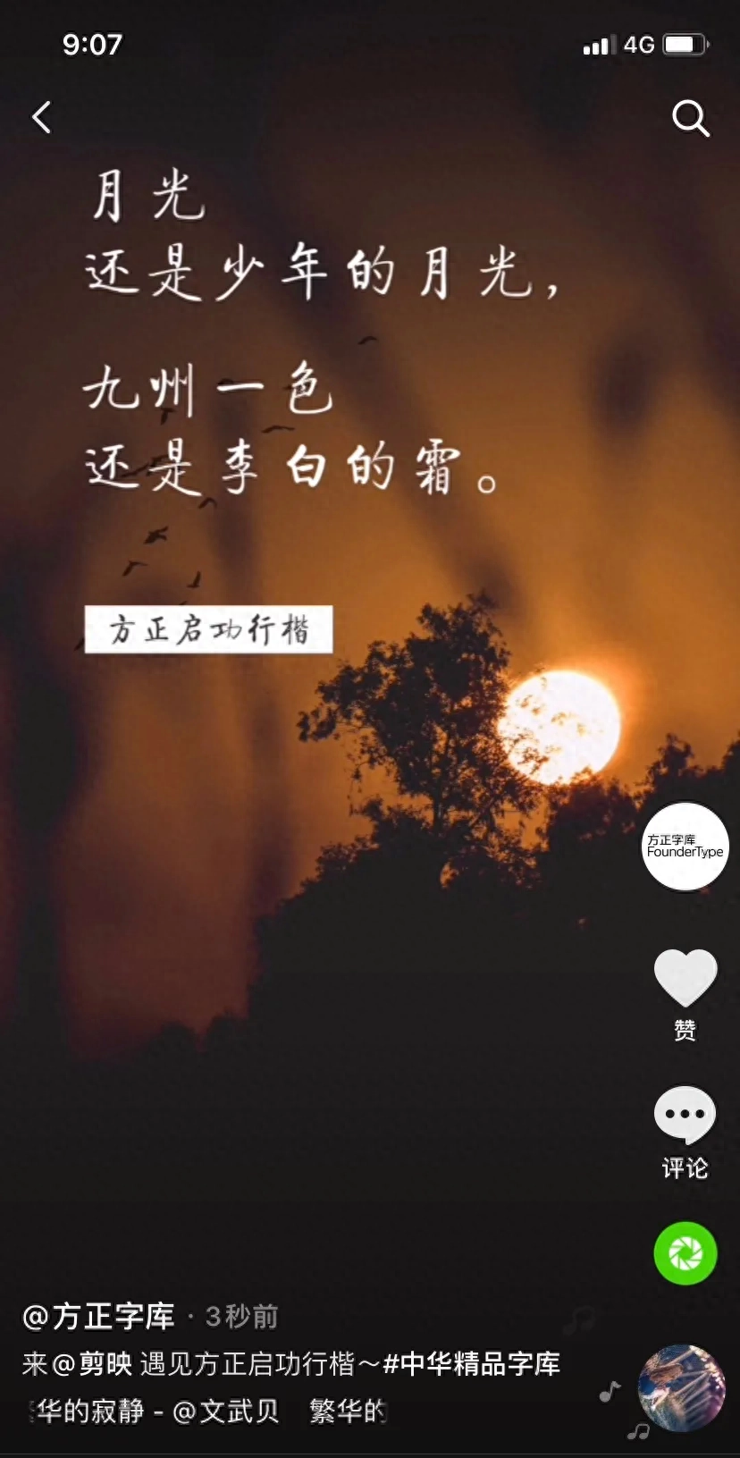
Qi Gong (1912-2005): Contemporary calligrapher and painter, calligraphy and painting connoisseur, and literary historian. His courtesy name is Yuan Bo, and his first name is Yuan Bai. He is a Manchu and was born in Beijing. He has been engaged in the teaching and research of literature and history for a long time. He once taught at Fu Jen Catholic University. After the founding of New China, he served as professor at Beijing Normal University, director of the Central Research Institute of Literature and History, and chairman of the Chinese Calligraphers Association. Proficient in calligraphy, painting and cultural relics appraisal, he serves as chairman of the National Cultural Relics Appraisal Committee. In calligraphy, he advocated the practice of calligraphy, paying special attention to the knotting of characters, and created the "golden section method". The style of calligraphy embodies vigor, vigor and elegance in a dignified and quiet manner. He is the author of "Qi Gong's Collection of Manuscripts", "On the Hundred Jue of Calligraphy", etc., as well as various calligraphy collections such as "Selected Works of Qi Gong's Calligraphy".
Features of the font: Qigong Xingkai was written by Mr. Qin Yonglong, professor of calligraphy at Beijing Normal University and education committee member of the Chinese Calligraphers Association, appointed by Mr. Qi Gong. The structure is precise and strict, the strokes are clear and vigorous, the layout is light and heavy, the host and guest complement each other, the style is handsome and elegant and popular. She has a calm and comely personality, a generous body, elegant and graceful, with an elegant and bookish air.
Author: Qin Yonglong
Reviewers: Li Honghai, Yu Le
Applicable scenarios: Retro style, culture, books, music, fashion, VLOG

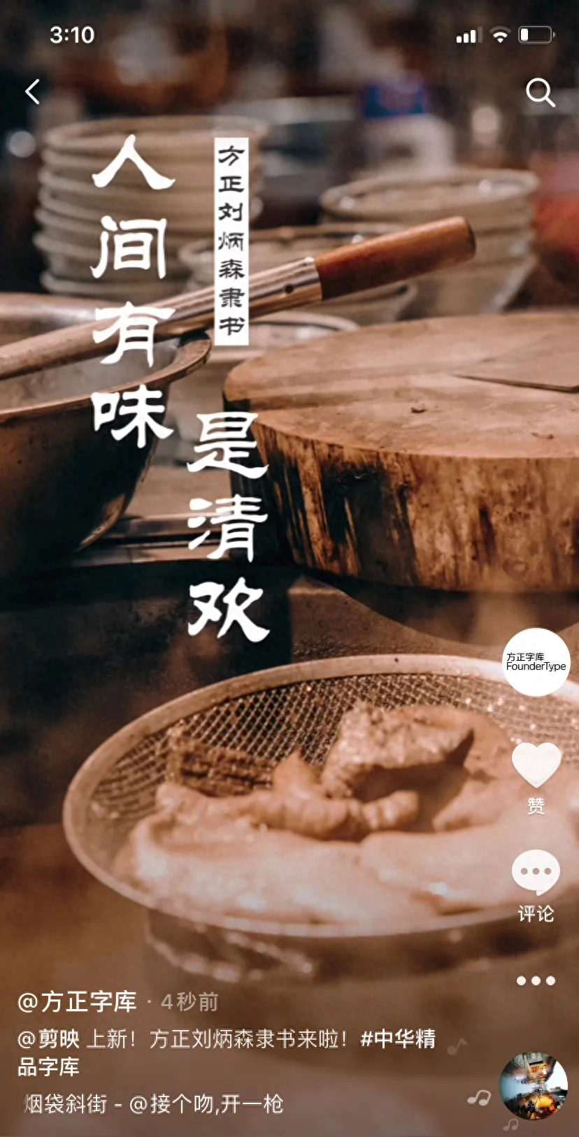
Liu Bingsen (1937-2005): contemporary calligrapher. He once served as a researcher at the Palace Museum in Beijing, vice chairman of the Chinese Calligraphers Association, vice chairman of the China Federation of Literary and Art Circles, vice president of the Chinese Buddhist Association, and a standing member of the National Committee of the Chinese People's Political Consultative Conference. He has profound calligraphy skills and is famous for his official and regular script. His official script fully demonstrated his creativity and formed a distinctive personal style, which is unique in the contemporary calligraphy world.
Features of the font: Liu Bingsen’s official script was born out of the lead type copper mold script. This set of manuscripts was written by Mr. Liu Bingsen. The style is calm and atmospheric, with a unique charm that is smooth, natural and unhurried. It is upright, honest, steady and elegant, in line with modern aesthetic taste.
Author:Liu Bingsen
Reviewer:Qiu Yin
Applicable scenarios: Food, humanities, life, emotions, documentaries
-END-
Articles are uploaded by users and are for non-commercial browsing only. Posted by: Lomu, please indicate the source: https://www.daogebangong.com/en/articles/detail/zhe-7-kuan-jing-pin-zi-ti-dou-yin-jian-ying-APP-mian-fei-yong.html
 支付宝扫一扫
评论列表(196条)
测试