As a maintenance member of the school, Xiaomi can testify that most teachers are used to making 4:3 PPT, and only a small number of young teachers can quickly produce 16:9 widescreen PPT courseware.
In the past, 4:3 monitors and projector screens were mainstream, so teachers were used to making 4:3 PPT courseware, but in recent years 16:9 widescreen has become more and more popular, such as our school’s The projector screen and electronic tablet have been replaced with 16:9 widescreen.
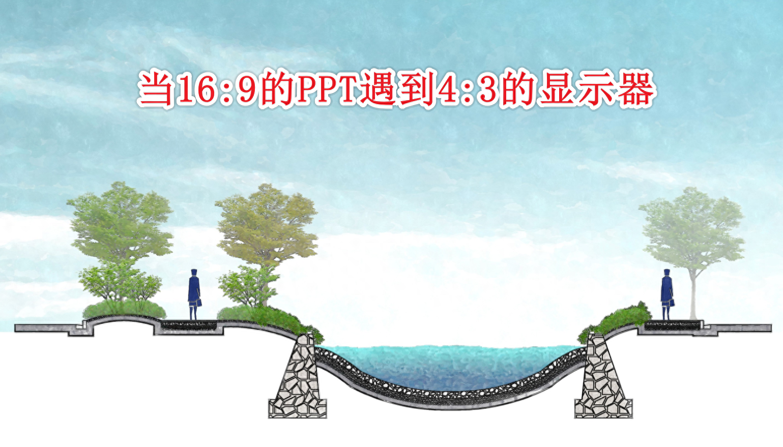
Unfortunately, it is difficult to change habits after a while. If the PPT made by the teacher is 4:3, and it is displayed on a 16:9 display, there will be obvious black borders on both sides, which is very ugly.
Then there is another situation. If you are used to designing PPT with a 16:9 ratio, but suddenly encounter a 4:3 monitor, what should you do? There are various worries. The beautiful PPT that was originally made with a lot of effort has become unsightly due to the proportion of the monitor.
In fact, we can learn how to adjust PPT of various proportions so that we can adjust it at any time in different scenarios.

Xiaomi provides 3 methods for your reference.
1. Support content
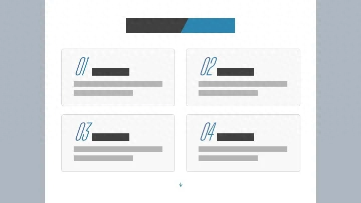
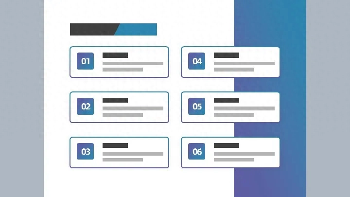
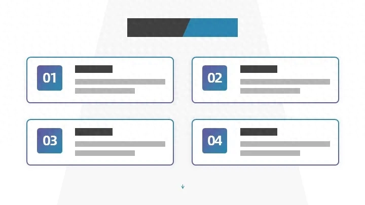
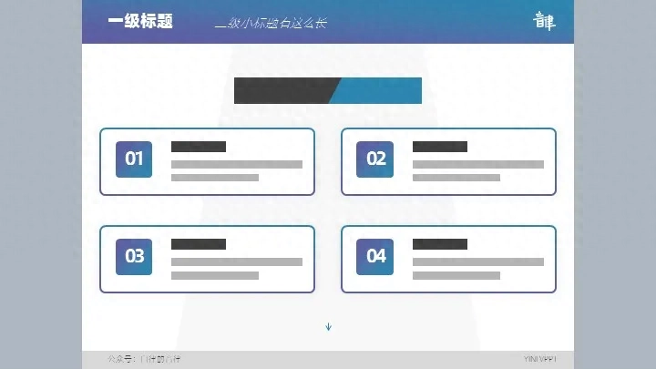
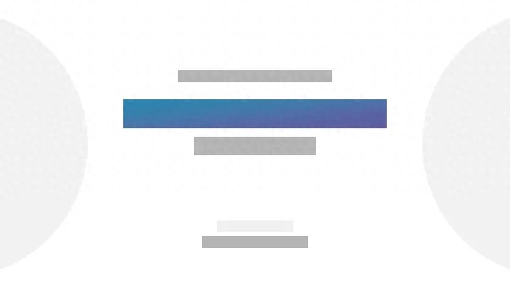
What does this mean? In order to make it easier for everyone to understand, I will use the layout color block to demonstrate it. You can use the style and details as you like, such as the following widescreen PPT:
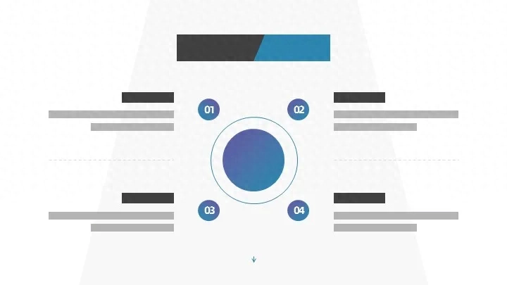
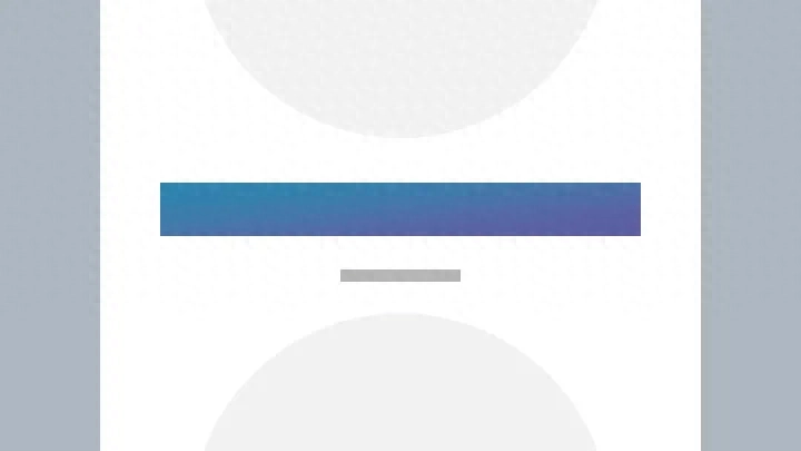
Now if we reduce all its contents to a ratio of 4:3, we will find that there are blank spaces above and below.
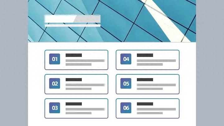
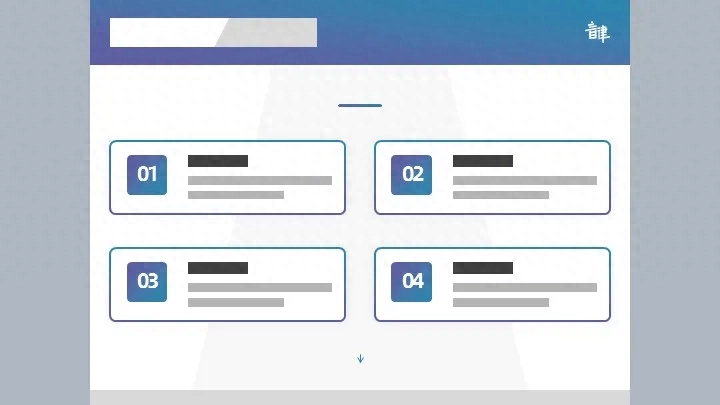
then what should we do? In fact, we can keep the title unchanged and make the content higher. There are many methods. The most common one is to add a border or color block background to the content area:
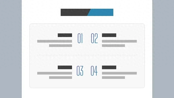
This approach actually frames the area, allowing people to visually feel that the content in the large color block is a whole.
This is the idea. Then we use the widescreen layout template and just add a background at the back. Of course, it doesn't have to be a color block. You can also use a thick line frame or a picture background, both are fine.
In addition, we can also move the serial number letters upward, which can also play a role in raising the content area.
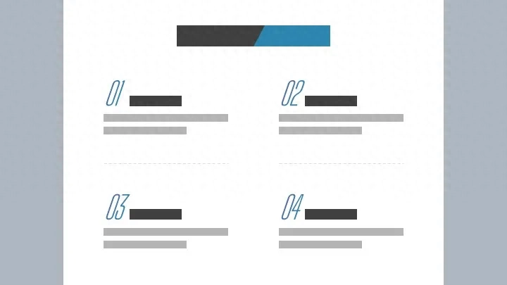
As for the serial number, it actually serves more of an auxiliary decoration. Can we replace it with lines, letters, icons, etc.?
In fact, they are all possible, the idea is still the same, you can give it a try.
After the content area becomes taller, you can also add a substrate or border to make it look more comfortable:
Card designs like this are very common, especially in business PPT.
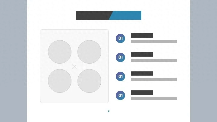
To raise the content area, in addition to adjusting the layout of the relatively simple substrate or decorative elements just now, you can also visualize the content, and the effect will be better.
By appropriately refining and summarizing the content from pure text to displaying it in charts, it is easier to adjust the height and the spacing between the content, making it look much more comfortable:
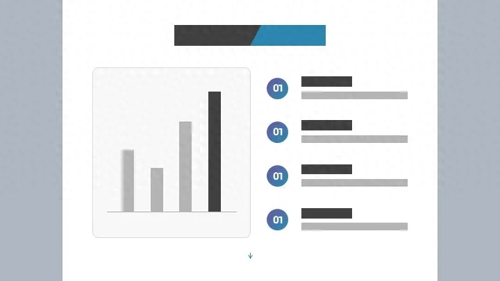
So what if there is less content? If the content is small, you can enlarge the keywords to make the page look more focused. Similarly, you can turn the data content into charts to make the effect more friendly:
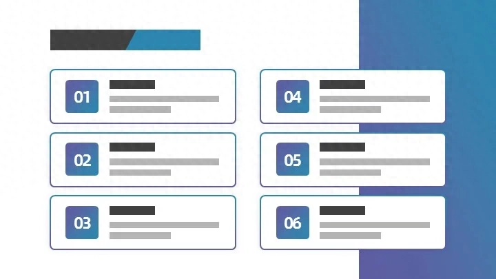
So what should you do if the content is difficult to extract keywords? In this case, you can consider processing it into a logical diagram, or a flow chart or a structure chart:

As can be seen from the picture above, it is easier to adjust the spacing in graphical display, and it is convenient to modify the PPT at any time, so everyone must learn from it when making daily PPT.
For graphical display, whether it is narrower or wider has little impact. As long as the spacing is within a reasonable range and the overall style is unified, there will be no problem.
With the same idea, even if you only adjust the spacing, you can make the 4:3 PPT look beautiful.
For example, in the picture above, while keeping the layout unchanged, I need to increase the spacing between the content parts:
This adjustment method is actually very common, especially when the PPT suddenly needs to be changed from a 16:9 widescreen to a 4:3 regular screen ratio, or when the widescreen is changed to an ultra-widescreen.
A friend asked, since raising the content area can make the page look more comfortable, can we also consider it this way?
2. Add up and down code
What should you do if you don't want to adjust the content layout and want to copy the widescreen layout and use it directly after shrinking it?
It's very simple, just make the upper and lower areas higher, such as adding a picture or a color block background on the top:
To put it simply, keep the original PPT unchanged and add a section at the top, so there is no change in the content of the original PPT.
This idea, in essence, is to compress the proportion of the content part and return the content part to the widescreen ratio.
Let’s take another example, such as the picture below:
We keep the content part unchanged, add color blocks above, decorative elements can also be used, and compress the middle part to a widescreen ratio:
Why do you do that? In fact, it is just to make the content more in line with everyone's reading habits. Of course, this operation also saves time.
If you want to apply the template layout, just copy and shrink it and put it directly. If you don't like decorative lines, you can also move the title down a little and add a title:
Similarly, you can also turn the top into a navigation bar. In short, it is just to add something to it and make the overall content more substantial.
This method of operation is very common in academic PPT, the typical "chapter + section + subtitle".
The two ideas just mentioned are actually to raise the content part so that the page does not look so sparse. In fact, the more common operation method is the third method below.

3. Adjust layout
It can be said that the above two methods are lazy, and there are no major adjustments to the layout.
If this behavior is not advisable within the scope of business, it may make your Party A feel that you are just coping without putting much thought into it. If you want the business to be completed smoothly, you need to learn more skills.
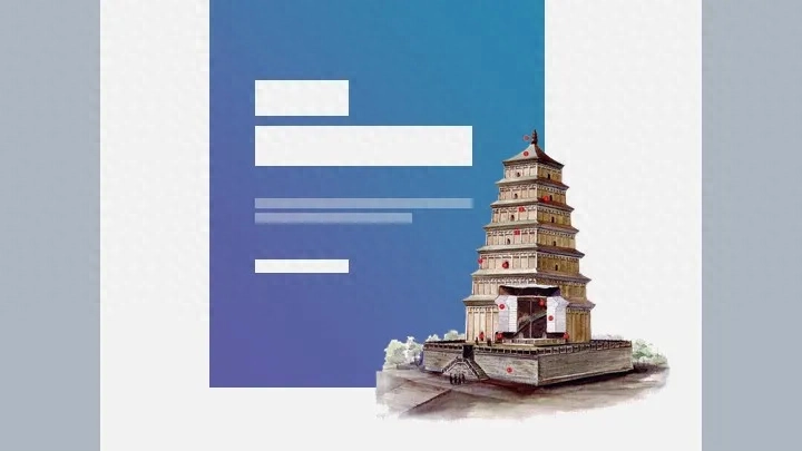
Okay, let’s get to the point, like the picture below:
People often put some symmetrical materials on the left and right sides to decorate the page. However, when placed in a 4:3 ratio PPT, can it become symmetrical up and down?
This kind of layout will work very well if used as homepage, last page, or summary page.
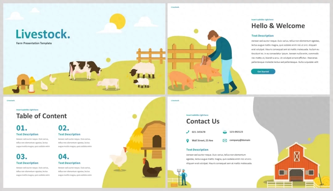
Likewise, the following is the most common layout in widescreen:
After just a few simple adjustments, it will look great on a normal screen:
Therefore, there is actually no shortage of ideas. Now everyone understands that what is lacking is actually templates and layouts.
4. Idea expansion
If you are unwilling to adjust, or are not confident enough, you can also try the following method.
1. Apply the 4:3 ratio template directly on the PPT template site
Many websites provide a large number of screen-sized templates, such as:
Some templates also provide templates with different proportions and different color schemes:
2. Use the theme library of iSlide plug-in
Xiaomi has introduced the iSlide plug-in several times before. Its functions are very powerful. For example, its theme library provides a large number of templates with different proportions:
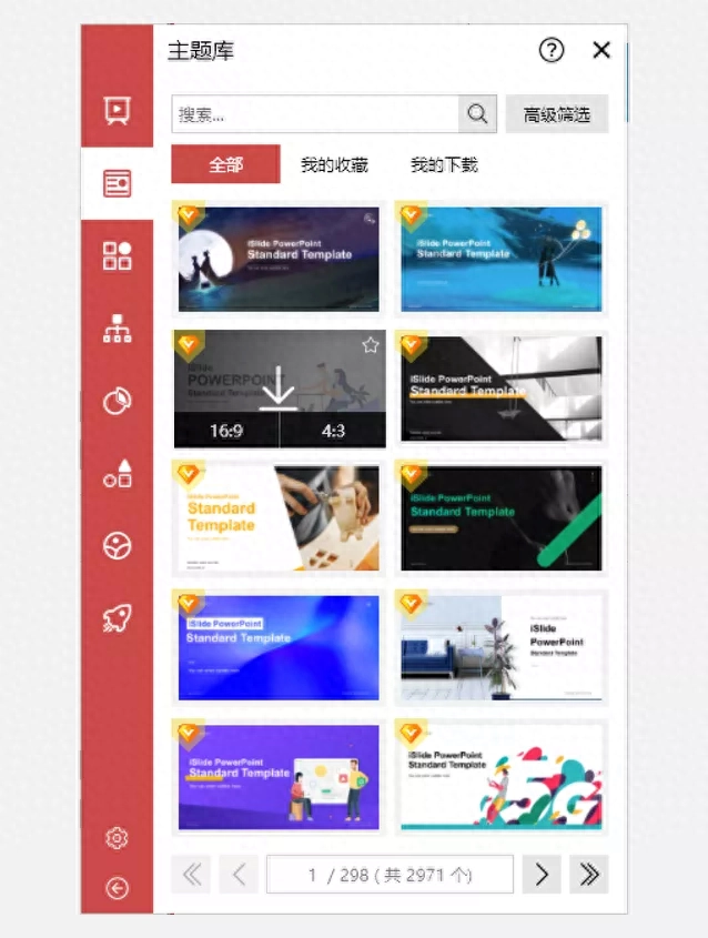
Just choose the one you like and download it directly, and then apply it.
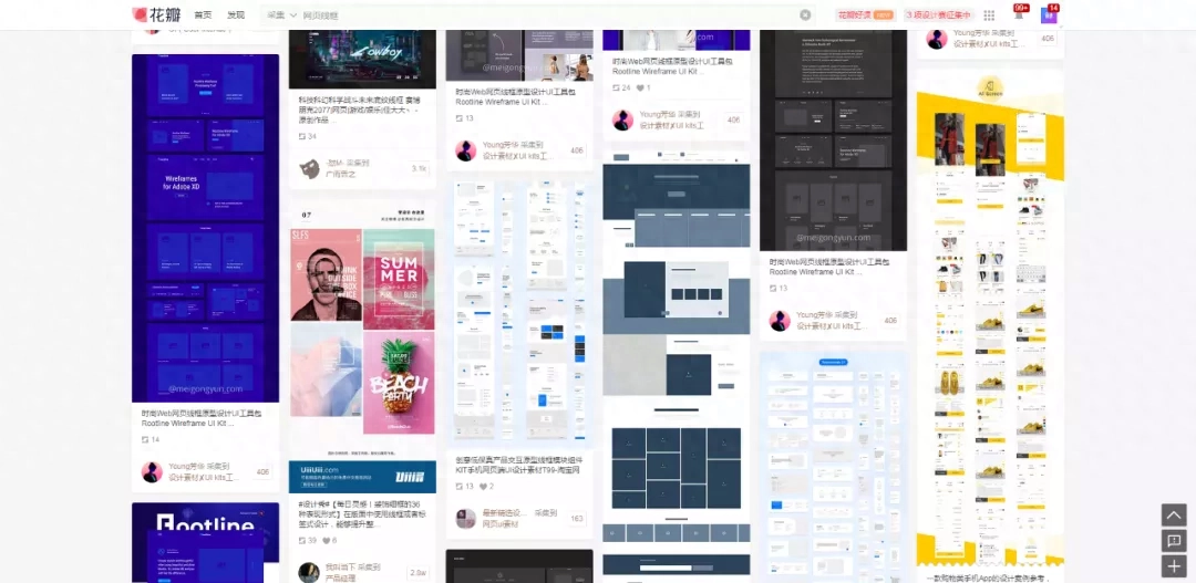
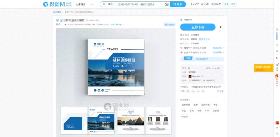
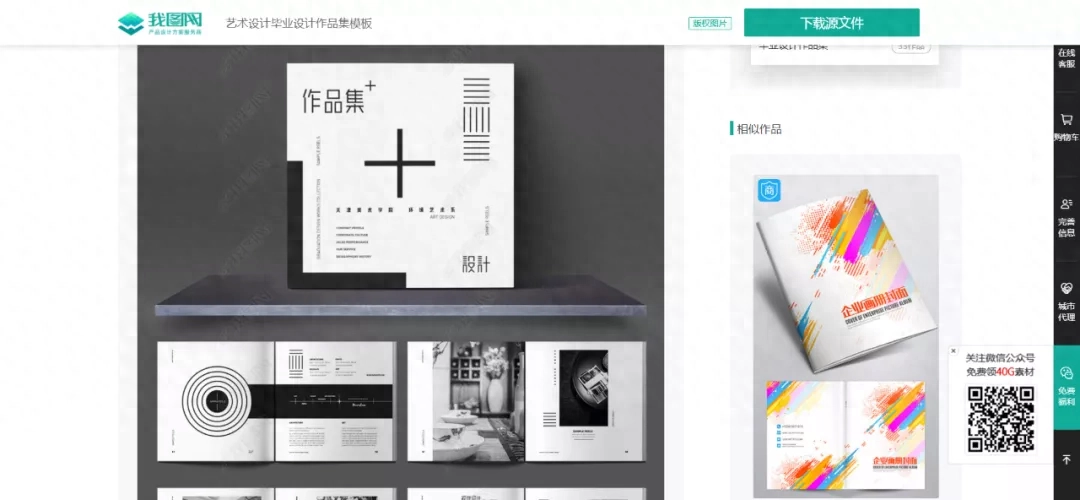
3. Refer to some exquisite web pages, albums, portfolios, etc.
There are some web pages, albums and works that are very beautiful in design. You can refer to their design concepts and layouts and apply them to your own PPT, such as:
Well, if you learn how to adjust the different proportions of PPT, you can freely use your PPT in any different scenarios. If you often need to make PPT courseware, learning to adjust the proportion will greatly reduce your work worries.
Articles are uploaded by users and are for non-commercial browsing only. Posted by: Lomu, please indicate the source: https://www.daogebangong.com/en/articles/detail/zen-me-ban-dang-kuan-ping-16-9PPT-yu-dao-pu-ping-4-3-de-xian-shi-ping-zhe-yang-tiao-zheng.html
 支付宝扫一扫
评论列表(196条)
测试