Let me tell you a very scary thing, that is, 2023 has passed Halfway through, is your work report PPT ready?
I know you are not ready yet. Probably the most asked question by readers recently is how to format work report PPT.
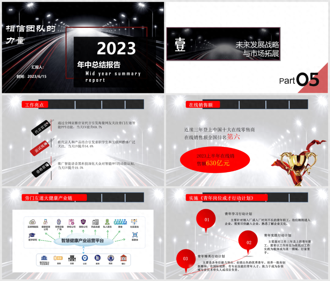
Today's article is based on the request of readers, to revise a mid-year summary report PPT. This is the original draft:

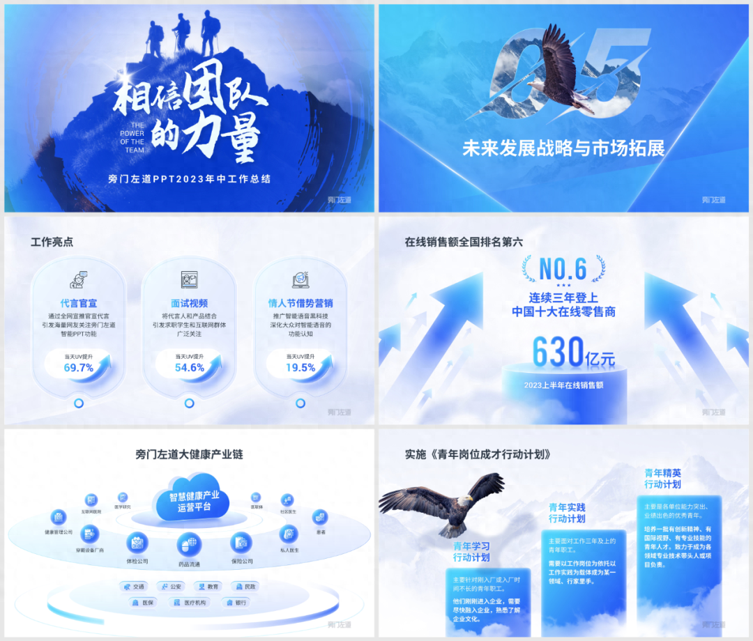
01Look at the cover page first
The original manuscript obviously applies a template, the picture does not match the content, and the content The layout is also quite confusing.

Let’s reorganize the visual hierarchy of cover information.
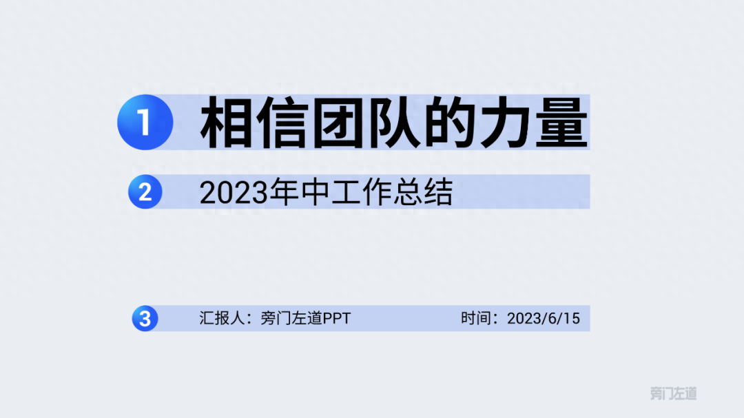
In order to reflect the sense of power, the title can be typed in staggered calligraphy fonts, which will also look more imposing:

The cover background can use a mountain climbing chart to show teamwork:

To keep the overall tone consistent, we can change the image to blue using recolor:
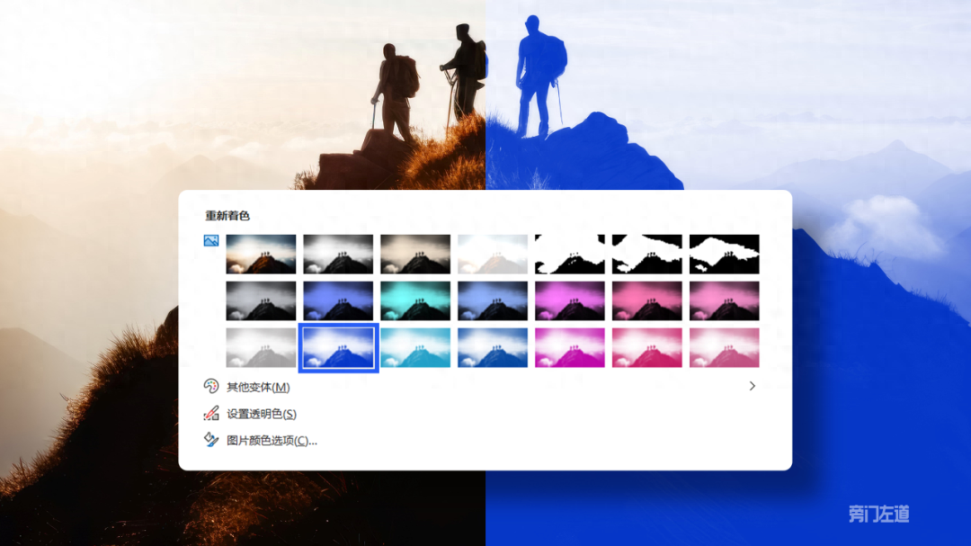

And use brush materials to enrich the background, and use light effect materials to embellish the title:

Let’s take a look at the finished product~

02 Let’s look at the transition page

The transition page is very simple, be sure to remember this method, digital zoom.

Just enlarge the chapter number to make the originally monotonous page fuller.

If you want the page to be richer, you can fill the background and numbers with images:

Using the overlay of elements and numbers can further enrich the layering of the page.

Of course, we can also adjust the digital perspective to blend the images:

You can get a transition page with a great sense of space~

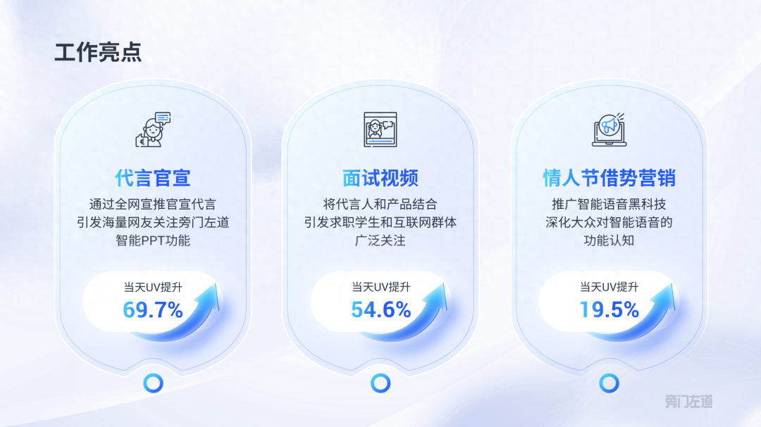
03 Work Highlights Page
When doing work reports, avoid information leveling, be sure to The key points are highlighted.
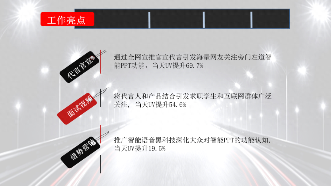
A page like this one, in addition to subtitles, highlights key data, allowing leaders to see the results of the work at a glance.
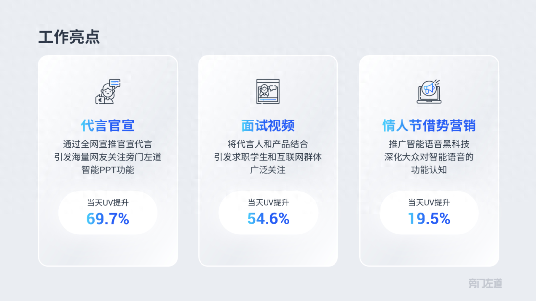
Here I add some additional arrows to indicate the increase in data:

If you are tired of looking at ordinary rounded rectangles, you can also change the shape outline:

Isn’t this more creative?
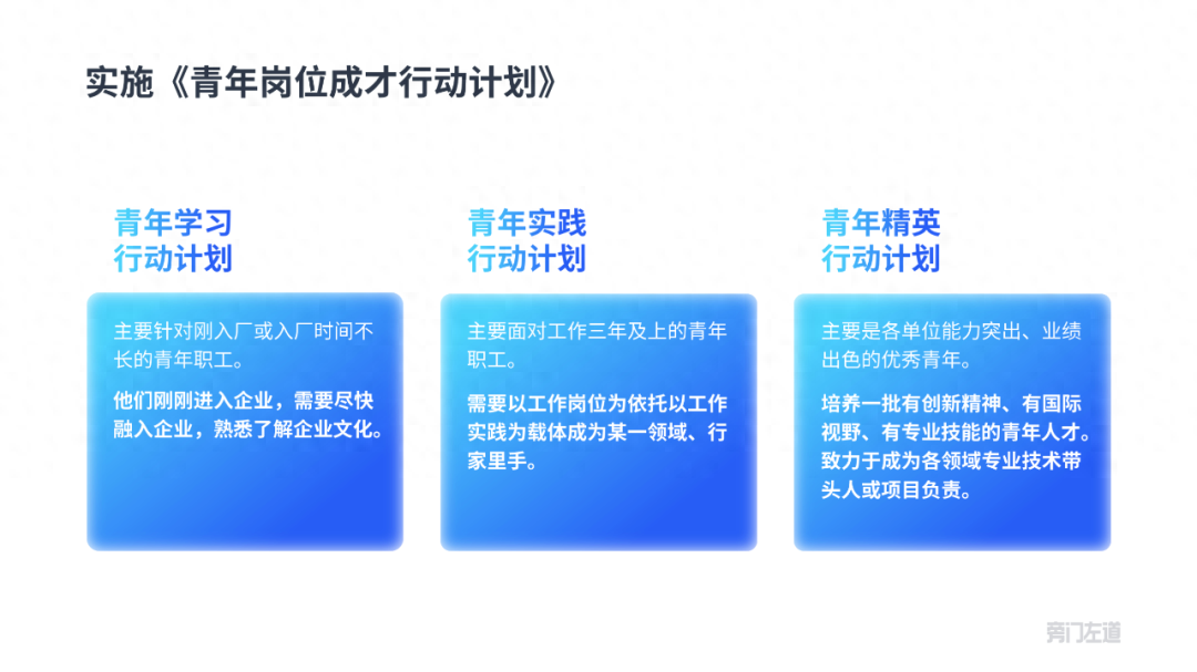
04 data display page
There are only two key data in the page, which can easily cause page holes:

In addition, when highlighting data information, try to avoid splitting the data and text in the same text box, and enlarge the data separately, which will make it more tidy visually.

Considering the honor attribute of the data on this page, I used center alignment and used wheat ears and platforms for display:

Now there is still space on both sides, you can add some upward slanting arrows to make the picture fuller:

Finally, add some cloud modifications to create a hazy beauty:

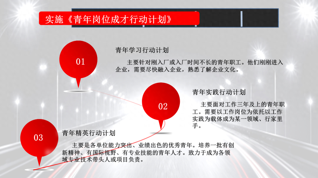
05 logic diagram page
The original icons on this page have different colors, and the overall content structure of the page is not very good. presented.
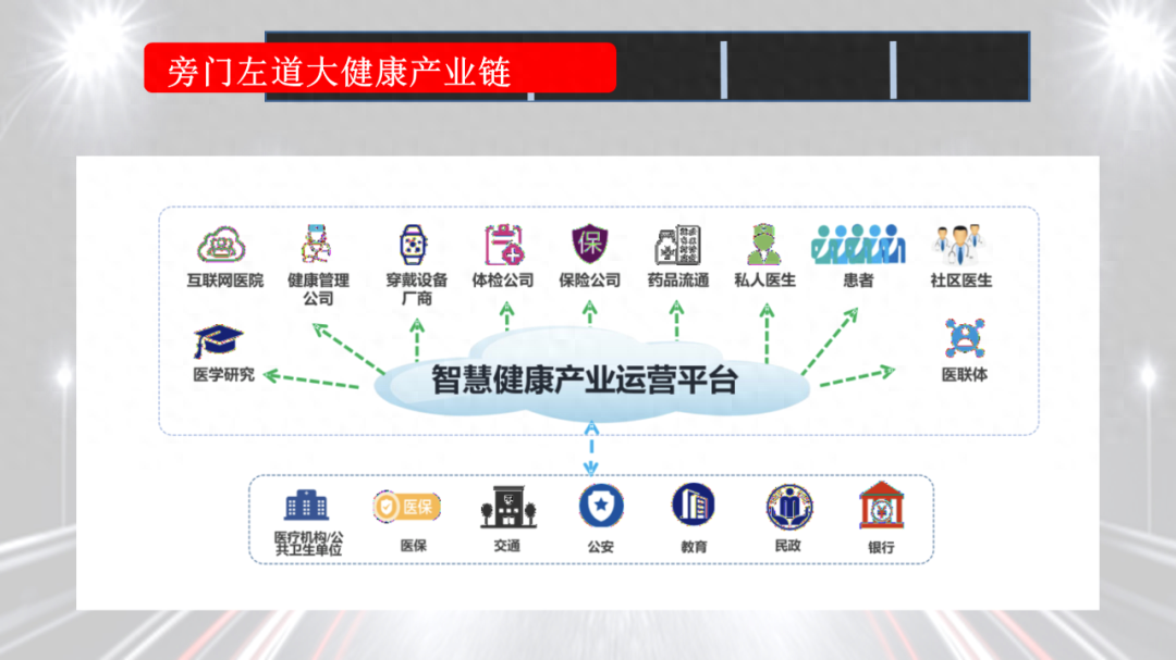
We can use two gradient ellipses as the basic platform to build the overall structural framework:

The upper-level operation platform can be represented by the "cloud". The specific branch spheres should be placed around the "cloud" in accordance with the principle of large near and far small.

The lower layer directly uses rounded rectangles to carry the content, and just arrange them neatly:
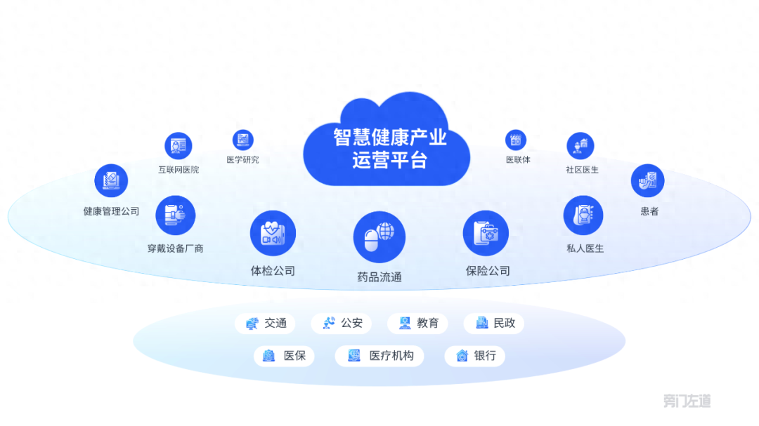
Finally, adjust the graphics’ gradient, shadow, reflection and other parameters to make the shape more textured:
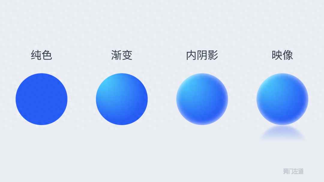
Make the page more visually appealing!

06 Future Planning Page
Obviously, this page of the manuscript is intended to be Come up with something creative.
But before you can use your creativity, you also need to do basic layout, such as arranging the content neatly.
Next, adjust the height of the color blocks to represent different levels of implementation plans:

In order to enhance the scene and expressiveness of the page, I added the eagle and mountain background:

Finally, use cloud material to blur the edges of the shape.

At this point, this PPT has been modified. Let us take a look at the comparison before and after the modification:
- Before modification-
- After modification-
How about it? After the modification, does it look like your leader likes it?
Articles are uploaded by users and are for non-commercial browsing only. Posted by: Lomu, please indicate the source: https://www.daogebangong.com/en/articles/detail/yuan-lai-zhe-cai-shi-ling-dao-xi-huan-de-gong-zuo-hui-bao-PPT-guai-bu-de-tong-shi-neng-sheng-zhi-jia-xin.html
 支付宝扫一扫
评论列表(196条)
测试