An excellent report PPT can clearly show your excellent performance. Making an excellent report PPT is crucial for every workplace person.
If this is your PPT:
via:network
This is someone else’s PPT:
via:network
Then, no matter how strong your work ability is, it may be difficult for such a reporting PPT to be recognized by the leader.
If you want to make excellent presentation PPT, you need to master the following skills:
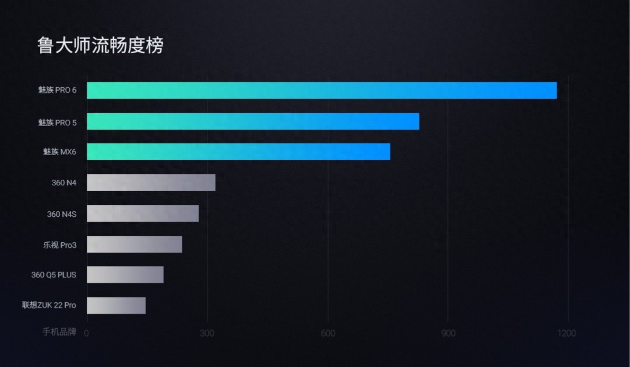
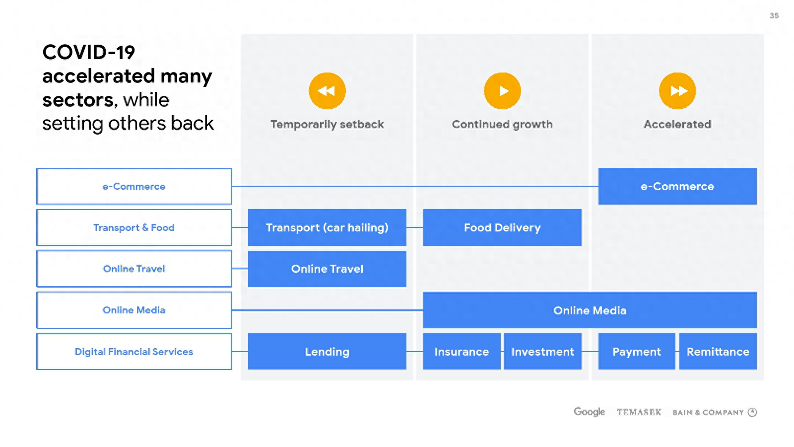
Standardized charts and clear data
Reporting PPT is generally characterized by rich content, The data is complex and the text is huge. Want to present your data clearly. Charts need to be standardized.
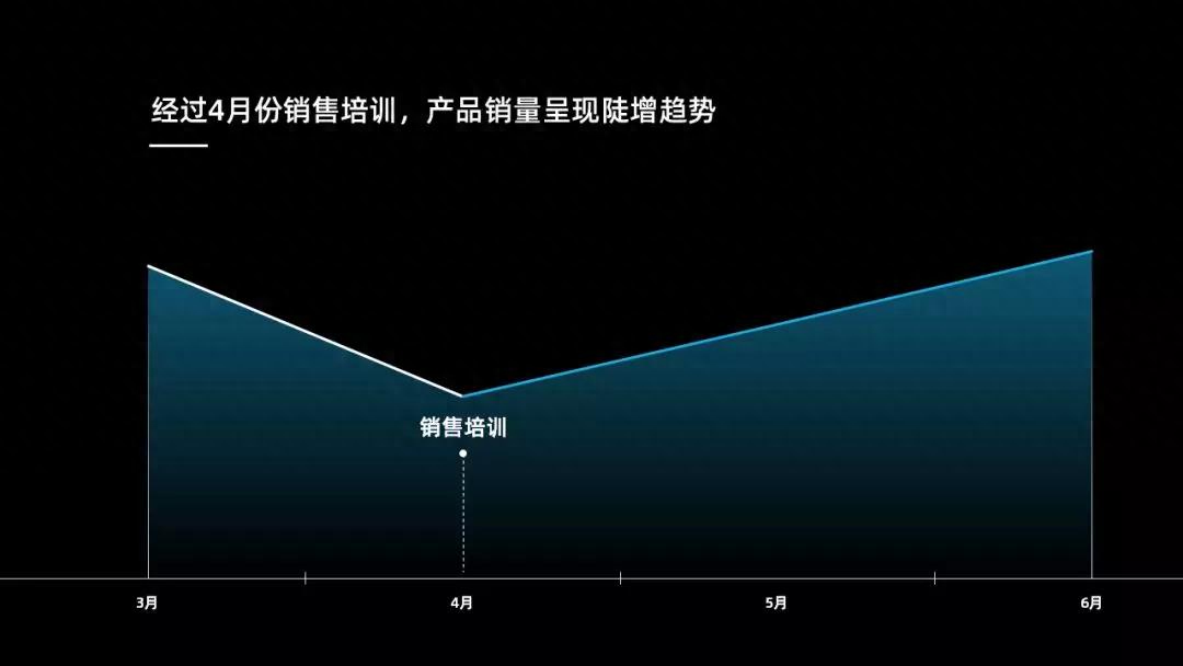
When we see the chart below, what do you think it means? It may be that sales started to pick up after April, or it may be something else, right?

But if I tell you, what it actually wants to express is not the sales data at all, but the increase in product sales after the sales training in early April. It mainly wants to reflect , is to emphasize the sales training in early April:
In addition, you can add auxiliary lines:
With this auxiliary line, the data of the entire picture is clear at a glance
For key data, you can also use bright colors to mark:
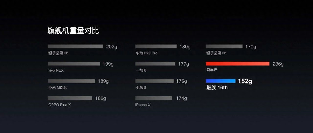
The color of the key data is very bright and displayed very eye-catchingly.
Reasonable color matching to achieve visual unity
PPT color matching is suitable for most people , it is still relatively difficult to do. For work report PPT, you can generally use the company logo color
Let’s take a look at Google’s logo colors, including red, yellow, blue and green

However, generally not all of them will be used, but one or two of them will be used. In addition, in order to avoid the monotony of the page, the universal color - gray will be used.
Like gray with blue:
Gray with yellow:
Grey, yellow, and blue are used together:
It should be noted that the logo can have up to 3 colors, and cannot exceed 3, otherwise the picture will be very messy.
Use lines or light color blocks
Don’t underestimate the inside of PPT lines, because many times, we rely on them.
Using lines can also have the effect of regularizing title text.
Like this:
In addition to making the title look neater, lines can also make the structure of the table of contents clearer.
In addition, when the PPT page has a lot of Chinese content, lines can also be used to plan the layout.
For example, this page:
In addition to the lines mentioned above, the page can be standardized. The following method can also play the same role.
Use light color blocks to look refreshing and visually prominent. As shown below:
via:Network
via:network
Using this technique, the page can be displayed clearly and organized.
Making an excellent PPT is actually not difficult, as long as you master these three skills.
Review the three skills mentioned today to deepen your impression.
01. Standard charts and clear data
02. Reasonable color matching to achieve visual unity
03. Use lines or light color blocks
Follow@松雪仙PPT Get more PPT skills
Articles are uploaded by users and are for non-commercial browsing only. Posted by: Lomu, please indicate the source: https://www.daogebangong.com/en/articles/detail/yong-zhe-3-ge-ji-qiao-zuo-chu-de-hui-bao-PPT-rang-ling-dao-zan-bu-jue-kou.html
 支付宝扫一扫
评论列表(196条)
测试