
Like a designer, designing high-looking PPT is one of the goals pursued by professionals. Everyone hopes to achieve outstanding results with little effort.
In the book "A Design Book for Everyone", the four principles of design are mentioned: Contrast, Alignment, Repetition, and Intimacy Sex. The four principles are basic principles and apply to almost all design fields, and PPT is no exception.
But how to understand the profound design principles? Don’t be afraid, today we will take a look at one of the four principles - Contrast.
How to easily create contrast in PPT?
Through several typical PPT cases, you can quickly and easily understand and master 8 common techniques.
01 Size comparison
Because there is a difference, two different things can be clearly distinguished. The most commonly used comparison method is size comparison, that is, area comparison. Area is reflected in PPT in three forms: text size, shape and picture size.
Use different font sizes depending on the importance of the text content. Important content should be highlighted in large font size; minor content should be highlighted in small font size that can be clearly seen.
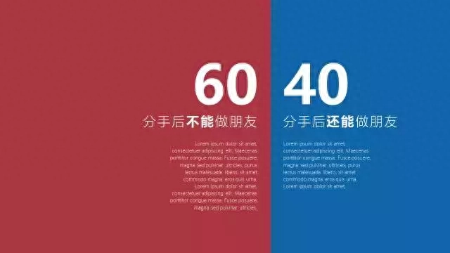
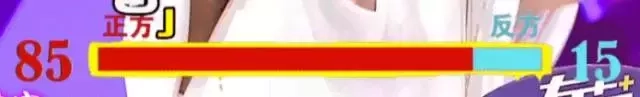
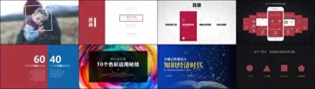
In addition to font size, the size comparison of color blocks is also very intuitive. For example, in the picture below, the comparison of the number of people holding two different views is reflected by the area of the color block.
Qi Pa talks about the changing status bar of live audience votes. Does it look familiar to you?
Likewise, images can also use size comparison. Different sizes create differences, create the center of gravity of the page, and guide people's eyes to read. For example, as shown in the example below, it decreases from the middle to both sides.
02 Color Contrast
Did you notice? Shared bicycles can be seen everywhere on the streets now, and different brands have different colors. Color is an excellent choice for creating contrast.
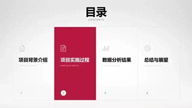
For example, on the transition page in the picture below, the red color will immediately grab your attention, and then you realize that the next PPT will talk about the "project implementation process."
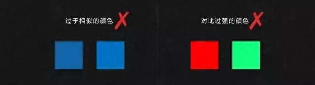
Of course, it is not recommended to use too many colors on one slide. Excessive contrast will distract attention and be counterproductive. It is enough to use 2 or 3 colors; do not use colors that are too similar; and do not use colors that are too contrasting.
03 Font comparison
Text is one of the important components of PPT. Changing different fonts to make PPT full of design is a technique commonly used by many PPT masters.
Some fonts have different weights, which are different thicknesses of strokes, such as Siyuan Heibo. Through the reasonable combination of different font weights, key titles can be highlighted and the layering of the page can be enriched.
Another thing is that different fonts have different glyphs. The difference in font shape is more obvious than the difference in font weight. Use a special font for general opinion title content, while the main text uses a regular font, such as Microsoft Yahei.

Of course, it should be noted that when selecting special fonts, the legibility of the text must also be considered. Crazy calligraphy fonts are not suitable.
04 Shape comparison
Use different shapes to differentiate different content and create contrast. PPT comes with 108 different types of shapes that can be drawn by yourself. If combined with the vertex editing and shape merging functions, you can draw any shape you want. It is a good choice to use different shapes to carry different contents and form contrast.
05 Comparison between reality and reality
In slide production, I recommend two methods of virtual and real comparison. The first is to process the picture, separate the main part of the picture, and use the fog function in the artistic effect to weaken the remaining background. The contrast between seeing clearly and not seeing clearly is similar to the use of a magnifying glass.

Another method of virtual and real contrast is to use a combination of solid and dotted boxes. As shown in the example below, the solid line frame is the main content of the industry slide, while the dotted line frame can weaken other unimportant information, thus forming a contrast and highlighting the key points.
06 Comparison of dynamic and static conditions
The human eye is inherently sensitive to dynamic things. Therefore, by adding animations to the content on the page in sequence, you can combine dynamic and static content, attract people's attention to the dynamic content, and guide the audience to follow your footsteps and enjoy your speech.

07 Texture comparison
Texture, that is, reality. We hope that people listening to the speech can be immersed in the scene and fully feel the scene we are describing. How to make PPT realistic?
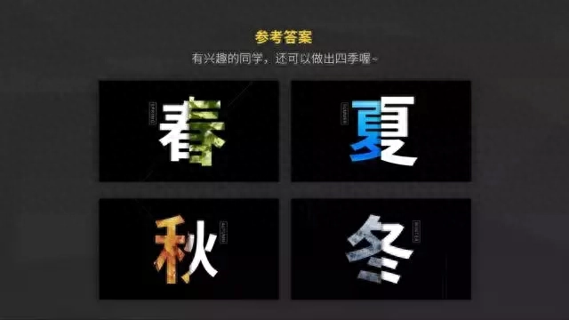
For example, use pictures with real textures, and fill the text with scenery photos of each season in spring, summer, autumn and winter, so that the calligraphy and painting are integrated and the content is fuller. (Screenshot from the course "I Know a P")
Another example is using gradient colors and shadows to make the picture less flat. Although flatness is simple and easy to make, if you look at it more, you will find that it is emotionless and cannot infect people's emotions.
08 Density contrast
Density contrast is actually related to intimacy, and related content is closer in distance. Because of this, a slide can be divided into multiple content blocks, and enough white space will be left around each content block, which creates a contrast between density and density.
Even though there is a lot of content, it can still be organized and comfortable to look at.
Okay, are you satisfied with today’s dry stuff?
If you are eager to learn, you must have discovered a little secret by reading this article, right? In actual application, the 8 comparison techniques are often used in combination.
If you want to learn PPT knowledge more systematically, then purchase the column below to unlock more PPT skills~
Articles are uploaded by users and are for non-commercial browsing only. Posted by: Lomu, please indicate the source: https://www.daogebangong.com/en/articles/detail/yong-dui-bi-ji-qiao-zuo-PPT-xiao-guo-ju-ran-zhe-me-jing-yan-zhe-8-ge-shi-yong-ji-qiao-jian-yi-shou-cang.html
 支付宝扫一扫
评论列表(196条)
测试