
Hello everyone, I am Brother Li
I was looking for PPT information on the Internet two days ago. A netizen submitted a 2-page PPT to me to see how to modify it.
We are just doing a modification and beautification, and I would like to share my modification ideas.
Look at the original manuscript first, and you can think about it.


Next, we will modify it page by page.
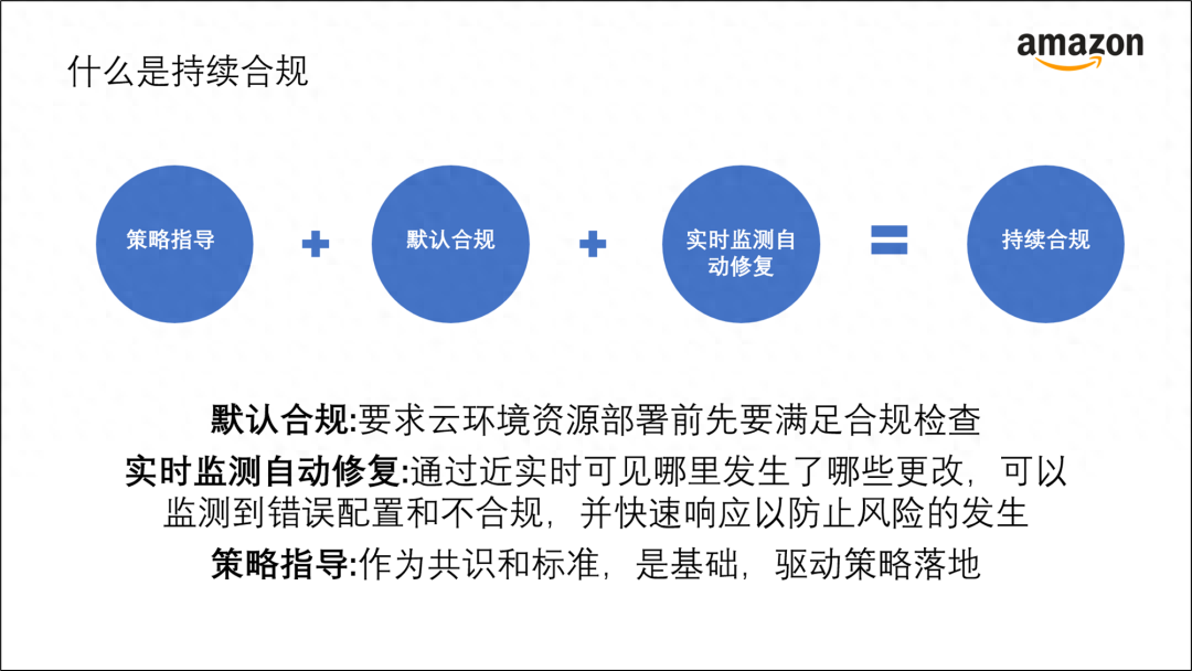
Look at the first page of PPT first.

The PPT structure on this page is relatively simple, and it talks about what kind of continuous compliance it is.
Weadd icons to the above four keywords to increase visualization.

There are three paragraphs below, which we can separate into three modules.
Doesn’t this look more refreshing and neat?

You can addAmazon’s main colors, black and orange, to get such an effect.

We can change it again and have a split screen arrangement > version, not bad either.

These layouts are relatively conventional. Let’s try a newer layout.
For example, here is asemi-circle wraparound style.

Of course, we can alsouse a triangle to typesetting , to get such an effect.

Let’s have another dark version.
You can add a picture to the background, and then add a black mask, to get such an effect.
Isn’t it pretty cool.

Next, let’s look at the second page of PPT.

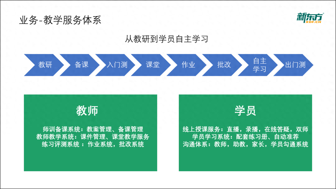
This is a one-page PPT from New Oriental, talking about the teaching service system
Look at the independent learning process first

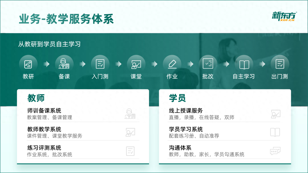
We can change it to this effect,Add icons to increase the visualization effect .
Isn’t the visual effect much better?

The bottom shape hereThe color is from light to dark
The method is very simple, select all the circles, press ctrl+g to group them together, and then set the gradient.

Then, the green color block below is a bit heavy.

We can adjust it and use green and white contrasting color blocks to make the overall look more comfortable.

The method is super simple. Just combine two rectangles.

On the right side, we canadd a picture of a teacher< /span>, making the overall look more vivid.

Then, we put the modified PPT together and take a look at it as a whole to see if it looks good.

Let’s change the layout again. There is a winding flow chart just above. Is it possible to use a waist layout?
Try it

Isn’t it pretty good.
The above is the modification of these two pages of PPT. I hope it will inspire everyone.
PS: I am Brother Li, a PPT maker for 9 years designer.
If you also want to make good-looking PPT, you can learn from Brother Li. The column has a total of 40 video lessons , which are very systematic and of super high quality.
There is also a Q&A community, and 5G PPT materials are also given
In addition, I will give you some benefits. The ways to obtain them are as follows:

Articles are uploaded by users and are for non-commercial browsing only. Posted by: Lomu, please indicate the source: https://www.daogebangong.com/en/articles/detail/xin-dong-fang-zhe-ye-PPT-liu-cheng-tu-dao-di-zen-me-xiu-gai.html

 支付宝扫一扫
评论列表(196条)
测试