
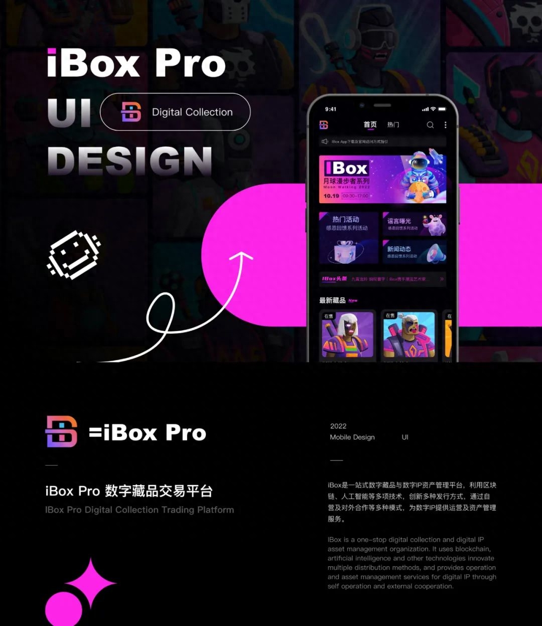
From the rise in 2017 to the popularity in 21, today’s digital Collection platforms are everywhere. In addition to major manufacturers, all walks of life are also involved in the field. Many museums have launched digital collections of cultural relics, and some clothing brands have also taken advantage of this to seek new opportunities. In addition, more and more projects such as film and television, opera, photography, animation, games, and intangible cultural heritage are beginning to be combined with digital collections. It seems that we have entered an era where everything can be collected digitally.So today we will share with you the iBox revision from UI30 installment students.
iBox is a digital collection trading platform, through self-operation and external cooperation It provides operation and asset management services for digital IP and completes the entire process of traditional IP from mining, secondary creation, issuance of digital collections to value discovery, thus forming a stable supply chain system for digital collections of traditional IP.
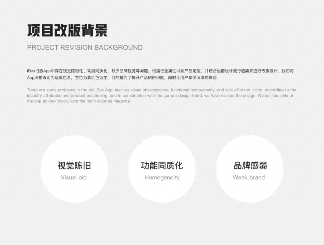
The old version of the App is visually outdated, has homogeneous functions, and lacks brand vision and other issues, so we carry out redesign design based on industry attributes and product positioning, as well as current design trends.
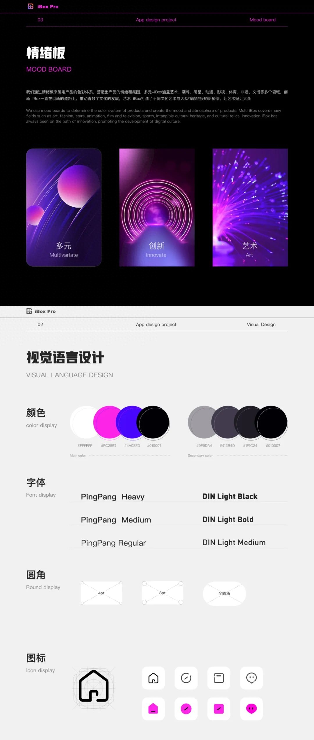
The new version of the product hopes to convey professionalism, leadership, innovation and quality to users Therefore, based on product positioning and keyword matching, we extracted elements to define the visual tonality of the brand and products, clarified the design style and implemented it. We set the new version to dark black, with the main color being purple, and the secondary color The color is blue-purple. As for the font, we chose Ping Fang, which has beautiful lines and is highly recognizable, as the main text font. The digital font uses the DIN font with clear structure and strong lines. The rounded corners are defined in multiples of 4px. Not only It can be more adaptable, and the rounded corner style can also allow users to perceive the distinction of functions, and the rounded corners can give users a friendly and lively visual experience. Tab bar icons use linear icons, and the selected state is filled with surface icons with the main color. The combination of lines and surfaces creates a more layered feel, allowing users to quickly identify and distinguish.
We use mood boards to determine the color system of the product and create a For the mood and atmosphere, we extracted three keywords: diversity, innovation, and art.
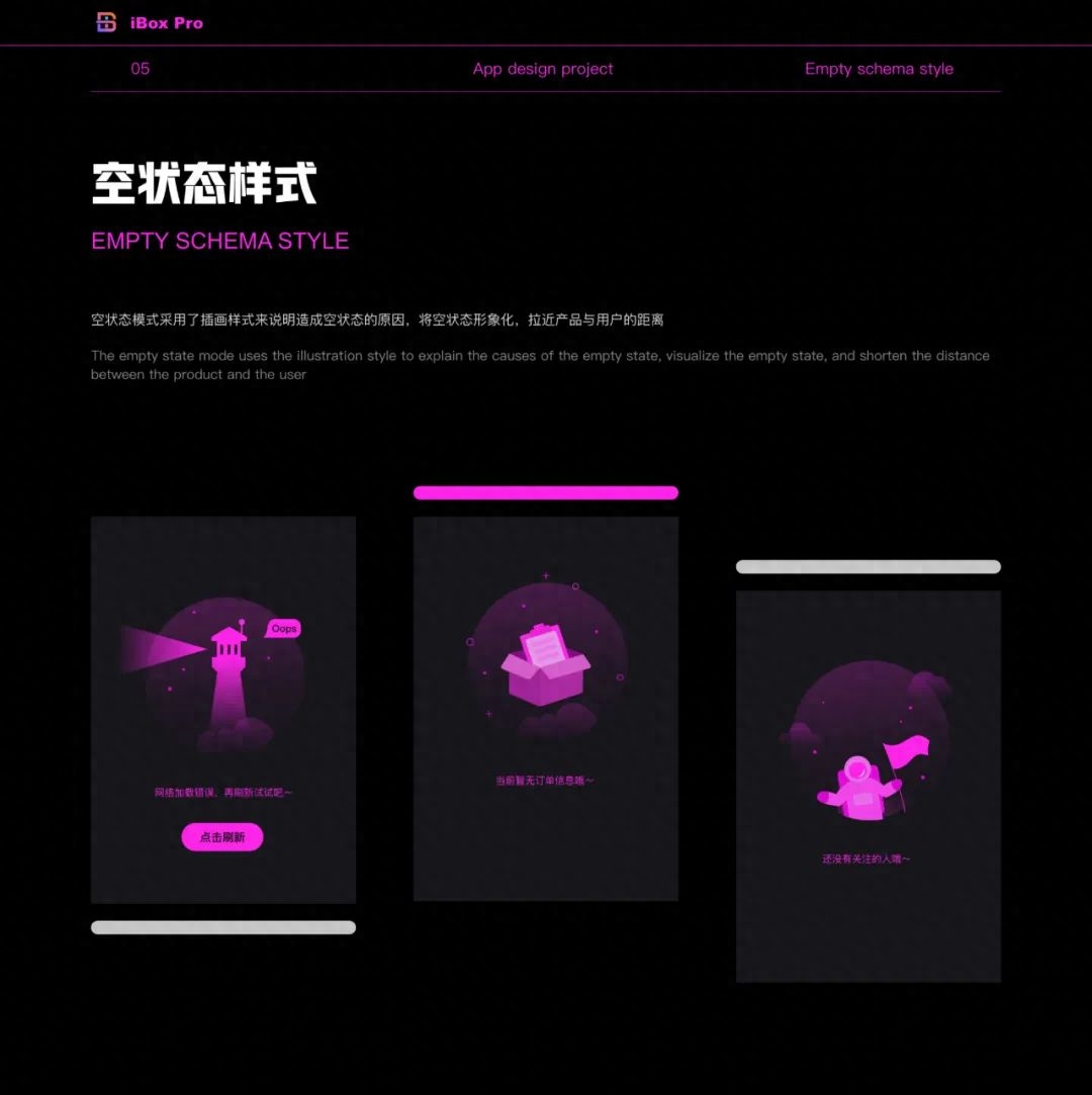
The empty state is something that many users don’t want to see. We overturn it Instead of the boring and traditional old version, it adopts the form of graphic and emotional pattern illustrations, combined with copywriting to guide users and shorten the distance between the product and users.
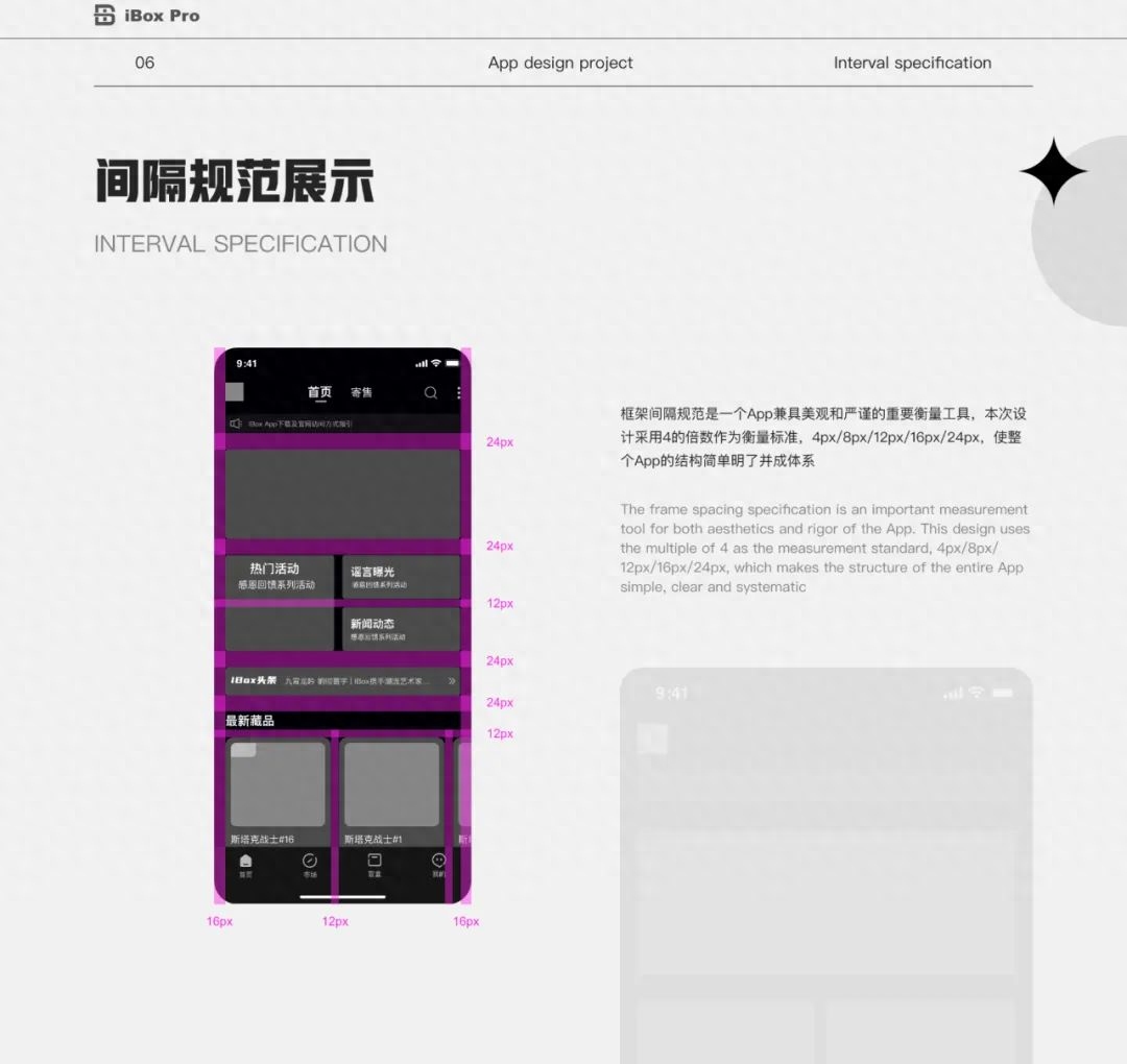
In the product design process, frame spacing specifications are very important. It is an important tool to measure the beauty and rigor of our products. This design uses multiples of 4 as the measurement standard, and uses different spacing to reflect the level of information, making the structure of the entire product simple, clear and systematic.
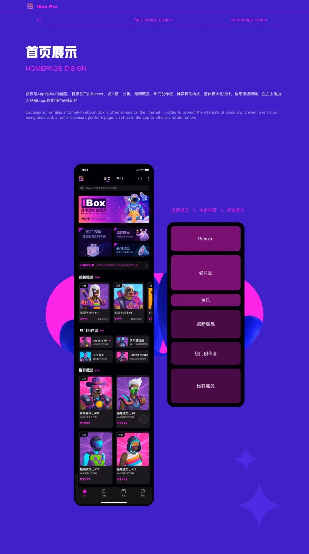
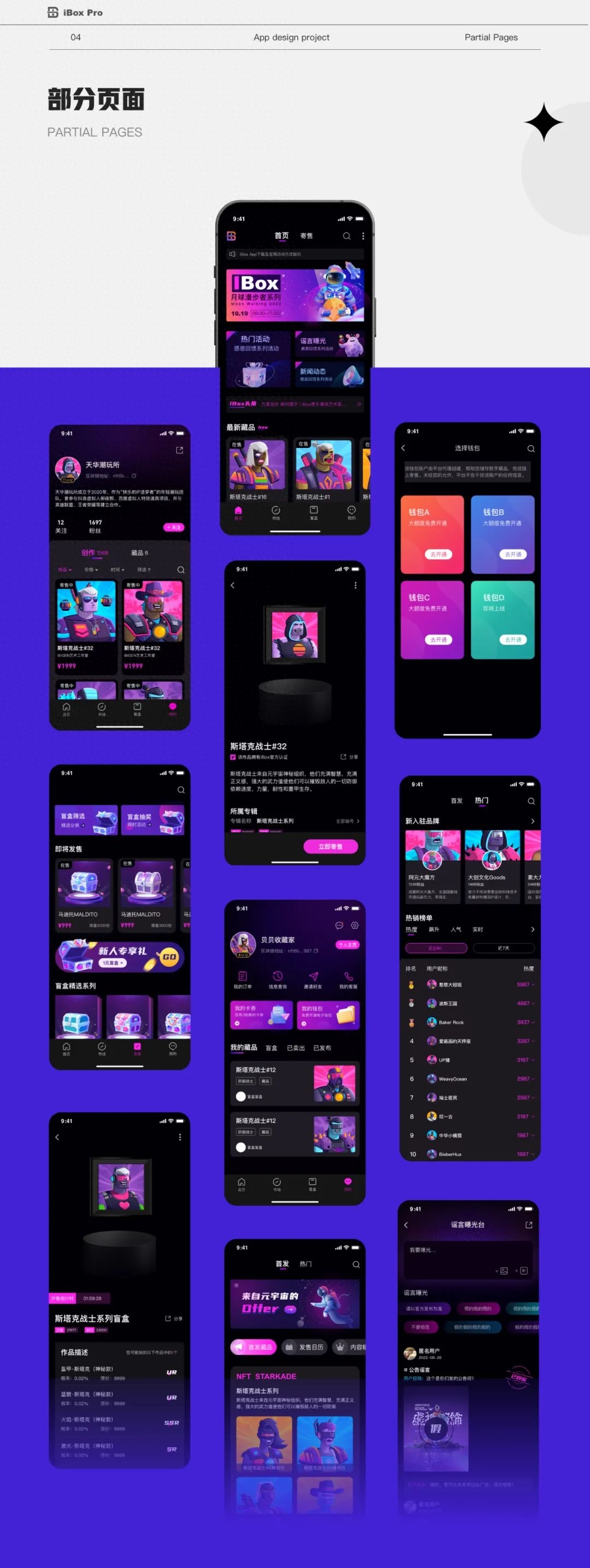
Now we enter the product interface display, first of all, our homepage , the homepage is the core functional area of the App. The new version of the homepage is composed of Banner, tile area, announcements, latest collections, popular creators, recommended collections and other sections. The overall design adopts a modular design with clear information levels. The brand logo is added to the upper left corner of the homepage to enhance users' brand memory. The design of the homepage mainly focuses on three aspects: operational improvement, multi-dimensional recommendation and visual beautification.
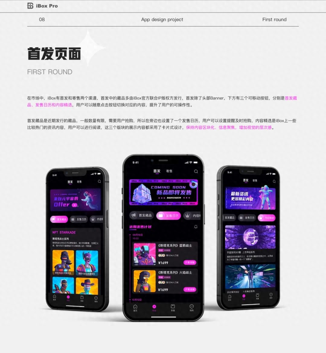
The first release refers to the collection issued by the official joint IP copyright owner. On the launch page, in addition to the operation banner at the head, the three switchable buttons below are for the launch collection, release calendar and content selection. When the user switches between different contents, the button style will switch from gray to the main color with slight gradient, prompting This user section has been activated, improving user operability. Because collections released recently are generally limited in quantity and need to be snapped up by users, users can set on-sale reminders in the release calendar to snap up items in a timely manner, which can also further improve the user experience. The display content of these three sections adopts a card-style design, which maintains content blockization, information focus, and increases visual hierarchy.
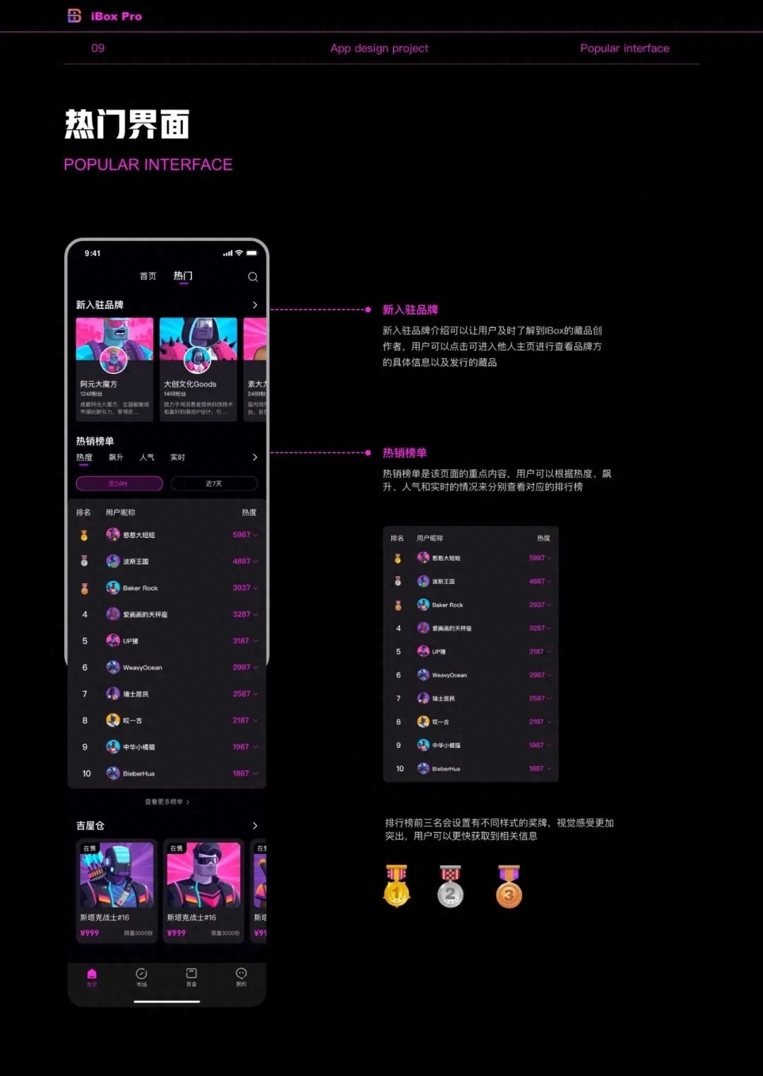
The popular interfaces mainly include new brands and best-selling lists. Registered brands can allow users to learn about the product's collection creator in a timely manner. Users can click on the creator's business card to enter their homepage to view more information. The best-selling list is the key content of this page. Here, users can click on the creator's business card to view more information. and real-time conditions to view the corresponding rankings respectively. This also provides an entry point for some users who have just started playing with digital collections or are unfamiliar with our products. Users can quickly learn about the current hot trends from here. So as to gain a deeper understanding. Since there are 10 lists in total, it would be too lengthy to use numbers to represent the rankings. Therefore, we have set up 123-style medals for the top three in the list. This will make the user’s visual experience more prominent, and they can also obtain the top-ranked medals more quickly. information.
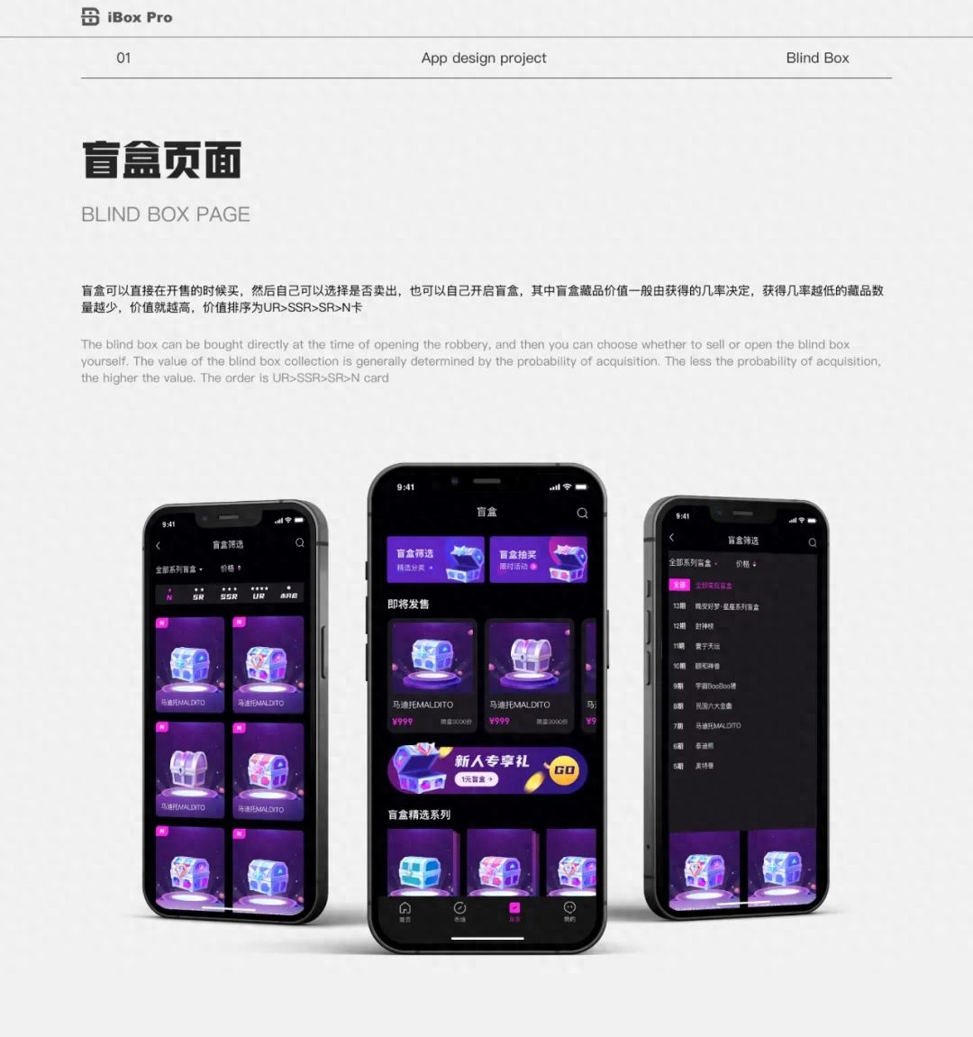
The following isOur blind box boundaryAs shown, the blind box has the same meaning as the hand-made blind box, that is, we don’t know what is inside. The blind box can be purchased directly when it is on sale. , and then the user can choose whether to sell. If not, they can also open the blind box themselves. The value of the blind box collection is generally determined by the probability of acquisition. The lower the probability of acquisition, the higher the value of the collection. Go high to the UR>SSR>SR>N card.
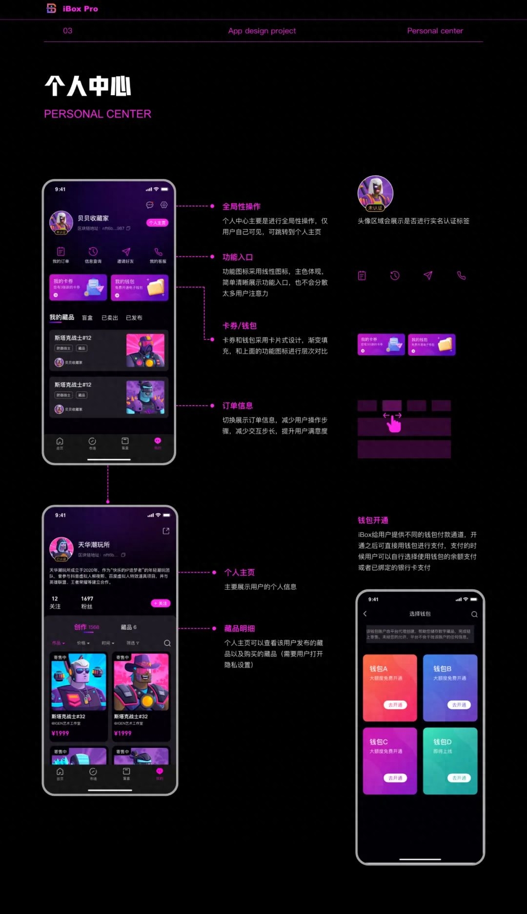
Personal center includes personal settings, function entrance, order information, and message reminders etc., mainly to perform global operations on this page, which is only visible to the user. From the personal center, you can click to jump to the personal homepage. The personal homepage displays the user's personal information, including followers and fans, as well as created works and collections. , is visible to everyone, but users can set visible content. Provide users with a wallet payment channel in the personal center. After opening, users can pay directly with the wallet.
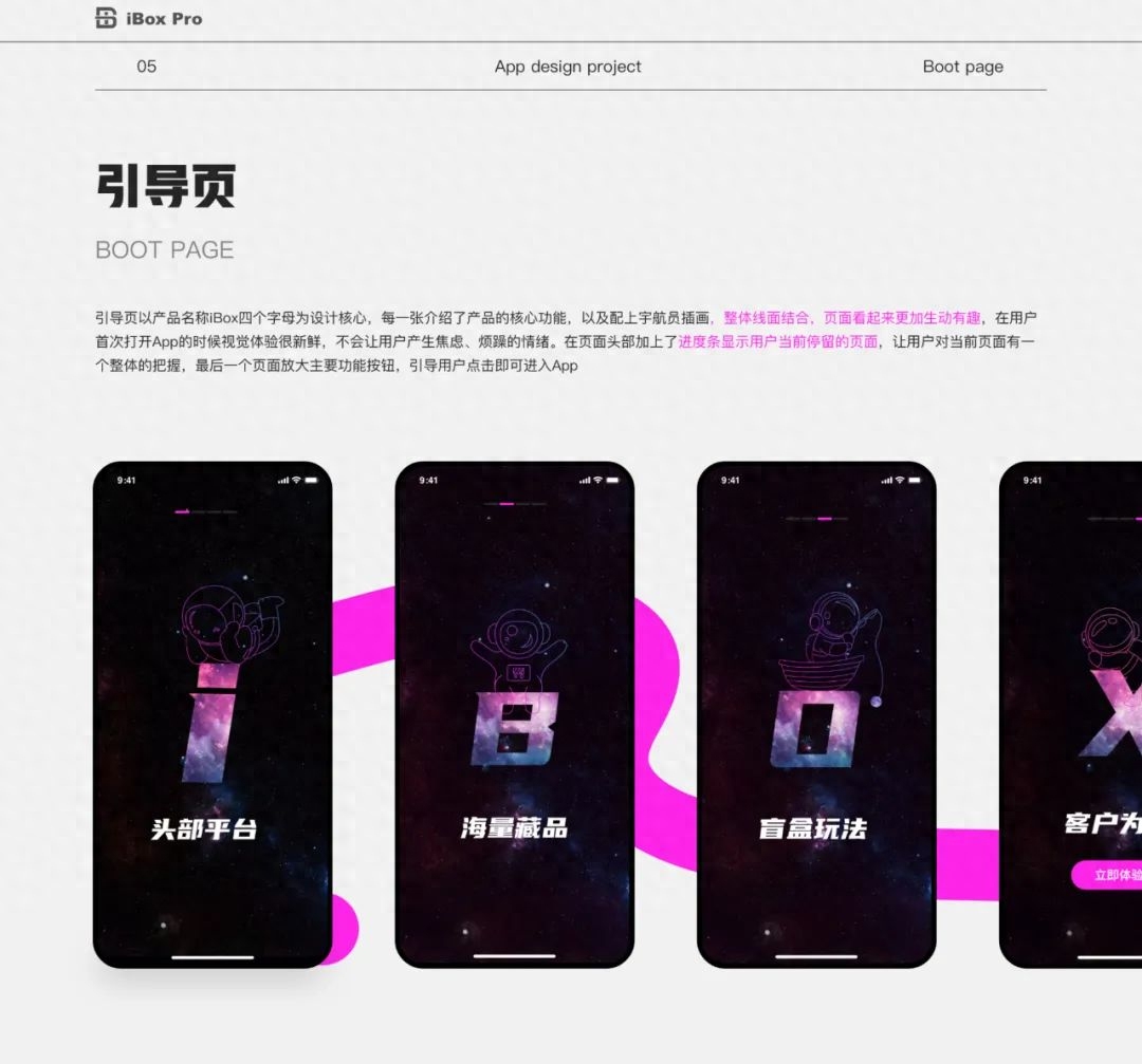
The guide page takes the four letters of the product name iBox as the design core. One page introduces the core functions of the product, and is accompanied by astronaut illustrations. The overall combination of lines and surfaces makes the page look more lively and interesting. When users open the app for the first time, the visual experience is very fresh and will not make users feel anxious or irritable. . A progress bar is added to the header of the page to show the page the user is currently on, allowing the user to have an overall grasp of the current page. The last page enlarges the main function button to guide the user to click to enter the App.
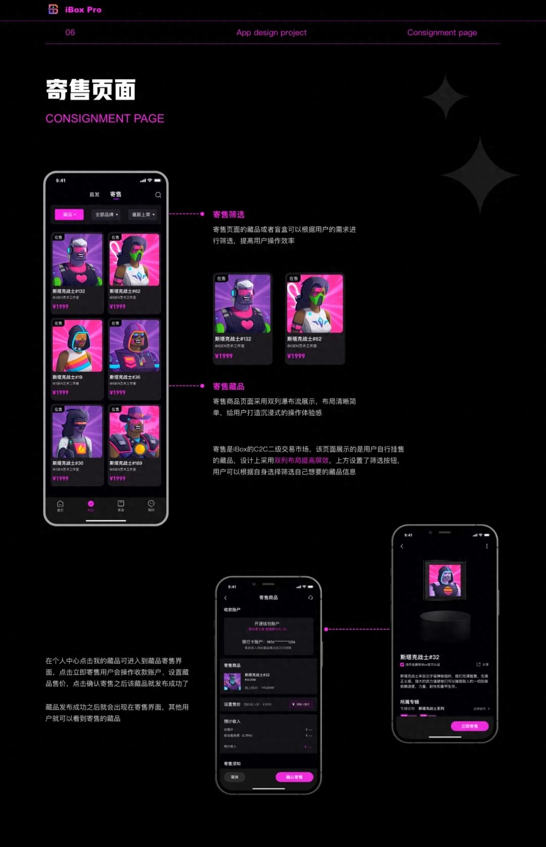
Consignment is iBox’s C2C secondary trading market. This page displays It is a collection that users put up for sale by themselves. The design adopts a double-column layout to improve the screen effect and create an immersive operating experience for users. There are filter buttons at the top of the page so that users can filter the collection information they want according to their own choices.
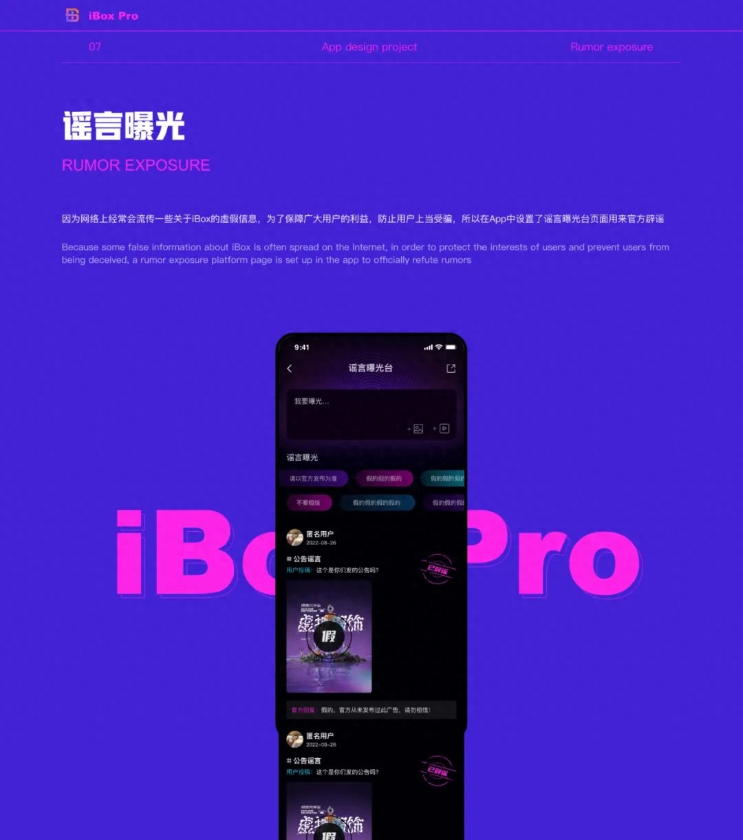
Because some false information about the platform is often circulated on the Internet, in order To protect the interests of users and prevent them from being deceived, a rumor exposure platform page is set up in the App for official refutation of rumors. Users can post rumors here, and after receiving them, the backend will refute the rumors below the post.
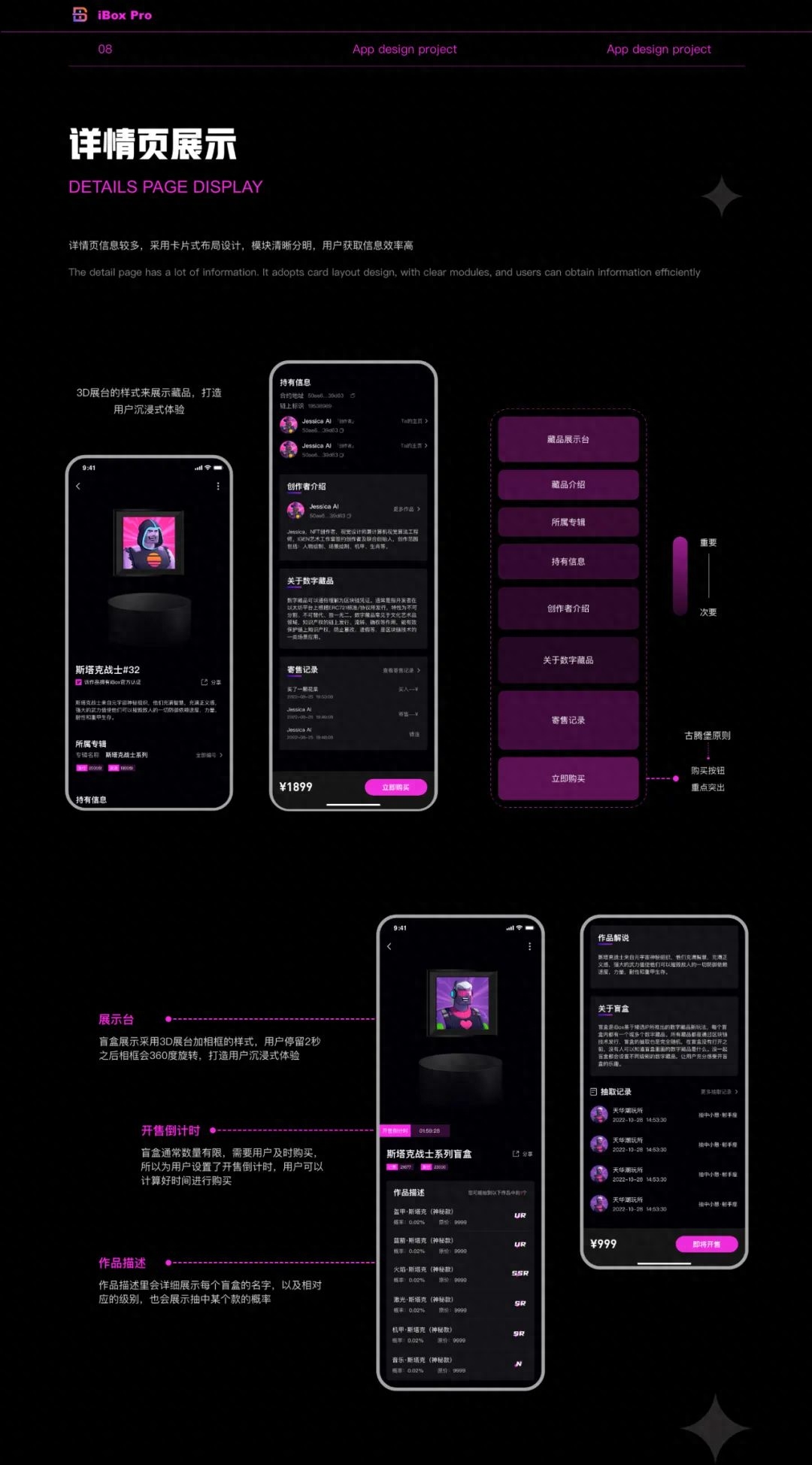
The following is the display of our collection details page, and the information comparison on the details page Many, the layout adopts a card-style design, the modules are clear and distinct, and users can obtain information efficiently. When entering the details page, the first thing we see is the display stand of the collection. We use a 3D exhibition stand and a black photo frame as the border of the collection. Adding a black background creates an immersive experience for users. The more important content on the details page is placed at the beginning and end, making it easier for users to pay attention. The purchase button is an important function of the page, and according to Gutenberg In principle, the lower right is the end point of the user's visual flow, so the purchase button is placed in the lower right corner in the design, and the main color is used to highlight and enlarge the button to contrast with the content. The general design layout of the blind box details page is the same as that of the collection details page. The difference is that users who purchase blind boxes cannot see the style of the blind box, and blind boxes are usually in a series, so there will be corresponding information on the details page. The description of the work will show the name of each blind box and the probability of being drawn. You can also see the blind boxes that have been drawn in the draw record.
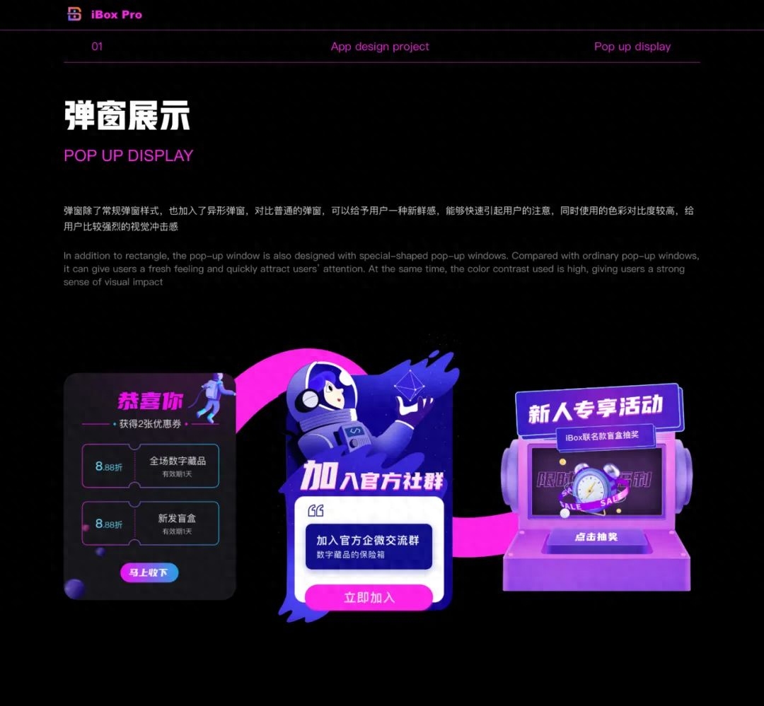
In addition to regular pop-up window styles, special-shaped pop-up windows are also added , compared with ordinary pop-up windows, it can give users a sense of freshness and quickly attract their attention. At the same time, the color contrast used is higher, giving users a stronger visual impact.
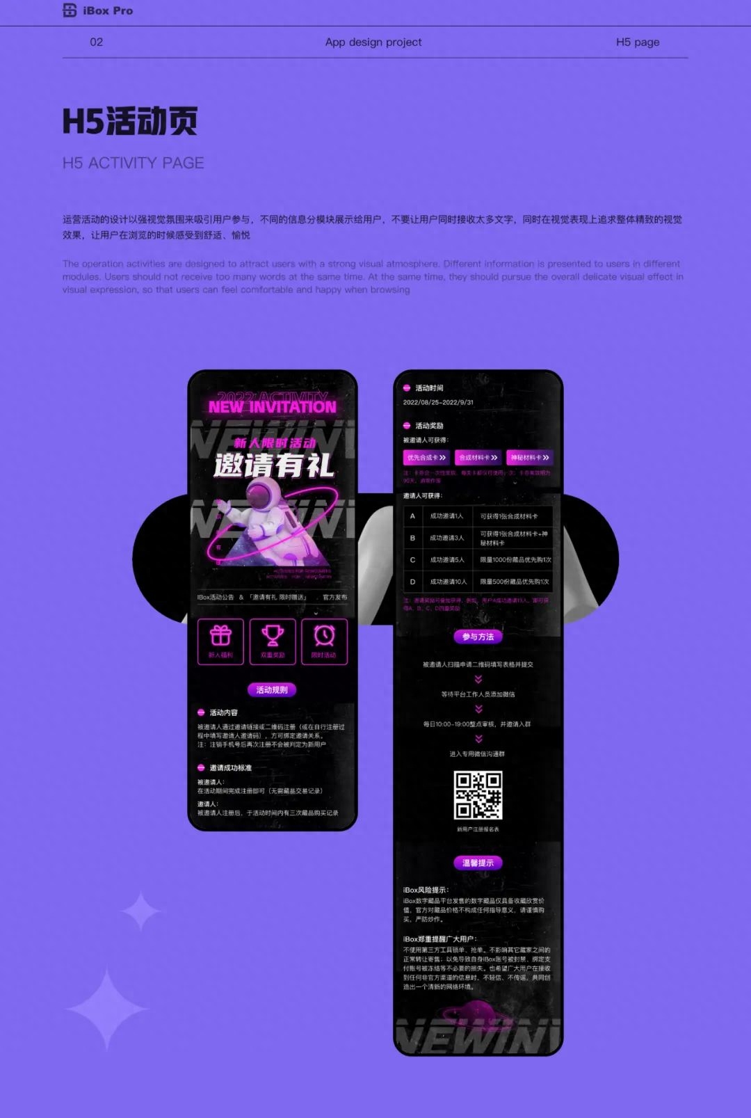
The design of operational activities uses a strong visual atmosphere to attract user participation. Different The information is displayed to the user in modules, and the user is not allowed to receive too much text at the same time. At the same time, the overall exquisite visual effect is pursued in terms of visual performance, so that the user feels comfortable and happy when browsing.
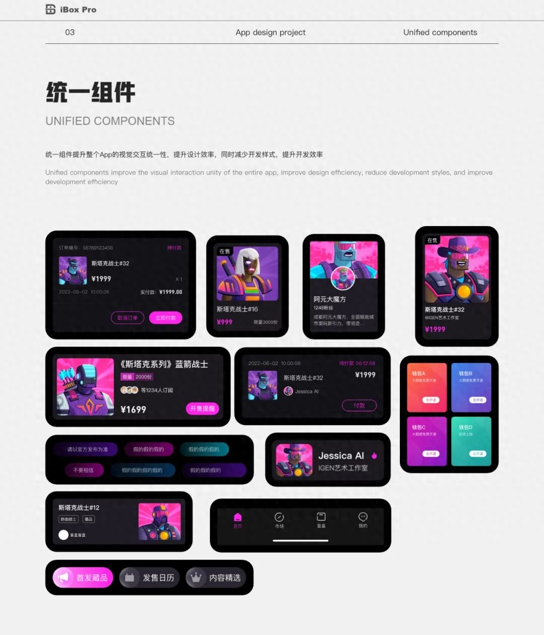
Unified components improve the visual interaction unity of the entire App and improve design efficiency , while reducing development styles and improving development efficiency.
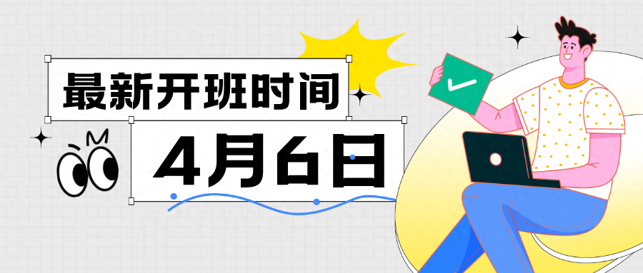
PS: Adobe Design UI38 Training CampApril 6thOpen,April 20The class has officially started, looking forward to everyone joining!
Articles are uploaded by users and are for non-commercial browsing only. Posted by: Lomu, please indicate the source: https://www.daogebangong.com/en/articles/detail/xiao-duo-bi-de-she-ji-bi-ji-17-iBox-gai-ban-fen-xiang.html
 支付宝扫一扫
评论列表(196条)
测试