The following article comes from The Way of Word Beauty, written by SJ-QUAN

Share cases, knowledge, tutorials, etc. related to font design.
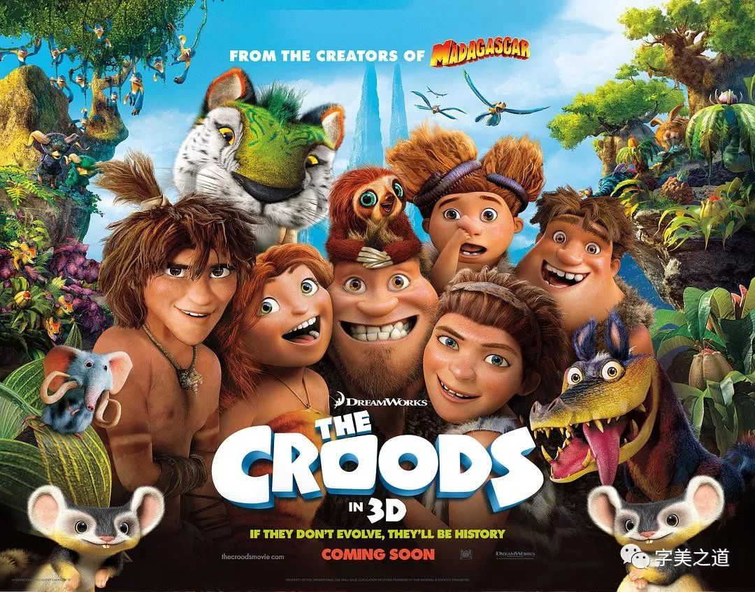
Whether it is a foreign brand or a movie, after it is introduced into the country, it is necessary to design corresponding Chinese character fonts. Examples of brands include Coca-Cola, Pepsi-Cola, Carlsberg, etc.; not to mention movies, not long ago, China and the United States Partial agreements have been reached on issues related to film industry exchanges and film culture development: China will add 14 3D or IMAX films to the original quota of about 20 American films introduced each year;
So, when a Hollywood blockbuster is released in China, the Chinese version of its title font must match the style and temperament of the original English title font. This requires designers to design skillfully, because the structures of Chinese and Western characters are very different. , designers must not only ensure the beauty and recognition of Chinese fonts, but also meet the unity of form and temperament with English fonts. Below we will learn how to design this type of Chinese fonts through several case studies.
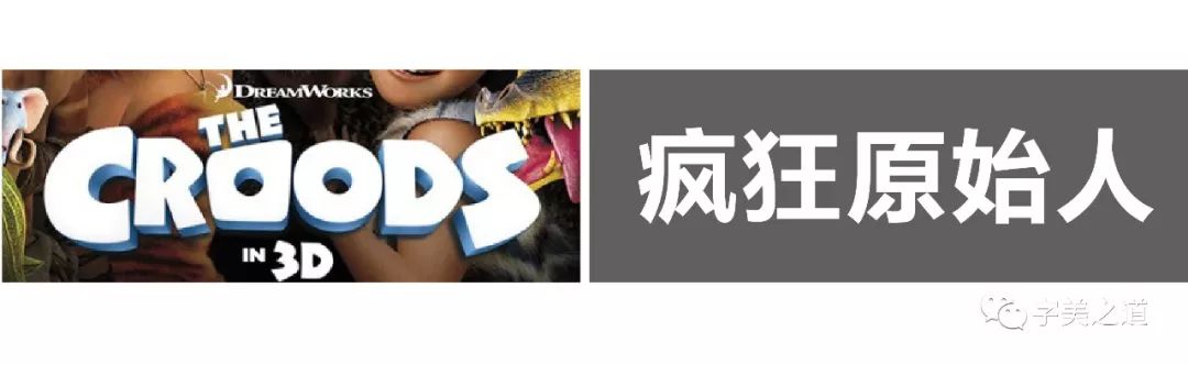
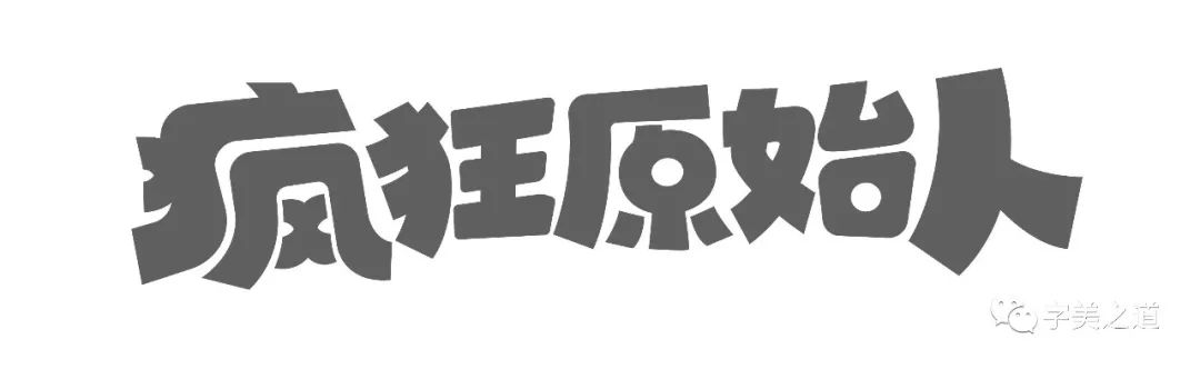
Case 1: Crazy Primitives
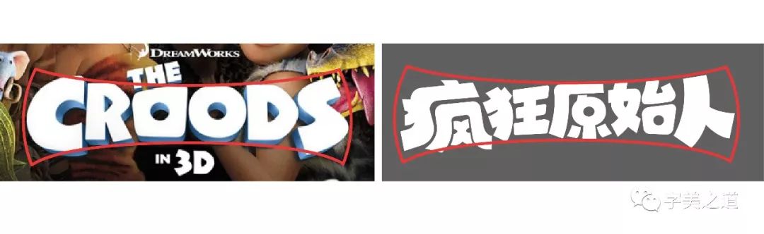
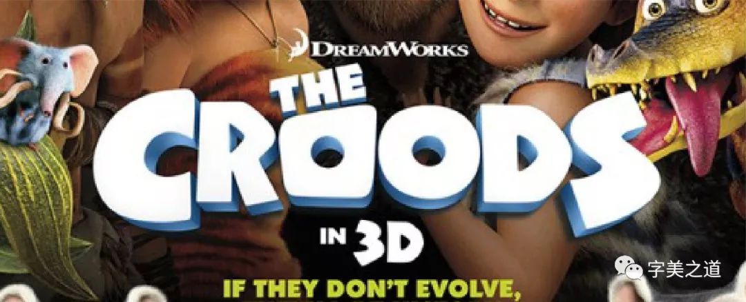
The original English font is very well designed, with letters that have a Stone Age feel, which has both the "clumsy" side of the Stone Age and a lively and interesting feel. Next, we will start designing the Chinese font. The official Chinese translation is: "Crazy Primitives". Let's type these words and put them together with the English font to see:
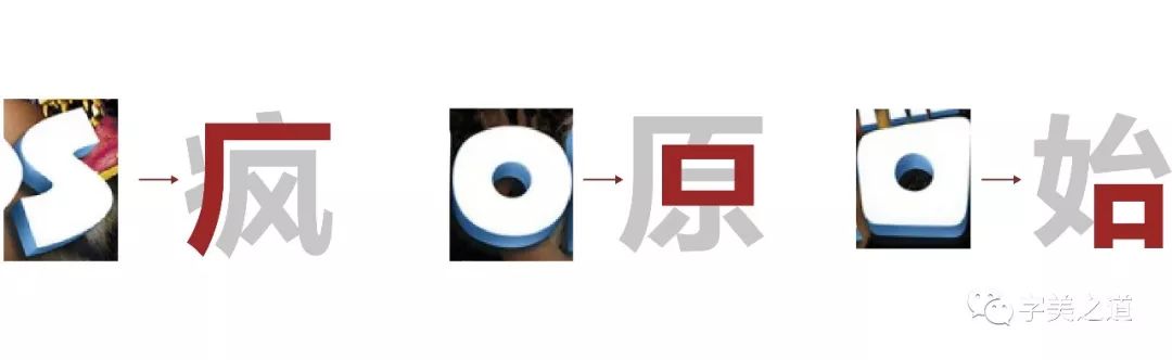
How to start designing? Here is a little tip to share with you, that is: "We must first find out which strokes or shapes in the original English font are more consistent with, or even replaceable, the Chinese title font." Through observation and comparison, we found the following A few points:
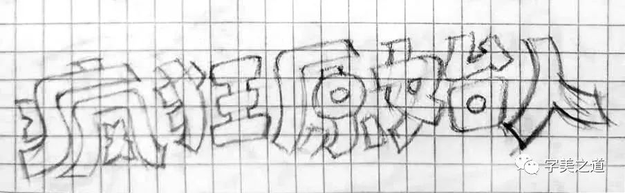
Okay, let’s start sketching:
When drawing the sketch, we put the previously analyzed English strokes in the appropriate position of the Chinese characters. At the same time, according to the style characteristics of English, we drew the general shape of the Chinese characters. Then we used the pen tool in AI to outline the shape of the characters and made some adjustments. The result is as follows:
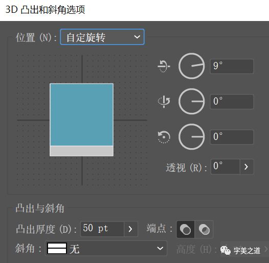 The design of Chinese follows the appearance characteristics of English, which is wide on both sides and narrow in the middle, so it is more unified visually. Next, we will add a three-dimensional effect to the characters. First, let's analyze the three-dimensional effect of English:
Articles are uploaded by users and are for non-commercial browsing only. Posted by: Lomu, please indicate the source: https://www.daogebangong.com/en/articles/detail/xi-wen-she-ji-yuan-su-xia-de-zhong-wen-zi-ti-chuang-xin.html
 支付宝扫一扫
评论列表(196条)
测试