Written in the front: The days of learning font design with the master, continue to share font design today, hoping to play a role in everyone's learning of font design.
Font name: Libo
Industry: Women's Beauty and Body Institutions
Creative ideas and methods: This is a female beauty and body shaping industry, and font design should reflect the femininity and health of women. The font strokes are mainly thin and round.
Here are a few ways to get creative with fonts:
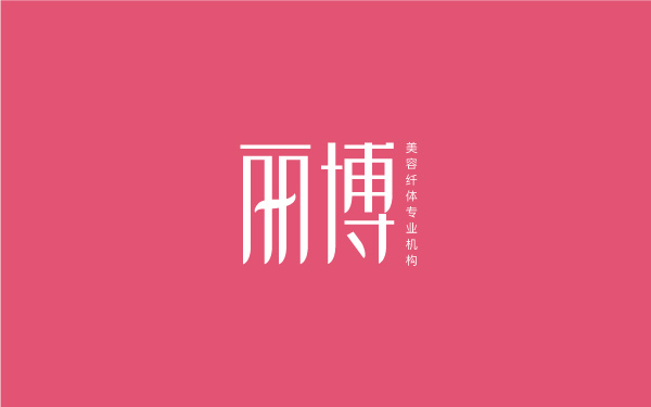
Idea 1: On the basic font, all the horizontal strokes are thinned, and the ends of the vertical strokes are adjusted into the shape of wicker, so that the font looks more soft and enchanting.

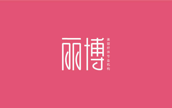
Creativity 2. Put the creative point of the font on the "curved hook", and all the hooks will be curved. The overall look is still unified and the steps are consistent. The font still looks smart and soft.

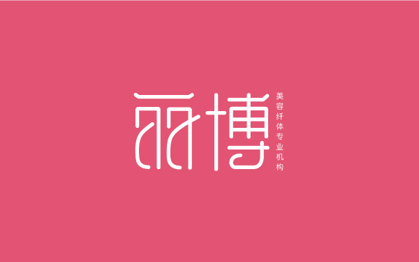
Creativity 3. The deformation of this font is relatively large, especially the Li character, which is slanted and chic with such two strokes, which makes the font soft and healthy at the same time.

That's it, friends, if you have any better panacea, call me anytime. I am waiting for you in the group, group number: 439833287.
Articles are uploaded by users and are for non-commercial browsing only. Posted by: Lomu, please indicate the source: https://www.daogebangong.com/en/articles/detail/womens%20beauty%20and%20body%20brand%20font%20design.html

 支付宝扫一扫
评论列表(196条)
测试