Right away It’s almost the end of the year, and considering that many readers will have to conduct a PPT work report.
So, this For the revision case of this issue, we selected the content of a work report theme.
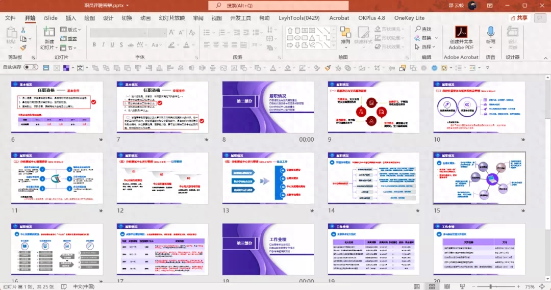
Still the old rules, Select 4 pages to modify:

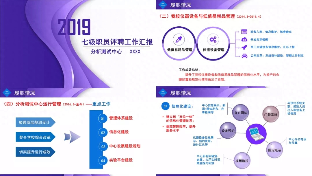
The original selection is Mainly purple tones, So, we keep it the same:

Next, to optimize a single page.
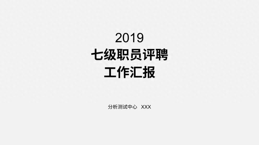
First is the cover page:

Its biggest problem Well, the information is not aligned, which makes it a bit messy, I believe you can see that.
Therefore , the first step of optimization is to center-align or left-align the content:
Also, I I found another graphic element to replace the color blocks in the original manuscript:

Next, for To fit the overall purple style, we can make some adjustments to the color of the graphics:

Like A bit monotonous? It doesn’t matter, you can consider changing the background to enrich the visual layering:< /span>
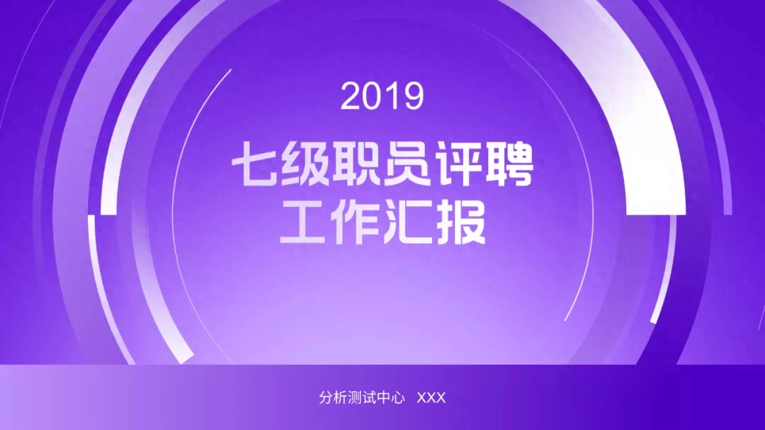
Very simple way , a PPT cover page is completed.
Then It’s the second page:
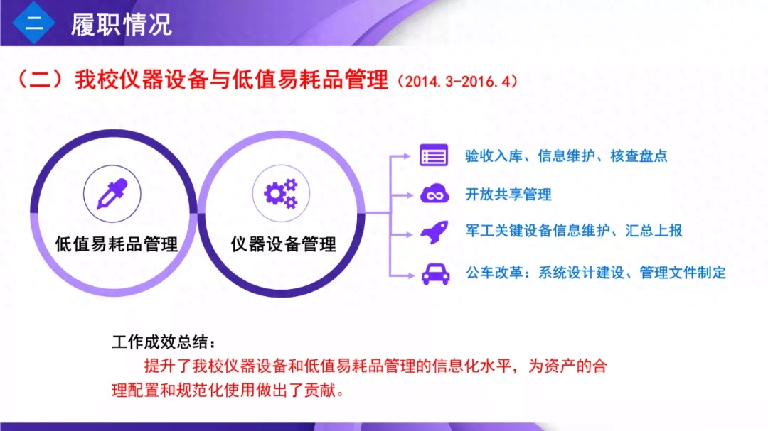
What about this page? , the logical relationship is relatively clear,However, in terms of typesetting and layout, it is a bit Scattered.
So, we can To redesign a layout, first understand the structure of the content.
surround Focusing on two major aspects, four aspects of work have been carried out, and the results achieved are at the bottom.
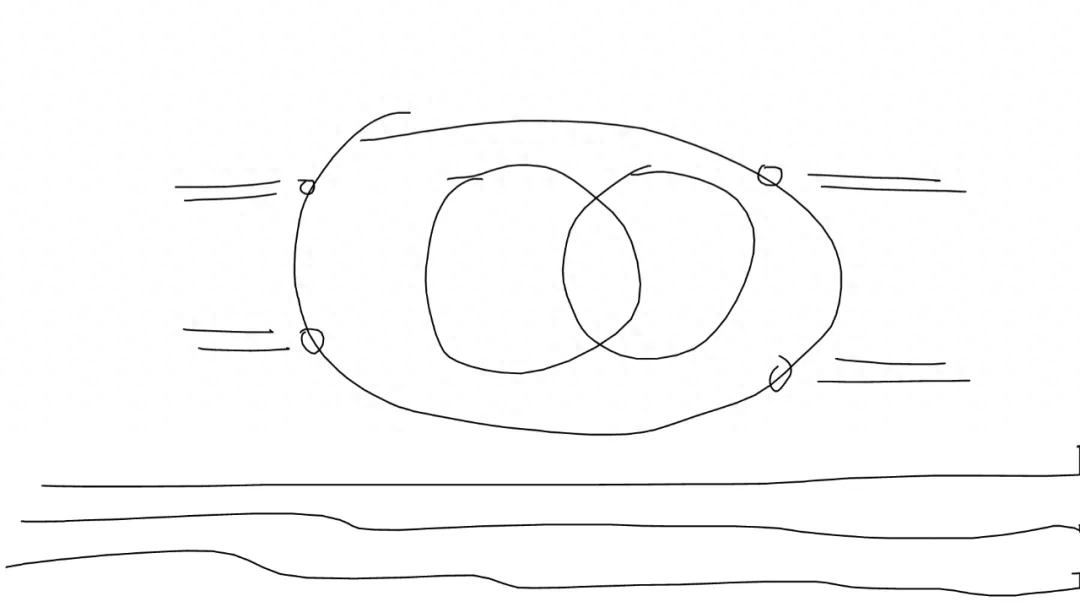
I drew one Sketch:
If you use PPT If you replace the color blocks, it will probably look like this:
But This style is a bit too flat. We can use three-dimensional rotation to increase the sense of space:
Finally, we You can add some lines to modify it:
The next is the third page:
Go to this page, The color suddenly changed, resulting in a less uniform style.
And The logical relationship on this page refers to the four tasks based on three basic principles.
So, I Draw a sketch:
Similarly, use The graphics that come with PPT show this logical relationship:
The visual layering is a bit Weak, we can use the principle of points, lines and surfaces to increase visual contrast:
Finally Well, I made this page like this:
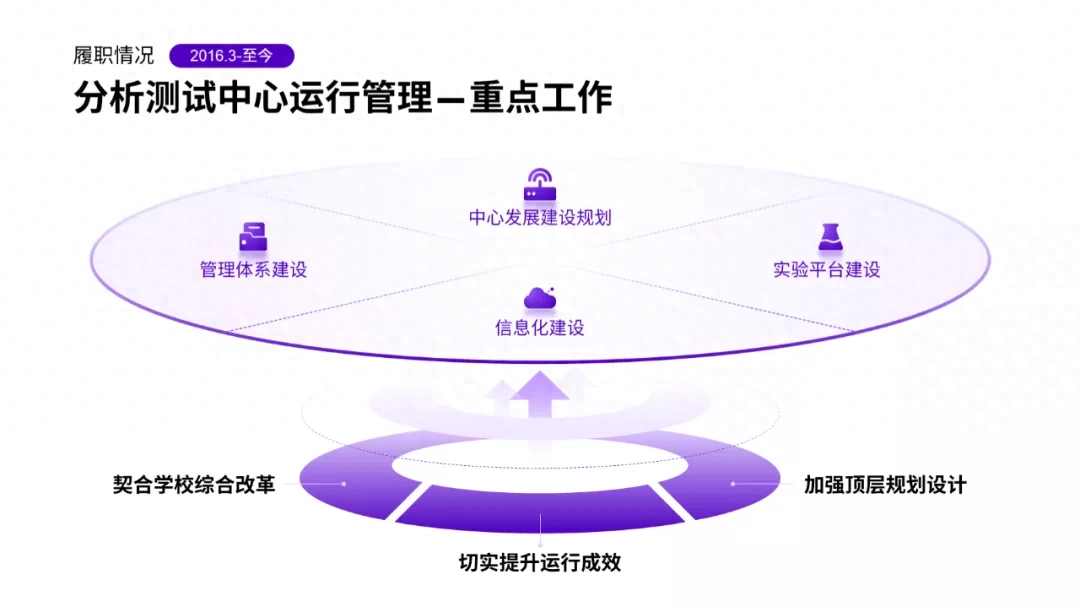
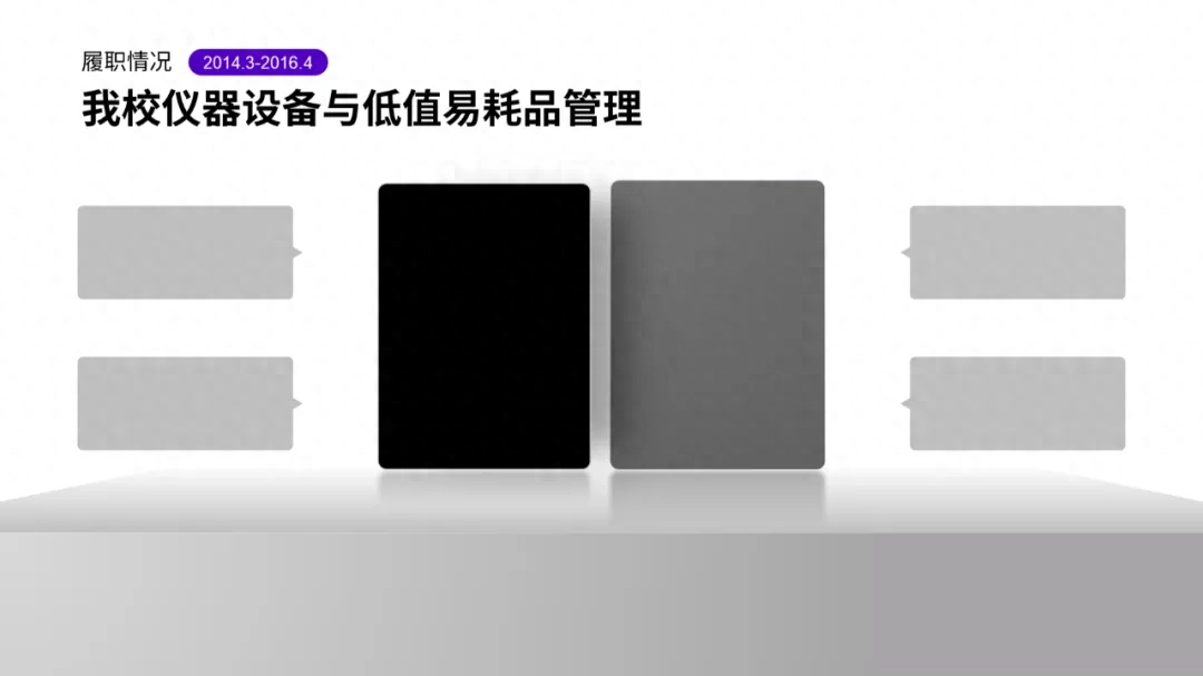
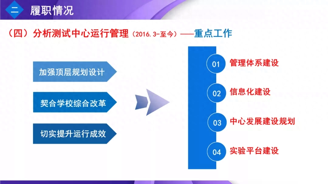
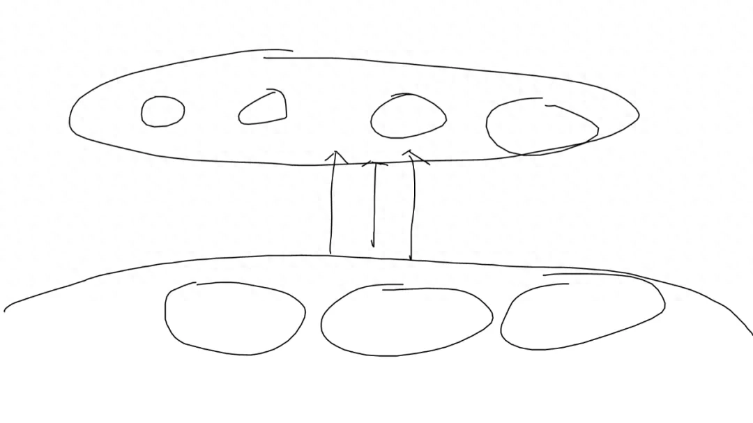
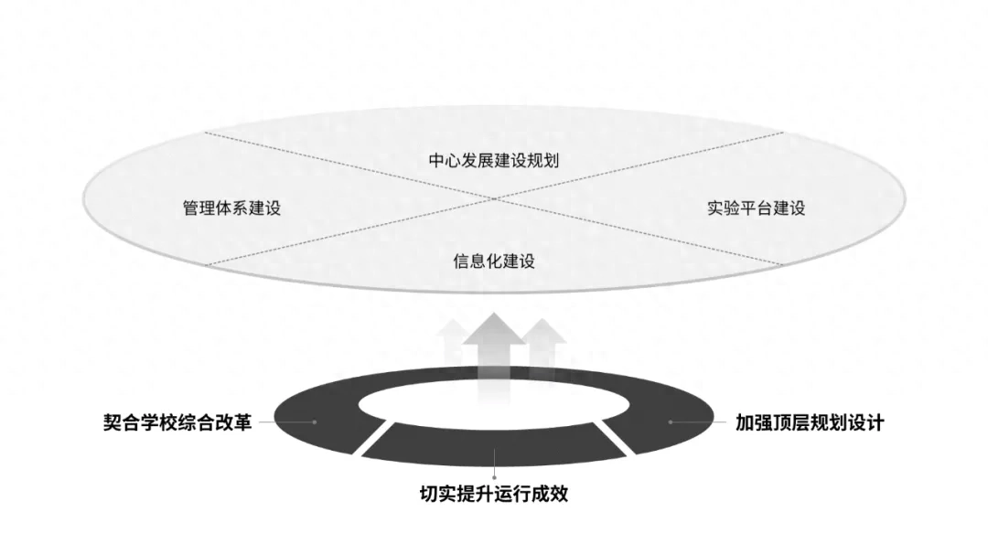
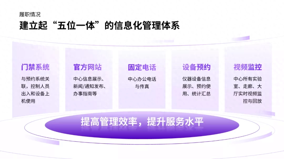
Finally It’s page 4:
The main content of this page The problem is that the graphics are so outdated and cheap.
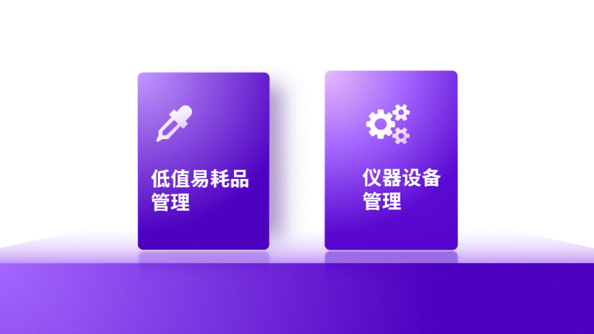
That What does this page say? It's very simple. Establishing a five-in-one information management system improves management efficiency.
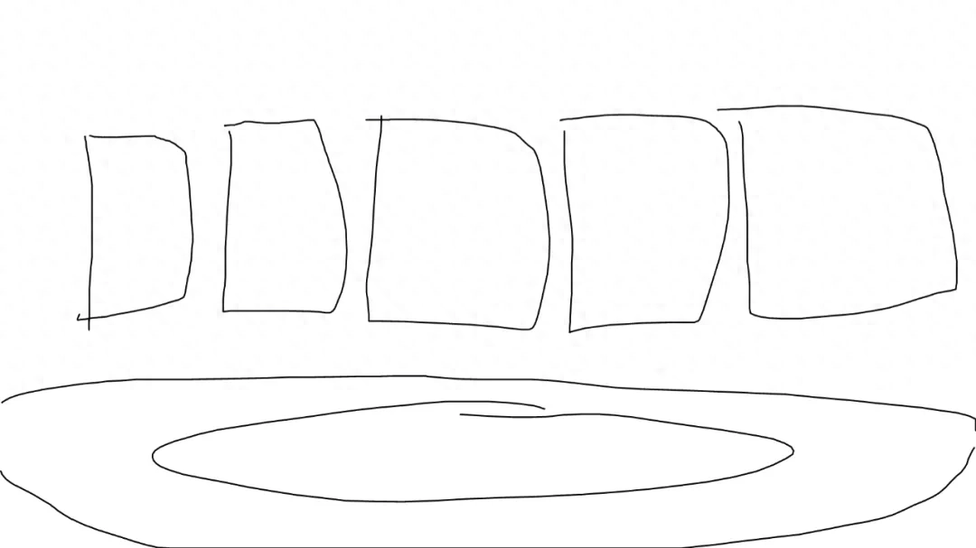
So, I The sketch in my mind probably looks like this:
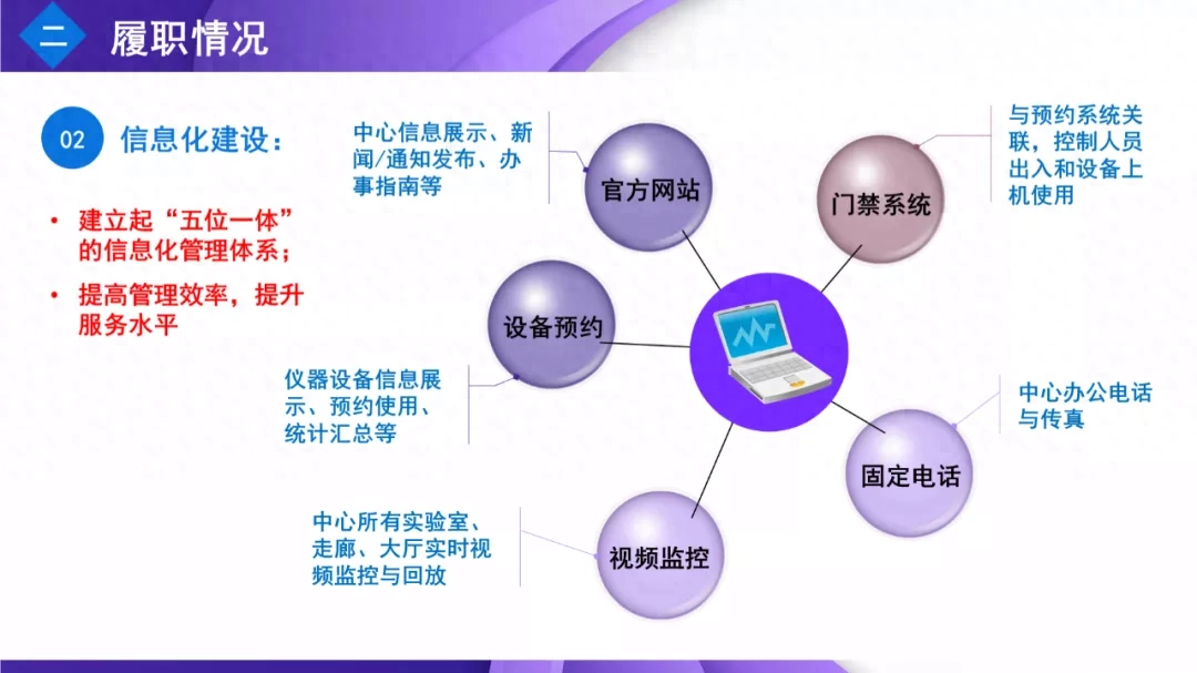
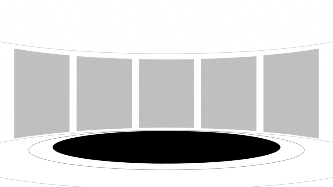
Replace it with The specific graphic style will look more intuitive:
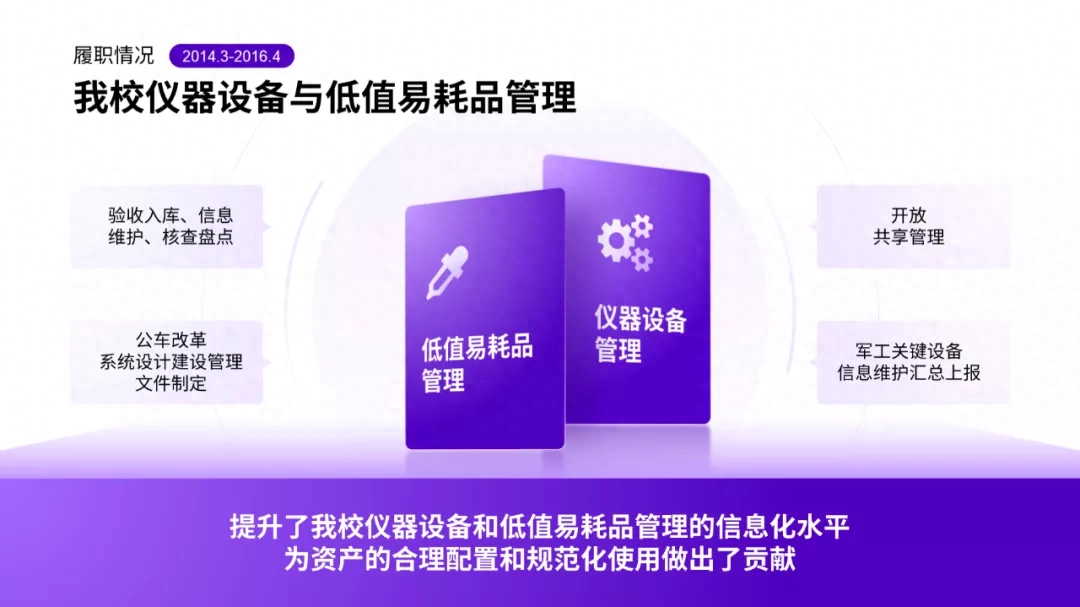
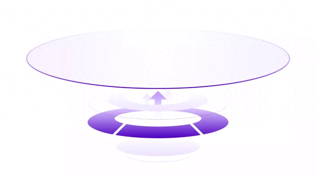
Then, for To keep consistent with the overall style, you can change the color:
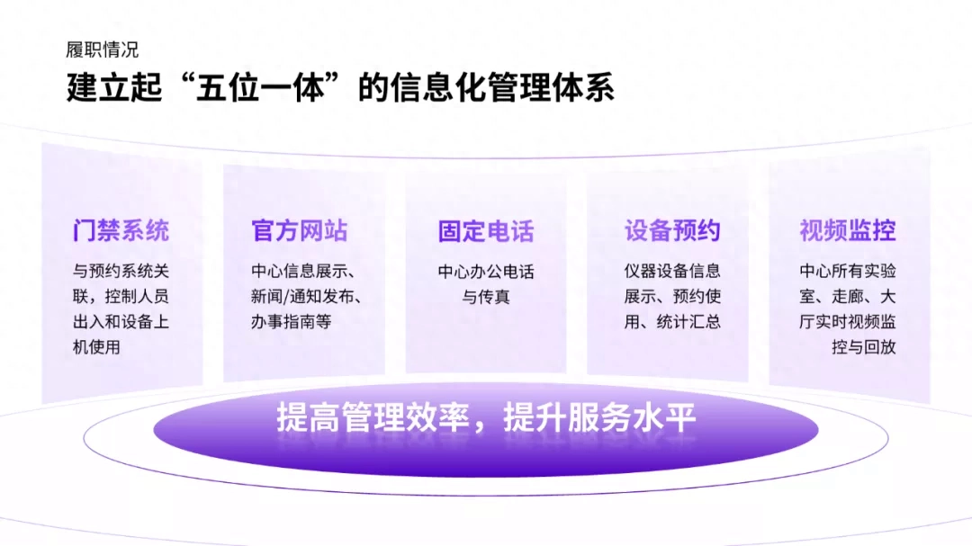
Also You can add some small decorative elements to enhance the sense of three-dimensional space:
This It’s the entire PPT modification process. Let’s take a look at it as a whole.
— before modification—
— After modification—
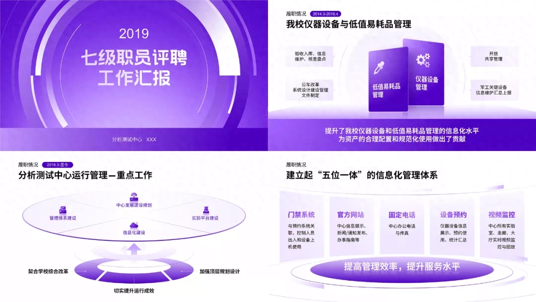
The entire PPT The modification is mainly to adjust the layout style of the page and use a lot of logical graphics. I hope it can inspire you.
Have you learned it? Remember to check in the comment section!
Articles are uploaded by users and are for non-commercial browsing only. Posted by: Lomu, please indicate the source: https://www.daogebangong.com/en/articles/detail/wo-zhi-hua-le-30-fen-zhong-bang-du-zhe-gai-le-fen-hui-bao-PPT-tong-shi-jiang-jin-wen-le.html
 支付宝扫一扫
评论列表(196条)
测试