

Hello, everyone , I am Brother Li~
Yesterday, I made a set of PPT about the Vitality Forest. Today we will do a review.
I hope that through the dismantling of the design ideas and the demonstration of operating techniques, I can give you some inspiration!
Look at the original PPT of this issue first.
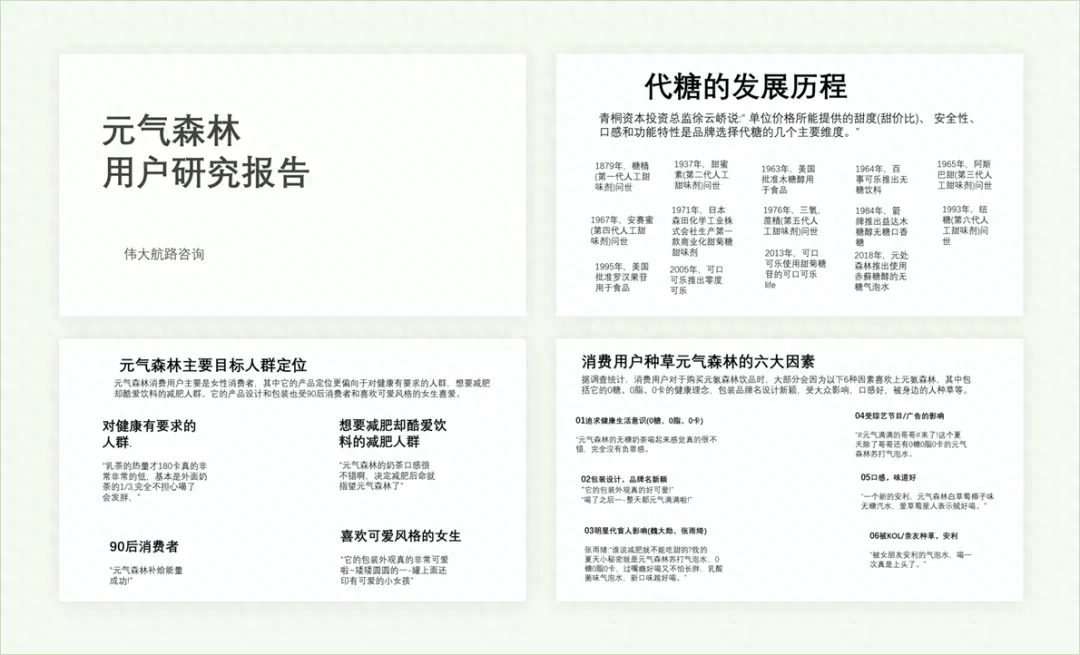
This is a pure PPT manuscript. Without further ado, let’s go directly to the modification of this issue.
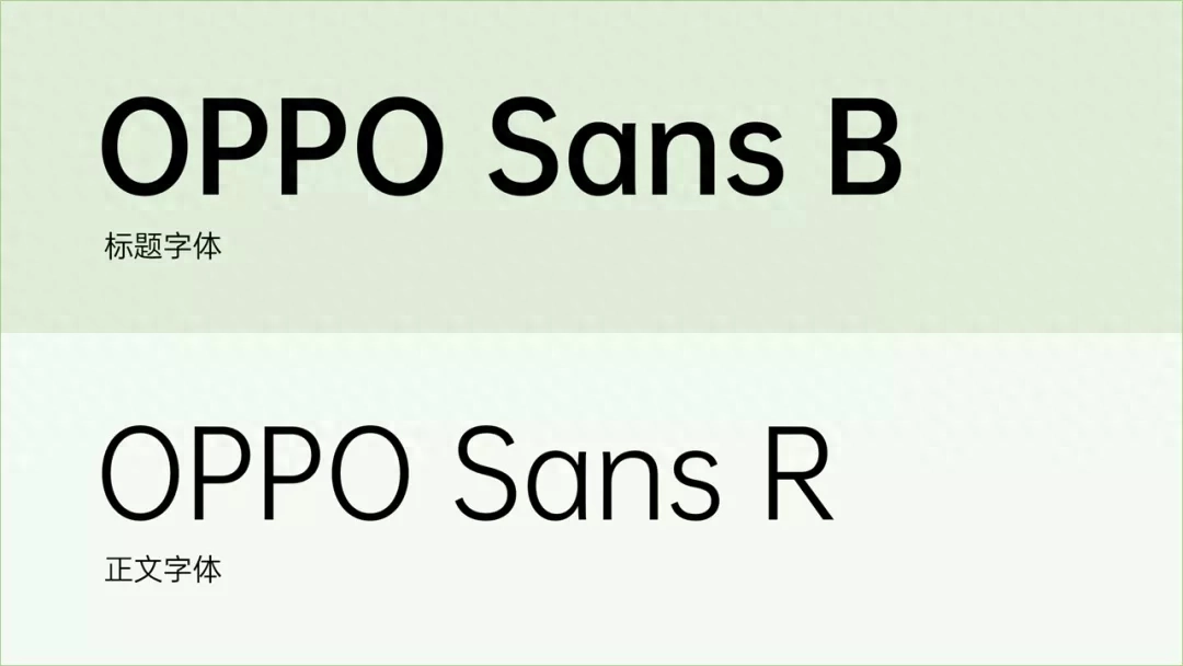
First of all, we decided on the main font for this issue, which is used hereOPPOSan font, is a free font that can be used commercially.
Next, let’s go page by page, looking at the first page first
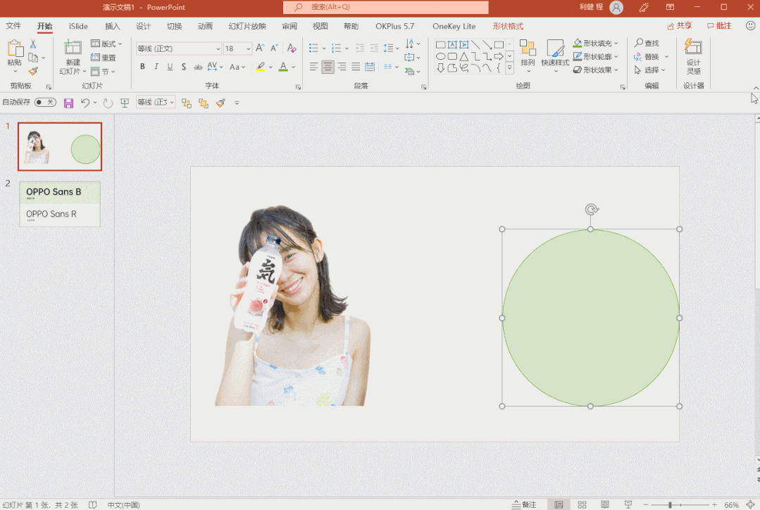
Cover
The cover is very simple with a title and a data company name.

First, let’s align the title to the left and place the text.
If you feel that the title lacks hierarchy, you can add a contrast.
For example, color contrast, or adding an English word.

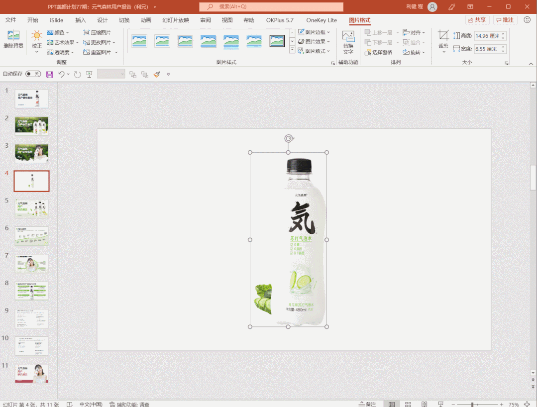
On the right, we are looking for a picture. Here, we go to the official website or Baidu to find someProduct image.
It is best to remove the background of product pictures (you can use the online tool to cut out pictures)

Then, place the product image on the right side to get such an effect.

There is a detail here, which is the production of shadows.
The left side has no shadow at the beginning,The right side has a shadow , looks more three-dimensional.

How to make it?
Next, adjust the background. We adjust it to light green and add a green color block at the bottom to get this effect.
Looks more layered.

Next, we add some fresh green leaves to make it look fresher and more design-like.
Finally got a PPT effect like this.

This is the first edition,I also made a version of the cover.
For example, we can find a background picture of a forest as a background.
Then select the picture, clickPicture Format-Artistic Effect-Blur, This reduces image noise.
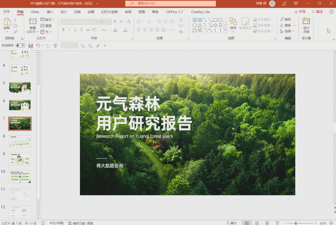
Then at the bottom, we add a curved color block, similar to a split screen, and then cover part of it.

How to make this arc? It’s just a shape——Single rounded rectangle, and then obtained through Boolean operations.
Look at the operation:
Next, we add the product image and polish it a little to get such an effect.
Isn’t it pretty good.

Next, let’s continue looking down at the second page of PPT.
Timeline
This is the development process of sugar substitutes, with many time points, a total of 14 nodes.
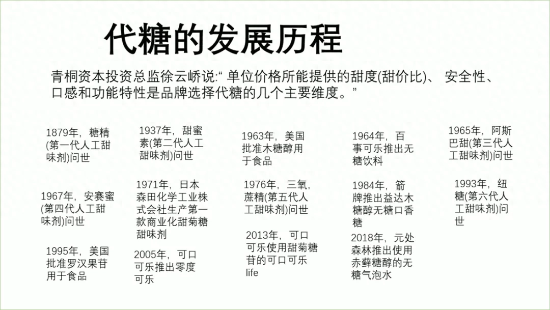
The first is the design of the title bar, we put the title Align it to the left, and then we used a title modification box, here we used a green shape.
Then extract the time point, using a String the lines together to form a timeline.

Since it is a development process, there is always an upward process.
So weused the curve tool to draw an upward curve
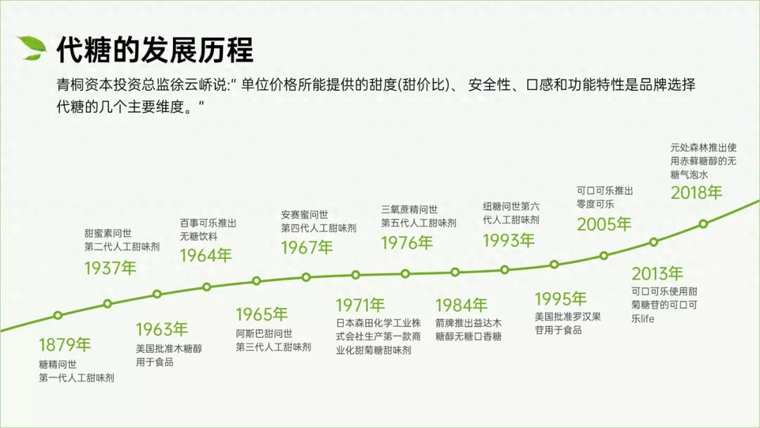
In order to have a better overall vision, we added a color block at the bottom of the curve to split the layout by color.
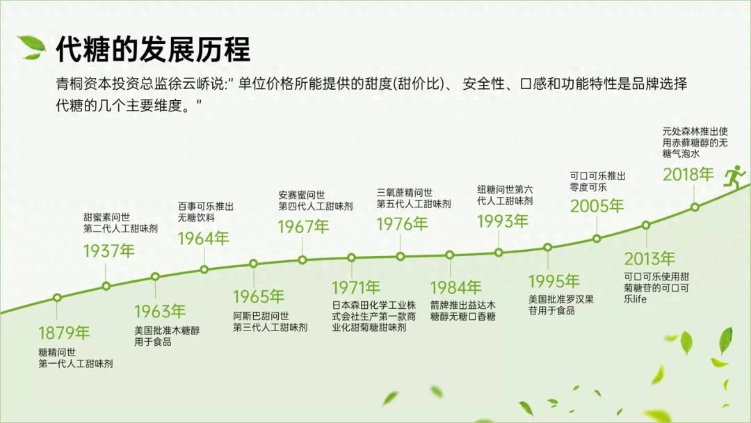
This is the development process of sugar substitutes, so there is no need for us to use Yuanqi Forest products.
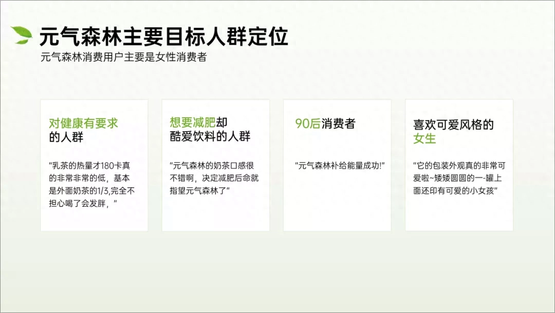
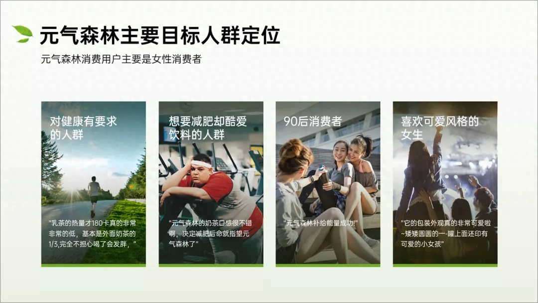
Crowd positioning
This is a target group positioning page. There are four main positions, and it also indicates that the main consumer group is women.
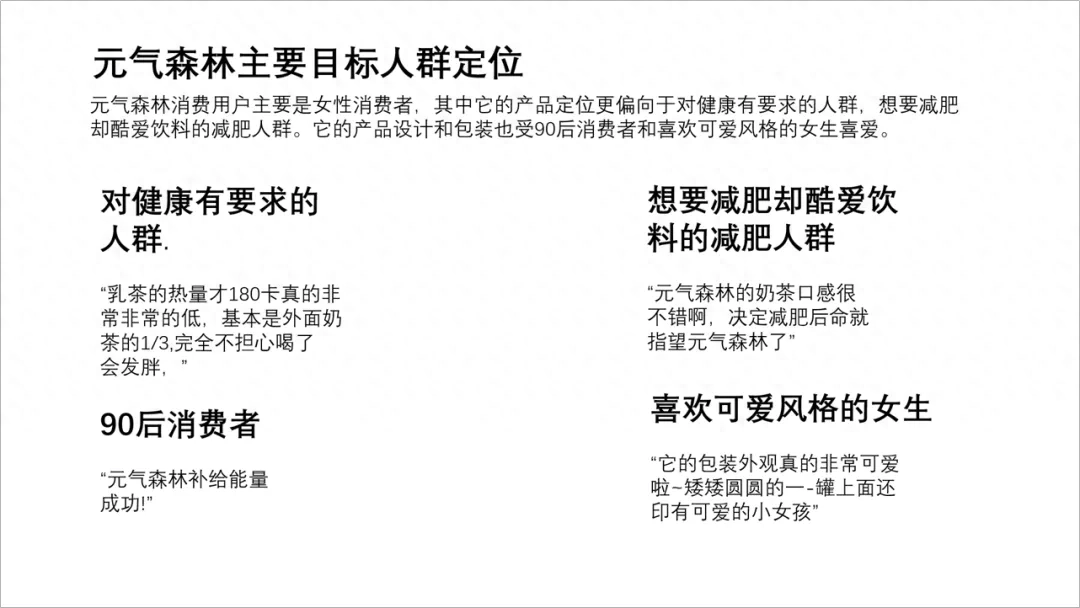
First unify the font, sort out the content, and make the layout neat.
You can find a matching picture for each target group.
You can probably get a PPT like this.
This is a side-by-side structure, we can also make a wrap-around structure.
Probably like the picture below.
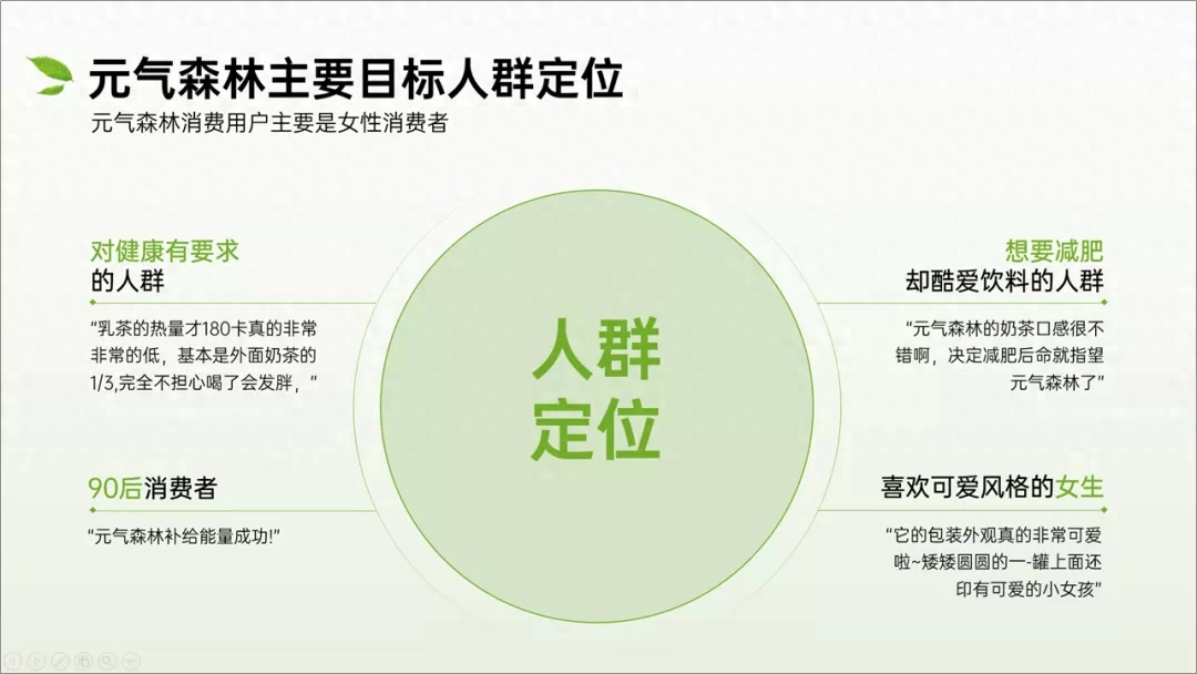
Since it is the target group, we still put someone in the middle, and it is a female consumer, so we went to look for it and found a picture.
We deduct the background, put it in, and get the picture below.

The character here "passes out" using Boolean operations. The specific operations are as follows.
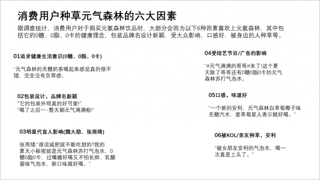
Last page
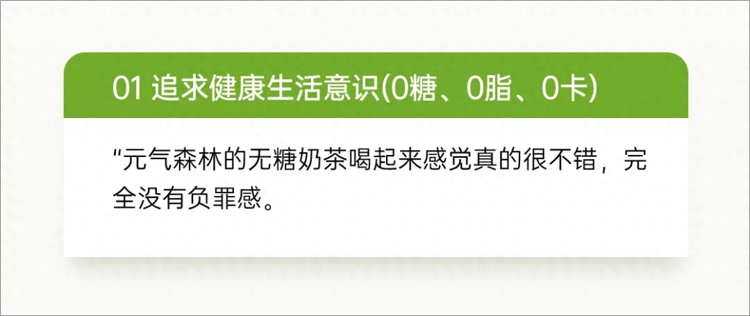
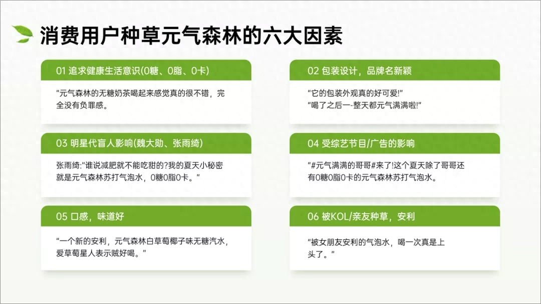
This PPT page has a lot of text, but the structure is very clear, including six major factors.
First typesetting and alignment, adjust the font and size.
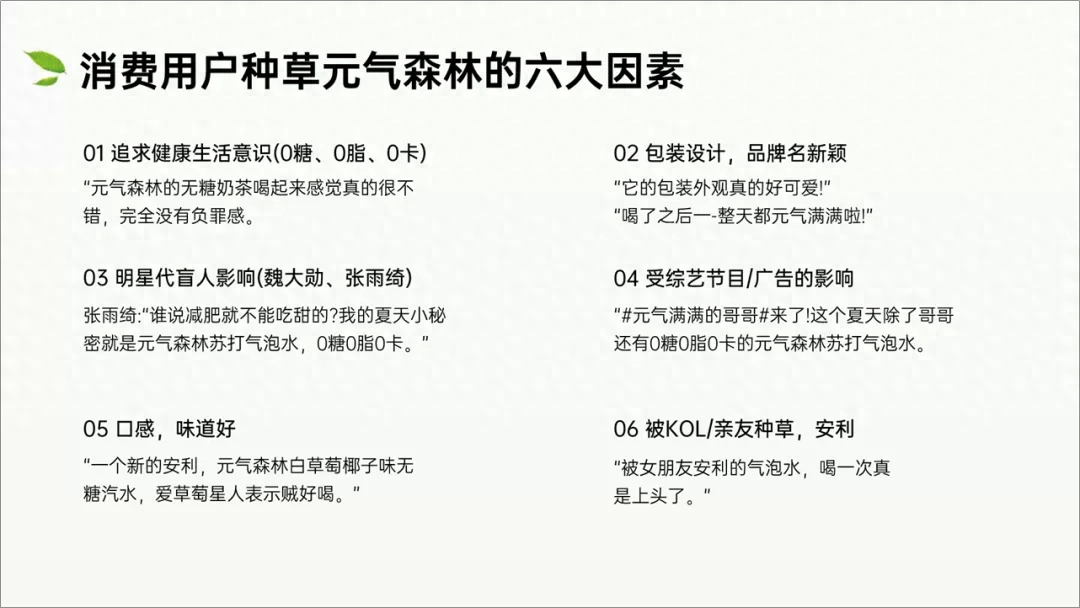
If there is too much content, it is easy to get messy. The grouping needs to be clearer. We finally put the text into the "container" of the shape.
This will make the content clearer.
Put them all in, and we can get six sets of content.
Most of it is text, which seems a little monotonous, so we added a picture and used the product picture of Yuanqi Forest.
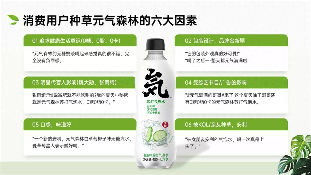
How? Not bad, the light color looks refreshing.
The above are today’s modifications.
By the way, the above is the modification case of this PPT, I hope you all like it.
End of article
We have prepared some benefits, go and get them

Articles are uploaded by users and are for non-commercial browsing only. Posted by: Lomu, please indicate the source: https://www.daogebangong.com/en/articles/detail/wo-bang-yuan-qi-sen-lin-gai-le-fen-PPT-ke-hu-shuo-ai-le.html
 支付宝扫一扫
评论列表(196条)
测试