
Beautiful Excel charts
The following is a table of sales quantities of a company’s products
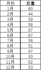
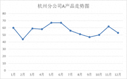
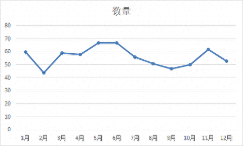
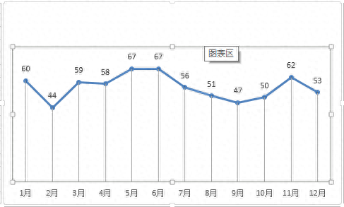
Based on this data, the chart you make looks like this:
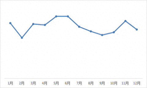
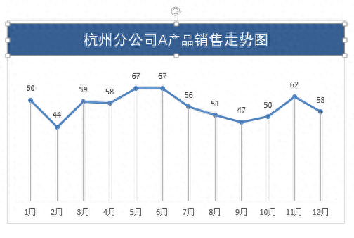
The chart made by others looks like this:
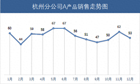
The table above is too ordinary and has no highlights. However, when the leader saw the table below, his eyes lit up. He might get dozens of dollars in salary increase next month! So how is this chart made?
1
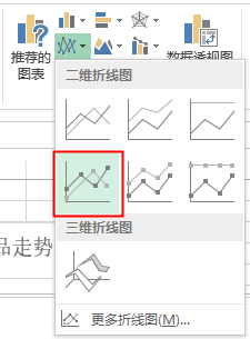
Insert chart
First, select the data, then insert the chart and select the two-dimensional line chart:
The effect after insertion is as follows:
2
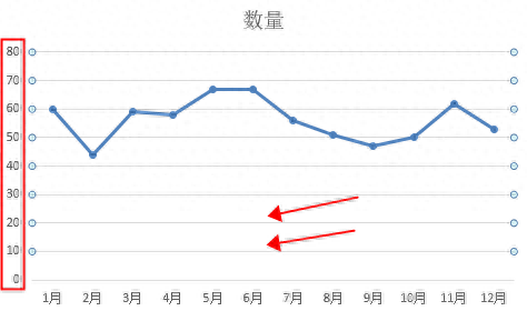
Remove redundant items
Select the chart title, the vertical axis in the rectangular area on the left and the vertical axis grid line pointed by the arrow, and then delete
Effect after deletion:
3
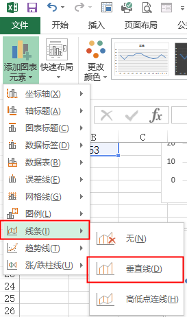
Add chart elements
Add vertical lines and data labels to chart elements (above)
Then select the chart area and drag it down.
Then insert a text box of appropriate size above the chart, modify its background color, and the font color is as follows
4
Modify chart properties
Modify the font of the data labels and horizontal axis to "isoline font", the effect is as follows:
Isn’t it much more advanced? Hurry up and learn to use it in your PPT!
Synchronize the original WeChat public account: Self-taught Excel
ID: selftt
Articles are uploaded by users and are for non-commercial browsing only. Posted by: Lomu, please indicate the source: https://www.daogebangong.com/en/articles/detail/wei-shi-me-bie-ren-zuo-PPT-zhong-de-Excel-tu-biao-zhe-me-piao-liang.html
 支付宝扫一扫
评论列表(196条)
测试