IT House News on May 7th Earlier this year, Microsoft unexpectedly confirmed that it was making UI improvements for Windows 10 and found related inactive code in the preview version. Microsoft today announced the release of Windows 10 Build 21376 to beta users in the development channel, which comes with updated Segoe UI fonts and more.
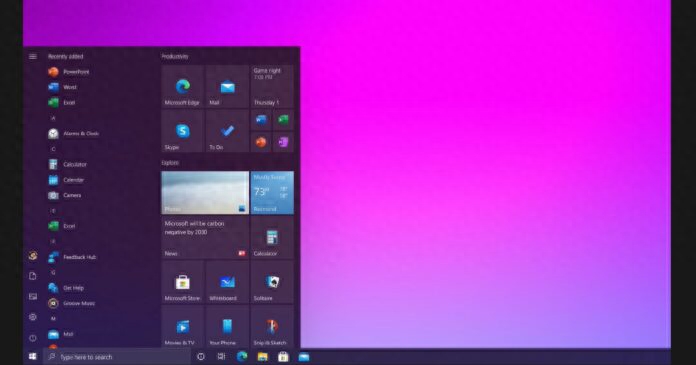
In the most recent preview build, there were two major changes. For one, rounded corners are now more obvious. Microsoft has also introduced new icons almost everywhere, extending to the Settings app, Control Panel, File Explorer, and various app windows.
Like most Windows 10 previews, this week’s update doesn’t have any big changes. The overall layout of the operating system is much the same as it has been since the last big feature update (Creators Update). However, Microsoft has updated some basic UI elements to make the interface look a little more modern.
As you may know, the default system font of Windows 10 is “Segoe UI” which is used in all applications like Control Browser, Explorer, Settings, etc.
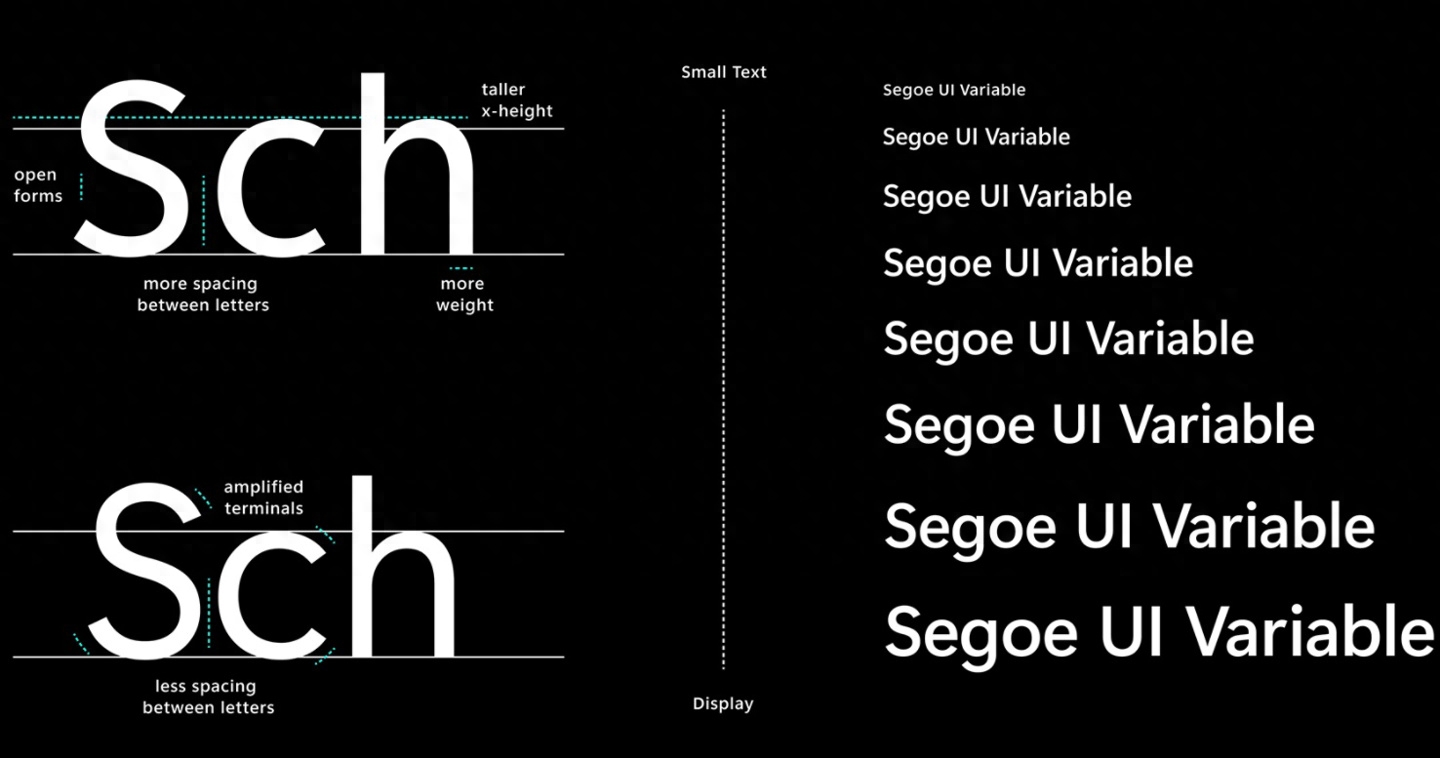
Microsoft is updating the default Segoe UI to to include an "optical axis" that should allow fonts to scale seamlessly on devices of various form factors. For example, Microsoft seems to have improved the readability of fonts at small sizes, and outlines look better on different display sizes.
By default, Segoe UI for Windows 10 is designed at 9pt font size. Font expression is limited at large sizes and currently lacks readability at sizes smaller than 9pt.
In the next version, Microsoft’s Segoe UI font user interface will dynamically adjust across all your apps and devices and provide great readability at different sizes. This includes fonts smaller than 9pt. Style and silhouette also get better in larger sizes. These changes will be noticeable in Settings and other Windows applications.

New fonts vs. old fonts
As you can see in the screenshot above, the Settings text on the app title bar does look cleaner than the existing font on the right.
It's worth noting that Microsoft is slowly moving to the new Segoe UI font, and currently, the new font is noticeable when you look closely at the title bar of a UWP app.
Articles are uploaded by users and are for non-commercial browsing only. Posted by: Lomu, please indicate the source: https://www.daogebangong.com/en/articles/detail/wei-ruan-fa-bu-Win10-Build-21376-nei-ce-ban-chong-xin-she-ji-mo-ren-yong-hu-jie-mian-zi-ti.html
 支付宝扫一扫
评论列表(196条)
测试