
A few days ago, a reader left a message asking how to make workplace PPT more attractive.
In fact, for PPT in the workplace, there is no need to pursue a strong sense of design.
Today, I will share with you a set of practical cases, as well as design ideas and applications method.
Still the old rule, before designing, determine the design specifications first.

Cover page
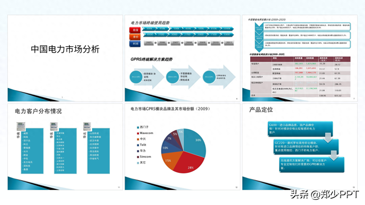
Looking at the cover, although the copy is straightforward, the effect is not good.
Share a method for content with less text.
Use this staggered layout effect, such as the effect of staggered sizes.

After the text is processed, decorate it with elements.
For example, use circular overlay to organize the design and highlight the theme.

Secondly, in order to avoid the circle being too single, the hollowing effect is used to optimize it, with a Line embellishment.

In addition, the text is optimized with a gradient effect to give it a more layered feel.

There is another effect, which is to maximize the circle and then use particle optimization.

If it feels empty on both sides, use lines to decorate it.

These effects can fully meet the needs of workplace PPT, if you want higher quality Effect.
You can use picture designs, such as this electricity picture.
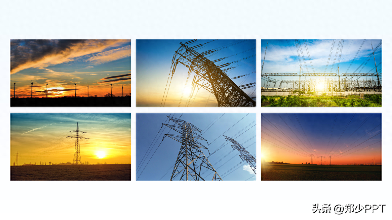
The effect of using pictures to design the page makes the page more scene-like.
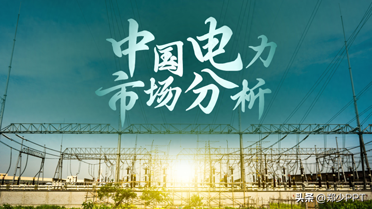
In addition, the design with a light background is more impactful.
Trend analysis
This page contains two sets of trend content, and the design is too complicated.
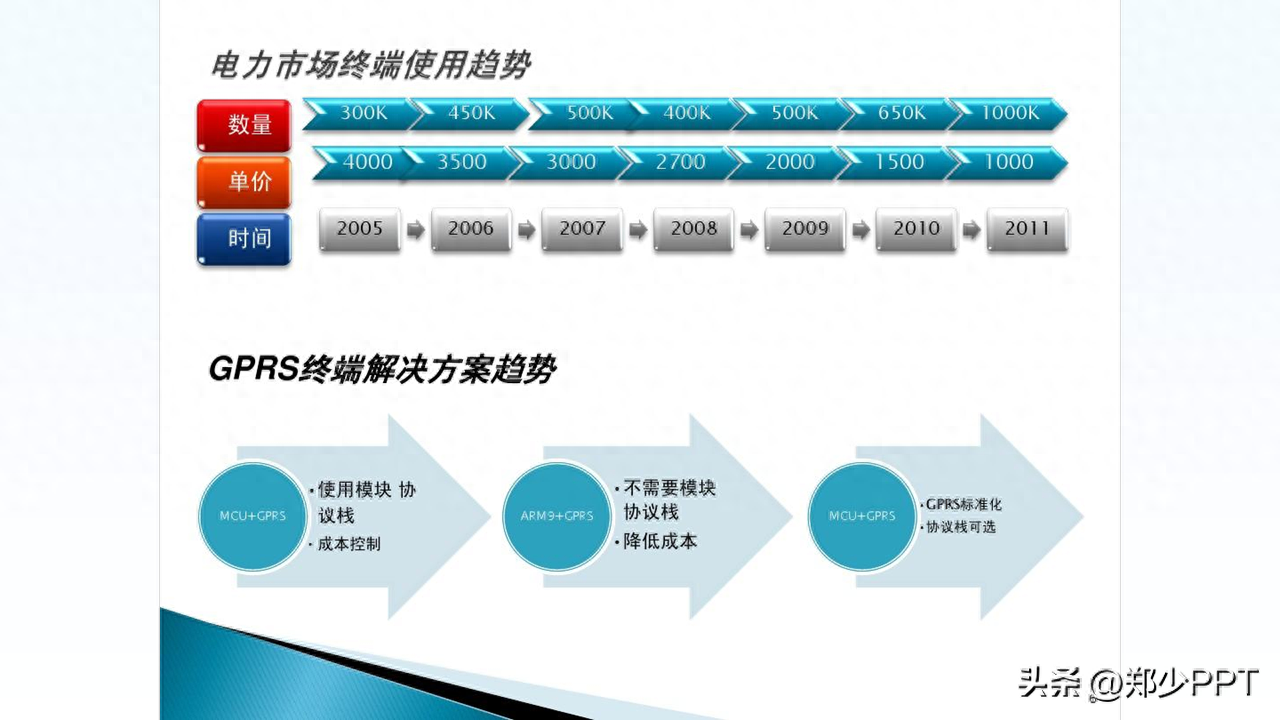
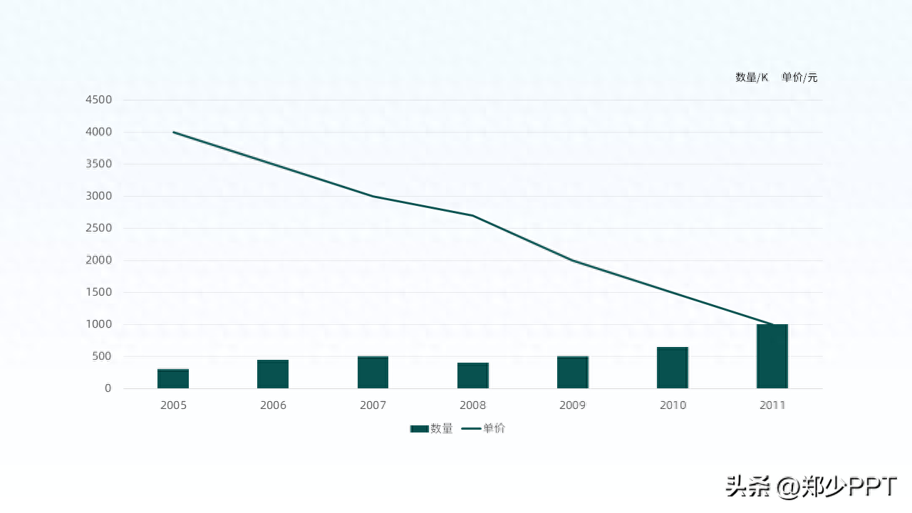
In fact, you can display the data in a chart style to make it look more intuitive .
As for the three groups of content at the bottom, you can borrow graphic design.
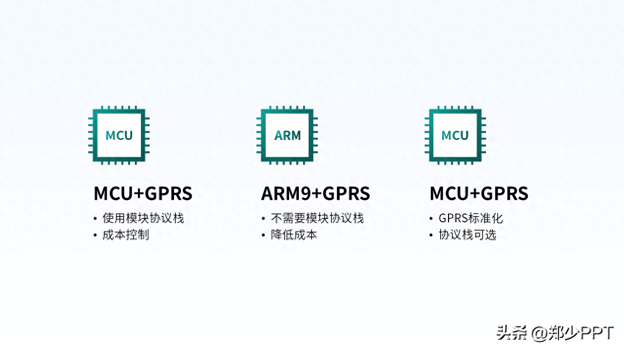
After processing, design the content separately on the left and right.
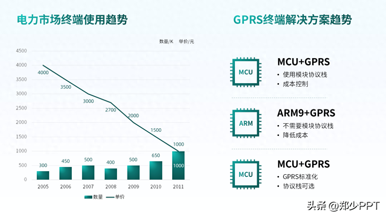
In order to make the distinction between the two themes more obvious, use shapes to distinguish them.
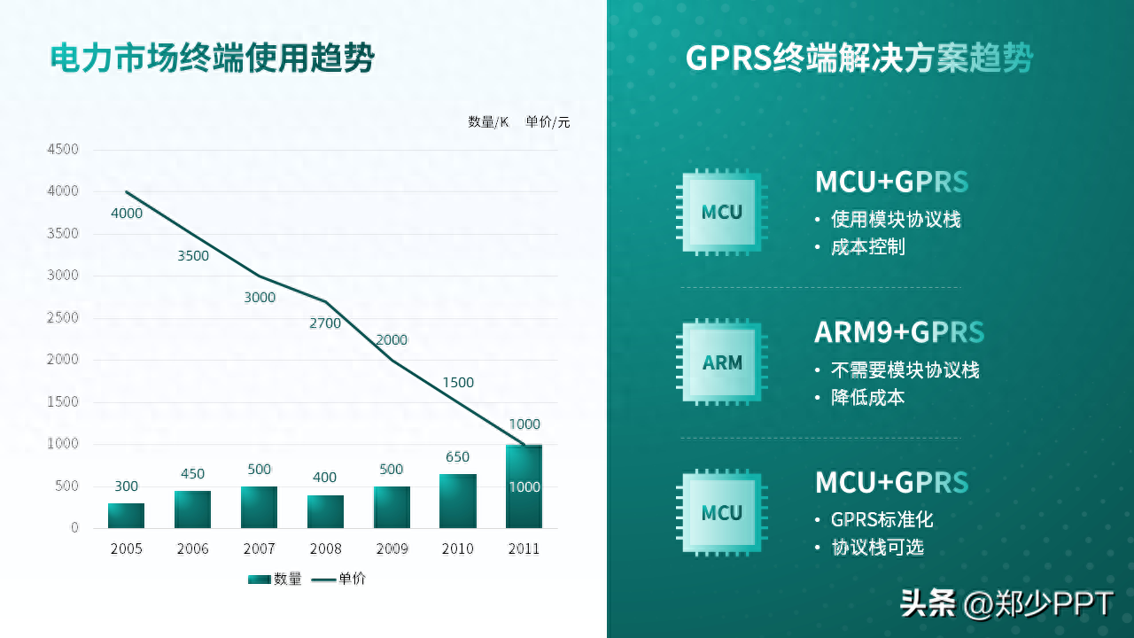
Finally, in order to make the two sets of data clearer, adjust the line chart to red.

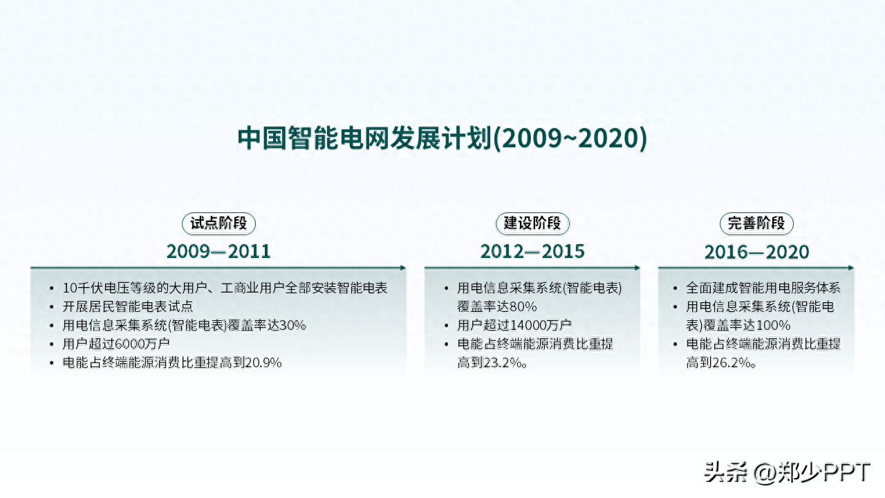
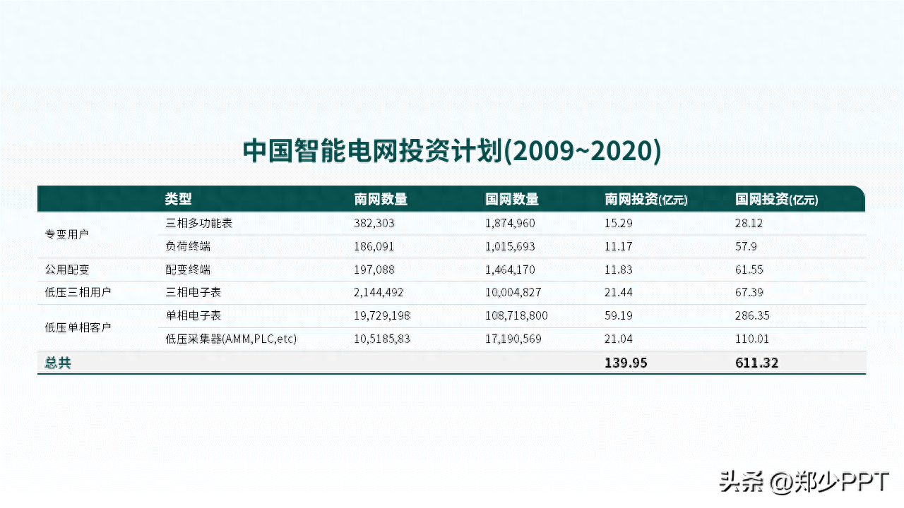
Table content
This page contains tables and timeline content. The bottom table is affixed to the page like a "plaster".
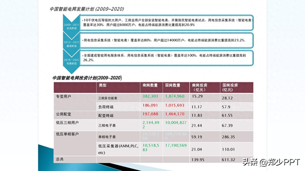
First look at the timeline, split the content and use arrows to indicate it.
The second is the table. Just use lines. Don’t use complicated effects to disturb information.
After designing, display the content in a top-down structure.
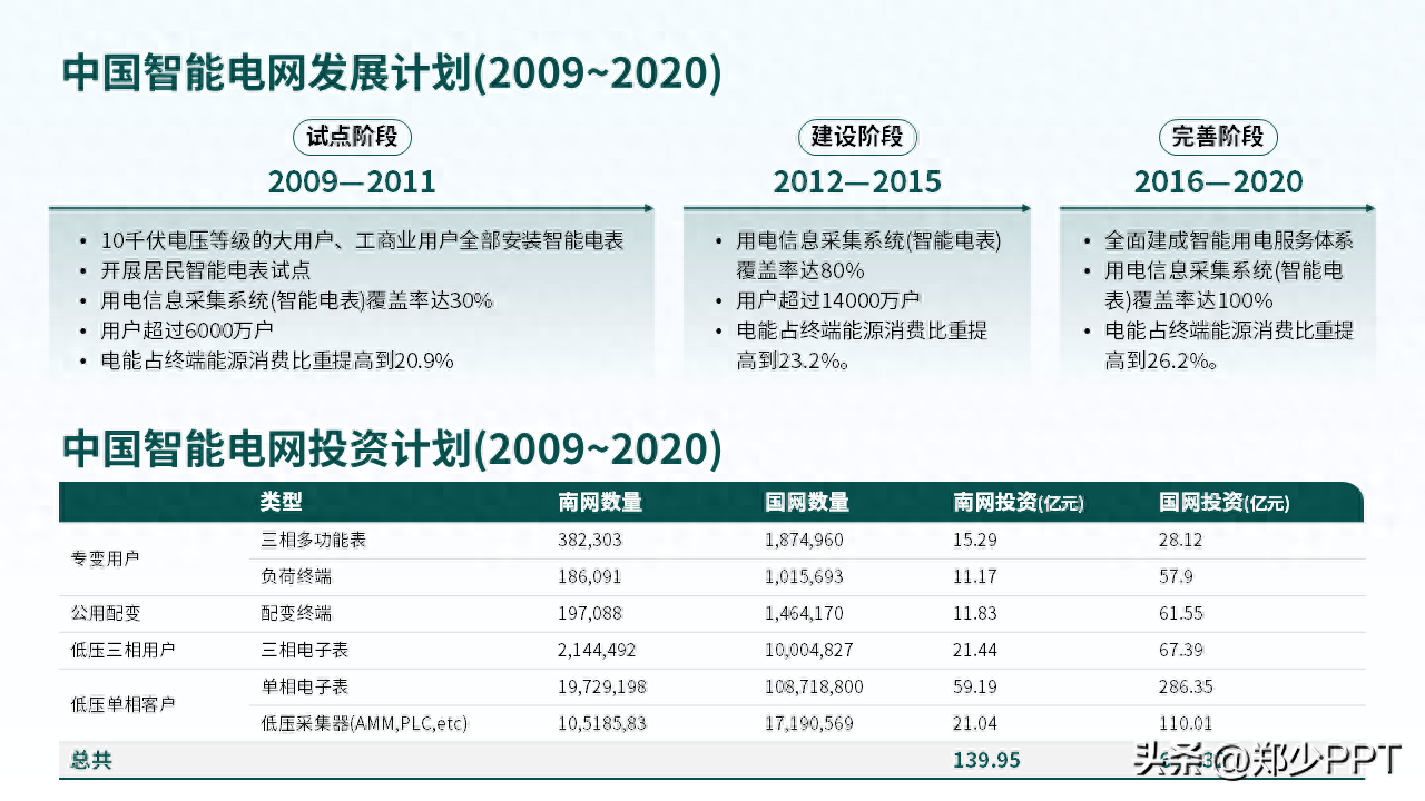
Similarly, shapes are still used to differentiate the content and make the page clearer.
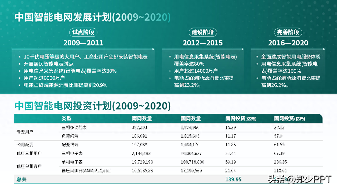
Finally, there is another point. The information in the original content must not be wrong. Mark it.

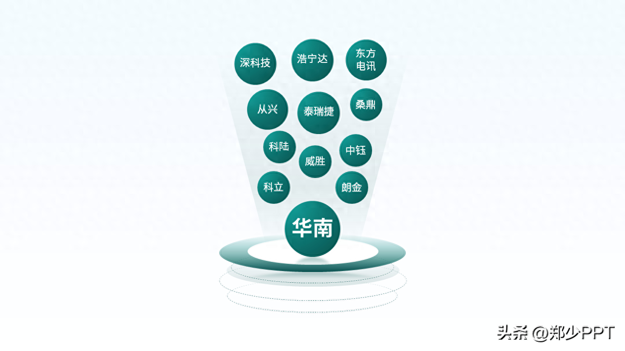
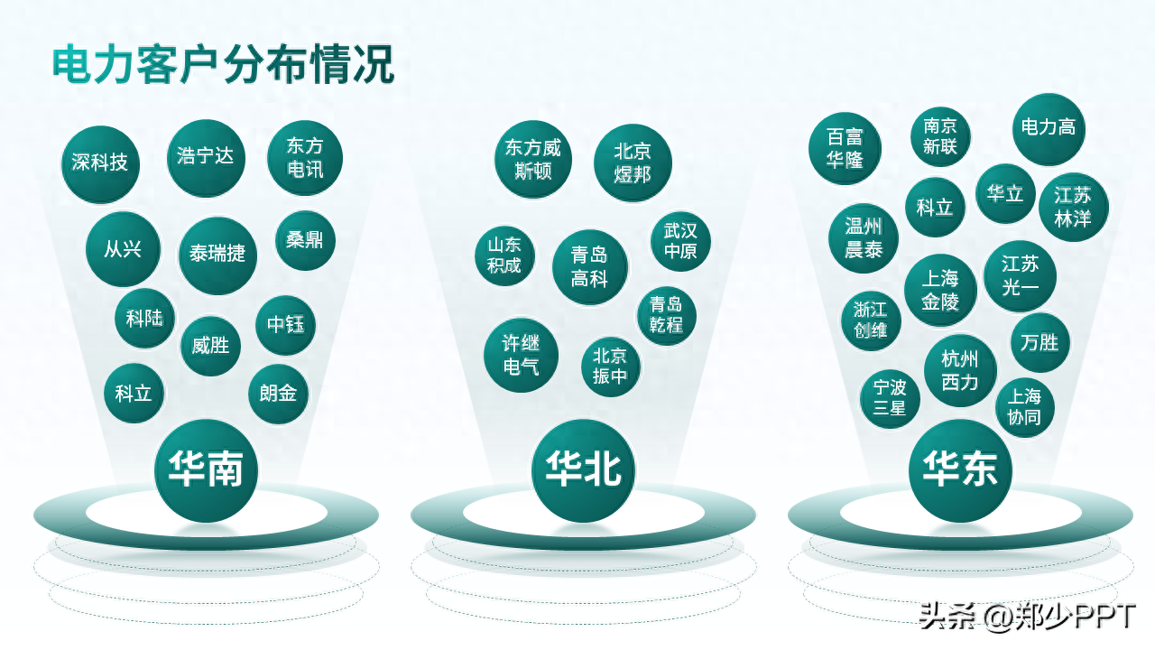
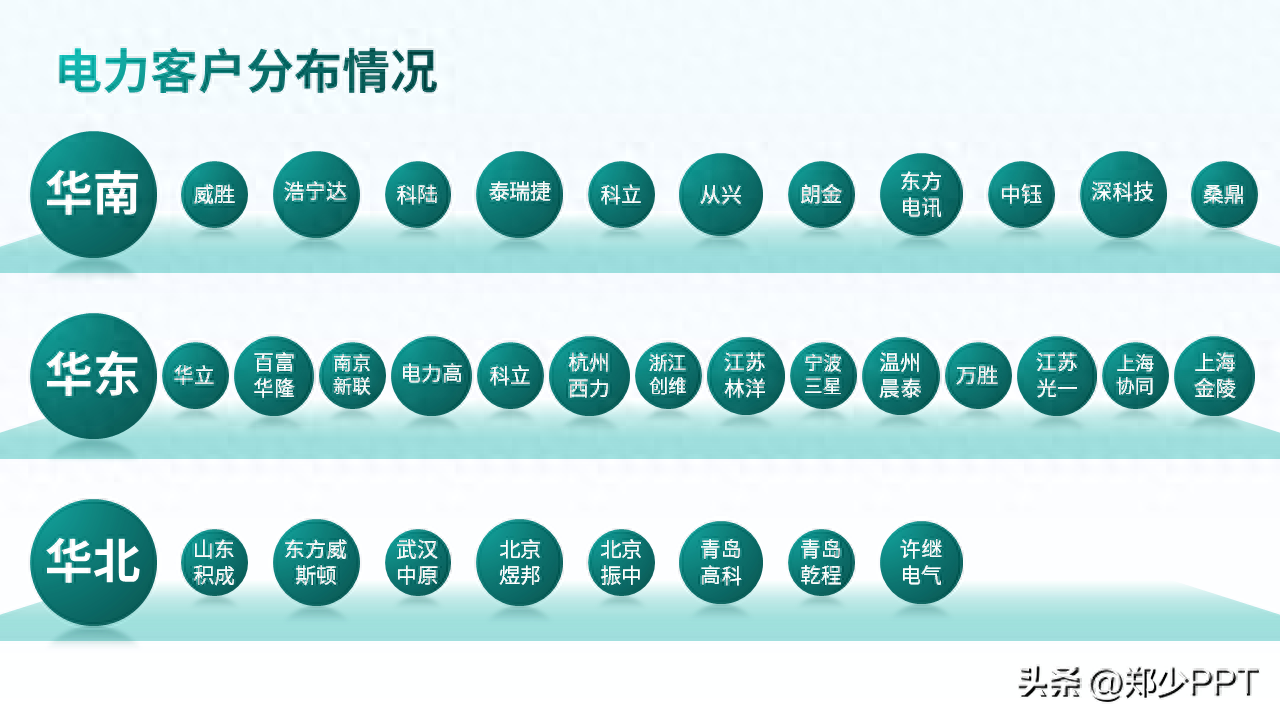
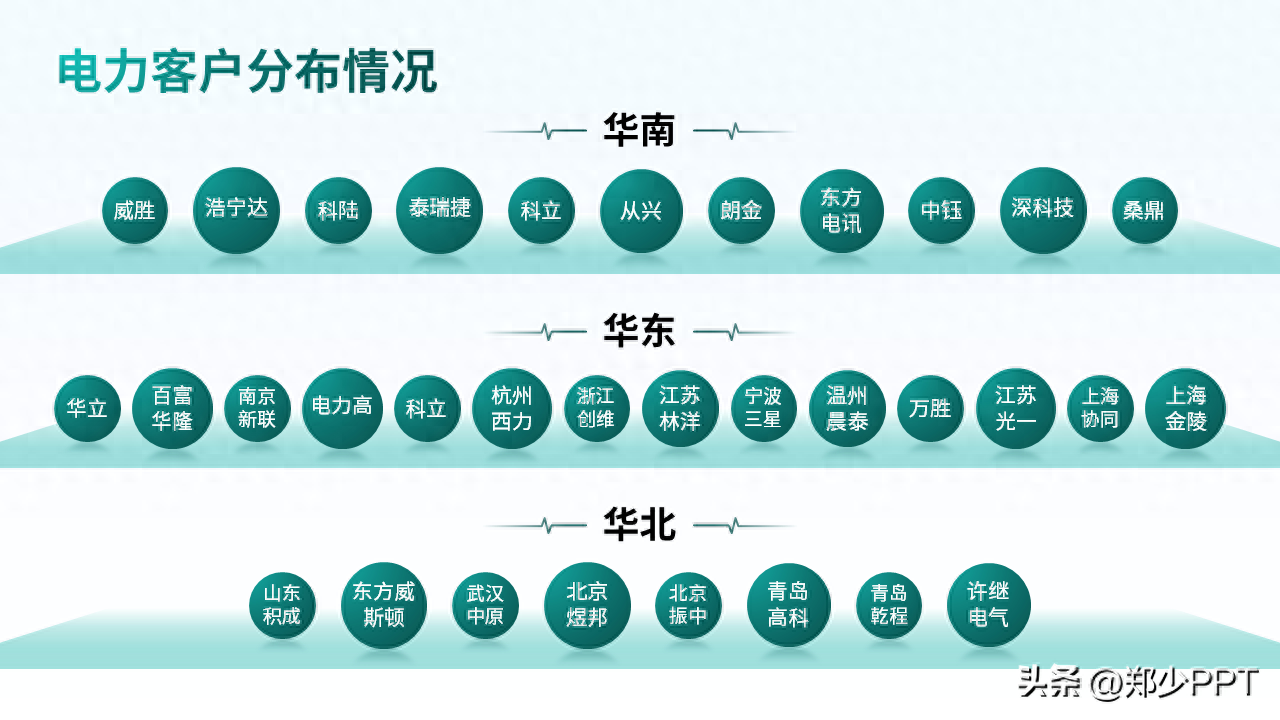
Customer distribution
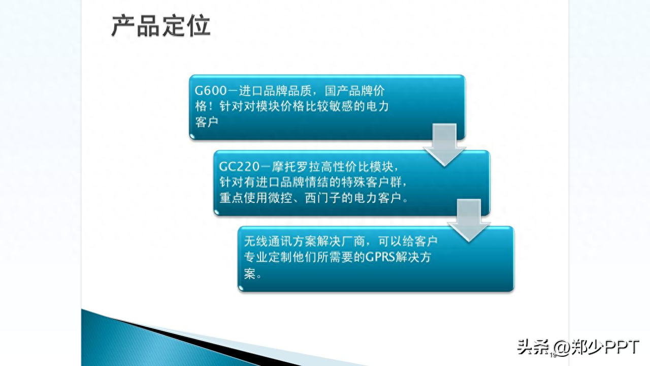
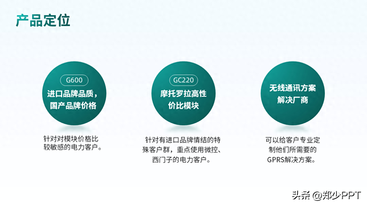
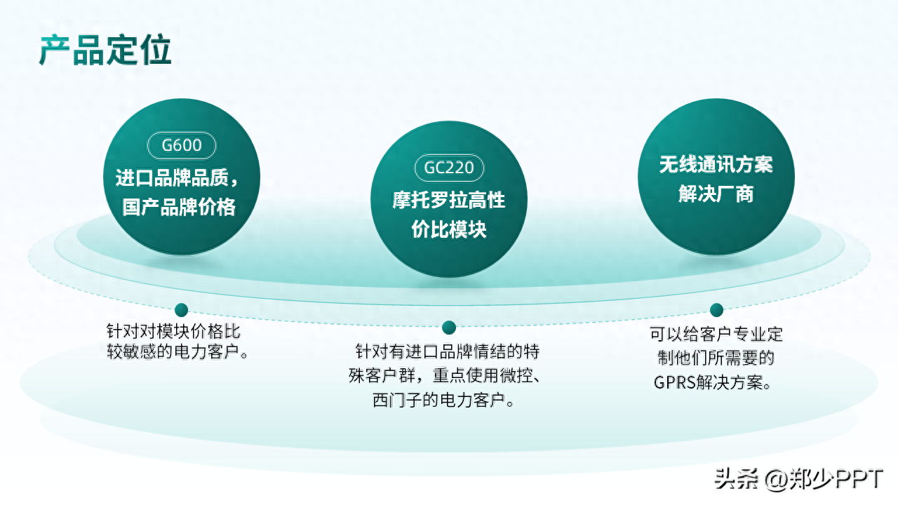
For these three groups of content, this idea is OK, but the effect is not very good.
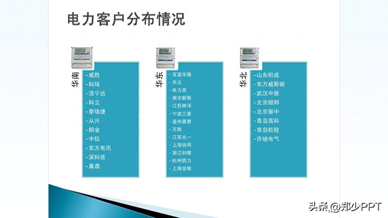
Here is a method to share, using modular organization, such as large and small circular designs.
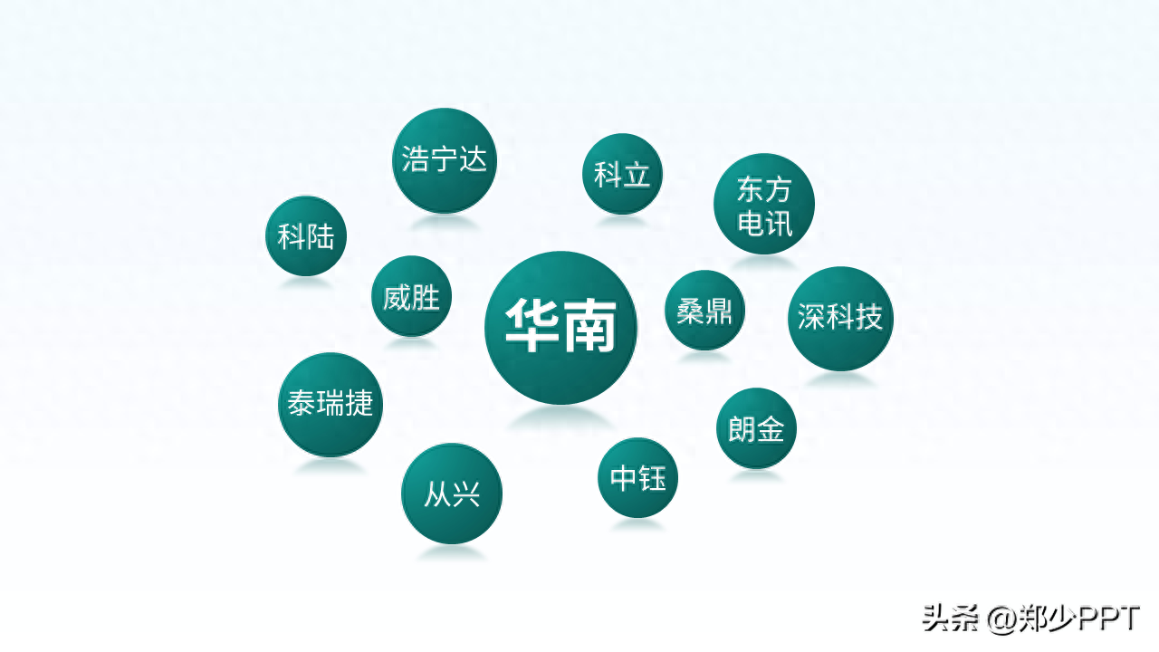
Secondly, since it is a modular process, changing to a creative element design will It is put in as a container.
Similarly, the other two groups of content are treated in the same way.
In addition, you can also use this horizontal effect.
Or, display South China, East China, and North China with a centered effect.
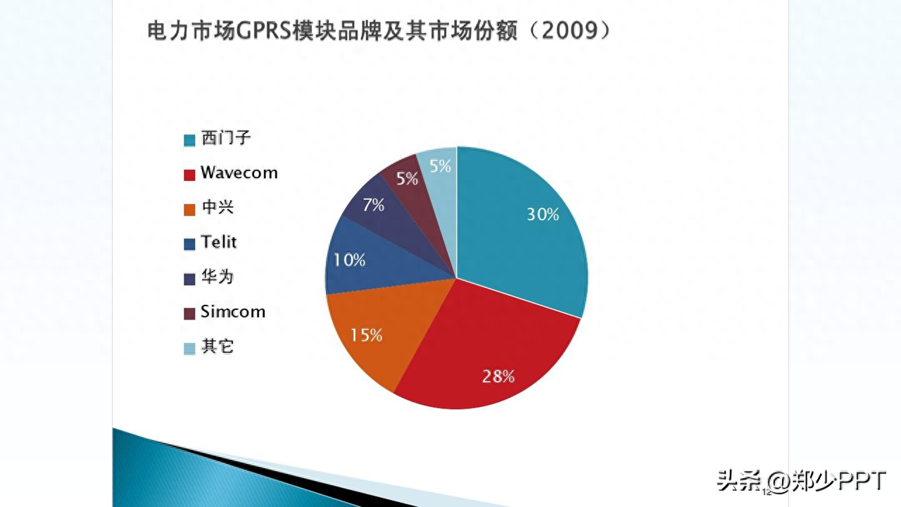
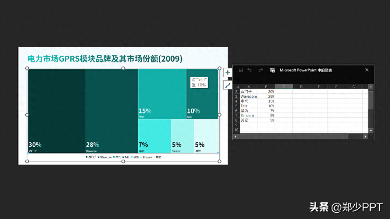
Pie chart data
For PPT in the workplace, the most fearful thing is a set of data, such as this big pie chart.
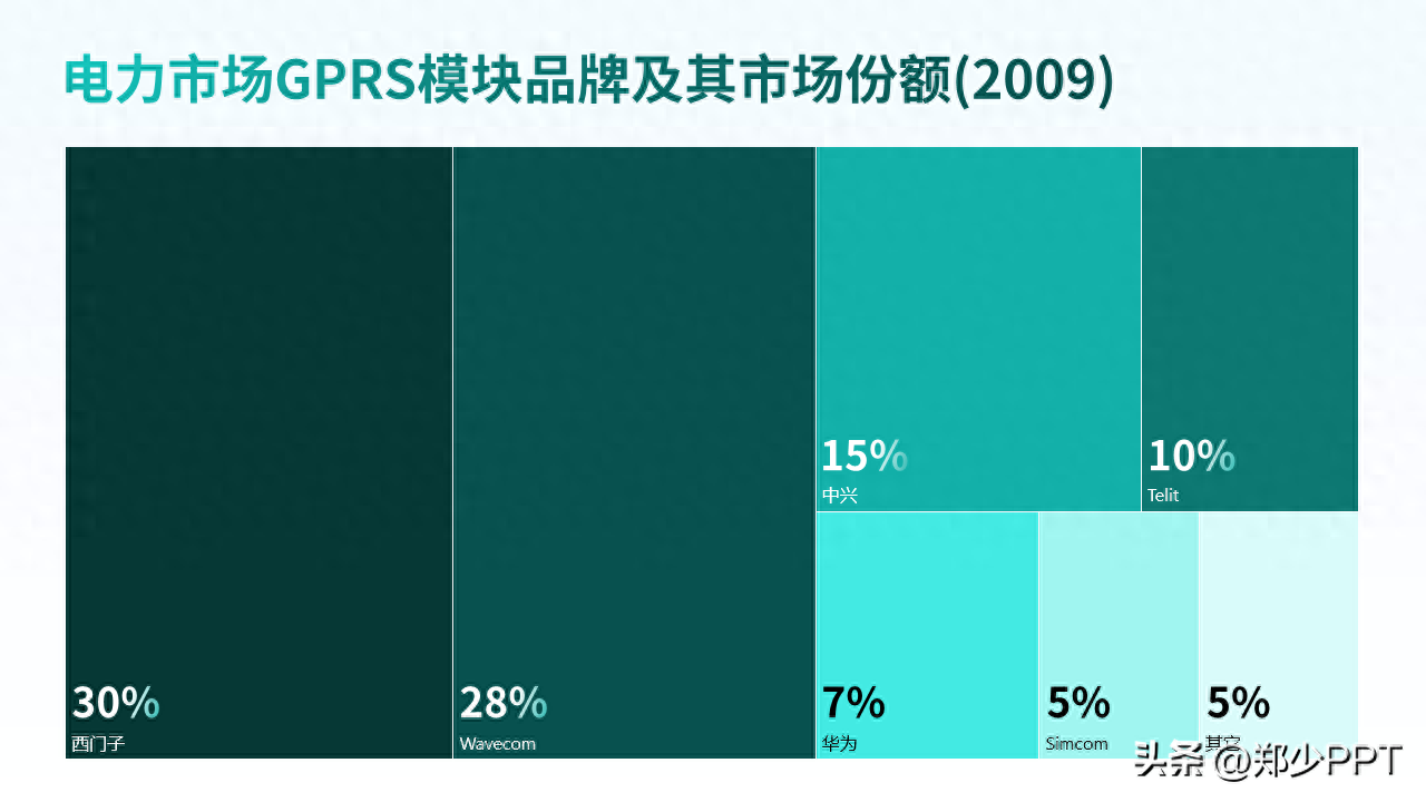
In fact, you can change your mind and replace the pie chart with this kind of tree diagram display .
The page is full and the data is intuitive.
In fact, tree diagrams are widely used. Click on the chart and select tree diagram.
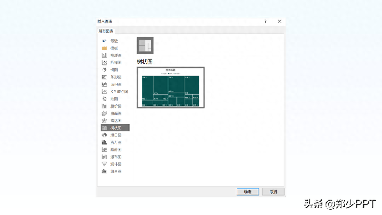
According to the branches and leaves, the redundant ones will be deleted.
Three paragraphs
Look at the content on the last page, about the three paragraphs.
Here is a simple process to optimize the content.

Next, use a circle to straighten it.
If it looks monotonous, use a gradient shape to optimize it to make the page more layered.
Finally, if you feel that this method is more complicated, you don’t have much time to design in the workplace .
It is recommended to use this KOPPT artifact plug-in, which contains a lot of creative materials.
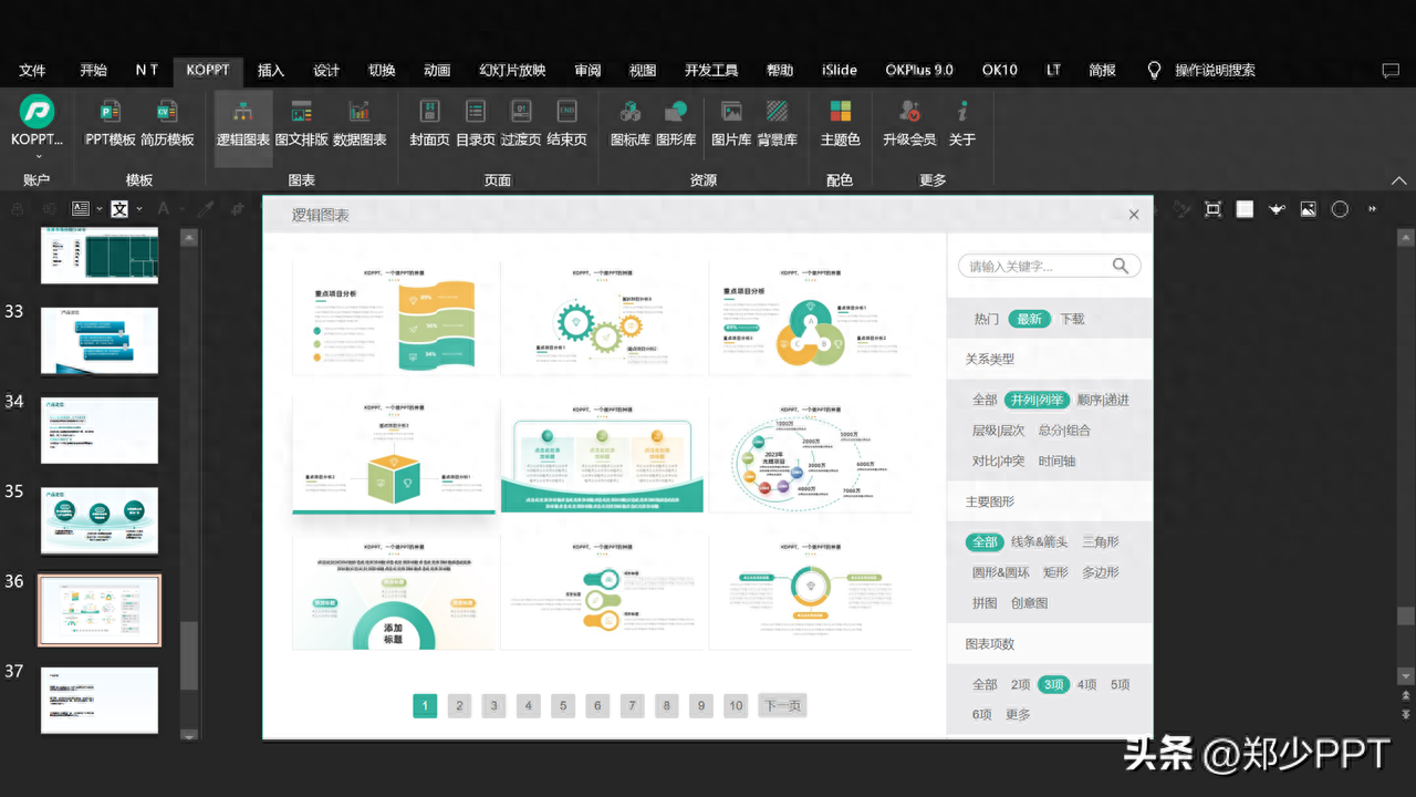
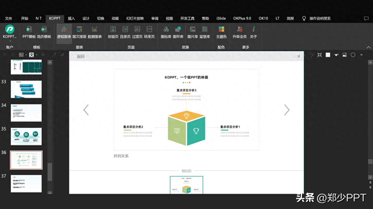
For example, click [Latest] here to see the newly updated creative structure diagram. You can import it into PPT with one click.
Okay, let’s finally take a look at the comparison effect before and after optimization.
Before optimization, the page was relatively empty and the style was not uniform.

After simple optimization, it can be seen that not only the colors are unified, but the page is also richer.

The above picture case materials are all from Internet sharing and have been deleted
That’s all I have to share about this topic. I hope it will be helpful to you. .
See you next time!
Articles are uploaded by users and are for non-commercial browsing only. Posted by: Lomu, please indicate the source: https://www.daogebangong.com/en/articles/detail/wei-ke-hu-she-ji-yi-fen-dian-li-PPT-jing-hu-zhuan-ye-lyu-se-xiao-guo-jian-yue-da-qi.html
 支付宝扫一扫
评论列表(196条)
测试