Reposted from the public account: She Chang
Web page layout determines to a large extent how website users interact with web content. Good web design has a strong Practicality and adaptability. In terms of layout, we must choose a design that is suitable and satisfying to users.
As designers, we should follow the best practices of web layout and bring the most cutting-edge and brand-new web pages to viewers. In terms of experience, we must also adjust the web page with the development of media and the improvement of technology to create a website that satisfies users and provides a great experience.
Old rules, please remember to like and collect!
01
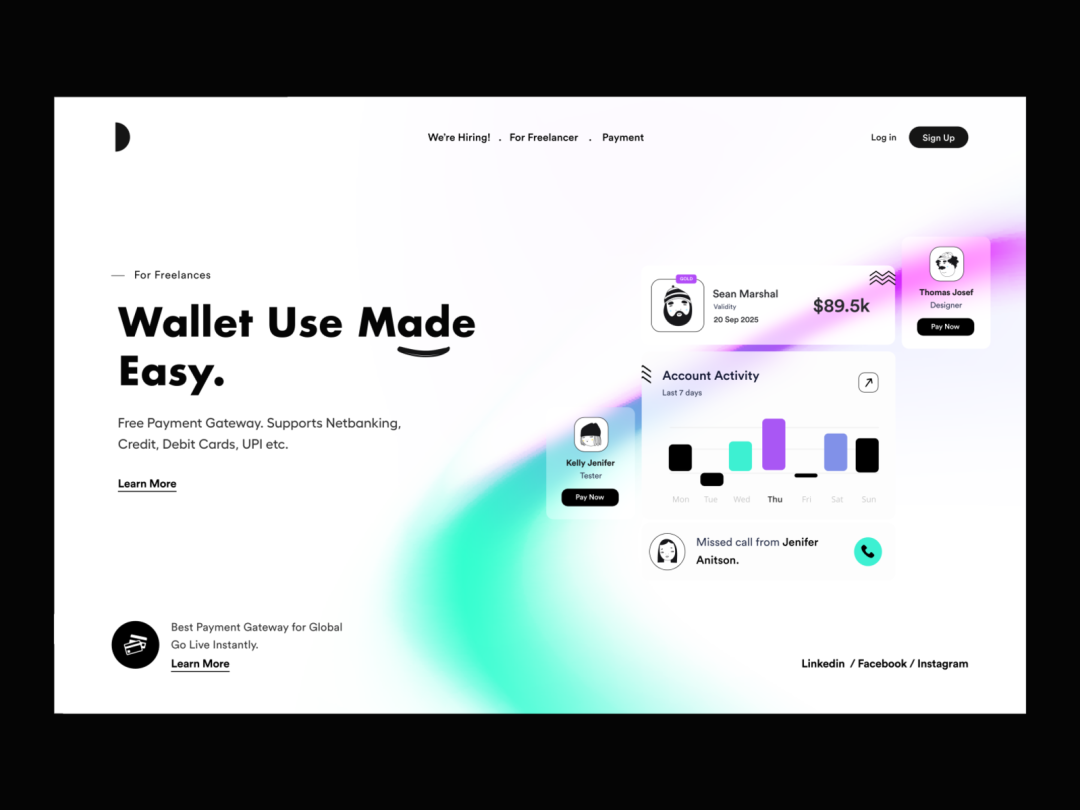
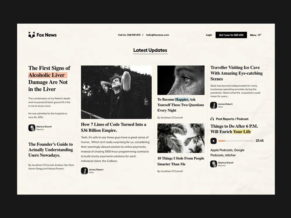
Card layout
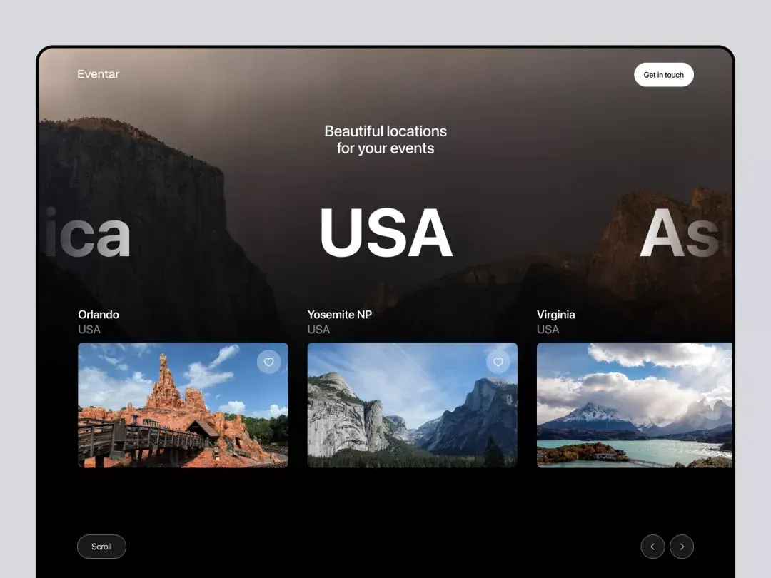
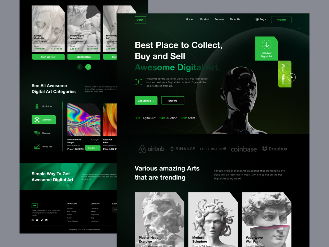
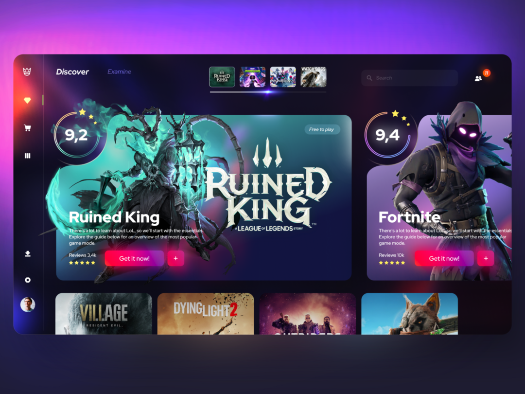
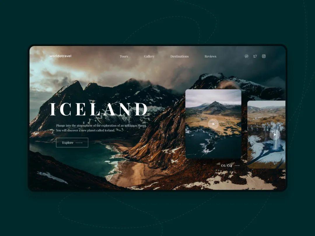
Card layout is divided into two types. One is that each card is the same size and arranged neatly and standardly. One is cards of different sizes, and the cards are arranged in no fixed order. Both techniques are suitable for web pages with a large amount of content to be displayed.
Apply : News websites, blog websites.
02
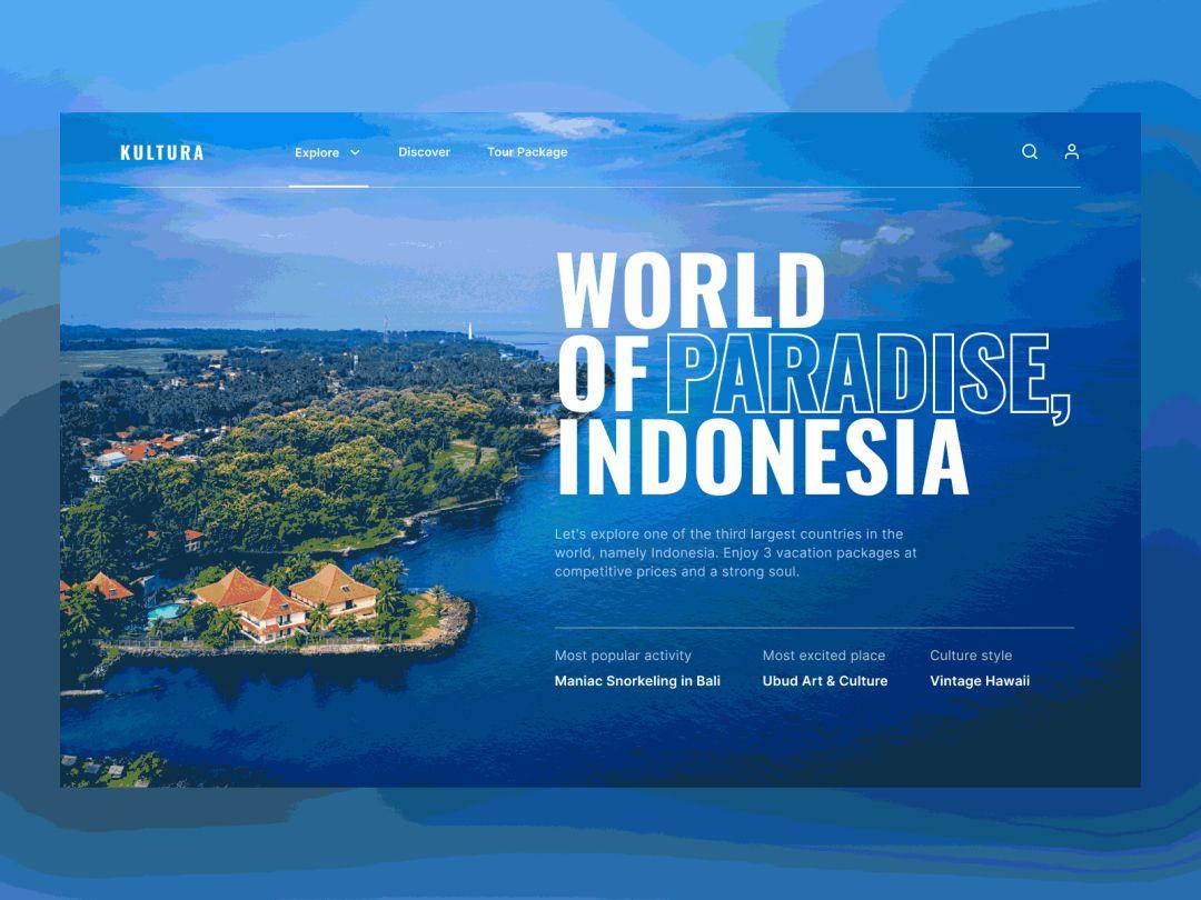
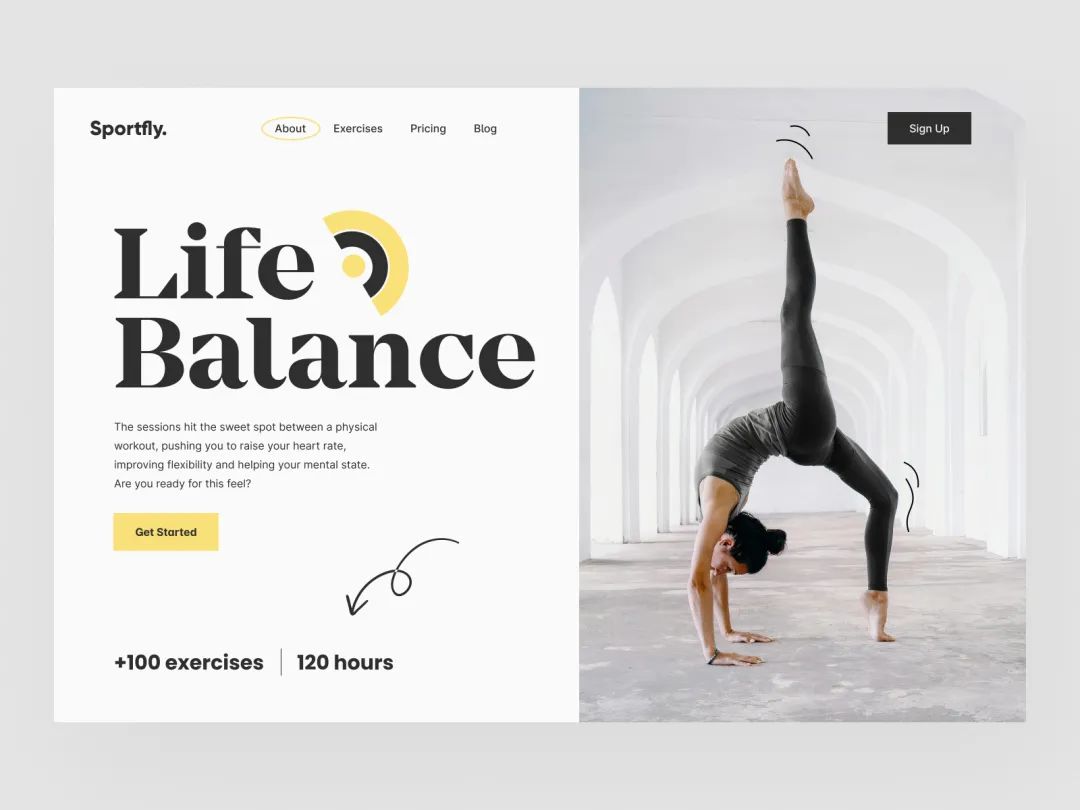
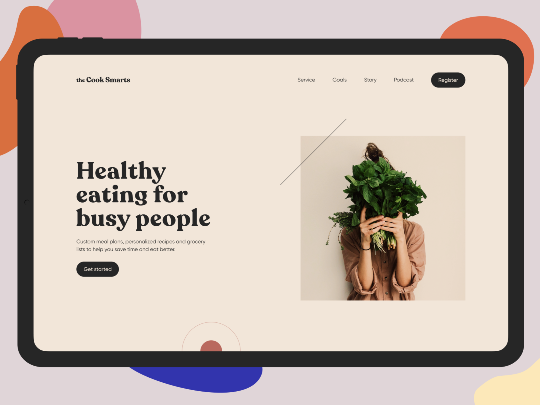
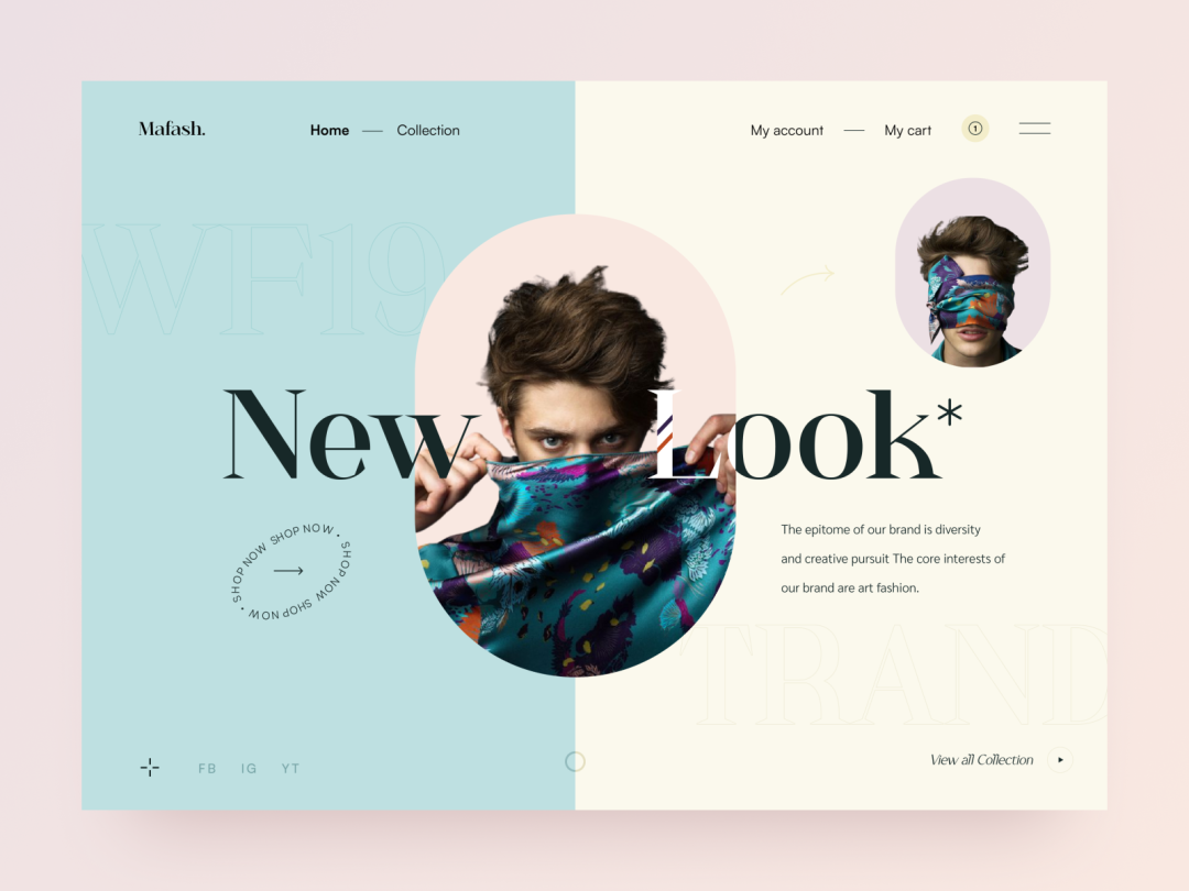
Split screen layout
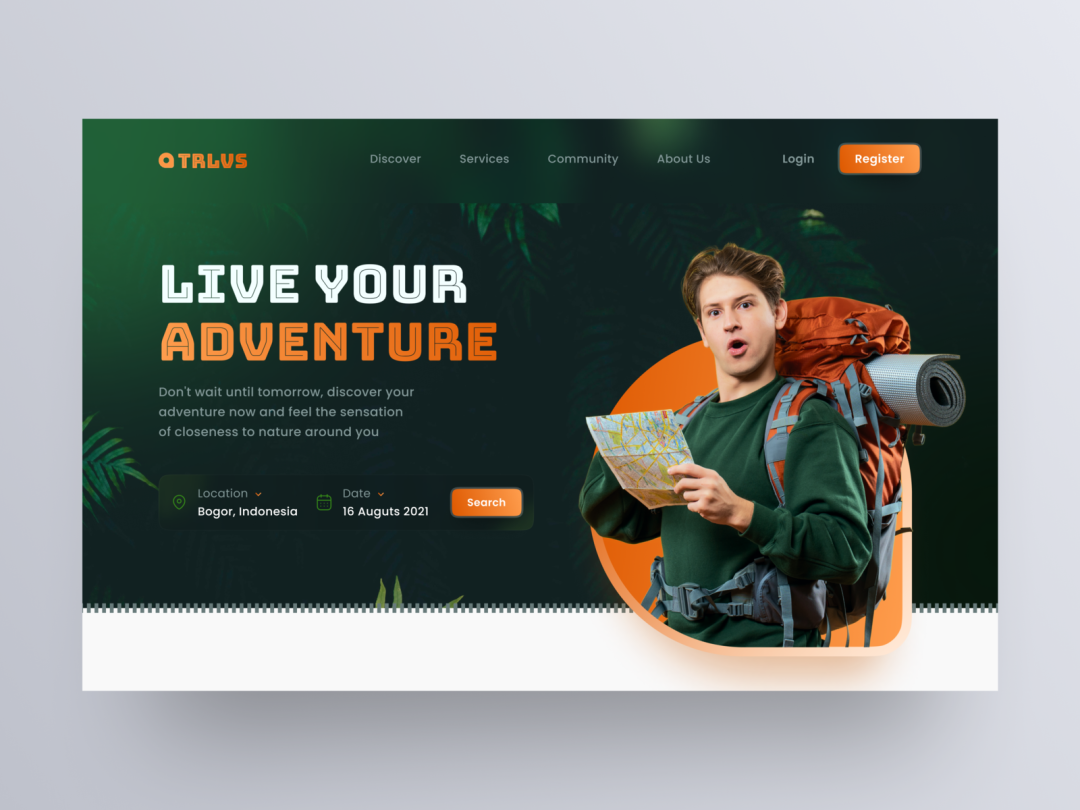
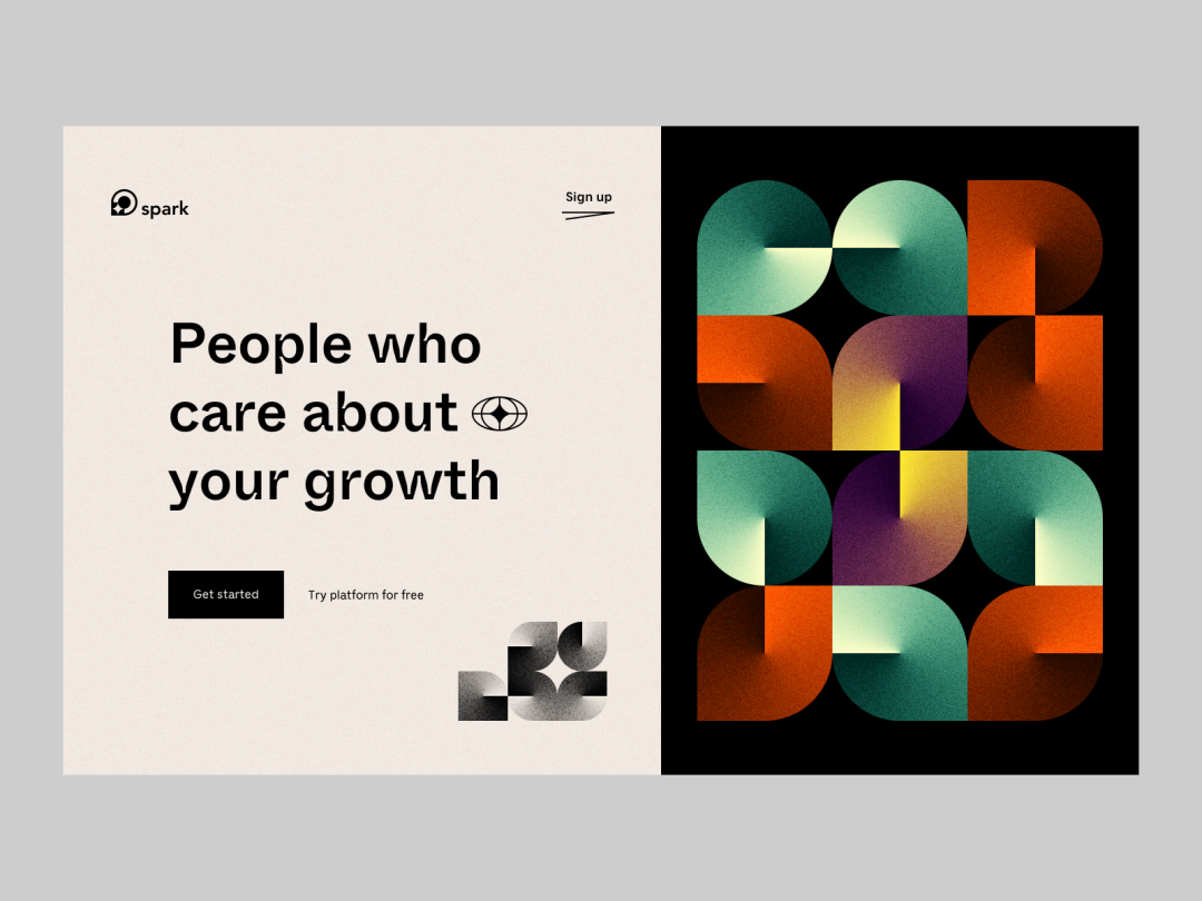
Split-screen layout is a popular layout technique. When pictures and text are equally important, you can choose split-screen layout . The layout technique can be text on the left and pictures on the right or text on the left and pictures on the right. It is very simple and easy to learn!
Apply : E-commerce website.
03
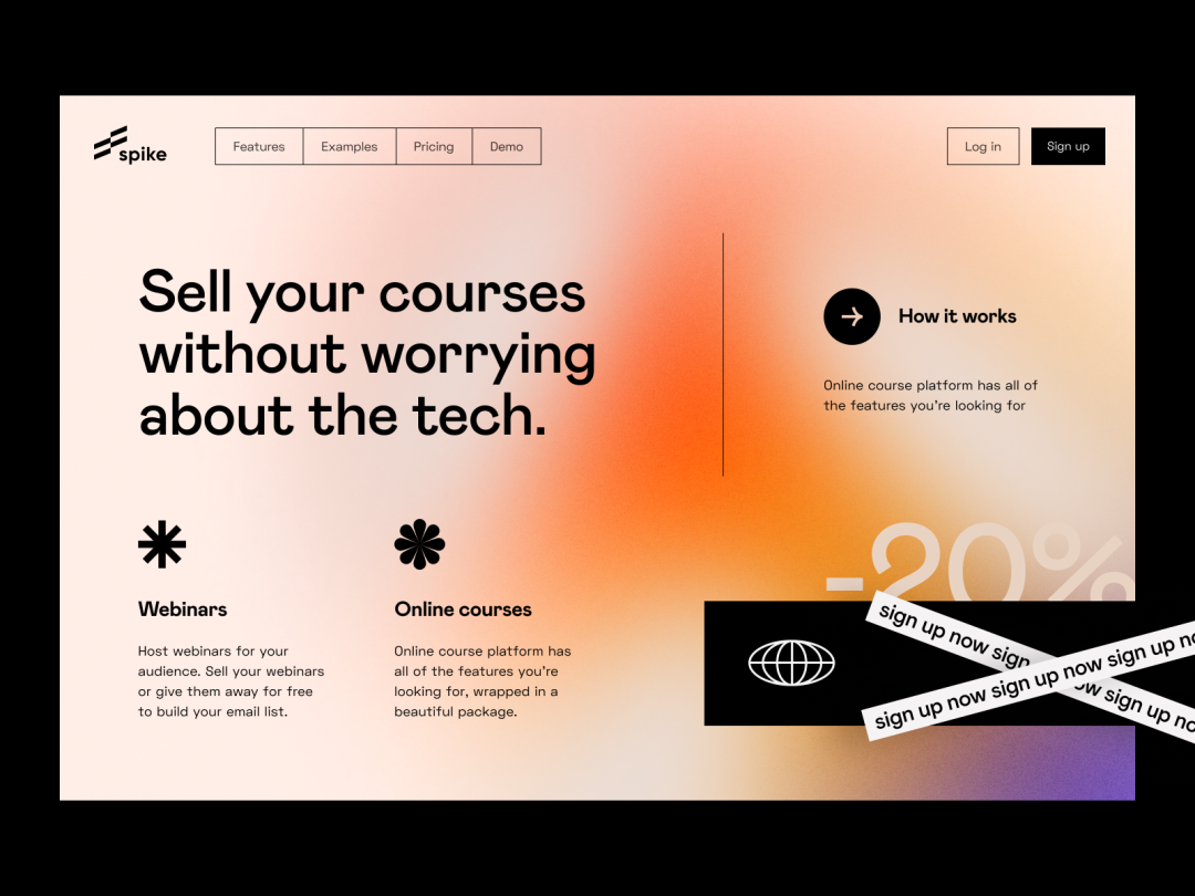
Plain text layout
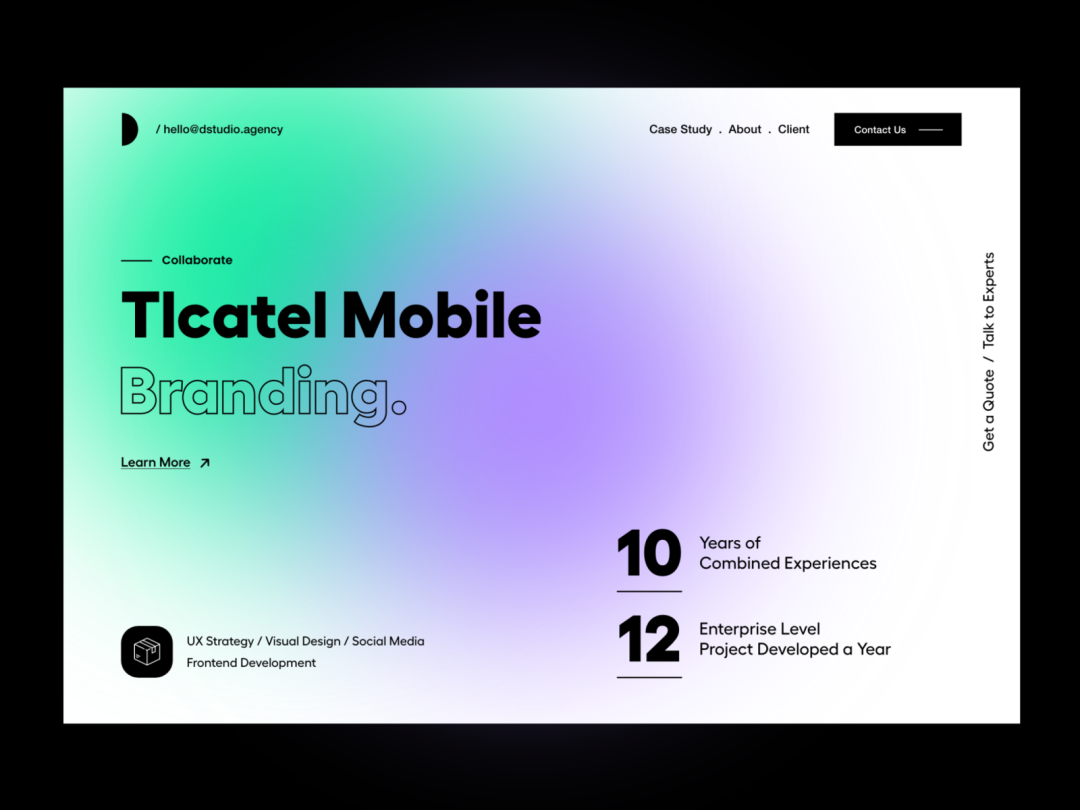
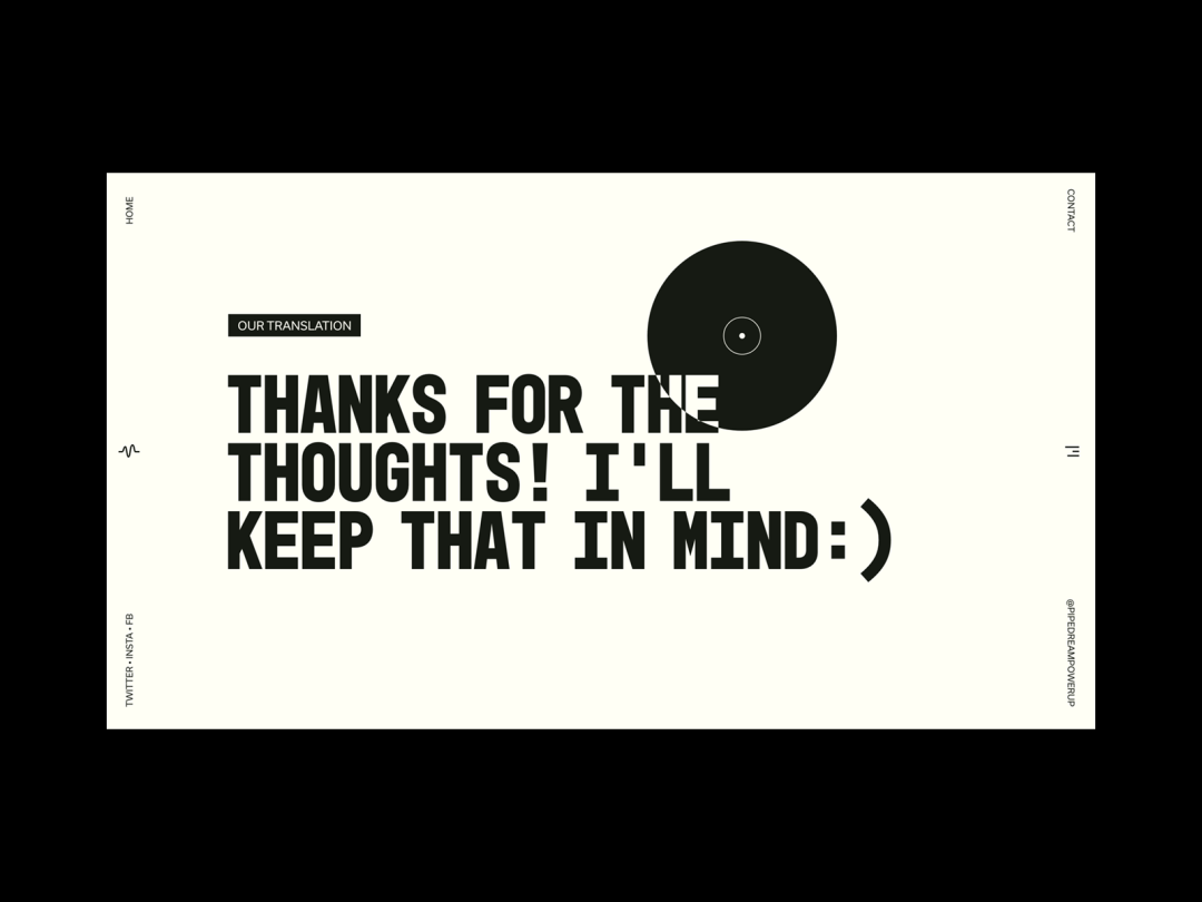
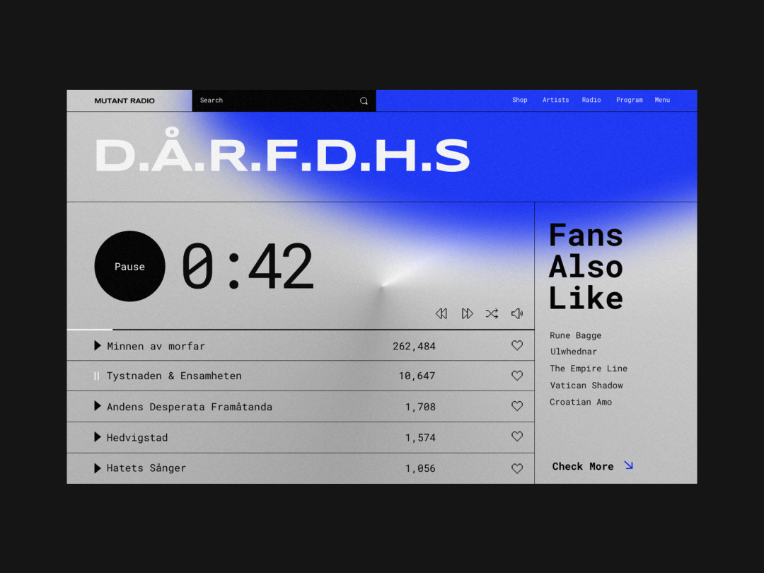
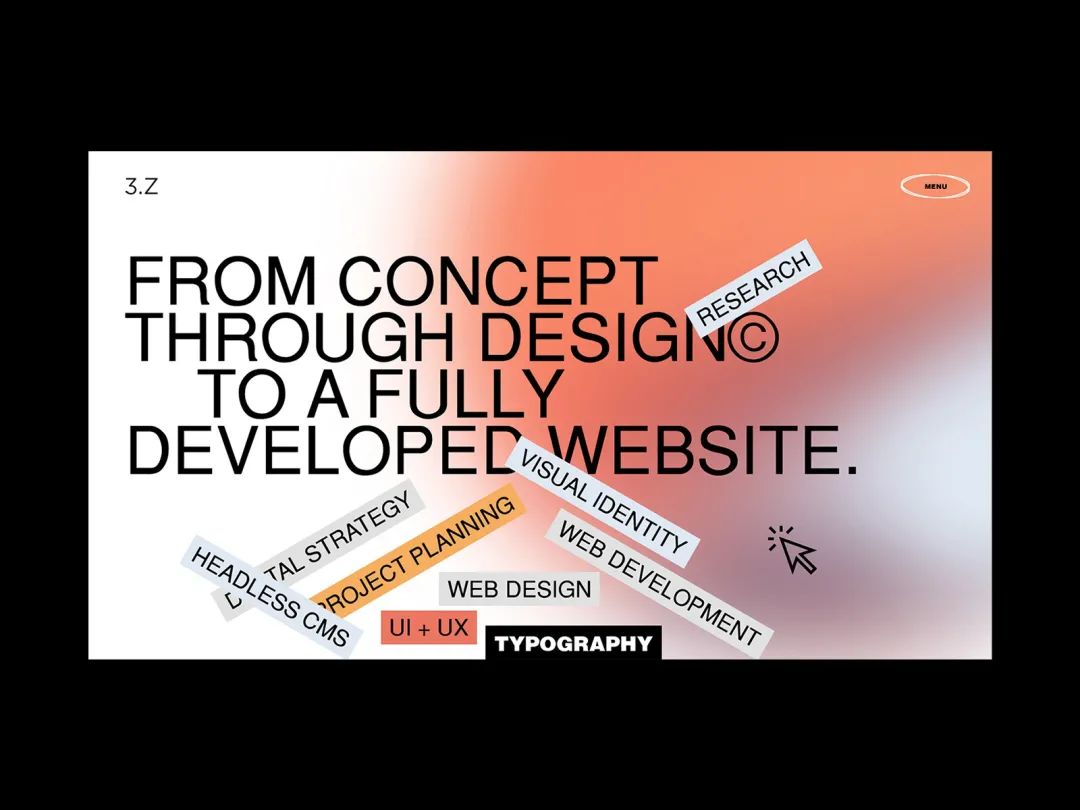
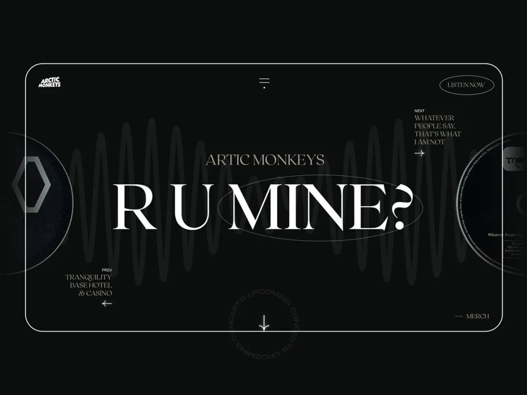
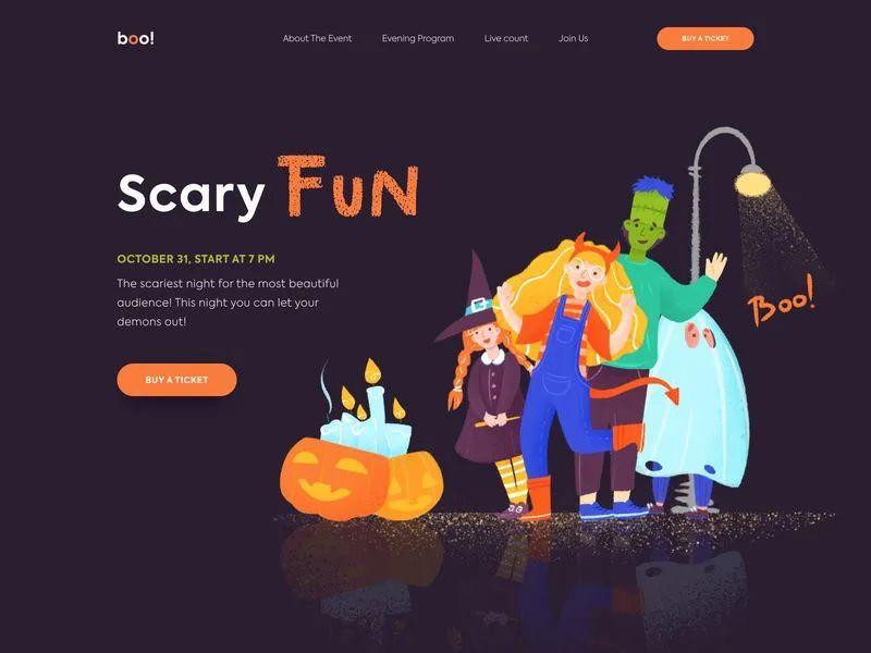
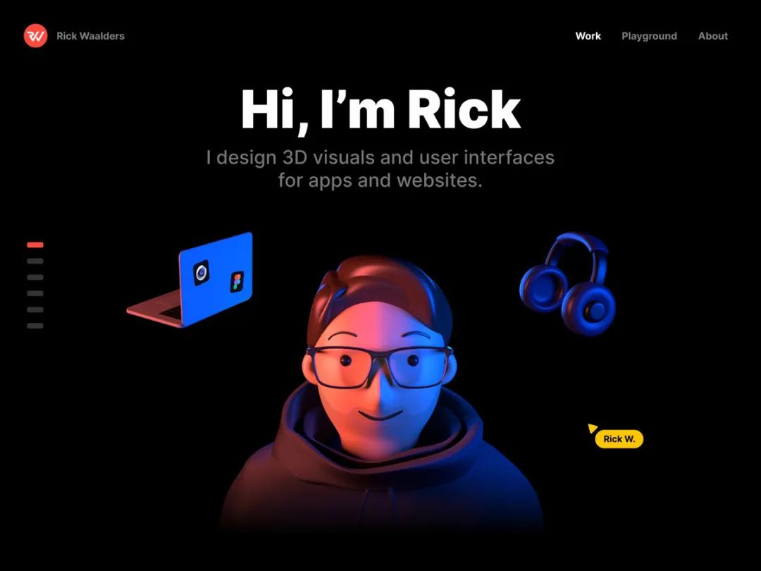
The pure text layout does not have the auxiliary elements of pictures. The entire web page only has text. We can enlarge the main text and the big title to use. Other text as auxiliary elements can also be decorative elements. The pure text layout is full of readability and has a strong visual impact!
Application: Minimalist homepage.

04
Personalized recommendation layout
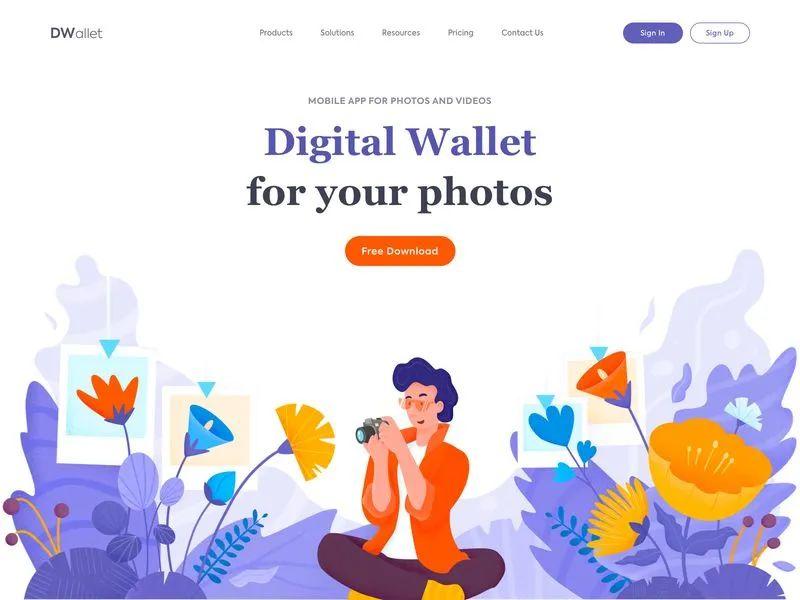
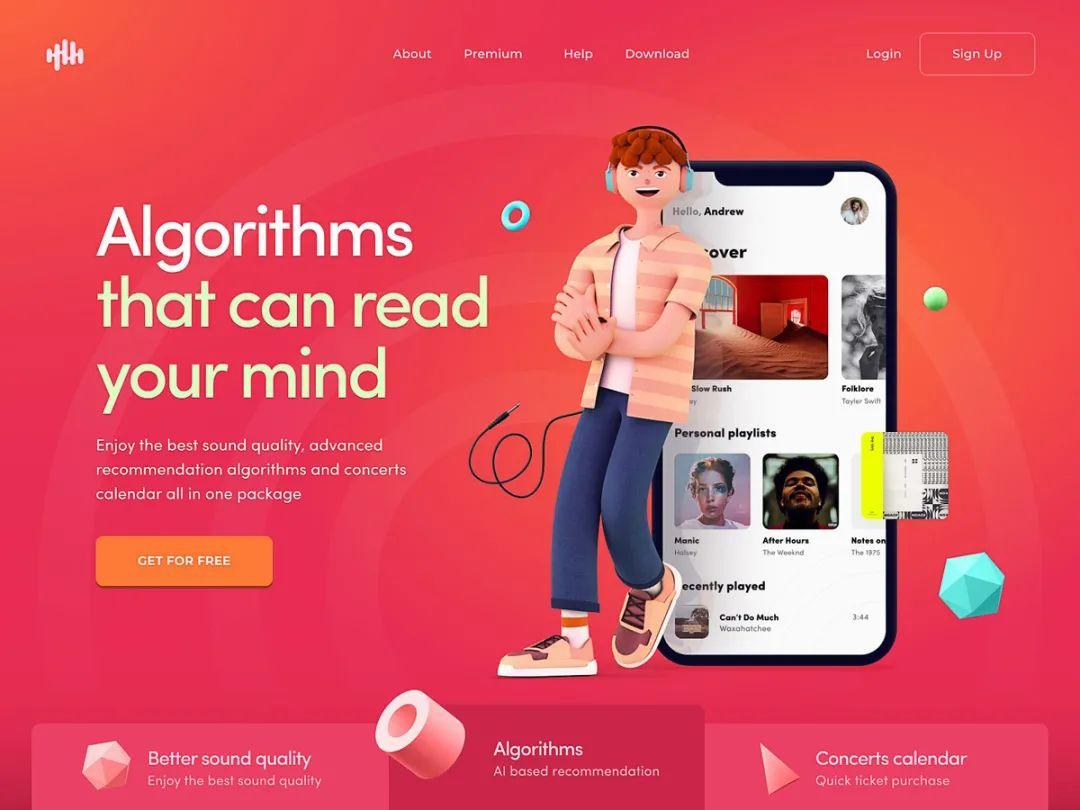
Personalized recommended layout requires tailoring the layout of the web page according to the user's preferences. Now with the development of artificial intelligence, we can Design the web page layout based on the user's previous subscription habits and recommend their favorite web page effects. Accurately analyze user preferences and meet user needs.
Application: Subscription product webpage.
05
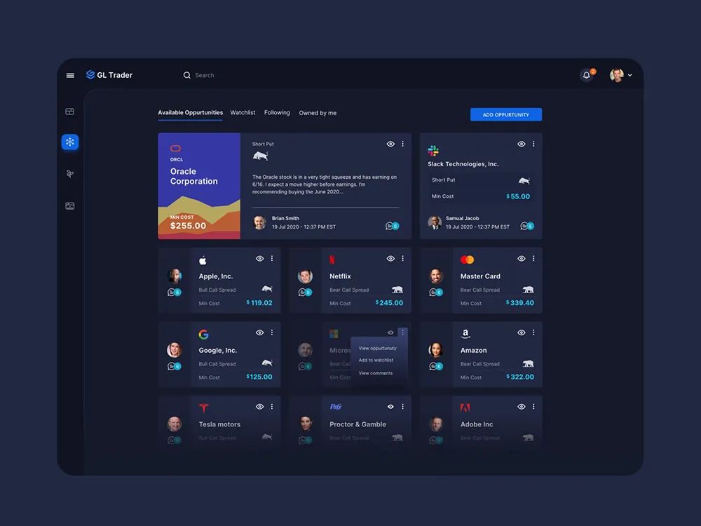
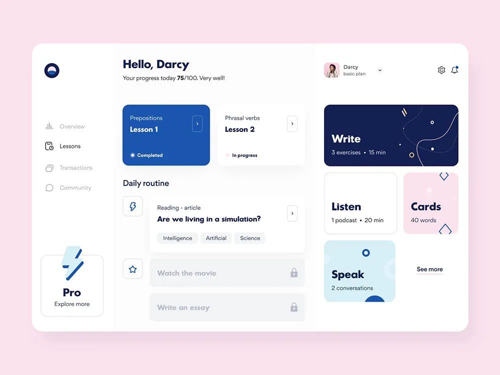
Grid layout
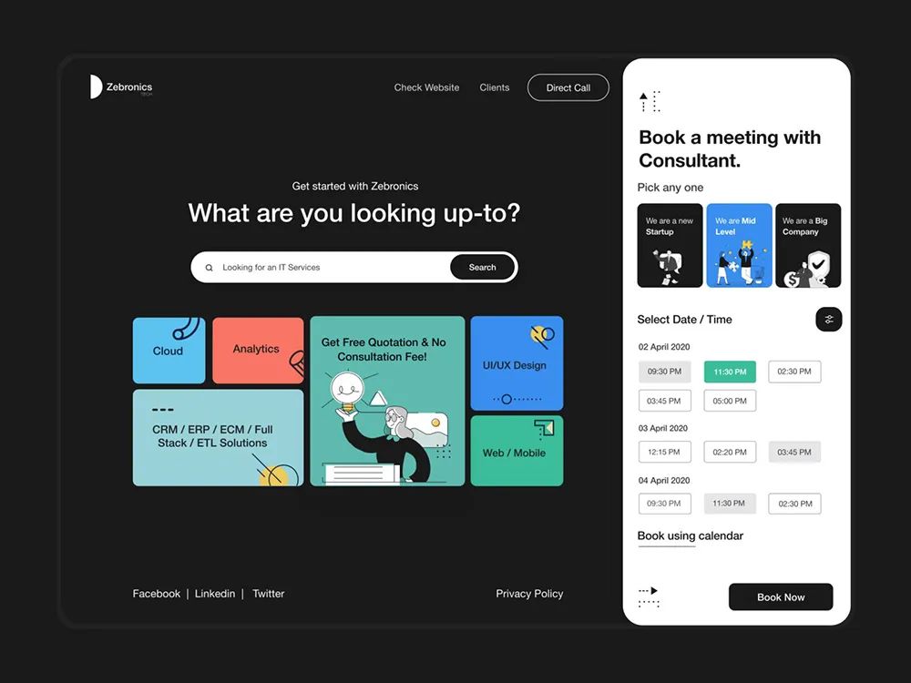
If there are many pictures and a web page with small content, you can choose a grid layout. Grid layout can use grids of different sizes to express content, and the content expressed in different grids is different. A grid will give a neat sense of order. Grid design can improve the neatness of the entire web page, keep content organized, and easy to use.
Application: Websites with more pictures and text.
06
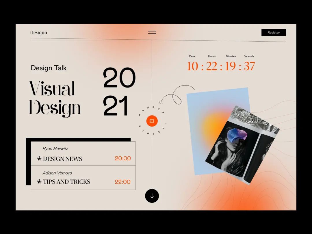
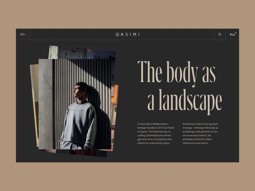
Magazine layout
If it is a website that needs to be updated every day, you can learn the layout of magazines and periodicals and apply it to the web page. The web page layout of magazine layout is the same as the layout in magazines that we usually see, arranged according to the classification of categories. This kind of layout can diversify the web page and give users a sense of freshness every day!
Application: Websites with a lot of content and types.

07
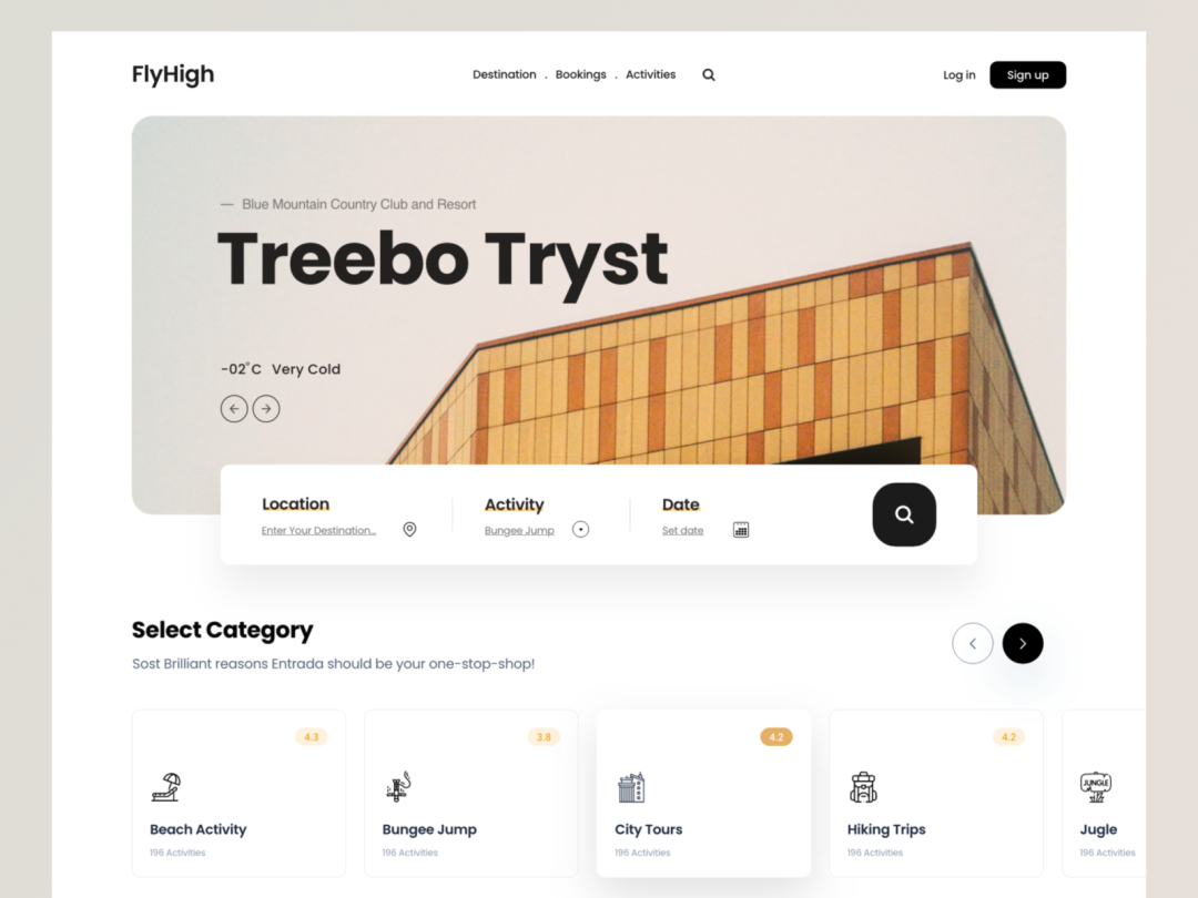
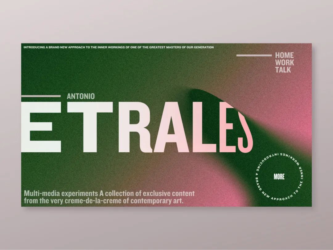
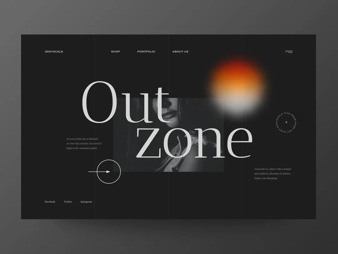
Single page layout
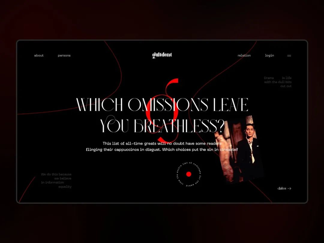
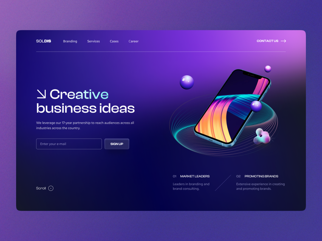
For websites with sparse content, a single-page layout is a good choice. A single-page layout puts all the main content of the website on one web page and completes navigation through scrolling. The single-page layout is the perfect choice for content storytelling, and you can also use the parallax scrolling effect to give the screen a sense of interactivity and immerse the viewer in it.
Applications: sparse content, immersive narrative websites, interactive readers.
08
F-shaped layout
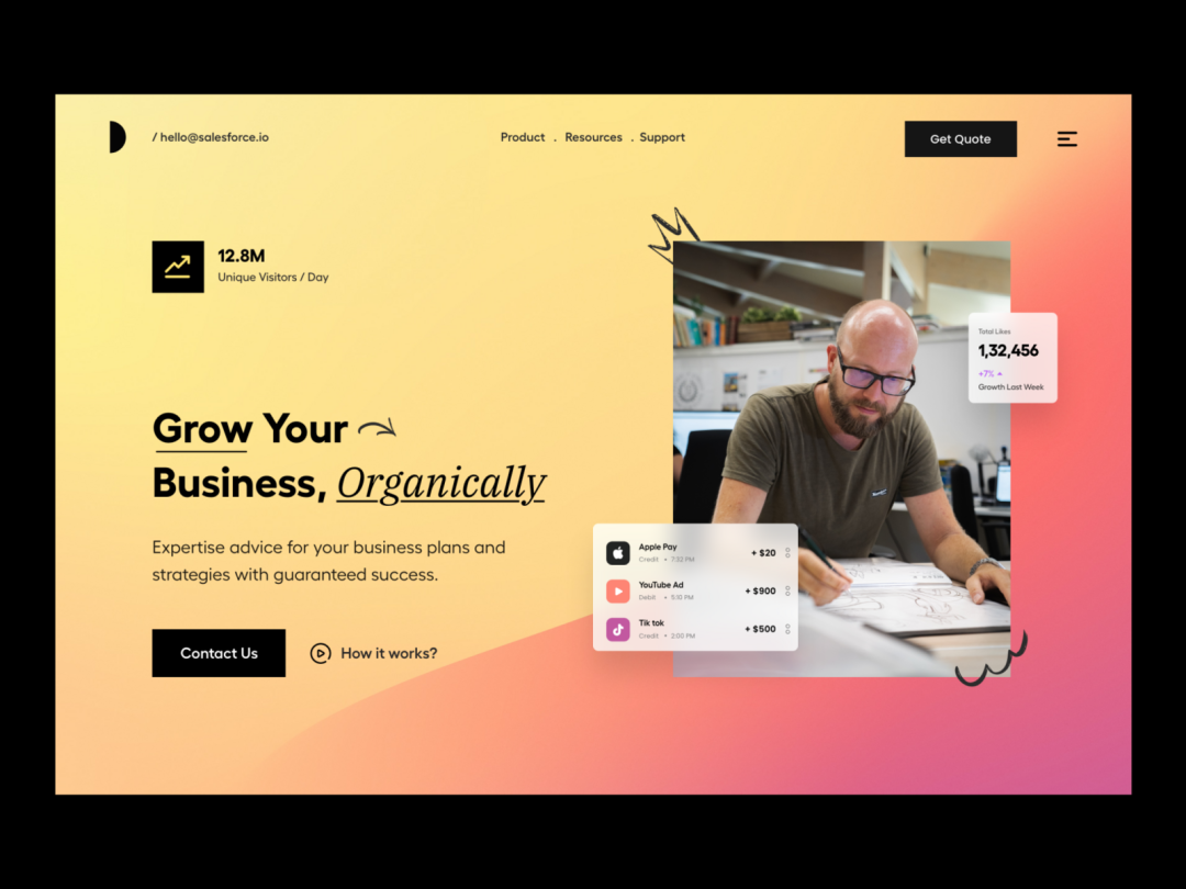
The F-shaped layout is suitable for many pages. Studies have shown that users will be accustomed to following the F-shaped layout when browsing web pages. Browse information using a reading track. Reading from left to right is the user's reading habit. Users read from left to right and then read downward, continuing from left to right. The F-type layout has a very clear visual hierarchy.
Application: Text-based, applicable to most websites.
09
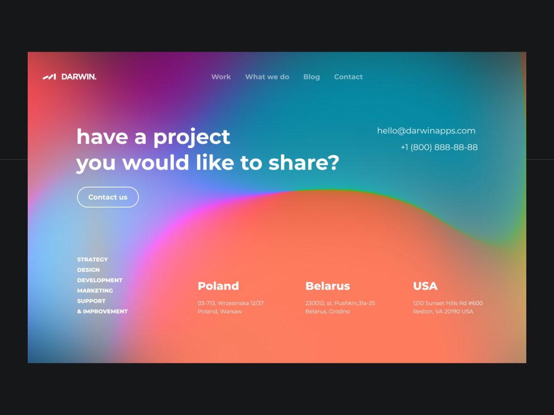
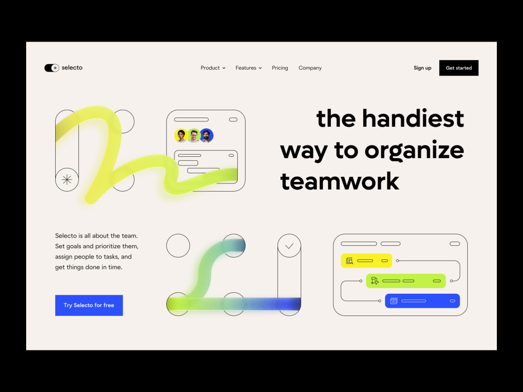
Z-shaped layout
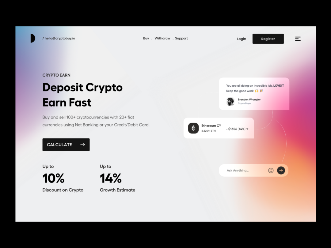
The Z-shaped layout attracts the user's eyes to the top, following the rule from left to right, and the user will move from left to right , the habit of reading web pages from top to bottom, this layout is relatively simple, just use the rule of reading from left to right reasonably, and arrange the elements reasonably and neatly.
Application: Most websites that focus on images.
This article is reproduced from the WeChat public account: Chief, the picture comes from the Internet, and the copyright belongs to the original owner. This article is for sharing and communication only. If there is any If there is any infringement, please contact me to delete it, thank you!
Articles are uploaded by users and are for non-commercial browsing only. Posted by: Lomu, please indicate the source: https://www.daogebangong.com/en/articles/detail/wang-ye-she-ji-wu-cong-xia-shou-fen-xiang-9-zhong-chang-jian-wang-ye-bu-ju-jiao-hui-ni.html

 支付宝扫一扫
评论列表(196条)
测试