
Hello, everyone, I am Xue Hai.
Today let’s talk about “Transition page".
The transition page is also called the transition page. It is the page that most people think is not important, but is actually very important. It plays a connecting role in PPT and can tell the audience the content to be demonstrated next and the current progress of the presentation.
So, how to create a professional transition page?
Usually, the structure of a transition page is [number + subtitle]. I summarized< strong>5 tips, let’s learn about them together.
01 < strong>Color block distinction
PPT content pages usually have a lot of graphic information. In order to distinguish the content pages and remind the audience to introduce the next link, We can use large-area color blocks of PPT theme colors as transition pages to distinguish them from content pages.
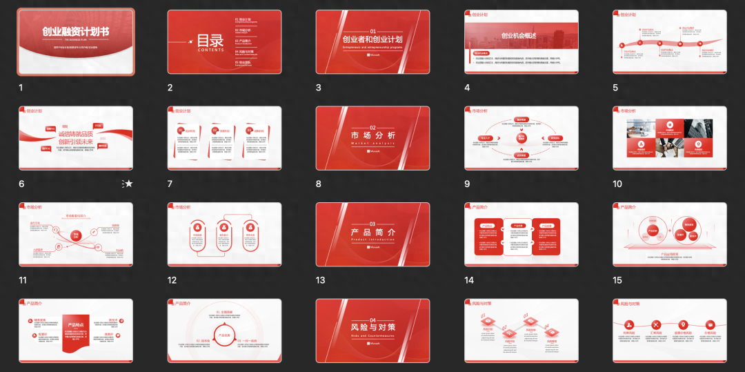
It can be seen that the theme color of this PPT is red, and the transition page uses red as a large area Color block background, center typesetting of text and subtitles.
The final effect is like this.

02 < strong>Creative Numbers
Since the title carries important text information, too much design will affect readability, so we can Spend some thought and make some creative designs.
Fill the numbers on the transition page through [Merge shapes ] to fill the picture with numbers, you can get this effect:


Use graphical numbers to represent them, which can be special fonts:


can also be modified glyph:

03 < strong>Directory page transition
If you feel that a single transition page is relatively empty, you can use the table of contents to make the transition page,you can use The embodied chapters are more prominent.
Simply change the section color and transparency of the transition page.


In addition to changing color and transparency, you can also resize as a differentiator.
04 < strong>Picture transition
The effect is not enough, please use pictures! The production of image transitions is also relatively simple,it is still the top, bottom, left and right, and centered layout.
If the brightness of the image is too high, you can use mask.

For illustrations, you can use solid color background.

You can also use cropping and merge shapes to create creative graphics.



05 < strong>Wireframes and shapes
In addition to numbers and copywriting, we can also modify the page with a variety of shapes and wireframes, More design sense.
For example, a circle.


or hexagon.

Creating transition pages is not that difficult, right? Have you learned it?
I am Xue Hai, I look forward to seeing you in the next issue!
Articles are uploaded by users and are for non-commercial browsing only. Posted by: Lomu, please indicate the source: https://www.daogebangong.com/en/articles/detail/wan-wan-mei-xiang-dao-PPT-guo-du-ye-hai-neng-zhe-me-bai-bian.html

 支付宝扫一扫
评论列表(196条)
测试