Font is one of the most important communication elements in visual design. The visual characteristics and quality of the font itself affect the quality of information transmission. English fonts have their own very complete system. If you want to master them, you need to study the history, formation and cultural attributes of fonts in detail. Due to the limited length of the article, here I only write some content that is more application-oriented based on my personal feelings.
Classification of English fonts
English text is roughly divided into three categories, serif, sans-serif and other fonts. Other fonts include Gothic, script and decorative fonts. These fonts are relatively rarely used in our work, so we focus on serifs and sans-serifs.

Serif fonts have a long history and were used for inscriptions in the ancient Roman period. They are suitable for expressing tradition, elegance, nobility, and a sense of distance.
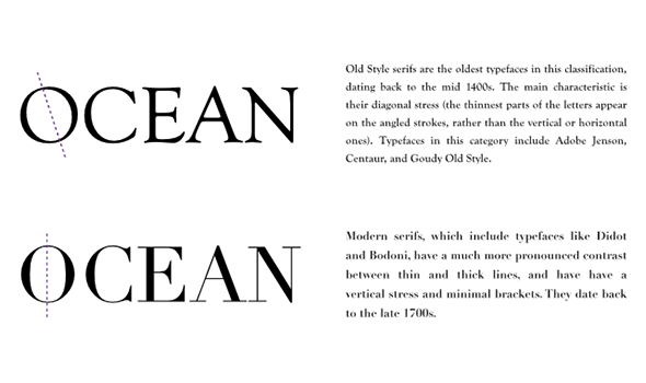
Serif fonts can be divided into two categories: Serif fonts that resemble handwriting are called "old fonts". The pen tip will leave writing marks at a fixed tilt angle, such as the letter O. The thinner parts are connected by diagonal lines. Old style does not mean outdated. The text of traditional books is usually typeset in old style, which is suitable for reading long texts.A serif font with neat proportions and no traces of handwriting is called "modern font". The thinner part of the O letter is connected vertically. It embodies a bright modern feel and gives people a cold and strict impression. This serif font makes the text less readable after being reduced, and is generally used in titles.

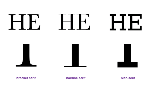
There is another way to classify serifs, which can be divided into three categories according to serif changes: serifs with specific curves are "bracket serifs", and those with thin straight lines at the junction are "hairline serifs" ”, thick square “plate serif”.

Bracket serif is the most common font type in old fonts. It is relatively friendly and traditional among serif fonts. The more common fonts include Times New Roman, Baskerville, Caslon, and Georgia.
Hairline serif is a common font in modern fonts. It has an obvious modern feel and is not suitable for fonts with small point sizes. Common fonts include Didot and Bodoni.
Slab serifs are more powerful and were used on billboards from the 19th to the early 20th century. They were mostly used for titles and have a nostalgic atmosphere.
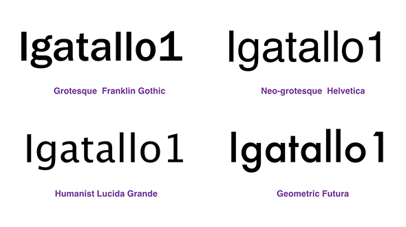
Sans-serif is more friendly than serif and modern. Categories can be roughly divided into four categories: Grotesque, Neo-grotesque, Humanist and Geometric.
Grotesque is the earliest sans serif font, so it retains some characteristics of serif fonts. For example, the lowercase letter g is written differently and there is a thick serif under the number 1.
Neo-grotesque includes many commonly used fonts, Helvetica, Arial, and Univers, which are emotionless, calm and concise.
Humanist has a touch of calligraphy, giving people a warm and elegant atmosphere, a bit of femininity, and very good recognition. It is a commonly used font for website text.
Geometric fonts tend to be geometric shapes. For example, the letter O looks very much like a perfect circle, and the letter a is a semicircle with a tail. It is not easy to read, so it is not suitable for use in main text, but
Articles are uploaded by users and are for non-commercial browsing only. Posted by: Lomu, please indicate the source: https://www.daogebangong.com/en/articles/detail/tiao-xuan-shi-he-de-ying-wen-zi-ti-zhi-nan.html
 支付宝扫一扫


评论列表(196条)
测试