I have been doing operation design for more than six years. Here I have summarized some small experiences to share with you, which should be able to help you as you advance.
1. Foreword
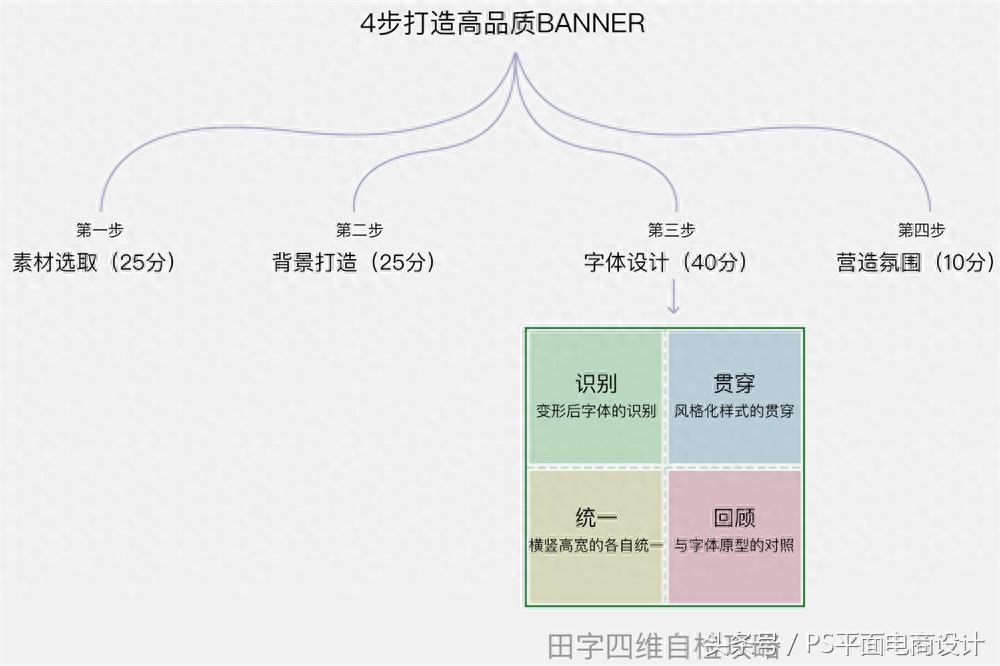
Material selection (25) + background (25) + copywriting design (40) + atmosphere creation (10) = 100 points (full score)
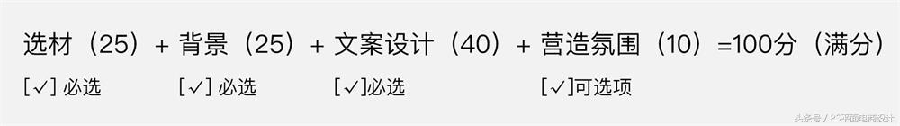
(Note: The points here are in a progressive relationship. Even if there are deductions among the three required options, you can maintain your design draft above the passing score line by following the following practices. The last optional option will become a bonus. sub option.)
Two and four steps to create a high-quality banner
1. Material selection (25 points)
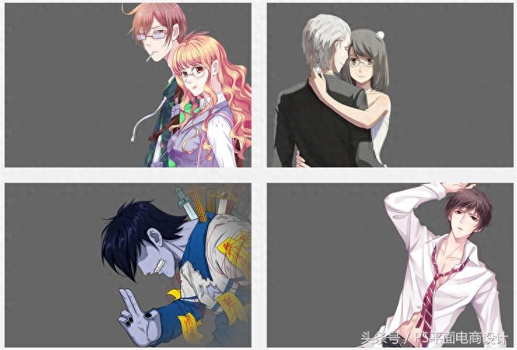
Take the daily animation carousel demand as an example. Create a canvas of corresponding size, place the character copy involved in the demand inside, and select the required character materials. First, the character materials in a banner image need to be unified in color, light and shadow. ; Half-length characters need to expose at least the upper part of the chest. Remember not to place one or two big heads directly. The characters pulled out in different scenes must have the same perspective (for example, not one top view and one bottom view). Characters in different environmental colors must be fixed at the end. To unify the tone.
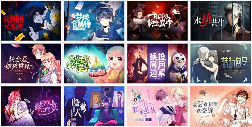
The following cases are all correct examples:
2. Background creation (25 points)
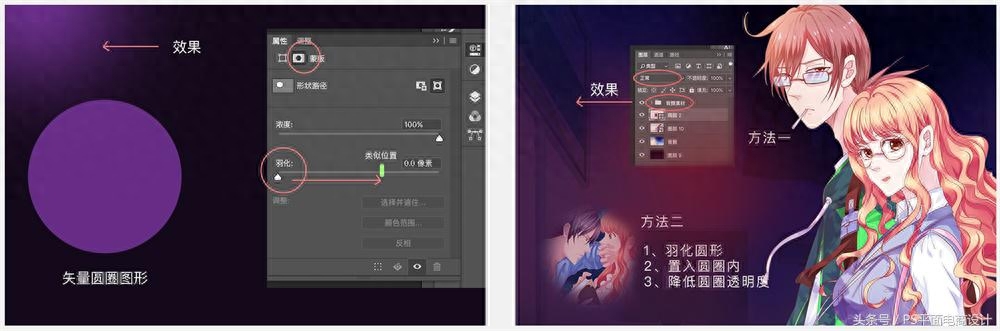
After dragging the selected material into the canvas, write all the required copy into our banner. At the same time, we fill the canvas with a color. For the specific color, we absorb more hues from the material and adjust a more comfortable color to cover the entire background. It is appropriate to put a few high-gloss color blocks in the background under the characters or under the copy. During this second step, we need to make a rough layout style for all the copy.
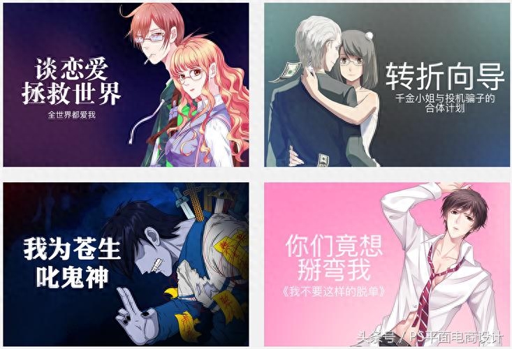
As I write this, I can’t control myself anymore, so I will add a little more advanced version and add some other materials to the background we have made, such as background elements with depth of field, cute character elements, or some good environment pictures. We will see it clearly when we look at the picture below. It can be said that it subtly enriches our picture and adds to the plot.
This approach is relatively simple and easy to produce results. Two commonly used methods are listed below.
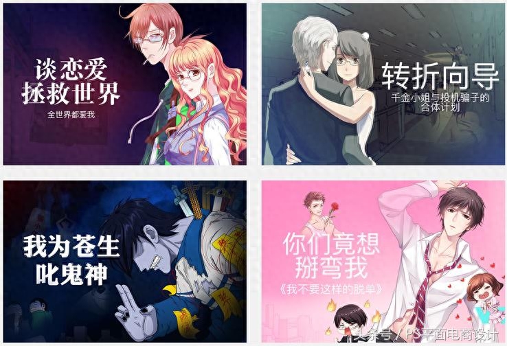
3. Font design (40 points)
The third step of font design is also the most critical link in our entire banenr design.
Below we add a knowledge point to assist in completing different types of font design. The methods described here are suitable for beginners without much experience.
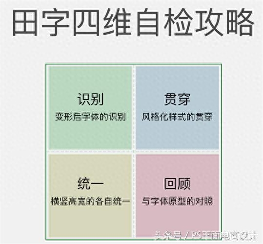
The self-inspection method that exists in font design - the four-dimensional self-inspection guide for Tian Zi:
- Recognition, the first and most important thing is the recognition. When the font loses its recognition, everything will be in vain.
- Throughout, consider the several fonts to be designed as a combination, then the stylized design style will run through our entire combination.
- Unification, the so-called unity is to standardize our horizontal and vertical characters. For example, the horizontal height is ten pixels and the vertical width is 20 pixels, which is the standard for each horizontal and vertical direction in the font combination.
- Review, never departing from the original, this mainly emphasizes the review of the font prototype. During the font design process, constantly review the font prototype, review the original font structure, and whether it is an addition to the original basis. , and whether the essence of the font has been mistakenly changed during the design deformation process.
Next, let’s see how our methodology is applied.
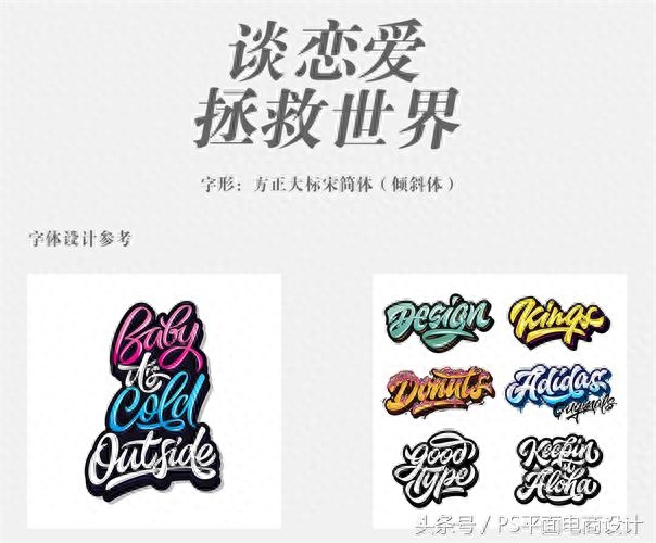
The thinking process before starting to make this banner also includes our choice of font design direction, which needs to be carried out before everything starts. We have mentioned before that we will skip the explanation of the thinking process for the time being. What we will do after the thinking has the results. Every step of the process is centered around our focus. The following is a detailed explanation using love themes as a case study.
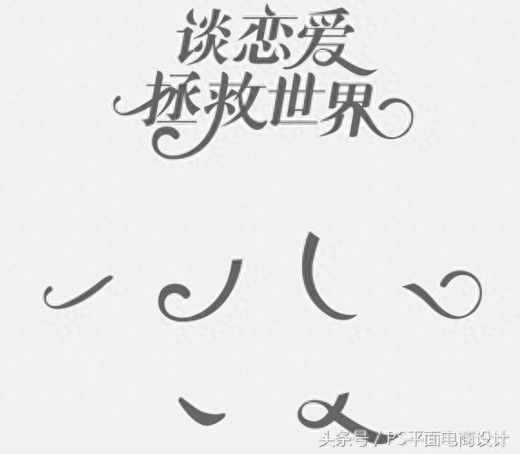
For the design of this love-type font, we directly use the original font's slant (Fangzheng Dabiao Song Simplified). The romantic atmosphere reflected by the love items between men and women, after thinking about it, we used this artistic English case with curves as a reference.
Quickly select the approximate strokes from our reference, place it in our font to see if it meets our expectations, and then use the "Pen Tool" to draw a stroke that is more suitable for our use. It can be seen from the picture that after placing it, our original glyphs can still be clearly seen (recognition is applied); similar strokes are added to almost every font (penetration is applied).
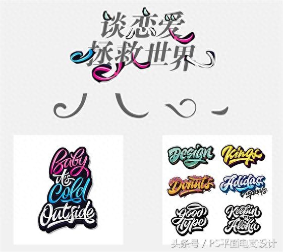
After the rough style is placed, the font optimization begins. First, we began to simplify the original font structure. Each "horizontal" was set to 3PX, and each "vertical" was set to a circular diameter of 14PX. (applied to unity)
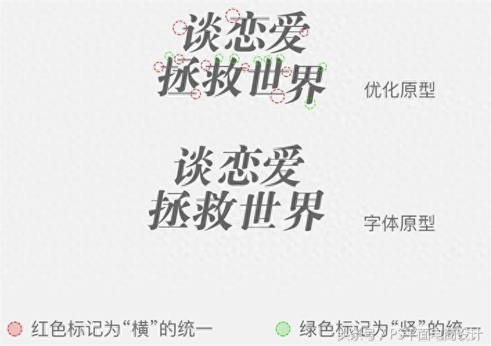
Then we began to place the strokes we drew into the simplified font structure. During the placement process, we need to constantly (apply to review) see whether our process has broken away from the structure of the font itself, and constantly use the perspective of a bystander. From the perspective of examining whether our copywriting has a high degree of recognition (recognition is applied), in this step, we added a few deformation styles of strokes, but they still belong to the same style, which returns to the most basic Starting (applied through).
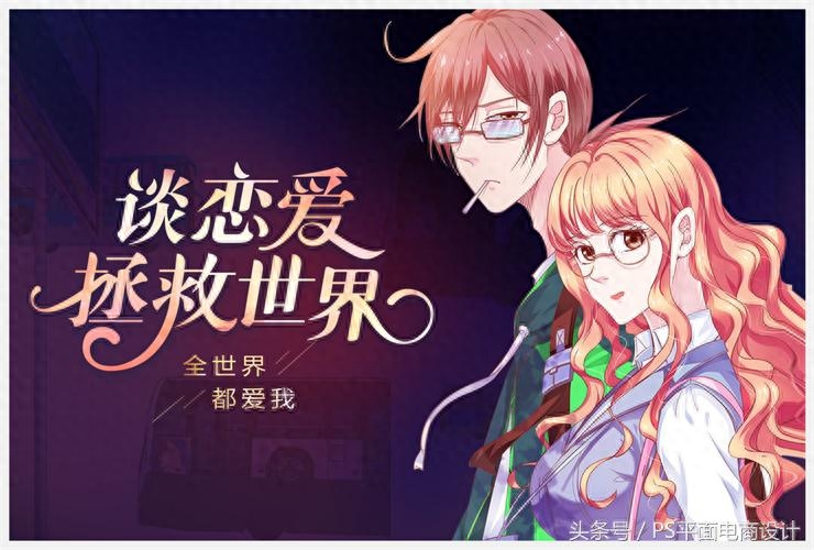
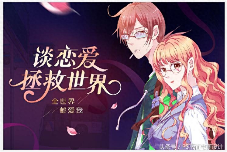
Next we place the copy into our screen and adjust the color of the copy according to the color of the characters
4. Create an atmosphere for 10 points
Through the previous three simple steps, we have reached a passing score. How to make a small breakthrough in just a few minutes depends on our next step.
Create an atmosphere, make the picture fuller and full of atmosphere.
At this point you can see that broken down, a high-quality banner can be created in a few simple steps. The several methodologies summarized here are used throughout our entire design process. The entire graphic design process is also constantly optimizing these four steps. The process and some cases below are designed according to the above methodology. I hope it can give some inspiration and help to friends who are lucky enough to see it.
3. Summary
This small sharing is a little long and is purely based on some personal design tips. Welcome to exchange and discuss. Welfare interaction
In order to thank you for your support after reading this article, we have specially prepared a gift package for newcomers: 2,000 design brushes, 10 design books, and 500 fonts that are essential for designers~~ Below is the receipt method
1. Follow the editor’s headline account in the upper right corner~
2. Commentary articles, no word limit, just one word will do
3. Private message to the editor: Newbie gift pack, get it~~
Articles are uploaded by users and are for non-commercial browsing only. Posted by: Lomu, please indicate the source: https://www.daogebangong.com/en/articles/detail/teng-xun-she-ji-shi-qing-song-4-bu-da-zao-yi-gao-guo-de-gao-pin-zhi-Banner.html
 支付宝扫一扫
评论列表(196条)
测试