
On the afternoon of July 18, 2015, in the third UTalk interview of UI China at Zhongguancun Innovation Works, Mr. Qiu Yin, deputy director of Founder Font Development Department, discussed the scientific, aesthetic and technical aspects of Chinese font design. A detailed screen display font design lesson was shared with friends present. From the initial dot matrix fonts that completely succumbed to low-pixel screen displays, to the use of fonts from the printing era, to the first generation of screen display fonts developed specifically for computers, Chinese screen display fonts have also moved from passive adaptation to active research and development. With the rapid popularity of Retina screens, Founder Font Library has now completed the development of the second generation of screen display fonts.
Guest Profile: Qiu Yin, deputy director of Founder Font Development Department, original designer of "Founder Youhei" and "Founder Dawei". 2010 Guangzhou Asian Games emblem font designer. Won the special prize in the China Pen Calligraphy Competition. First Prize in the First International Hard Pen Calligraphy Competition. First prize in the "Founder Award" Chinese Font Design Competition. He has published many copybooks such as "Qiu Yin's Fountain Pen Calligraphy", "Qiu Yin's Famous Foreign Poems", "New Ancient Calligraphy and New Multi-body Fountain Pen Copybooks".
Today I am honored to have the opportunity to share with you our experience in developing the second generation of screen display fonts. The so-called Chinese screen display fonts are fonts used for reading. Font is a very special product. It appeals to people's vision and can complete the function of information transmission through our sensory organs. Because it has to go through human feelings, things become complicated. Thousands of semantics require thousands of symbols. Because it appeals to vision, it naturally possesses beautiful, cultural and even spiritual attributes. When designing fonts, we must not only satisfy their functional attributes but also take into account their aesthetic attributes.

Judging from the experience of Founder font development, there are three aspects that can be shared with everyone, namely the scientific, artistic and technical aspects of font design. Scientific requirements belong to the rational level; the perceptual level is about subjectivity; technology refers to the operational level, including some techniques and methods. Any font must be presented through a media, and the media we use a lot now is the screen. If you want to achieve good reading comfort, you need to understand the relationship between fonts and screen media.
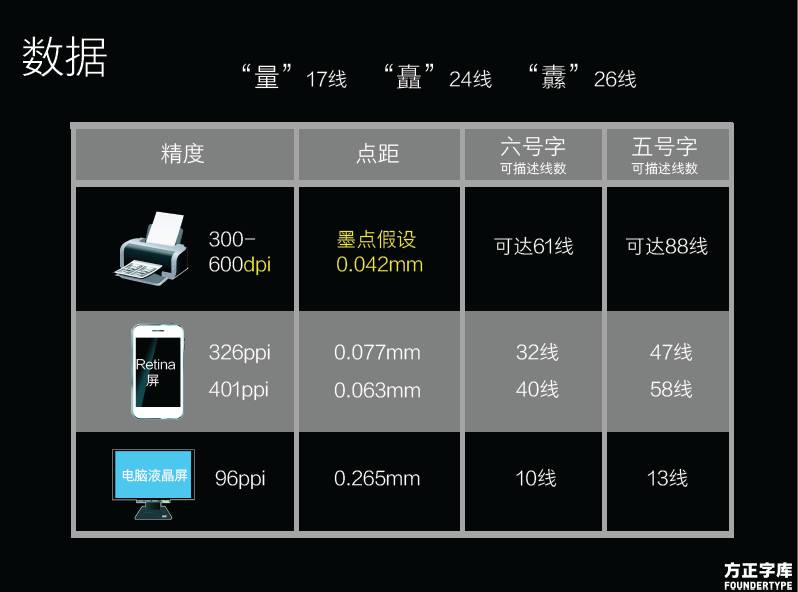
The biggest limitation of screen media is the accuracy of display. The lowest Chinese character library is 6763 characters, which is completely incomparable with any other Western system. From more than 6,000 words, we found some word examples to illustrate, such as "quantity" of strength, "chu" of standing, etc. These are very commonly used words. There are 17 vertical lines in "quantity" and 24 vertical lines in "chu". When printing on paper, there is no problem in expressing these numerous horizontal paintings. But there will be problems with small font sizes when displayed on the screen.
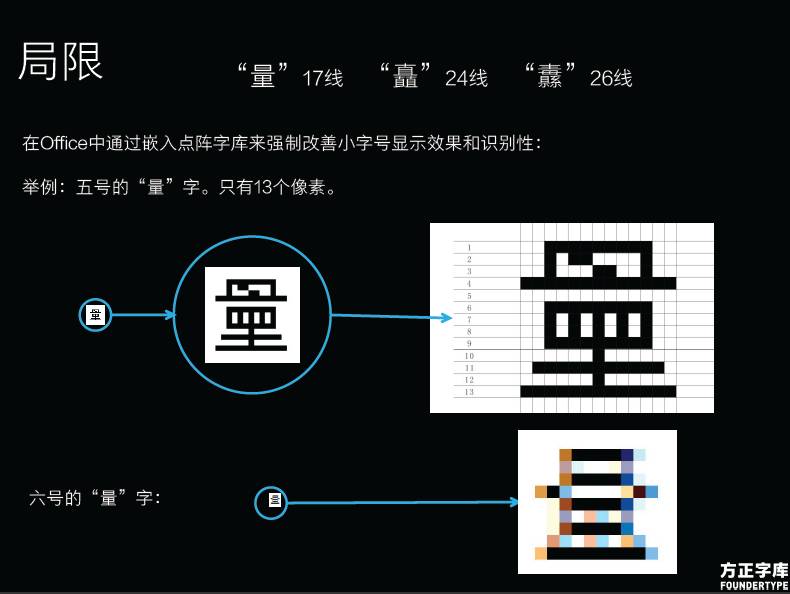
At 96ppi, the size of a pixel is 0.26 mm, and the corresponding size 5 character has only 13 lines. Obviously, there is no way to fully express the word "quantity" that requires 17 lines. The word "quantity" represented by 13 lines is actually a typo. The number 6 character has only 10 lines, so the word "quantity" expressed in this way is even more terrible. On the 326ppi Retina screen, size 6 can already reflect 32 lines. On such a screen, every line of Chinese characters can be displayed.

In the current matrix pixel arrangement, the horizontal and vertical lines are the lines with the best display quality, while the second best line is 45 degrees, and the third best display is the 26.6 degree line... so our common arrows Cursor uses the best quality threads
Articles are uploaded by users and are for non-commercial browsing only. Posted by: Lomu, please indicate the source: https://www.daogebangong.com/en/articles/detail/tan-suo-yi-jing-zhi-mei-han-zi-ping-xian-zi-ti-she-ji-de-yi-shu-yu-ke-ji-rong-he.html
 支付宝扫一扫
评论列表(196条)
测试