The following article comes from Yihai Shibei Design, author Deng Haibei

Sharing design experience, modifying practical cases, and recommending excellent works are designed to help novice designers grow quickly. We look forward to making progress together with you.

In the previous issue, "Teaching You to Get Rid of Font Selection Difficulty" analyzed the four major types of fonts: "Helvetica", "Songti", "Yuanti" and "Calligraphy", explaining the style characteristics and application of various fonts. Effects of use in various design cases. We can determine the font type according to the "target audience", "project tone", "industry attributes" and other methods to make the font and layout style match.
It is not easy to change too many fonts in one layout. No matter how much information there is, the choice of two or three fonts is enough to meet the needs of the screen. Even if the font remains unchanged, by changing the size, thickness, color or decorative techniques of the font, the purpose of distinguishing priority and guiding readers can be achieved. The fewer font types, the easier it is to control the layout of text information on the screen.
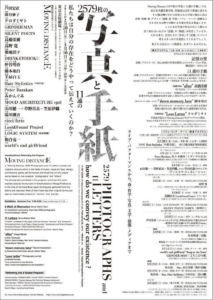
The amount of information is very large, but only one font is used. The visual hierarchy is well created through font size, thickness contrast, and clever arrangement.

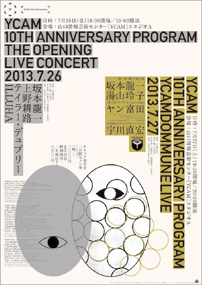
Only two sets of fonts are used in the entire layout: English information uses a thick sans-serif font and is enlarged and emphasized; while Japanese information uses a thinner serif font so that the information level can be well distinguished.
Some projects need to present a lively atmosphere, or require a very decorative design, and must use complex font combinations. Please keep the overall effect coordinated and avoid conflict and confusion.
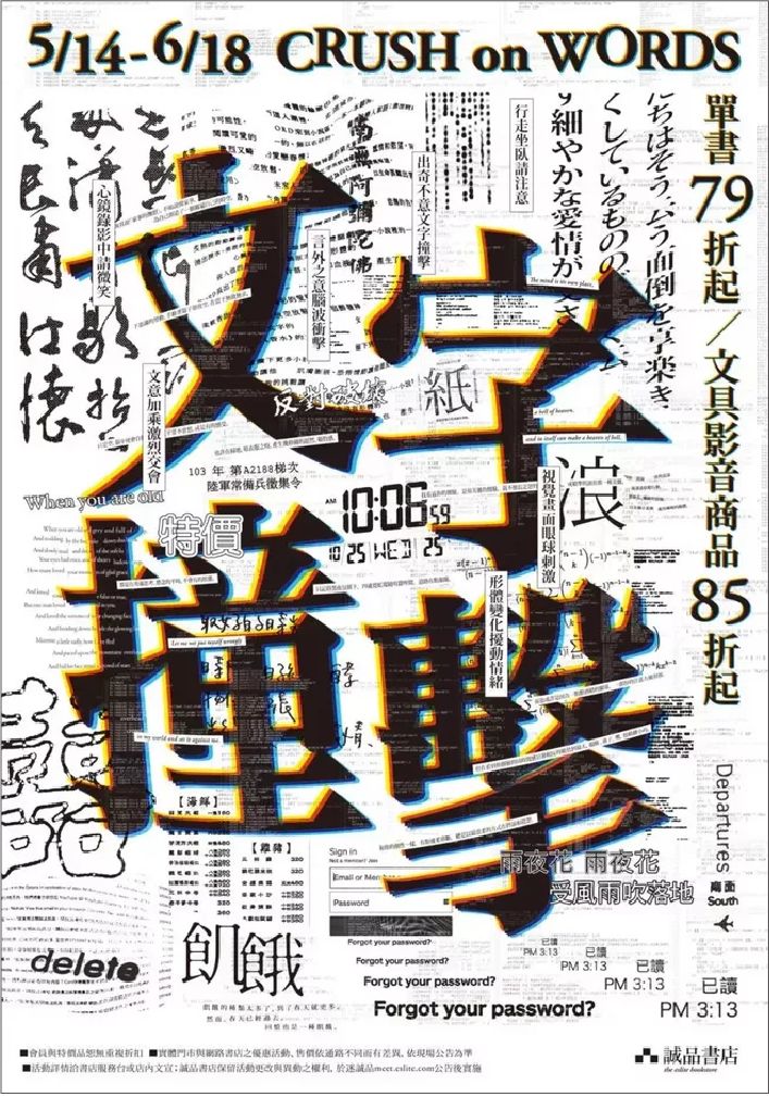
In order to create a lively and rich picture, this poster uses a lot of fonts, with a rich sense of form and strong visual impact. However, for most designers who do not have strong control over the layout, it is often difficult to achieve both richness and coordination. Therefore, limiting the number of fonts is a good way to achieve coordination and unity on the screen.
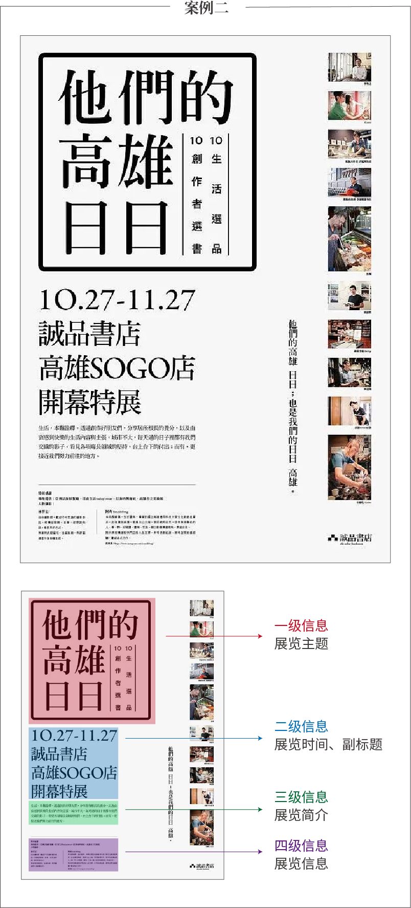
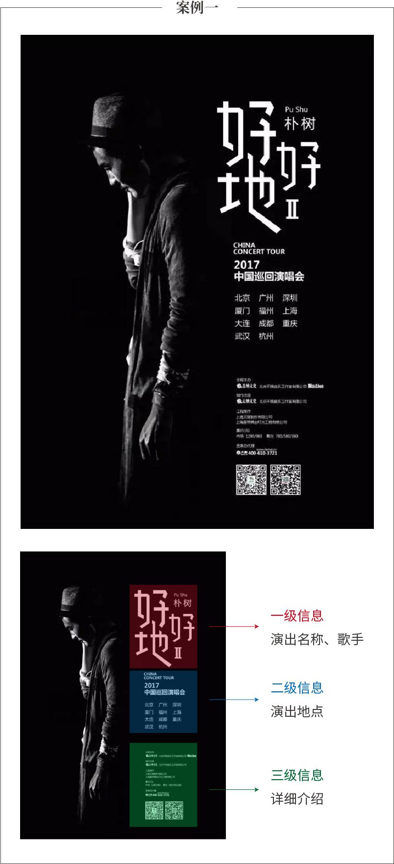
Why do we need to match fonts? First, for aesthetics, and second, to establish visual hierarchy. In a layout, there are different levels of information content, which need to be distinguished by priority, such as titles, subtitles, and text. Each information level will also have key information and non-key information. When matching fonts, it is necessary to use font size, thickness, color, etc. to help readers avoid visual confusion and bring a sense of hierarchy to the layout.


Articles are uploaded by users and are for non-commercial browsing only. Posted by: Lomu, please indicate the source: https://www.daogebangong.com/en/articles/detail/su-cheng-zhi-nan-jing-tong-zi-ti-zu-he-ji-qiao.html
 支付宝扫一扫
评论列表(196条)
测试