Dictionaries, documents, newspapers and books... Chinese characters exist everywhere we can see, as natural as the air around us. But where do these fonts come from? How did it change from handwriting to printing? The "Birthplace of Modern Chinese Character Printing Fonts" and the "Shanghai Printing Font Exhibition Hall" unveiled today, although the venue is "mini", can allow more people to understand the origin and development of modern Chinese character printing fonts, and understand the design specifications and Creation and writing craftsmanship to better promote and inherit Chinese character culture, font culture, and intangible cultural heritage.

Caption: Do you know fonts?
The origin of four fonts
The "Birthplace of Modern Chinese Printing Fonts" and the "Shanghai Printing Font Exhibition Hall" are both located in the Shanghai Printing Technology Research Institute, No. 60, Lane 1209, Xinzha Road, where the printing fonts of New China were born.
For a long period of time, the fonts and glyphs of Chinese characters in our country were messy, and the variants and variations were mixed, which seriously affected the printing quality and reading effect, and even led to my country’s failure to participate in the International Book Binding Expo competition. In 1959, the Ministry of Culture held a meeting to guide Shanghai to take the lead in carrying out "printing font reform". Based on the Printing Research Institute, at No. 60, Lane 1209, Xinzha Road, Shanghai gathered people with creative skills in art, writing block letters, and engraving characters. With the combination of experience and talents, a font research laboratory consisting of more than 50 people was established. Designers from the Type Research Office of the Institute of Printing and Printing spent five years to complete the creation and design of four commonly used printing fonts: Song, Hei, Kai and Fang, totaling 80,000 words. They made great contributions to the promotion of simplified characters and the standardization of the use of Chinese characters in New China. made a huge contribution.
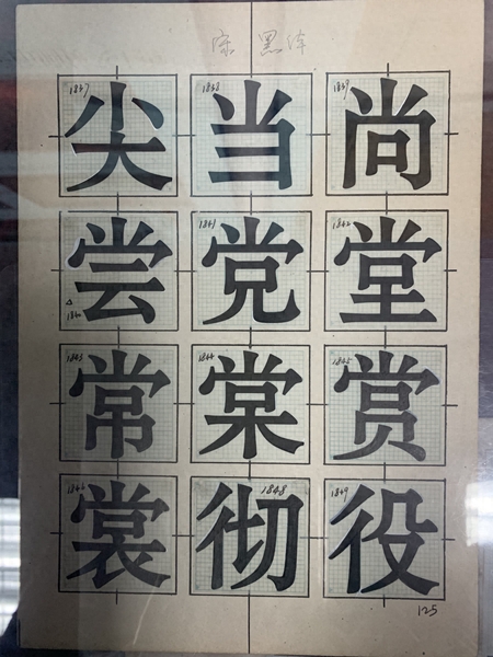
Caption: Song Heidi
Among them, Song style draws on the strengths of ancient versions such as "Swallow Notes" and modern Song style characters, and integrates the creative inspiration and artistic charm of calligraphy, art and lettering. Boldface is mostly used for titles, and is sometimes included in the main text. The fonts are square with a long stripe, black and white are symmetrical, the lines are neat, and they are decorated with bell mouths, which is dignified and stable. The Kai style was designed in 1964. It has slanted horizontal strokes and different vertical strokes, undulating stroke thickness, and smooth and natural strokes. It is the first choice font for beginners to learn Chinese characters. It is mainly used for printing primary school textbooks and children's books. The imitation Song style style completed in 1965 has a straight and graceful pen shape, similar thicknesses of horizontal and vertical strokes, and a structure that has the characteristics of regular Song Dynasty. The vertical strokes and closing strokes have a hanging angle. It is mainly used for the main text of documents.
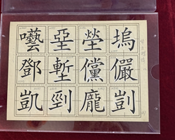
Original matrix of computer fonts
In the 1980s, the Shanghai Printing Technology Research Institute invested in the four major types of special scripts: Song, black, regular script and imitation as a joint venture with the British Mono Company, and purchased internationally advanced laser typesetting equipment for the first time. Later, all the original manuscripts of these four fonts were copied and provided free of charge to the national "748" project and the "Chinese Character Information Processing" major project, which contributed to the technological revolution of saying goodbye to "lead and fire" in my country's printing industry. Professor Wang Xuan of Founder of Peking University combined these fonts with modern digital information technology and became the original matrix for the invention of "Chinese character information processing laser phototypesetting technology". After that, it was generally entered into Chinese character libraries at home and abroad, and derived and recreated various fonts with different characteristics. .
Caption: regular script
At present, the four commonly used font varieties of Song, Hei, Kai and Fang are commonly used in computer system font libraries in China. Whether it is the increase in the number of national standard characters or the expansion of varieties, their basic internal and external shape frameworks such as stroke shape, structure, center of gravity, thickness and their Shen Yun all originated from the printing fonts created by the Shanghai Printing Technology Research Institute in the last century.
The skill of writing is passed down from generation to generation
In June 2009, the "Chinese Character Printing and Writing Skills" project of the Institute of Printing and Printing was included in the second batch of Shanghai intangible cultural heritage projects. The institute currently has more than ten intangible cultural heritage inheritors. It was announced at this year's Shanghai Book Fair The three sets of fonts used in the new version of "Cihai" are Cihai Song, Cihai Hei and Cihai Zhonghei created by the Shanghai Printing Technology Research Institute.
Chen Qirui, the second generation inheritor, was born in Suzhou. He came to Shanghai to study at the age of 15. At the age of 18, he entered the movable type research laboratory of the Shanghai Institute of Printing Technology (referred to as the Institute of Printing Technology). The youngest font designer at that time has now It is the age of seventy years.
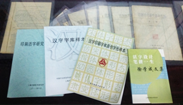
Caption: Collection of various font samples
The period when Chen Qirui was engaged in font design coincided with the "golden age" of type printing after the founding of the People's Republic of China. "It is not easy to design a character, and the process is very boring. First, you have to make a pencil draft, copy the original draft, then use a straight pen to draw lines, and then use a brush to outline, write, stroke, and hook, and then add the hollow characters Fill in ink, and then outline. After taking photos and reducing the sample, the structure, size, thickness, and pen shape of the font must be trimmed and unified. Several of us divide the work, like assembly line work. On average, one person can write up to three words a day. Four characters." Font designers must have calligraphy skills and artistic calligraphy writing skills. Qian Zhenzhi designed imitation Song fonts, Xu Xuecheng and Zhou Jincai designed black fonts, Xie Peiyuan and Shi Weifeng designed Song fonts... These masters were all created by Chen Qirui when he was at the Institute of Printing Research. colleagues and seniors.
Today, the first generation of inheritors have passed away, but the handwritten design drafts they left behind can still be seen in the glass windows of the exhibition hall, and the fonts they designed can be seen almost everywhere, integrated into everyone's daily life. (Xinmin Evening News reporter Xu Yisheng)
Disclaimer: This article is reprinted for the purpose of conveying more information. If there is an error in the source annotation or infringement of your legitimate rights and interests, please contact the author with proof of ownership and we will promptly correct and delete it. Thank you.
Source: Xinmin Evening News
Articles are uploaded by users and are for non-commercial browsing only. Posted by: Lomu, please indicate the source: https://www.daogebangong.com/en/articles/detail/song-hei-kai-fang-zhei-xie-tian-tian-kan-jian-de-zi-ti-ni-ke-zhi-dao-ta-men-de-lai-li.html
 支付宝扫一扫
评论列表(196条)
测试