


In addition to combining the specific content of the book, the design of the book cover should also take into account the characteristics of the readership. Only such cover design can be targeted. Generally speaking, book covers are divided into four categories: children's books, literature, science and technology, and biographies.

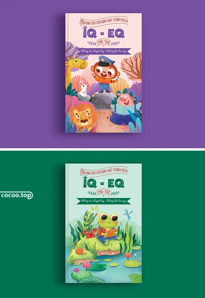
①Children’s books. Compared with adults, children prefer to understand things through concrete images such as colors and images. Therefore, children's book cover designs often use some colorful, lively and interesting children's paintings to attract young readers, and some use cartoon objects or toys. Using actual photos for cover design can also achieve good results. The text is often designed in a lively and exaggerated form that harmonizes with the illustrations.

In addition, the cover design of children's books must also take into account the requirements of book buyers, that is, it must attract the attention of parents of young readers, and the quality, content, cost-effectiveness and other information of the book must be clearly provided to viewers.
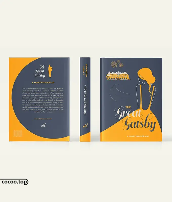
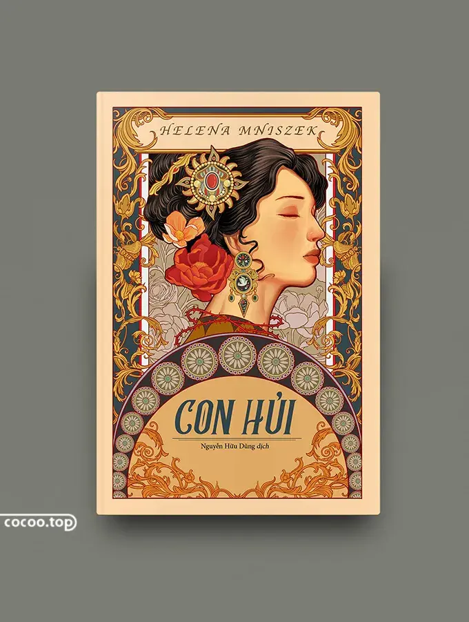
②Literature. The scope of literary books is very broad, and the levels of readers are also very rich. Most literary book covers are composed of illustrations and text. In cover design, illustrations and text that can express the content or basic spirit of the book should be fully considered. From this point of view, the designer's level of literary literacy and understanding and grasp of the content of the book will affect the quality of the design.
③Technology. Science and technology books include various professional books, popular science books, computer books, etc. Most of these books are provided to certain types of professional and technical personnel. Therefore, the cover design of such books should be specifically combined with the specific content of the book to avoid popularization and popularization. change.

④Biography. Such books often use characters as the main narrative objects. The most common cover design is to directly put the photos of the characters on the cover of the book, thus creating a certain visual impact and deepening the readers' understanding of the characters.

1. The design of the front cover. The front cover is the most important part of the cover. In addition to conveying the content of the book, it also has the function of catching the reader's attention in the first place. An excellent cover works plays a decisive role in the sales of the book. The design of the official seal can be divided into two categories in terms of components:
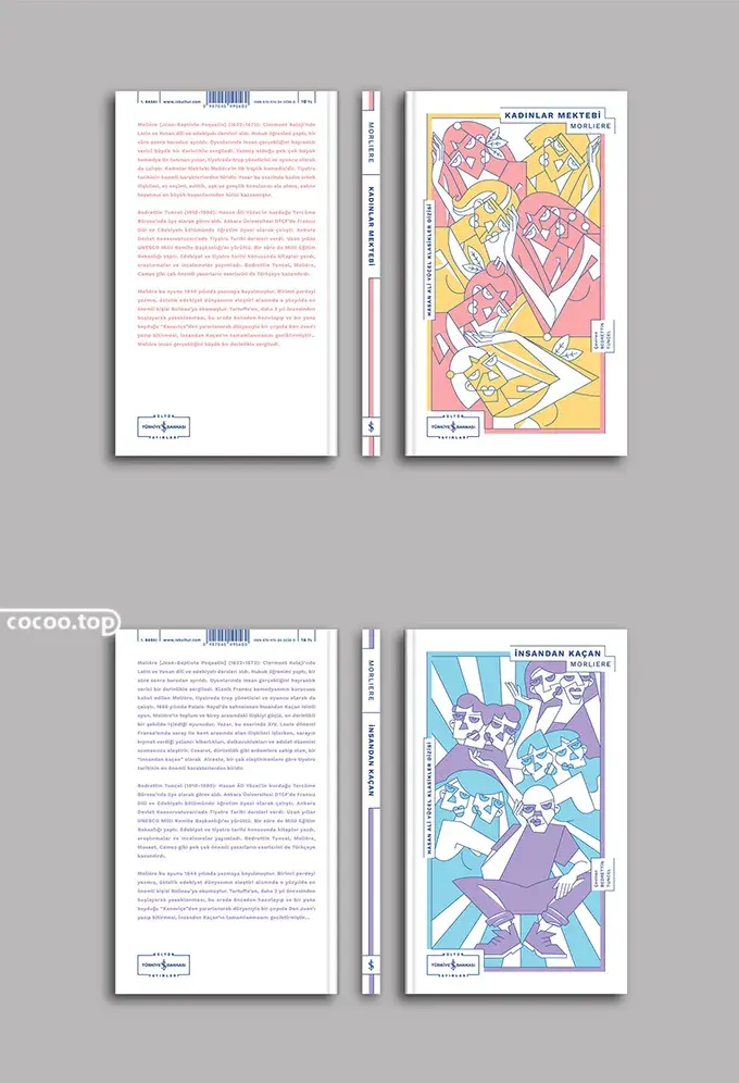
●Text-based design. The importance of each visual element is in order: text → color → graphics/image, where the role of text is to express the theme, graphics/images are auxiliary elements in the composition of the picture, and the design of color is mainly to balance the text and image, so that of mutual cooperation and coordination. This design technique is mainly used on book covers with serious, orthodox, abstract and solemn themes, and the text does not need to have too many decorative features.

●Design based on graphics/images. The visual focus is in order, graphic images → color → text. In the design, you must first choose graphic images that can show the connection with the book theme, and use this to establish the basic tone of the cover, and use appropriate colors to balance graphics/images and text. Relationship.

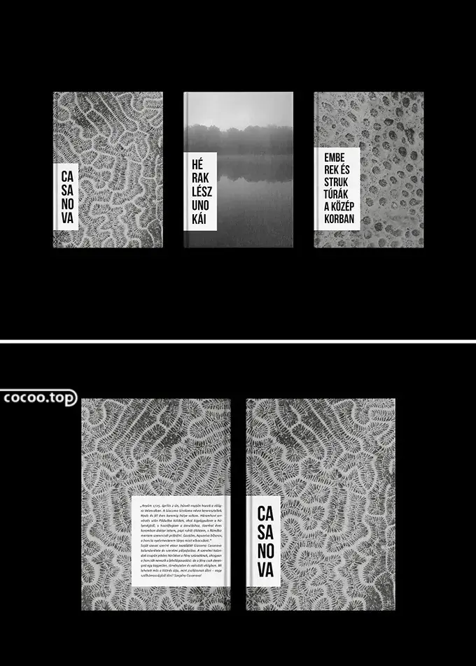
2. The design of the back cover. The back cover design is a continuation of the cover design creativity. The color and form of the cover are continued on the back cover to transmit continuous visual information, which can impress consumers more strongly. Extending the beauty of the cover is necessary for the integrity of the book design. Even a decorative symbol can bring out greater expressive power in the overall structure, and thus constitute the continuity of visual form, inducing readers to enter the reading state with continuous and smooth visual fluidity, maintaining horizontal continuity. Sex can lead to an orderly flow of sight toward the book.

Therefore, the design that extends to the back cover cannot be taken lightly, but should be connected with the cover to show effective space. Of course, in terms of structure, the shape and color of the back cover should be appropriate, the factors that induce sight should be taken into account, and the priorities should be clear.
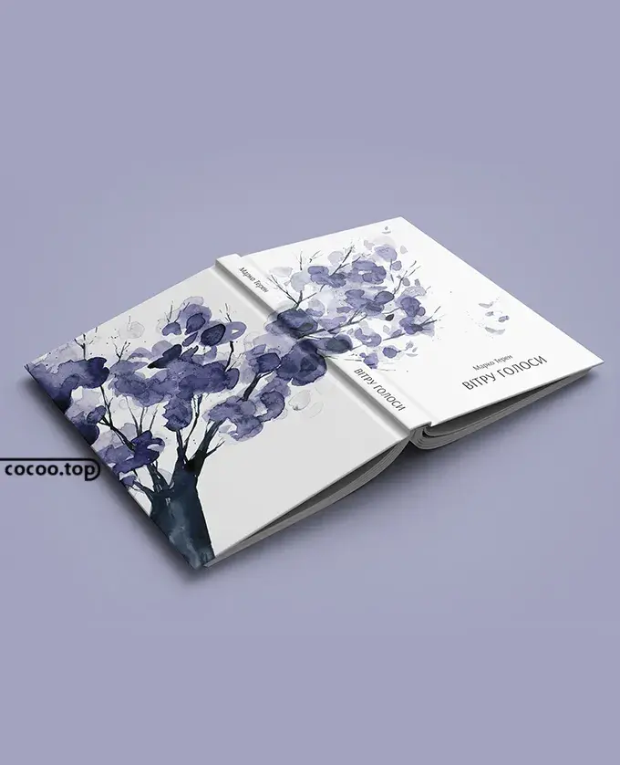
3. The design of the spine. The spine occupies the smallest area in the cover and is often overlooked by people. However, when the book is placed on the bookshelf, its role is even more important than the front cover, because people can only see the spine.

The design of the book spine is restricted by the thickness of the book. The title of the book, as the protagonist, becomes an important part of the design, and clear identification becomes the principle of the spine design. Normally, the Chinese characters on the spine are arranged vertically, but sometimes they are arranged horizontally or mixed horizontally and vertically on thicker spines. The font is the same as the title of the book on the front cover. The size and position of the text are arranged on the spine. , echoing the front and back covers.
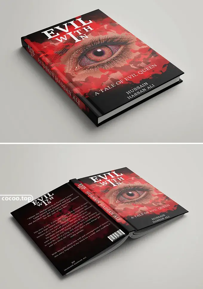
4. The design of the mouth. The choke is the extension of the cover that people see after opening it. Usually, there will be a brief introduction to the book on the front cover, and the design factors of the front cover will also extend to the front cover. In addition, the front cover can also be used as a detail of the front cover design, making the design of the entire book More harmonious and beautiful. On the back cover, you can print the author's resume, portrait and other titles of works, etc. This can increase the publicity of the author and enable readers to have a more comprehensive understanding of the author.
Articles are uploaded by users and are for non-commercial browsing only. Posted by: Lomu, please indicate the source: https://www.daogebangong.com/en/articles/detail/shu-ji-feng-mian-she-ji-nei-rong.html

 支付宝扫一扫
评论列表(196条)
测试