Contributed from: Designup Third Market ID: D3SIGNUP
Which font will be the first in the "Font Jianghu" series in the new year of 2018? After all, the fonts that appeared in front of them are really very famous. Helvetica, which is recognized as the number one in the world, Didot, a scheming lady in the fashion industry, and Times New Roman, which is known as a classic... If the next font that appears is not a gimmick, it will be thrown as a rotten egg. !
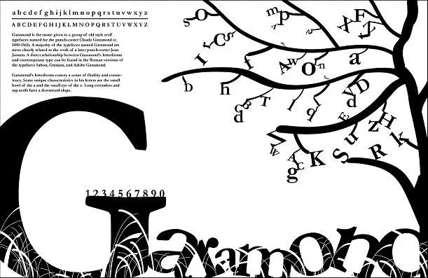
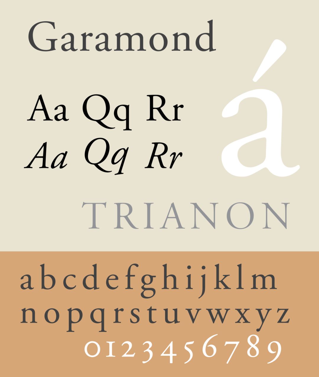
GaramondFearless, with a long history of nearly five hundred years, born in the historical waves of the Renaissance, It was selected as the second place in the world's famous hundred fonts by Fontshop, a famous European font company. Of course, it depends on your choice.
We will explain Garamond's past and present for you. In your opinion, can it become the number one?
Eternal masterpiece of classical craftsmen
The story kicks off in the sixteenth century, with the Reformation and the Renaissance struggling to advance. Countless people were persecuted by Catholic tyranny, including Claude Garamond< /strong>Augereau, a highly respected teacher, watched him being burned on the stake with his most beloved poems in his arms.

Claude Garamond
Ripples of rebellion stirred in Claude's heart, and he vowed to inherit the teacher's career. At that time, Gothic font was widely used in France, and "new ideas required new fonts".
Claude experienced countless researches, modifications and reproductions on the basis of the prototype of the font, and finally gave birth to Garamond, which we know today and named after him.
It was once said that Michelangelo created the immortal sculpture David, and Claude's historical status is just like him creating the classic old serif (old- style), is recognized as a model of perfect aesthetics.
Garamond typeface has great consistency and a unique sense of flow. Like flipping through a Renaissance classic, the ink in the paper fibers crinkles and swells in such a subtle way, elegant and charming without being overly ornate.
Claude was the first to deviate from the pure handwriting style. The font is more delicate, even more beautiful than the words written by literati, and the readability is stronger. It can be said to be very powerful!
Its richest features are the smaller eye parts of the lowercase letters a and e, the lowercase height of the overall lowercase letters, and sharper strokes (such as lowercase J).
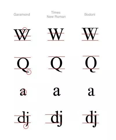
Partial letter comparison with Times New Roman and Bodoni
It is a pity that he did not witness the glory of Garamond font during his lifetime. After Claude's death, most of what he left belonged to the French Royal Printing Office, and this font was also dusty in the imprint of the times. Until nearly a hundred years later, a person appeared.
Successor
Every genius in the world hopes to meet someone who understands him, and Claude is lucky enough to meet him. In 1612, the Swiss-born printer Jean Jannon published the first typeface sample book in France.
The typeface he uses is based on the Garamond style, very similar, but more asymmetrical, representing the progressive style of the 17th century. At that time, Jean's printing house was confiscated for religious reasons, and it further became the standard font of the Royal Printing Office, leading the printing industry.
The Royal Printing Office of France has long adopted the Jannon typeface, which it claims to be the work of Claude Garamond.
Until the Paris World Expo in the early 20th century, Garamond became a hit and imitated, forming an upsurge of revival of this font, and various variants were born accordingly. Many large companies have done the Garamond complex. carve. The four most famous variants are Monotype Garamond, Simoncini Garamond, ITC Garamond, and Adobe Garamond released by Adobe in 1989.
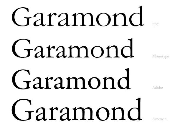
Comparison of several variants
Of course, not every variant can win the favor of the public, The most prominent feature of Garamond is the sense of fluidity and readability based on cultural heritage.
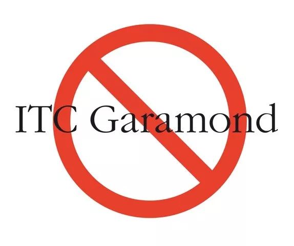
But ITC Garamond is more like pleasing modern aesthetics, obviously lacking a sense of elegance and history, and the abnormal height of lowercase letters, but more exaggerated and vulgar (such as lowercase d), although influenced by some children's literature Books are loved, but still suffer from a lot of spurning.
Adobe is cleverly designed according to the original mold of French typeface designer Claude Garamond, while Monotype and Simoncini are based on the stereotyped design of Jean Jannon, respecting history and having a high status in the font industry.
In fact, there are still differences between Claude's and Jean's designs, and after Jean's printing factory was confiscated, his designs were also assigned to Garamond. It was not until 1926 that the name was corrected by the British magazine, but Garamond's name has been deeply rooted in the hearts of the people. It would not be unhappy to think that Jean is as famous as his idol. ?

Jean Jannon
Never come second
We know that Fontshop, a famous European font company, selected Garamond as the second in the world, so is it really only ranked second? I don't agree with this!
If Helvetica is the classic of sans-serif, Garamond is the milestone font of serif. Its brilliance lies in representing an era. In the 15th and 16th centuries, the Gothic style was in power. font style, and Garamond is a model of humanist Roman font, which has cross-age significance in the history of typography.

Some people may say that Garamond is so old that it is outdated now. That would be too naive. Garamond has been passed down for nearly 500 years after various changes. When we look at it, we will have an ancient feeling, but there is an invisible force that cannot resist its charm. We are fascinated by the natural, elegant, well-proportioned and smooth changes in thickness.
It is especially suitable for printed books. It seems to be connected with the story when read. Most literary classics in Europe and America are typeset with Garamond. Like the Harry Potter series we all love.


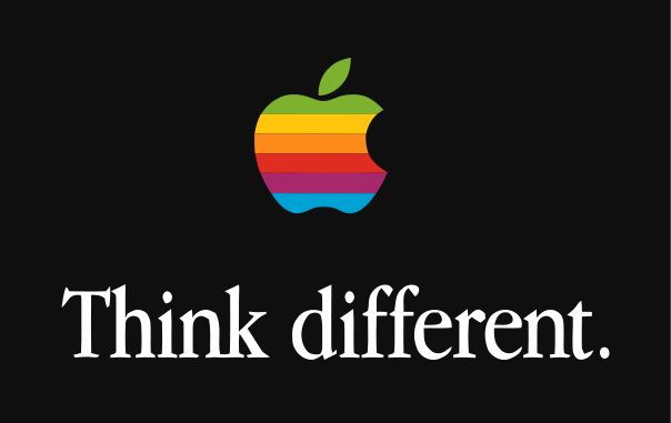
In addition to being successful in the printing industry, Garamond is also showing no weakness in the Internet age. In 1984, Apple's Macintosh came out, and its Think different series adopted Garamond as the brand font image.
A font that even Steve Jobs likes!
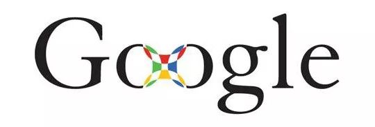
In the 1990s, Google hired Ruth Kedar to design a new brand logo for it. She chose Adobe Garamond fonts, and initially used black as the main color. After continuous adjustment and layout, each letter has a different color design.

Coca-Cola's early promotional posters have distinctive features, and also use Garamond, which is more readable~

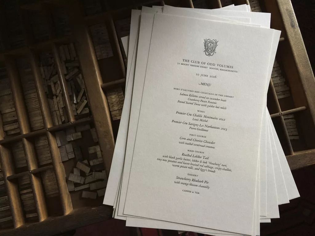
Garamond has a wide range of uses, even the Menu (menu) of high-end restaurants loves to use it, showing elegant and noble taste.
This font can often be seen on some high-end red wine labels. The winery Niebaum-Coppola owned by Coppola, the director of "The Godfather", uses the font Sabon derived from Garamond on its website.

Even in today's Internet digital age, Garamond still has an irreplaceable position. It is not the masterpiece of Claude Garamond alone, but the efforts made by countless pioneers of that era to revive the belief in literary inheritance.
After hundreds of years of continuous evolution, Garamond has spawned many variants, all of which have extremely high achievements in their respective fields. From paper printing, book cover, brand identity to poster design, restaurant and winery... Garamond writes unforgettable beauty for us with its unique rhythm.
The harder you work, the luckier you get.
This is the right path of Pangmen.
Articles are uploaded by users and are for non-commercial browsing only. Posted by: Lomu, please indicate the source: https://www.daogebangong.com/en/articles/detail/shock%20This%20font%20has%20been%20loved%20by%20humans%20for%20500%20years.html
 支付宝扫一扫
评论列表(196条)
测试