First of all, the number of fonts is not the key to a good design. In the early days of design, Xiao Zhai was also keen on collecting various fonts. At one time, he had more than 2,000 fonts installed on his computer. However, with a deeper understanding of design, I found that these fonts are not used most of the time, but instead increase the burden on the computer.
English fonts can be simplified into two major categories: serifs and sans-serifs. Their main difference is that serifs have claw-shaped serifs at the end of the strokes and the strokes vary in thickness.
Serifs include: Old roman, Old style, transitional fonts (Transitional), modern font (Modern).
Sans serifs are divided into: Early sans serifs (Grotesk), new sans serifs (Neo-Grotesk), geometric sans serif (Geometric), humanistic sans serif (Humanist).
After you have a clear understanding of font classifications, interested students can further understand the history of these fonts and experience their characteristics in different usage environments. Over time, you will have a deeper understanding of English fonts, be able to quickly determine applicable font types in future design work, and quickly find suitable fonts.
Today, Xiao Zhai recommends ten classic English fonts. When you feel confused when choosing a font, you can try these fonts, they usually won’t go wrong.
1. Helvetica

2. Arctic

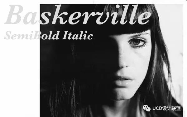
3. Baskerville

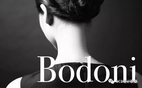
4. Bodoni

5. ChunkFiveEx

6. Didot

7. DIN

8. Futura

9. Haettenschweiler

10. UniSans
Articles are uploaded by users and are for non-commercial browsing only. Posted by: Lomu, please indicate the source: https://www.daogebangong.com/en/articles/detail/shi-kuan-bu-ke-cuo-guo-de-jing-dian-ying-wen-zi-ti.html

 支付宝扫一扫
评论列表(196条)
测试