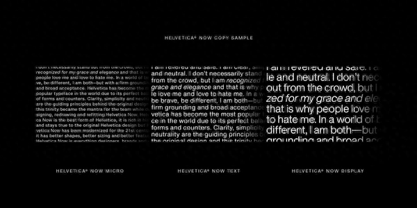
Helvetica, one of the most famous English fonts in the world, finally launched a new version after 35 years (Neue Helvetica in 1983).
The new version of the font is called "Helvetica Now" and was defined by the copyright agent Monotype. It mainly solves the current problems of character spacing and clarity (readability) of the Helvetica font. After all, 35 years ago, smartphones, high-definition displays, and 4K TVs were not as popular as they are now.
It is reported that the Helvetica Now font launched this time is divided into Helvetica Now Micro, Text and Display, which are respectively oriented to three scenario services: editing, writing and brand promotion.
Specifically, Display will be mainly used for large-format display content such as headlines and advertisements. Text will be mainly used for articles, FAQs, forums and other fields. Micro and Text are almost the same, but are used for presentation on smaller screens.

Helvetica Now Display Black is available for free download for individual users. All you need to do is submit your name, email address, job title and other information.
According to data, Helvetica was designed in 1957 by Swiss font designers Eduard Hoffmann and Max Miedinger. It has been the default font for Apple computers for a long time, and the Arial font commonly used by Microsoft also comes from it. Even, in 2007, British director Gary Hustwit shot a documentary "Helvetica (Legendary Font)" specifically for it, with a Douban score of 8.7.
Today, Helvetica is widely used in corporate logos, such as 3M, American Airlines, BMW, Lufthansa, Fendi, Jeep, Intel, Muji, Nestlé, Panasonic, Microsoft, Mitsubishi Electric, Motorola, Toyota, Samsung, Standard Chartered Bank etc.

Articles are uploaded by users and are for non-commercial browsing only. Posted by: Lomu, please indicate the source: https://www.daogebangong.com/en/articles/detail/shi-ge-35-nian-quan-qiu-zui-shou-huan-ying-ying-wen-zi-ti-Helvetica-fa-bu-xin-ban.html

 支付宝扫一扫
评论列表(196条)
测试