Source: WeChat public account PingMianDesigner (graphic design)

Arrangement is composed of many words Design, it is very different from single font design. Since it is a combination, there must be a connection between fonts and fonts, creating a relationship of arrangement and combination. Therefore, when combining text, we must not only consider the design of each font but also the arrangement and combination relationship between the text. So, how to arrange and combine words to achieve a formal beauty?

Symmetry is the most important aspect of text arrangement and combination. One of the commonly used methods. It reflects a stable and harmonious beauty. Many things in real life follow the law of symmetry. Symmetrical things give a kind of affinity, highlight the beauty of balance, stability, and completeness, and also embody the characteristics of a kind of orderly beauty and normative beauty, thus making people psychologically and physically The need to achieve harmonious beauty.
Generally in the arrangement and combination of text Two expressions of horizontal and vertical symmetry are adopted, both of which are based on the central axis. Symmetry is divided into absolute symmetry and relative symmetry. Absolute symmetry means that the top, bottom, left and right are exactly the same. In application design, it is often used in some high-end products, long-standing brand product packaging, advertising and other designs to reflect a noble, elegant and credible impression.
But there are also many arrangement combinations based on The design content adopts a relatively symmetrical approach in order to avoid the slightly rigid appearance of symmetry. Relative symmetry is to achieve a visual balance by slightly changing some parts on the premise of symmetry. The symmetrical technique should be used reasonably according to the design content when font arrangement and combination.
In the nature where people live, The undulating mountains, rushing rivers, and winding paths in the forest all contain the rhythm of beauty; the painter's passionate lines and beating colors; the calligrapher's brushstrokes of words can all make people feel the rhythm of beauty. Rhythm is a simple and even repetition with a sense of pure jumping. When rhythm rules are applied to text arrangement and combination, it can be expressed as:
One is between words The arrangement can be combined in an arc to achieve a vivid and lively feeling, and give people a rhythmic and beautiful enjoyment; secondly, in the layout and combination of many text and graphics, the intervals, pauses, space ratios between paragraphs, and the between words can be adopted Changes in size, density and mutual relationship between text and graphics, primary and secondary processing, ups and downs, etc. Rhythm can bring a new vitality to text arrangement and combination, and its expression techniques include repetition, gradient, etc., which are commonly used techniques in plane composition.
Contrast refers to two or more The constituent elements are mutually opposed and exclusive. Contrast has the beauty of contradiction and conflict, and has a strong visual impact. Contrast is one of the most commonly used methods in text arrangement and combination. Contrast techniques include size contrast, direction contrast, dynamic and static contrast, light and dark contrast, color contrast and texture contrast.
Using this rule can make a more rigid , the plain text arrangement and combination becomes richer and more dynamic, and can effectively convey the information contained in the text, especially the important theme content and spiritual connotation are highlighted in the contrast, making it clear to the viewer at a glance. The formal law of contrast is an important means for the success of artistic design. It exists in all laws, but it is divided into strong and weak ones.
Space in the sense of text arrangement and combination The law refers to the two-dimensional space on the plane, that is, real space and virtual space. The part occupied by text and graphics is called real space, and the remaining space is called virtual space. The purpose of virtual space is to highlight the theme text and graphics of real space. Proper use of space can play the role of "silence is better than sound".
Arrange and combine text, that is The processing of positive and negative space between words, line spacing, and even between individual glyph strokes. In the overall layout arrangement, the virtual and real contrast between text and graphics, text graphics and the positive and negative space of the layout. Modern graphic design attaches great importance to the use of virtual space, such as posters, bindings, business cards, newspaper advertising design, etc.

Shaping is like a plane forming the basic The idiosyncrasy in design is the same. Most of the shapes maintain a certain pattern, leaving a small part inconsistent with the overall order, creating a contradiction and conflict point. In text arrangement and combination, using text shaping can increase interest, increase appeal, and make the image more vivid. It is a relatively intuitive and expressive technique.
When designing or arranging text , not only can the font itself be graphical, it is also often used to arrange and combine words. According to the needs of creativity, shaping can be concrete or abstract. When used, shaping should conform to the ideological content expressed by the font and the positioning requirements of the design. If used improperly, it will only give people a sense of being far-fetched.

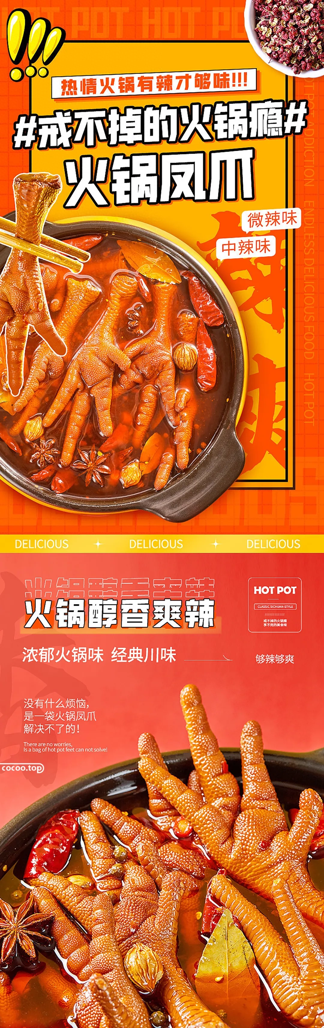
Exaggeration as a form of expression is more It is widely used in many arts. In the arrangement and combination of words, firstly, the meaning of the words is graphically deformed on the strokes of the font, and the connotation is processed and extended by a more concrete expression, causing the viewer to feel a sense of psychological pleasure. And leave a deep impression, thereby achieving the purpose of expressing its design ideas to people, conveying information, and enhancing its visual impact.
The second is in the design concept Exaggeration, based on the content and spiritual essence of the font, expresses its connotation and replaces a certain part of the font strokes with exaggerated concrete graphics that are consistent with the text content to form a meaningful artistic effect.
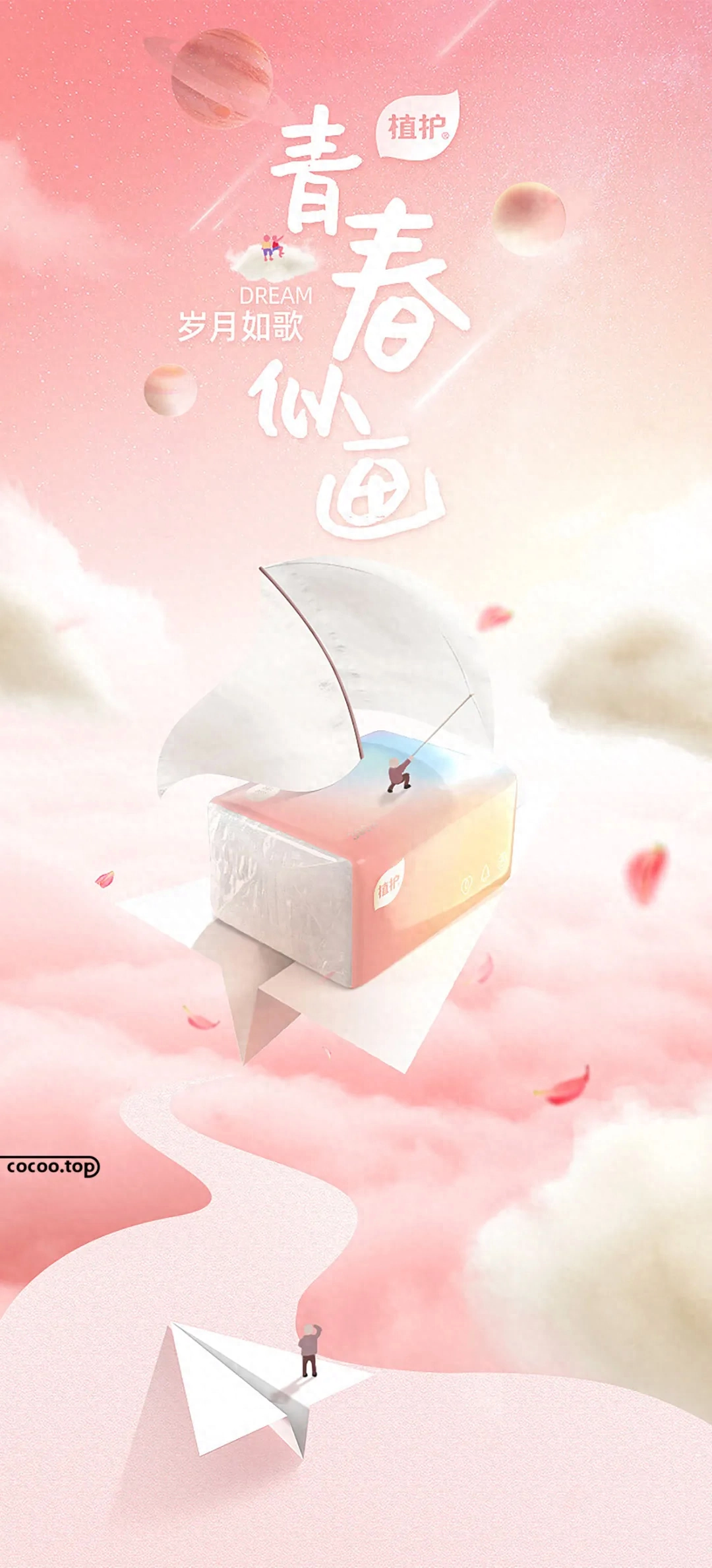
Lenovo is composed of the content and The pen form characteristics of the font arouse a related imagination of the designer. In the arrangement and combination of words, through a bold and careful combination of the specific meanings of the words, without losing the font recognition and information transmission, the spiritual essence expressed by the design is further expanded and enhanced, achieving both It loses the original intention, but creates rich associative space for the viewer.
Lenovo is a font arrangement combination An effective form, when using association, the combination of content and form, the unity of change and recognition must be just right. If it does not make the viewer associate, and the way it is expressed damages the recognition of the font, it will have a negative effect, so the designer must pay special attention to it.
In the text layout combination, no matter Whatever expression techniques designers use based on their creative ideas must follow the most important basic rules of symmetry, balance, contrast, and coordination. Among the basic rules, coordination is the most important. As all types of artistic design, it also includes text. The arrangement and combination are all to create a kind of beauty, an orderly and regular harmonious beauty.

The above four basic rules are used in design They do not appear in isolation, but coexist together at the same time. When we arrange and combine words, we should fully consider the reasonable application of various laws and integrate them organically. Symmetry and balance are the basis of font arrangement and combination, contrast is the focus of design, and coordination is the key. Follow the formal beauty rules of font layout and combination well, achieve unity amidst changes, and seek changes amidst unity, and the layout and combination of text will be more perfect.
Articles are uploaded by users and are for non-commercial browsing only. Posted by: Lomu, please indicate the source: https://www.daogebangong.com/en/articles/detail/sheng-dan-ru-he-ti-sheng-wen-zi-mei-gan-shi-shi-zhei-xie-wen-zi-bian-pai-fa-ze.html
 支付宝扫一扫
评论列表(196条)
测试