Gu Yujia/organized
This article is compiled from the "Guanzhi Lecture Hall" founded by the Historical Documentation Center of Shanghai Library. Chen Xianxing, a senior researcher at the Historical Documentation Center of Shanghai Library, explains rare and ancient books.
Chen Xianxing was born in Shanghai in December 1951 and his ancestral home is Lishui, Jiangsu. He joined the Shanghai Library in 1973 and studied editions and epigraphy from Mr. Gu Tinglong and Pan Jingzheng. He has been in charge of cataloging and authenticating editions of ancient books for a long time. He has been a visiting scholar at the University of California, Berkeley, and the Japanese Literature Research Archive, and has edited (including co-edited) "Chinese Ancient Books Manuscripts and Illustrations", "Opening the Door to the Golden Chamber and the Stone Chamber - Rare Ancient Books", "Berkeley" University of California East Asia Library's "Chronology of Rare Chinese Ancient Books", "Authentication of Ming and Qing Manuscripts", "Illustrated Catalog of Song Editions in the Collection of Shanghai Library", "Authentic Inscriptions and Postscripts of Rare Books in Shanghai Library", "Examination of the Collection of Inscriptions and Postscripts on Rare Books in Shanghai Library", etc. He is currently a member of the National Cultural Relics Appraisal Committee, a librarian of the Shanghai Literature and History Research Center, and a research librarian of the Shanghai Library.
Chen Xianxing's book and shadow of "Rare Ancient Books"
Identifying the font of the engraving is the first priority in authenticating the version
In recent years, some people have divided scholars in the field of edition studies into the appreciation school and the textual review school. This is probably influenced by Hong Liangji's statement in the Qing Dynasty that bibliophiles were divided into five classes. Whether Hong’s statement is correct or not will be discussed separately. I think that no matter what the school is, it must be premised on mastering the ability to identify versions. Of course, the identification of an edition cannot only be based on the shape of the engraving, but also requires relevant examination and verification from aspects such as the origin of the edition and the content of the book. However, making a rough judgment based on the engraving of the plate is the first step in identifying the version. As soon as the book is opened, the most eye-catching thing is the font, so identifying the font is the first important thing to do when authenticating the edition. It may not be accurate enough to identify the version only by the font, but it is nonsense to say that the version is authenticated without identifying the font. From my understanding, the so-called "watch the wind and wait for the future" as mentioned by the predecessors is mainly about fonts. If you don't recognize the fonts and only recognize the inscriptions, taboo characters, or engraving techniques, you may mistake the Ming and Qing imitations of the Song Dynasty or the translation of the Song Dynasty version for the Song Dynasty version.
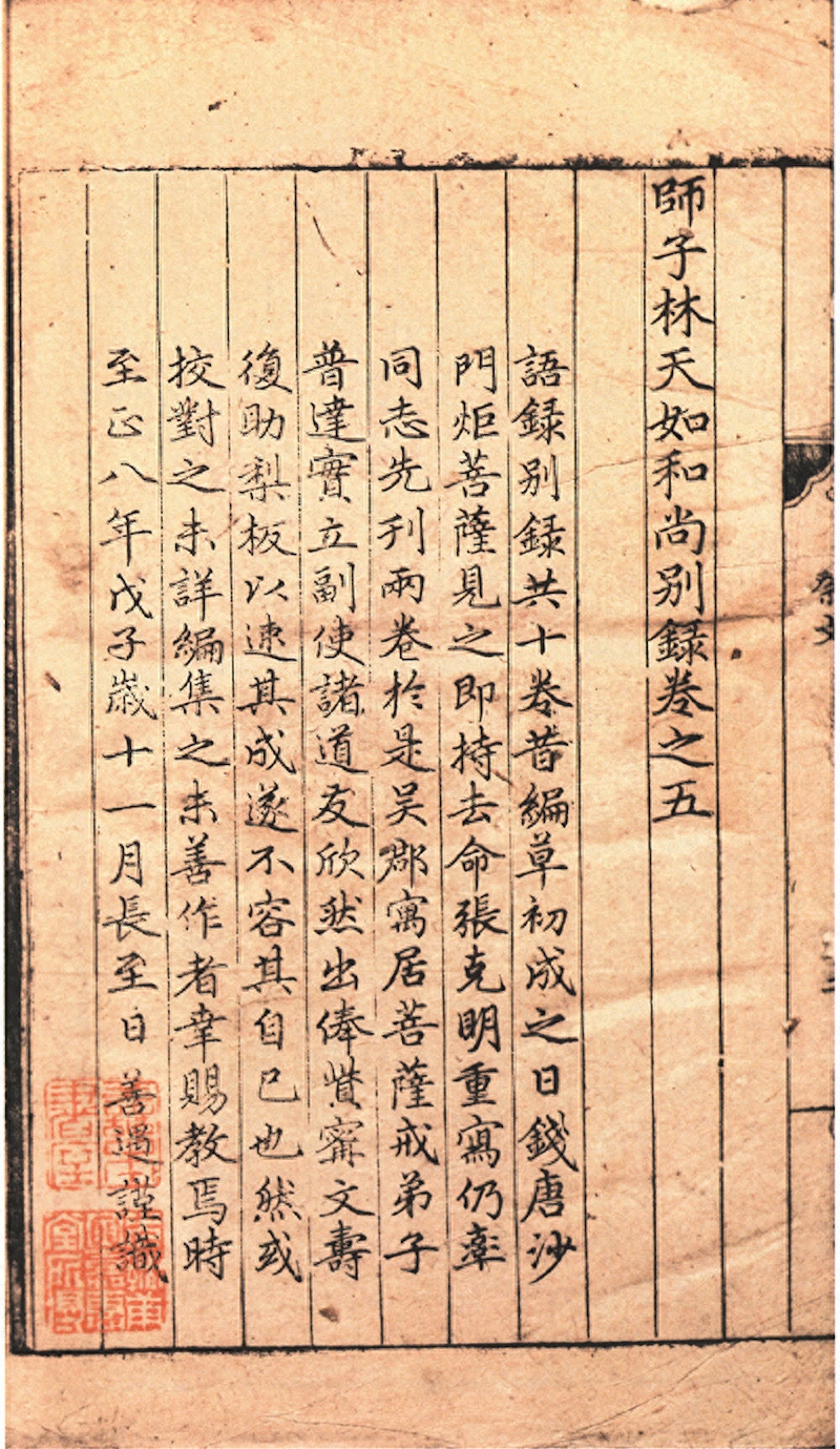
There may be some Buddhist scriptures in the Song Dynasty that use Su Dongpo's regular script. For example, the Chongning edition of the "Miaofa Lotus Sutra" in the Northern Song Dynasty collected by the Shanghai Library has a Su style of small characters, which is very similar. But generally speaking, calligraphy engravers in the Song Dynasty respected Tang regular script and mostly used the fonts of Ouyang Xun, Yan Zhenqing, and Liu Gongquan. This was certainly due to the influence of the three regular script masters who reached their peak, but it may also be due to the lack of comparable masters of regular script in the Song Dynasty. The predecessors have seen the extant Song Dynasty editions (mainly Southern Song Dynasty block editions) and concluded that their fonts have the regional styles of Zhejiang, Europe, Shuyan, Fujian and Liuzhou, which is relatively in line with the actual situation. Therefore, we must have a general understanding of the characteristics of Ou, Yan, and Liu calligraphy styles, and correspondingly the fonts of the three most influential calligraphy centers of Zhejiang, Shu, and Fujian in the Song Dynasty.
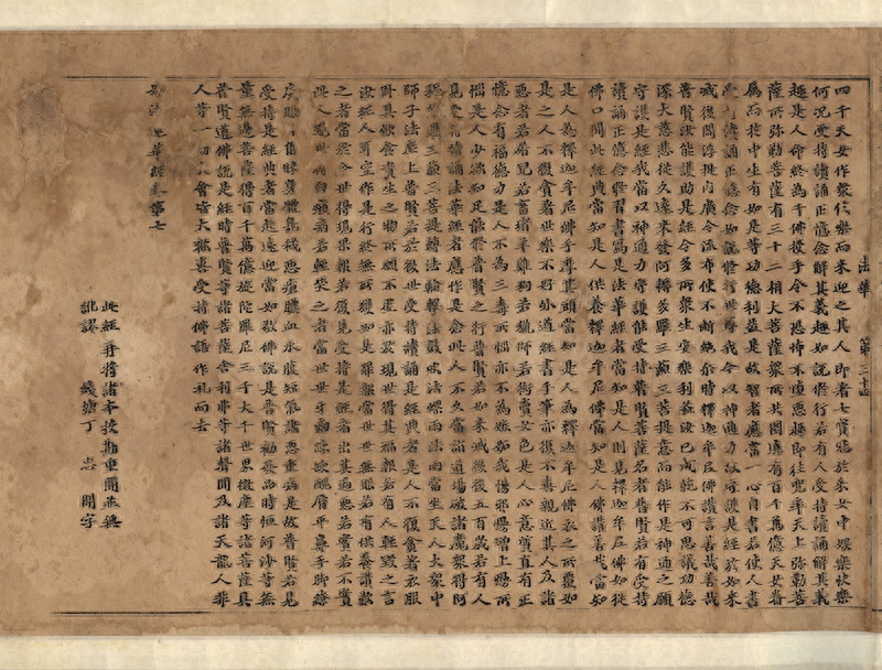
A copy of the Northern Song Dynasty Chongning edition of the Lotus Sutra of Wonderful Dharma collected by the Shanghai Library
Let’s talk about the word European first. Ouyang Xun (557-641) was a great calligrapher from the Sui Dynasty to the Tang Dynasty. His regular script was rigorous but not engraving, and his calligraphy was sharp but not charming. Representative works include "Inscription on the Liquan of Jiucheng Palace", "Inscription on the Pagoda of Huadu Temple", "Stele on Huangfu's Birthday", "Stele on Gonggong Yu", etc. The so-called "square and neat fonts" among edition experts mostly refer to the European calligraphy editions of the Song and Zhejiang dynasties. In my opinion, to distinguish whether the Song version is European or not, the hook is the most obvious. The hook is longer and the circle is square on the outside and round on the inside. This is the so-called distinctive feature of the European character blending with regular script.
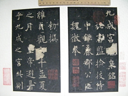
Ouyang Xun's rubbing of "Jiucheng Palace Liquan Inscription"
Book shadow of "Wu Jing Turtle Mirror" in Zhejiang-engraved European script in the Southern Song Dynasty
Say the word "face" for the first time. Yan Zhenqing (709-785) was a great calligrapher in the prosperous Tang Dynasty. His works were numerous and varied. The Duobao Pagoda Stele he created when he was 43 years old is well-organized, dignified and beautiful, but it is not typical of Yan calligraphy. "Magu Immortal Altar", written at the age of 63, uses circles instead of squares, is well-proportioned and solemn. It is called the crown of Yan calligraphy and is also his representative work. In the past, some edition writers described Song edition fonts as having the so-called "silkworm head and swallow tail", which should be a guide to the Song and Shu carved Yan calligraphy editions. However, there were different opinions in the Song Dynasty as to whether "silkworm head and swallow tail" is a characteristic of Yan characters (see Mi Fu's "Haiyue Famous Sayings" and "Xuanhe Shupu·Yan Zhenqing"). As far as the appearance of the Shu blockbuster is concerned, there is no "silkworm head" phenomenon in its writing. I think there are two characteristics that need to be paid attention to when identifying Yan characters in the Song Dynasty. One is that the key vertical strokes are slightly arc-shaped; the other is that the strokes are forked like a swallow's tail when the strokes are drawn back. This is found in "Hangzhou West Lake Zhao". The Zhejiang-blocked editions of the Northern Song Dynasty are the most typical ones, such as "Collection of Qingsi Jielianshe" and "Comments to the Lotus Sutra of Wonderful Dharma", while the swallow-tail shape of the Shu-blocked editions of the Southern Song Dynasty is no longer obvious, but the meaning is still there.
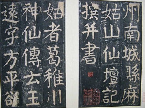
Rubbings of Yan Zhenqing's "Magu Immortal Altar"
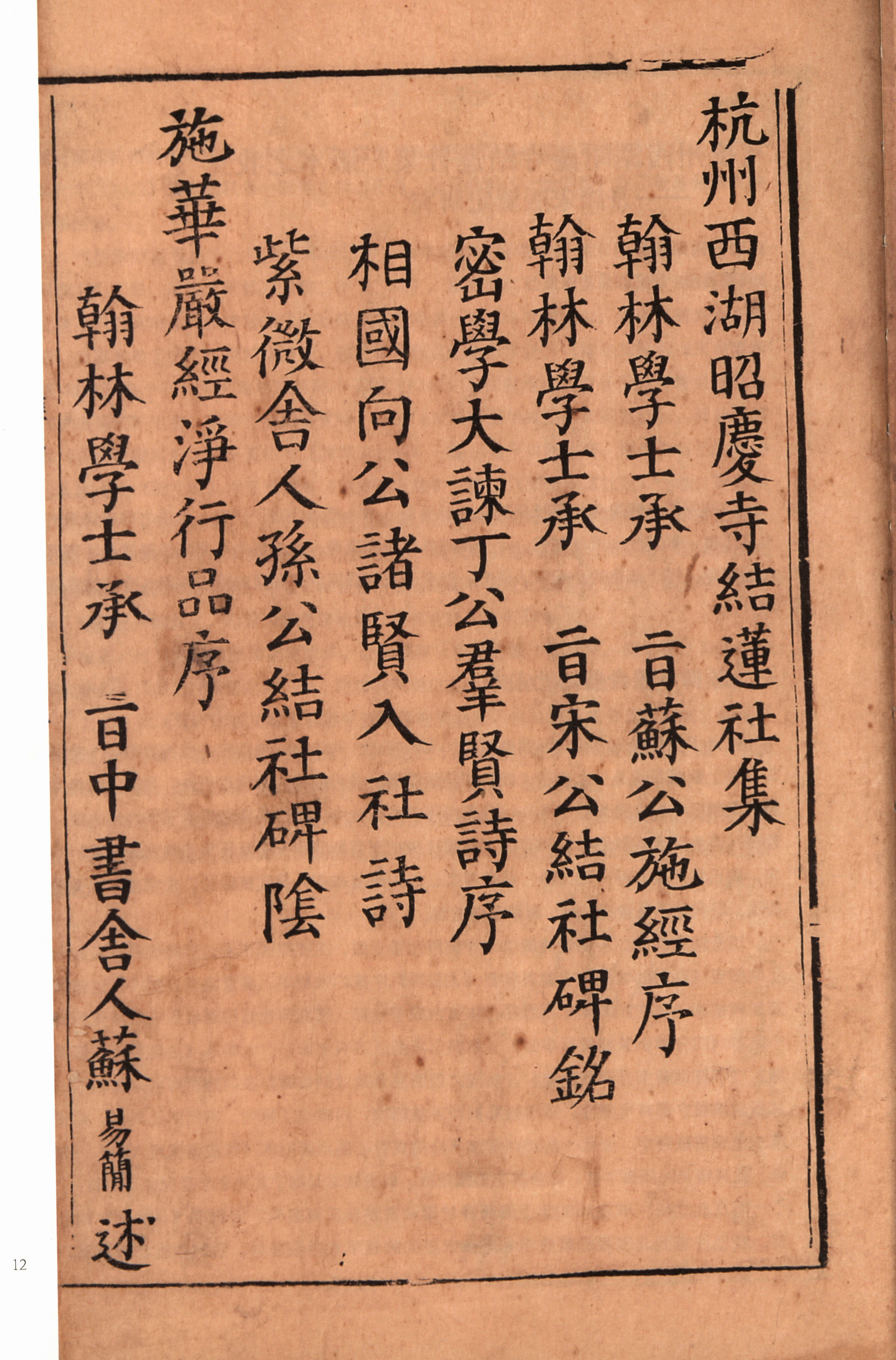
"Collection of Jielian Society of Zhaoqing Temple, West Lake, Hangzhou"
Book shadow of "Collection and Commentary of the Spring and Autumn Classics" in Shu engraved script in the Southern Song Dynasty
Let’s talk about the character Liu. Liu Gongquan (778-865) was the last master of calligraphy in the Tang Dynasty. His representative works include Diamond Sutra, Shence Army Stele, Mysterious Tower Stele, etc. His calligraphy absorbed Ou's rigor and Yan's dynamism. The dots and strokes are straight and elegant, even, thin and hard, and self-contained. What edition writers call "the fonts are elegant and sharp" refers to the willow-type editions built by the Song Dynasty. I think the word "Liu" is more derived from the Chinese character "Fa Yan", especially similar to "Duobao Pagoda Stele"; there are even occasional traces of the Chinese character "Yanwei", so we need to distinguish it carefully. To identify whether the Song Dynasty version has Liu characters, it is necessary to grasp the two characteristics of being tall and thin, which are quite distinct from the facial features.
Rubbings of Liu Gongquan's "Mysterious Pagoda Stele"

Book shadow of "Zhang Qiu Jian Jian Jing" in the Southern Song Dynasty.
Although the inscription is handwritten by a calligrapher on stone, once it is chiseled, it will be somewhat different from the ink mark. And rubbings come sooner or later, and the rubbing technique has its own advantages and disadvantages, so it is inevitable that there will be distortions. As for the engravings, although the fonts are said to be imitated from Ou, Yan, and Liu Yunyun, they are actually the work of writers and engravers in the Song Dynasty. What’s more, the quality of the engraving varies with the fineness and roughness of the engravings. Therefore, most of the fonts we see are similar to calligraphy. There are differences in the original calligraphy of each calligrapher. We can only understand whether it has the characteristics and connotations of a certain calligrapher, but cannot rigidly compare it with the inscriptions. If the rubbings you see on the stele are a poor copy, it will be even more confusing. However, the Song Dynasty fonts have a common feature, that is, they often start with exposed or half-hidden edges. Therefore, when looking at the horizontal strokes, the strokes appear to be light at the beginning and heavy at the end. This feature is particularly obvious in the Fujian editions of the Southern Song Dynasty, so it is not difficult to distinguish them from the local calligraphy of the Yuan Dynasty and early Ming Dynasty bookstore editions.
In the Yuan Dynasty, Zhao Mengfu's calligraphy was highly praised, and the style became so popular that it was widely used in printed editions. The Zhizheng engraving of Yuan Dynasty's "Quotations of Monk Lin Tianru," now in the Nanjing Library, can be called the best of the Yuan engravings in Zhao style.
A copy of the Yuanzhizheng engraving of "The Quotations of Master Lin Tianru" collected by the Nanjing Library
Rubbing of Zhao Mengfu's "Stele for the Reconstruction of Xuanwu Hall in Yousheng Temple" collected by the Palace Museum
But it should be noted that Zhao Mengfu’s calligraphy style evolved from the calligraphy of Li Yong of the Tang Dynasty. Therefore, learning Zhao character must be combined with studying Li character. “Li Sixun Stele” and “Lushan Temple Stele” are Li’s representative works, and their calligraphy style is also found in the Yuan Dynasty editions Every reflection. For example, in the Yuan Dynasty edition of "Shitongziwen", the main text is in the craftsman style commonly used in Fujian bookstores. If readers compare it with Zhao Mengfu's calligraphy, they will not be able to make a judgment.
Yuan Zhizheng 4th year (1344), Chonghua Yu Zhi'an Qin Youtang's engraving of "Shitongziwen"
In fact, when appraising a version, you must not only look at the font of the main text, but also pay attention to the font of the preface and postscripts, because the prefaces and postscripts are often handwritten by the author, or written by famous artists, and the fonts often better reflect the trend of the times. The calligraphy of Hu Yizhong's preface to this volume of "Poetry of Poetry" is very characteristic of Li Yong's calligraphy. As for some people who lump all the fonts commonly used in Fujian bookshops in the Yuan Dynasty and even the early Ming Dynasty into Zhao style, this is really misleading and requires attention. Although this type of font is derived from Tang Kai script and evolved from the fonts used in the Song Dynasty edition, special emphasis is placed on the starting and ending of the strokes, especially when starting against the front. The initial strokes are in the shape of a round hook. Formed, which is different from what Yuan Ben deliberately made), and later became rounded or silkworm head-shaped, which is quite exaggerated. Until the early Ming Dynasty, it had been used by Fujian book engraving, especially book engraving in bookshops. However, the popularity of this font, or the formation of this engraving style, has a gradual process. In the early Yuan Dynasty, the fonts of Fujian-engraved books, even in the same book edition, do not all have this appearance. The Jian-engraved Song characters still occupy a certain space, but the fonts are softer than the Song version. By the middle of the Yuan Dynasty, the legacy of the Song version of the font had disappeared, and only one typeface of this type existed. However, from the middle Yuan Dynasty to the early Ming Dynasty, this type of font also changed. In the middle Yuan Dynasty, the font was still elegant and dynamic, while in the late Yuan Dynasty it was slightly dull, and in the early Ming Dynasty it was long and regular. , lifeless. Of course, the engravings of each period are different in quality and roughness. Only by comparing them carefully can we gain some understanding.
Preface by Hu Yizhong in Kuaiji, Guiwei in the third year of Yuan Dynasty
The calligraphy of the Ming Dynasty generally followed the Zhao style of the Yuan Dynasty. During the Zhengde and Jiajing periods, imitation Song engravings, represented by the Suzhou area, became popular. Some people call this kind of font that imitates the Song Dynasty blockbuster "Song style". Beginners may not understand it and need to analyze it. "Song style characters" has two meanings in typography: one refers to the fonts of the Song version. This is actually a relatively vague term, because the fonts of the Song version are diverse and have different postures. This statement has been made in the past, but it can only be understood by experts, and it is difficult for laymen to understand it. The other specifically refers to the imitation Song fonts that changed in Zhengde and Jiajing of the Ming Dynasty and took shape in Longqing and Wanli. Most of the extant imitation Song editions from the Zhengde and Jiajing periods imitated the European calligraphy. In other words, at least a batch of editions at that time were directly imitated from the Zhejiang European calligraphy editions of the Song Dynasty. Their superior works were only inferior to the Song originals, so they were There is a saying of "Shadow Song Dynasty Engraved Edition". Once the trend was established, it almost became a commonly used font for engraving books from the late Zhengde period to Jiajing period. Even if it is not a direct translation of the Song Dynasty version, there are still many excellent works. Later, in order to facilitate the application of the knife, the characteristics of light and heavy strokes were deliberately highlighted, so that the fonts became regular and uniform, and the charm of European calligraphy gradually lost.
In the 16th year of Zhengde in the Ming Dynasty (1521), Lu Yuanda imitated the Song version of "Huajian Collection" book and shadow
In the Wanli era, this font incorporated face and body components, and evolved into a square font with horizontal thinness and straight thickness (straight and thick is the variation of face and vertical strokes). Although this font has many variations of rectangular, fat and thin, since then, It has always been called "Fake Song Style", also known as "Song Style". This font did not evolve by mutation, but developed through certain changes. For example, in the fourth year of Jiajing reign (1525), Xu Zonglu's Yijing Shutang had an engraving of "Guoyu", but it was an old-time bookseller who tore off the preface and passed it off as a Song edition. Because some characters in this book are written in ancient character structures, and the dots and strokes in the font are similar to those in the Jiajing version. The difference is that it contains facial and body connotations, making it appear plump, especially the feet, which are prominent features. In fact, books with similar fonts are not uncommon. "Tianlu Linlang Bibliography" may mistakenly regard the Ming version as the Song version, and there is a similar font. There is another Jiajing engraved version of "Han Jun" made in the 11th year of Jiajing (1532), which is more typical. Except for the stiffness of the foot, the characters are basically in Yan style. I think the fonts of this type of book must have had an impact on the creation of Wanli Song-style characters. Wanli Song-style characters only emphasized the facial and body components and evolved into a new font.
In the fourth year of Jiajing reign of the Ming Dynasty (1525), Xu Zonglu’s engraved copy of “Guoyu” in Yijing Shutang
Some people think that the Wanli font was directly imitated from the bookshelf version of Lin'an, Zhejiang in the late Southern Song Dynasty. This is not accurate. It should be said that the Jiajing imitation was somewhat influenced by the bookstore version. Therefore, the "Nanyue Manuscript" of the bookstore version that suddenly appeared on the market in 2006 》, it was mistaken for Mingqi. Although the stroke thickness of the Shu Sheng version is more even, upon closer inspection it is still European style, without any hint of Yan calligraphy, and is completely different from Wanli Song style. By the way, I would like to point out that some scholars, following some old prejudices, dismissively call Wanli, a Song-style character, as Craftsman-style, while ignoring its creativity, which is biased. This type of font developed to its peak during the Kangxi era of the Qing Dynasty. In the past, bibliophiles called them Kangxi fine engravings. Many of them refer to this kind of beautiful Song-style fonts, and not all of them are software fonts. In addition, this kind of font has a solemn atmosphere that is not found in software fonts. It is like a list of books. Without the face type, it cannot present a steady and majestic posture. This is why it was often used by the imperial government in the Qing Dynasty to publish books about politics.
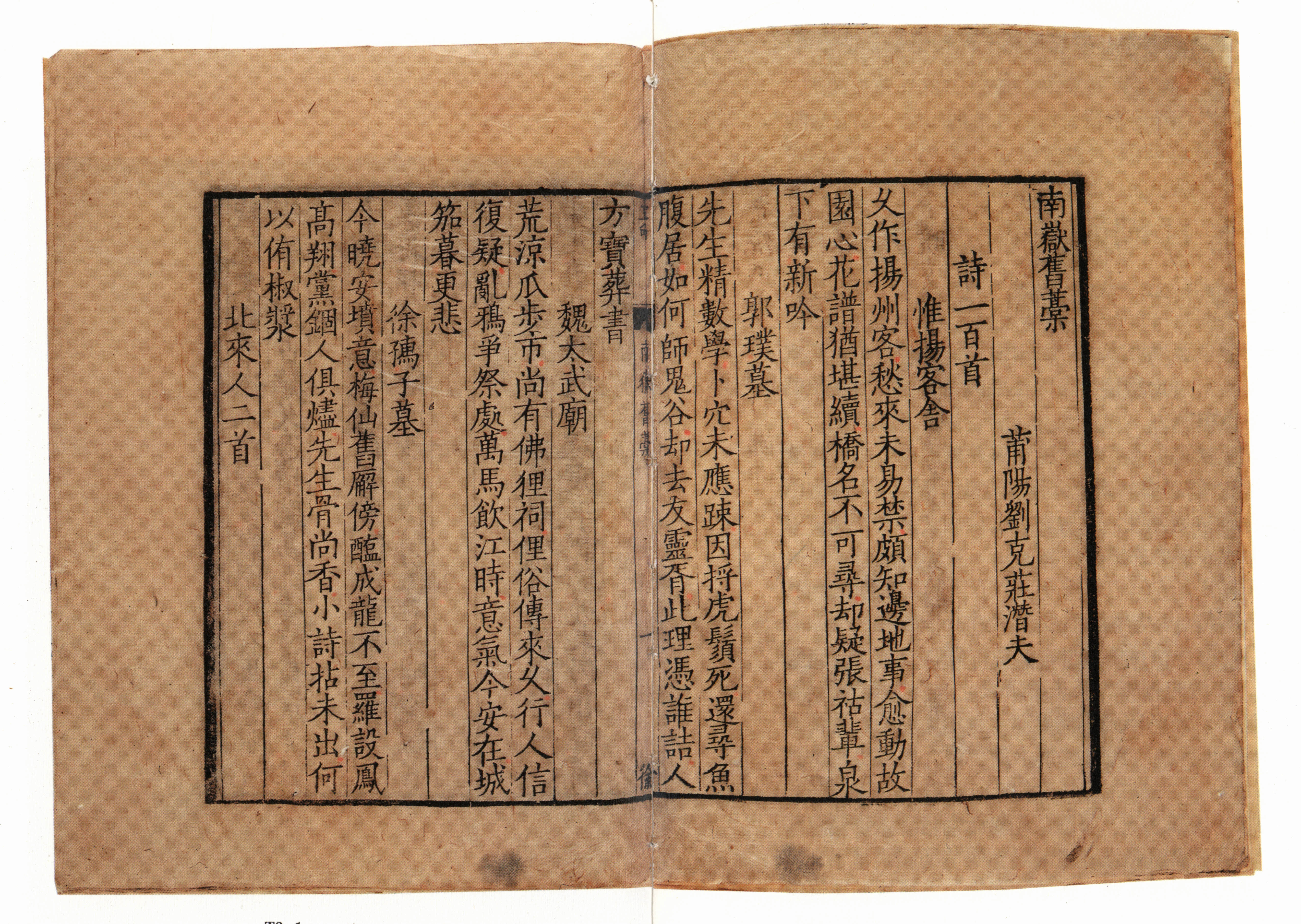
Shed version of "Nanyue Manuscript"
Book and photo of "Summer Record in Jiangcun" engraved in the 32nd year of Emperor Kangxi's reign in the Qing Dynasty (1693)
Although from the Wanli period of the Ming Dynasty to the Qing Dynasty, most of the calligraphy used imitation Song style, with horizontal thinness and straight thickness. However, the shape of the characters varied in size, fatness, and thinness, and there were differences in fineness, thickness, and height in the engravings, which need to be carefully compared and understood. For example, the fonts of the Wanli edition are large and fat, while those of Tianqi, Chongzhen and even Kangxi are small and thin. Of course, this is generally speaking. In addition, during the Wanli Period, regular script or Xingkai script scripts also appeared, commonly known as "soft script scripts". From Kangxi to Daoguang in the Qing Dynasty, there were also many manuscripts and engravings, many of which were written by famous artists with different styles. They are very exciting, such as "The Essence of Yuyangshan People" written by Lin Ji. The above is just a rough outline of the engraving fonts. For example, the characteristics of engraving fonts in areas other than Zhejiang, Sichuan, and Fujian in the Song Dynasty, the identification of fonts in Fujian inscriptions in the late Song Dynasty and early Yuan Dynasty, and the late Yuan and early Ming Dynasty, etc., all need to be studied in depth.
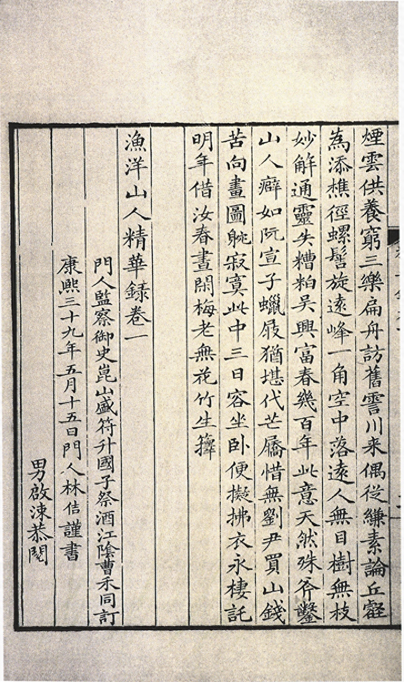
Book and photo of "The Essence of Yuyangshan People" engraved in the 39th year of Kangxi's reign (1700)
Editor in charge: Peng Shanshan
Proofreading: Luan Meng
Articles are uploaded by users and are for non-commercial browsing only. Posted by: Lomu, please indicate the source: https://www.daogebangong.com/en/articles/detail/shang-tu-guan-zhi-chen-xian-xing-shuo-shan-ben-ru-he-tong-guo-zi-ti-jian-ding-ban-ben.html
 支付宝扫一扫
评论列表(196条)
测试