
As the first visual impression of a PPT work, the cover is of self-evident importance.
If you are a professional designer, then, using professional drawing software such as PS and AI , we can make a PPT cover like this:


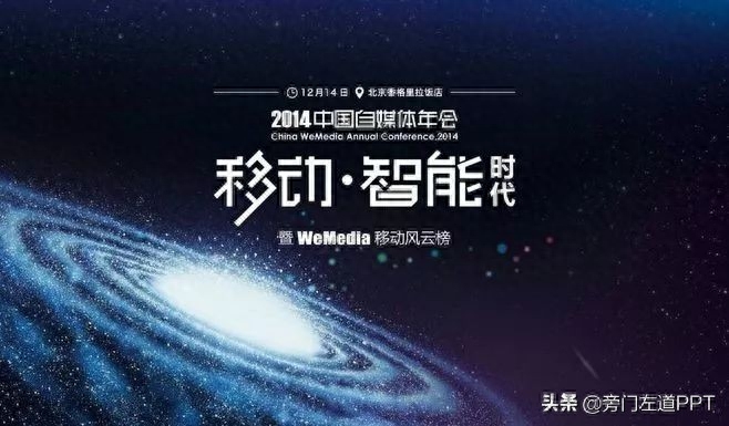
Looks cool, right?
However, I believe that for most of us, these cover works are rare and can only be appreciated. It is estimated that it will be very difficult to make them.
Therefore, in this article, I will share with you some PPT cover design skills that ordinary people can do, and help you create a beautiful Attractive PPT cover.
1. Add a gradient
Narrow the spacing of the text and add a gradient effect to the edges to make it appear overlapping. Shadow word effect.

2. Partial blur
First convert the text into shapes, use the merge shape function to split it, and then This can be achieved by adding a blur effect to some strokes in Chinese characters.


3. Add "shadow"
The words juxtaposed will inevitably look a bit bland, so by adding some strokes Add a shadow effect everywhere to give it the effect of grouping strokes.

This effect may seem difficult, but it is actually very simple. We only need to add some gradient color blocks to the text strokes:

4. Stroke replacement
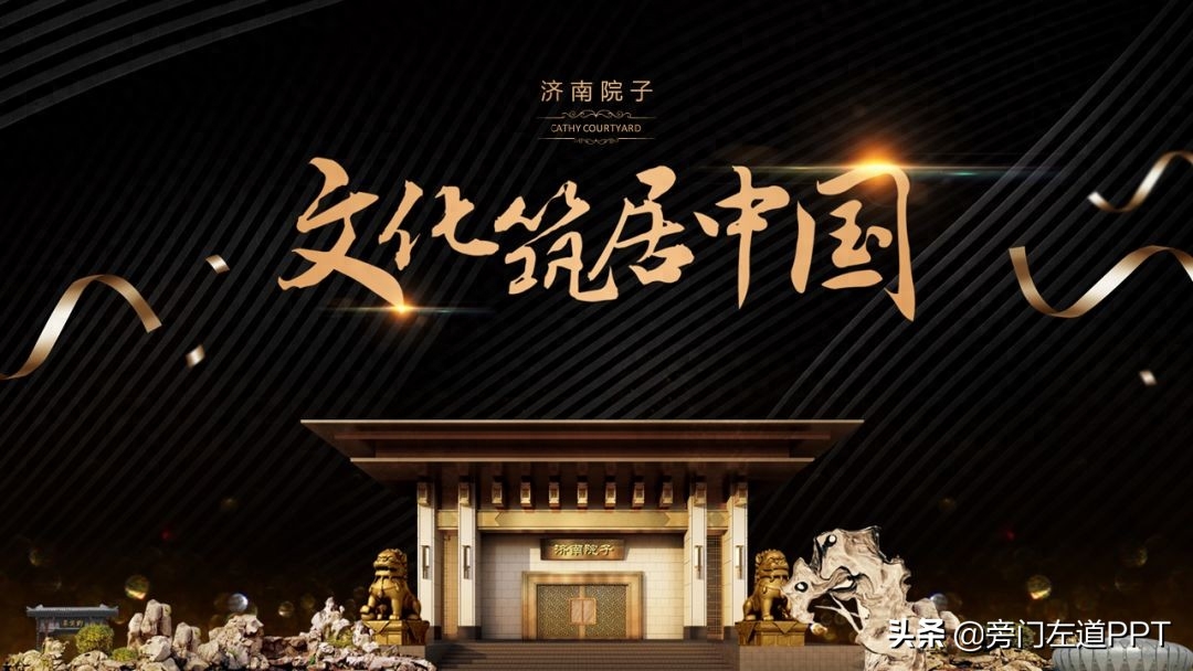
In order to make the text more visual, we can convert the text into a shape and use The icon element replaces some strokes to create a visual cover.

However, when replacing strokes, try to choose imagery icons that match the theme of the content.
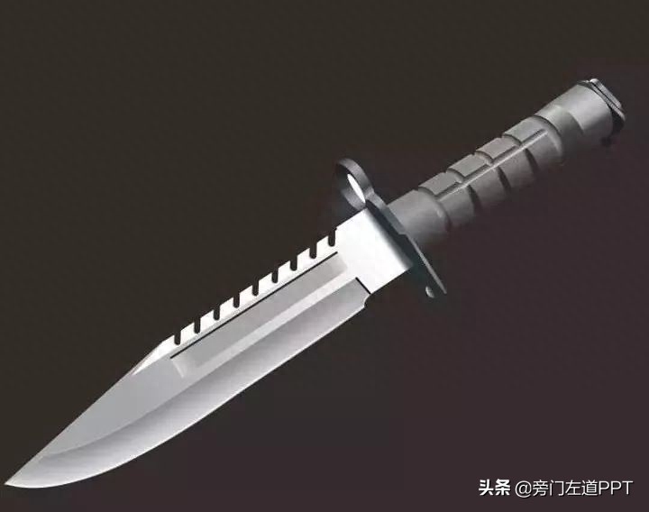
For example, in the PPT cover below, please pay attention to the fragmentation of the word "work":

The inspiration comes from military daggers like this:
For another example, we can add an hourglass icon to the time text:

Case from: Content Logic and Visual Expression
Of course, applying this technique to the layout of PPT content pages can still achieve good visual effects:

5. Connected strokes
Connect related Chinese character strokes to make the text arrangement more continuous It can also make the page more visual.

6. Fill texture
In order to give the text a certain visual style effect, add texture materials to the text , this requirement can be achieved.


7. Add stroke
When the text is presented on a background of similar color, in order to avoid the text being unclear , you can use strokes to give the page a good visual effect.

8. Add light effects
On a PPT page with a dark background, in order to make the visual effect of the page richer , adding some light effect materials above the text is a good choice.
9. Use brush calligraphy
The use of brush calligraphy can make plain text layout more visually interesting. Very suitable for use in PPT covers.


The above is to share with you how to make an attractive PPT cover starting from the text effect itself.
Of course, if you find it helpful and look forward to a companion article, please like and comment, so that I will be more motivated.
Articles are uploaded by users and are for non-commercial browsing only. Posted by: Lomu, please indicate the source: https://www.daogebangong.com/en/articles/detail/ru-he-zuo-chu-yi-zhang-xi-yin-yan-qiu-de-PPT-feng-mian-zhe-9-zhong-fang-fa-gei-ni-si-lu.html
 支付宝扫一扫
评论列表(196条)
测试