The authors of the previous two articles shared why design languages are needed and how they can be helpful internally and externally. At the same time, I shared with you that before making a design language, we must first establish design principles and design keywords under the design principles. Through the design keywords, we can derive the corresponding visual expression techniques, which is what we usually call shape and color. , word, structure, quality. Today’s article mainly shares how to finalize a design language?
Today we go directly to the topic. We have defined the design principles and keywords before, so what should we do next?
Design Strategy
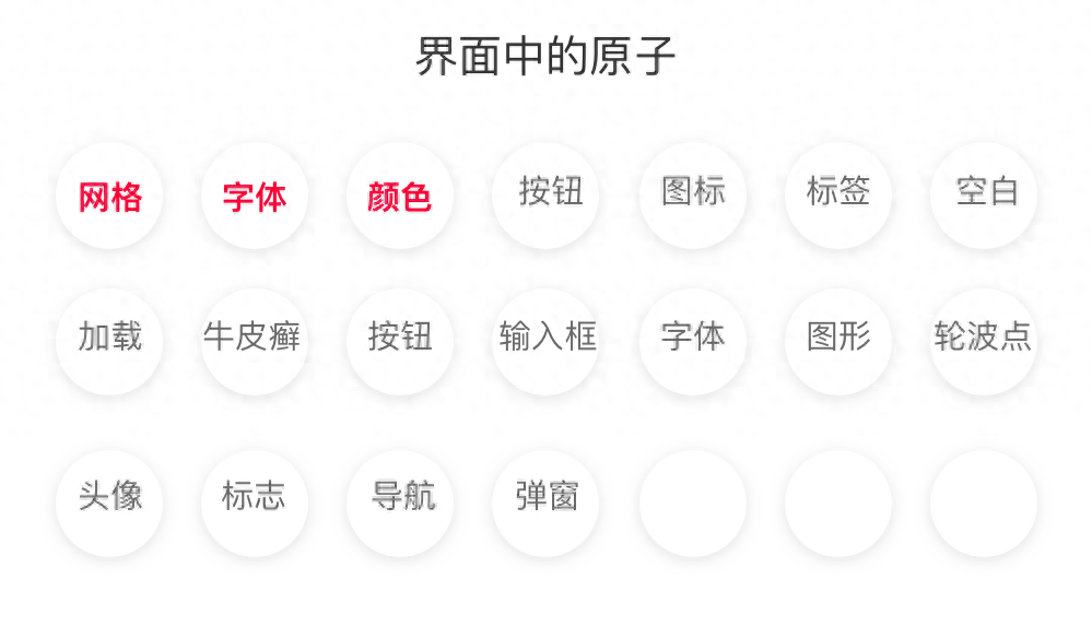
According to the law of atoms (those who do not understand the laws of atoms can search for atomic design methods), we start with the smallest elements in the page, which can also be understood as the elements that cannot be separated in the page. It is the most basic element that makes up the interface, starting from the smallest element. Let’s start with the basic elements of unity. This time I will start with colors, fonts, and grids.
Color
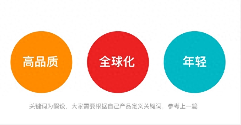
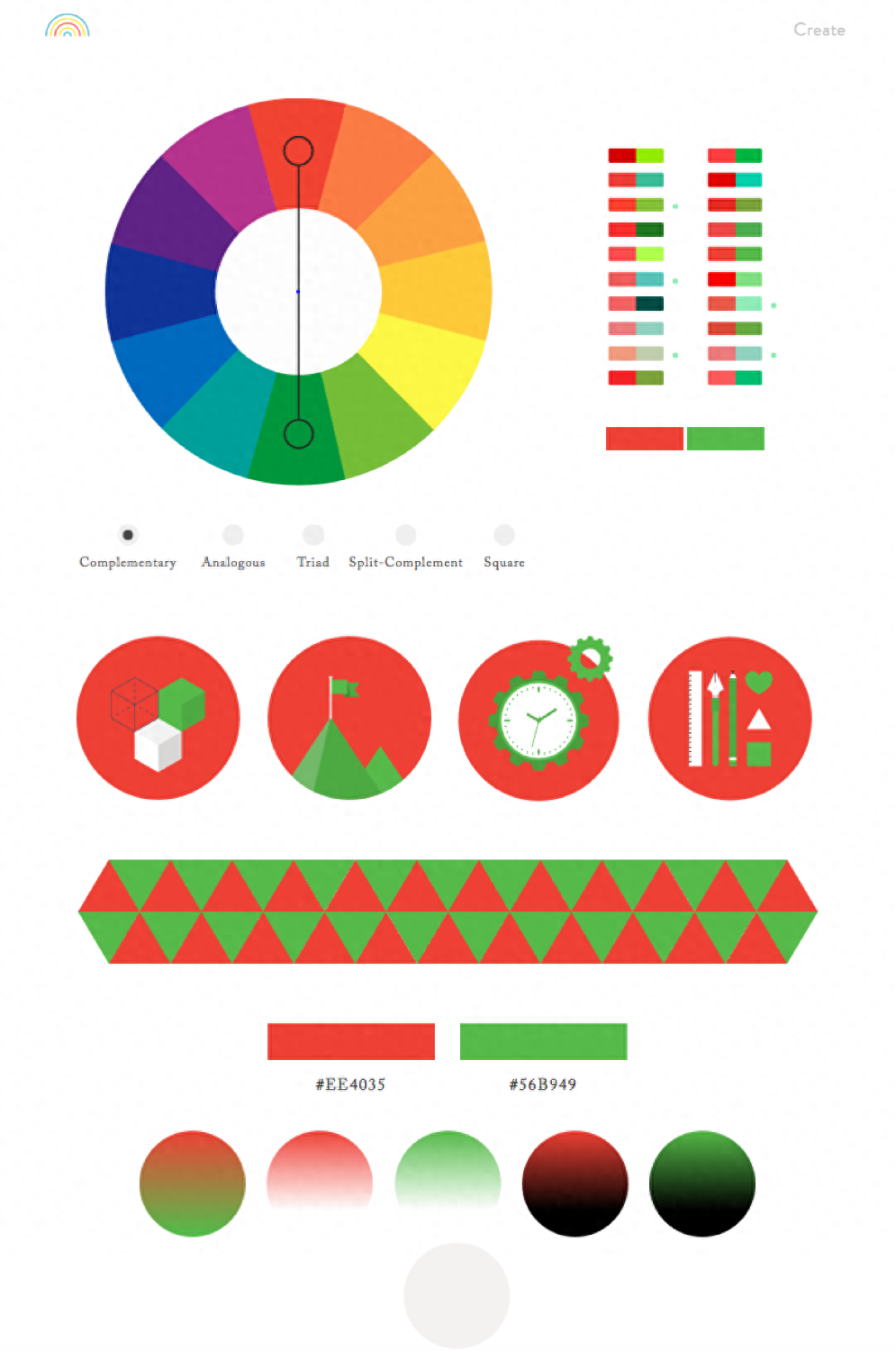
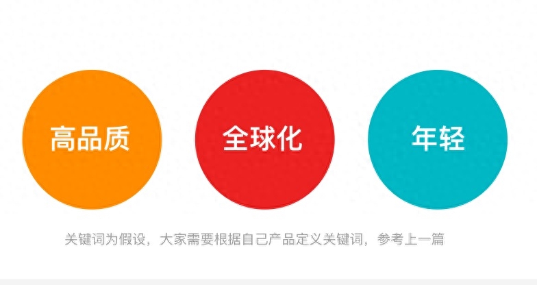
Starting from the color, the color needs to be defined based on the scene in the entire page. The color also needs to be derived based on the keywords we define. In the process of defining the color, you can participate in the principles of color psychology and competitive product analysis:
- High quality: Dark color scheme, black and white, neutral color scheme;
- Globalization: Deep purple, technological blue, Natural green;
- Younger: Gradient color, contrasting color of macaron.
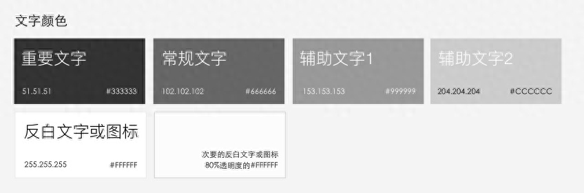
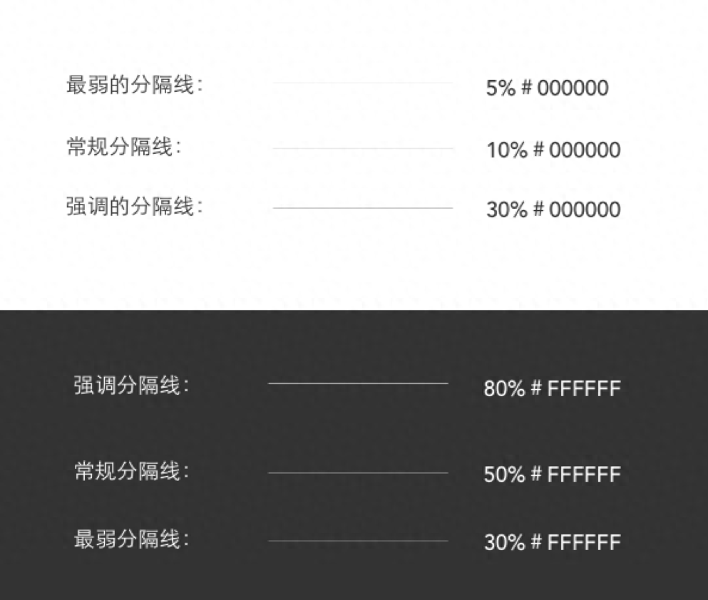
After defining the above-mentioned general color principles, it is necessary to sort out the usage scenarios in the interface and obtain the following approximate color types:
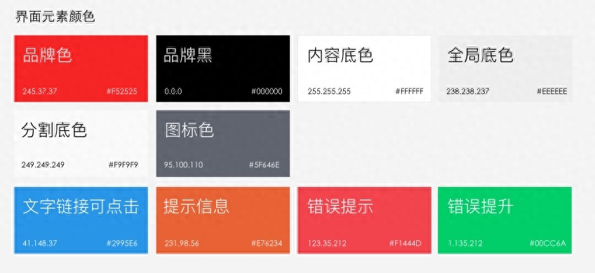
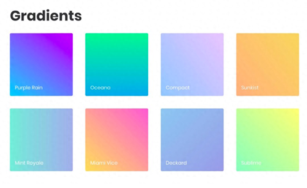
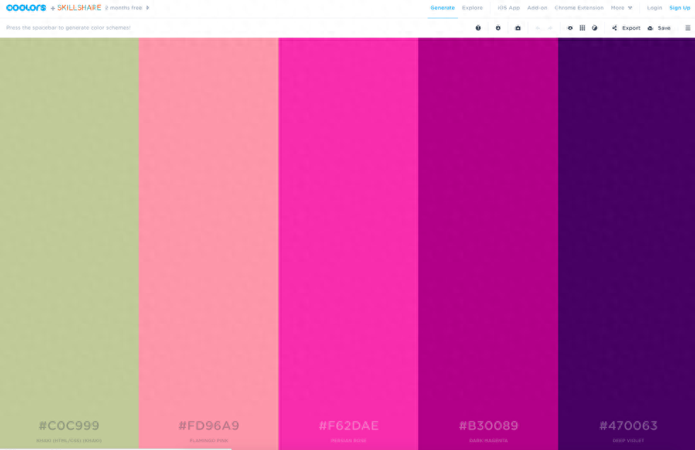
Of course, you can also define some commonly used gradient color palettes in the interface. Nowadays, many websites also have many beautiful gradients that you can try.
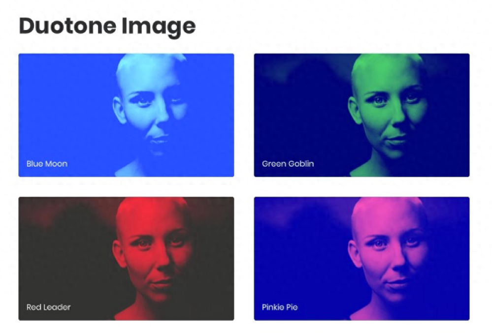
You can also define the text effects on some pictures, what colors to overlay, what the color mode is, and how much transparency is. These can help us define a color system.
Of course, there are also some very good color palettes. If you don’t know how to match colors or what the popular colors are at the moment, you can also choose a color palette from these color palettes and choose some colors that match your products.
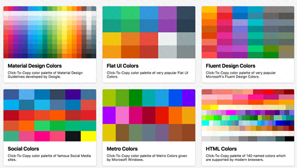
https://www.materialui.co/
https://coolors.co/
http://colorsupplyyy.com/app/
Font
Fonts are some of the elements that users see most in the interface. In addition to defining the fonts in the interface, we also need to define the fonts under the interface, including offline material promotion, etc. When choosing fonts, you need to pay attention to:
- Whether the information is conveyed clearly enough, the fonts are emotional, and whether the emotions expressed by the fonts are consistent with the needs of our interface.
- In terms of personality, some fonts are very square and straight, while some fonts have more lively strokes. So how do we choose different fonts? We also need to design them under the big design keywords in front.
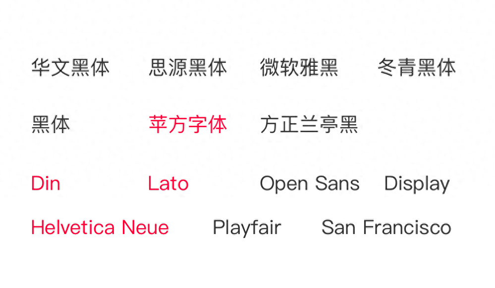
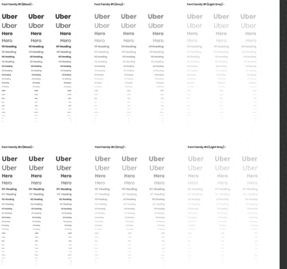
For font selection, it must be defined according to product keywords. The above are some English and Chinese fonts commonly used in the interface. Although each font looks similar in general, in fact, each font actually has some differences in strokes if you look closely!
My personal suggestion: Pingfang font is more versatile than Helvetica Neue, and the Chinese font package is larger. If special products require personalized Chinese fonts, you need to pay attention to the font size package processing!
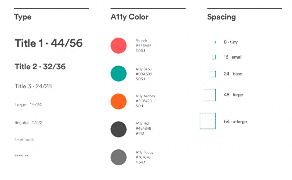
Font size
Font size is a very important element in the interface. The font size determines the level and level of information. In flat design, font size is becoming more and more important. Good font size settings can make the interface clearer and more consistent!
On the contrary, a poor font size will make the interface look fake. Regarding the choice of font size, you can follow the standard size of iOS, or you can define your font size according to your own product personality.
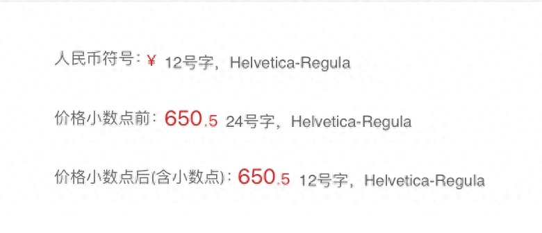
If you are an e-commerce product, then you may need to set a separate font size for the price font. If you are a financial product, then the corresponding font size also needs to define the corresponding size level.
For processing of special fonts (375 resolution)
5 commonly used font rhythms (375 resolution)
Special numerical or graphic font size (375 resolution)
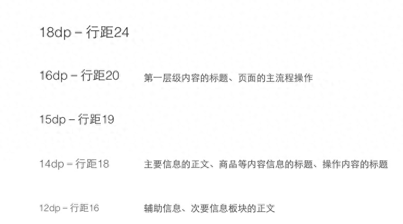
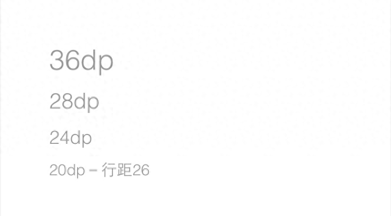
Row height
Refer to the 3C principle. If you don’t understand, you can search on Baidu. The line height in English is 1.2 times the font size. However, due to Chinese and English fonts, Chinese fonts are generally between 1.5-2 times. We need to fully consider the characteristics of different groups of people, the elderly, children, and young people. people and the environment in which they are used.
The line height in English is generally 1.2 times the font size. For example: if your font size is point 20, then the line height is 24. Of course, there are also many foreign designers who use the golden ratio of row heights, such as: 1.414 times, 1.618 times, 1.717 times, etc.
The row height size, as I said before, needs to fully consider the rhythm of your entire interface, the content and the user population to define whether it needs to be compact or dense.

The commonly used line height in Chinese is generally 1.5 times the font size. Of course, some simple methods can also be used, which is the font size + 4 principle. For example, if your font size is 20, your line height is 24, font size is 28, and line height 32 is also feasible. Yes, each team can define it according to their needs.
Font weight

Font weight, Gu Mingsi thinks, is font thickness. More and more products need to use font thickness to expand the information level. The current mainstream trend in iOS11 is also to use font weight to expand the information level, so it is also needed when defining font specifications. Repeatedly consider when to use which font.
Grid system
This piece of knowledge has not been used much by domestic design teams, and it is relatively complicated. Let me share it briefly: I think most students have experienced this situation. They got source files from other designers, and the spacing was confusing. The distance is 20, the distance is 24, and the distance is 32. It is particularly confusing because everyone has not defined its rules in detail.
See what others are doing?

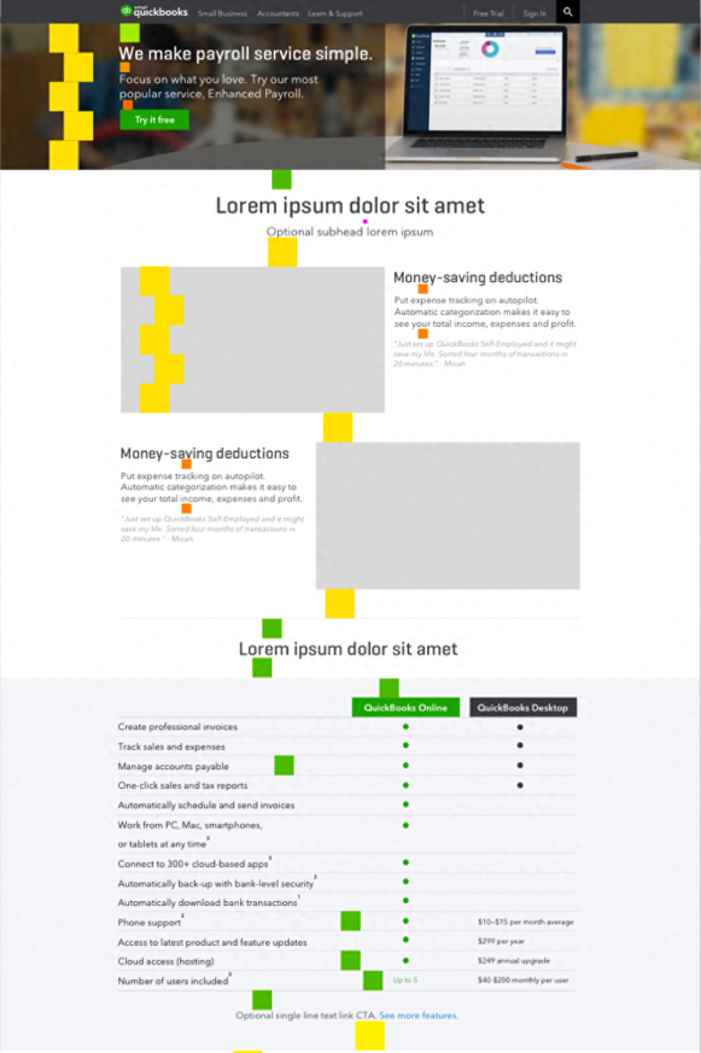
In Airbnb's specifications, the definition of spacing does not only define a minimum unit value like other specifications, but defines 5 types of flexible spacing: 8, 16, 24, 48, 64. In all his designs, including This set of spacing rules is used between elements and before elements, and between graphics and text, ensuring the unity of the entire interface.
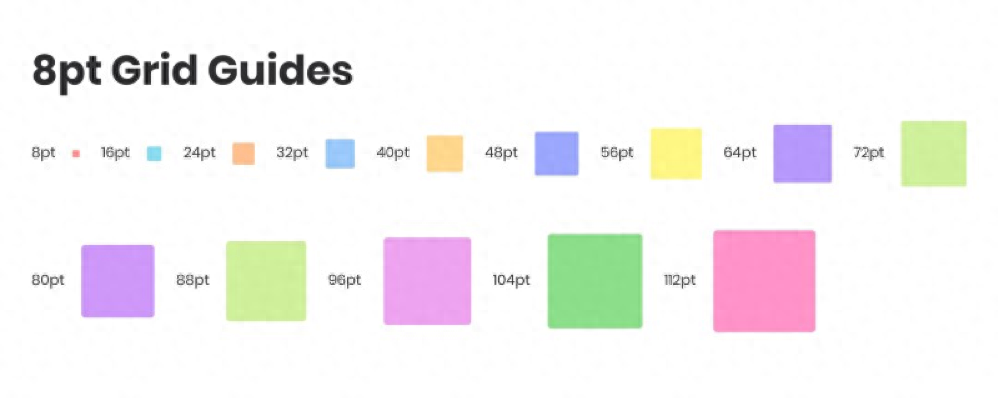
This is an 8-point grid that is widely used abroad. On this basis, Airbnb has further simplified it and only retained 8, 16, 24, 48, and 64.
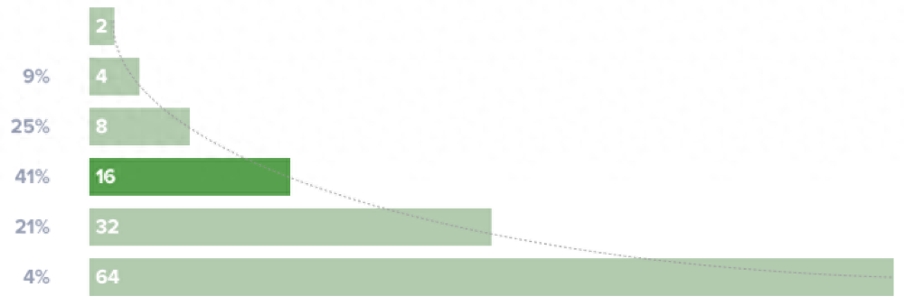
Foreign data shows that when designers use 8 as the minimum unit to design, what are the commonly used spacings? Finally, five commonly used spacing rules were defined.
Therefore, when we standardize, we must not use too many spacing rules, otherwise the spacing will be difficult to control and unify. Suggestion: Set several spacings, you can 8, 16, 24, 48, 64. If you feel that these spacings are not enough, you can also add new spacing rules, but it is recommended not to have too many spacings.
Grid design strategy
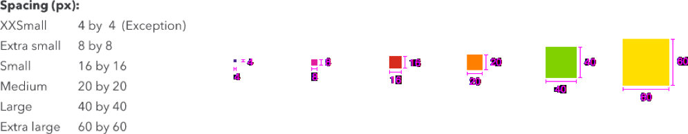
1. Determine the minimum unit
First define the minimum unit. The smaller the unit, the more compact the page. Currently, the most commonly used ones are 4, 5, and 8. Assume that our minimum unit is a multiple of 4, then all our spacing will increase according to multiples of 8, and we will get the spacing rule 8. 16, 20, 40, 60.
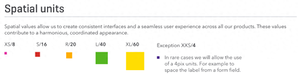
https://designsystem.quickbooks.com/foundations/spacial-units/
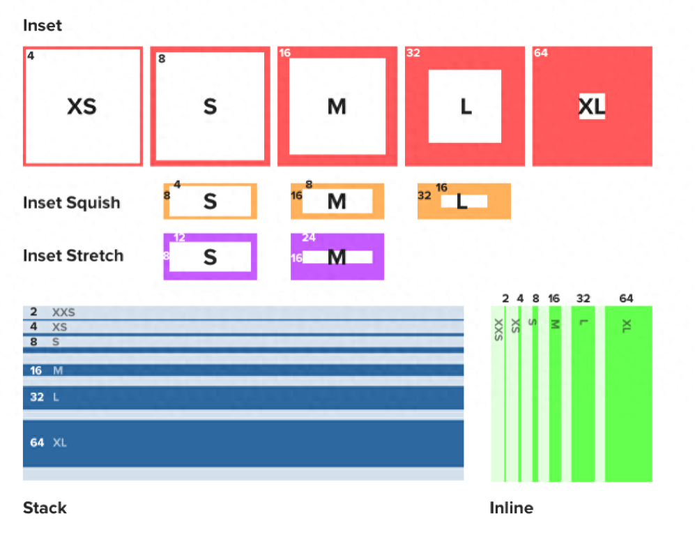
2. Design in increments

All spacing places in the interface are designed using the principles of 8, 16, 20, 40, and 60 to ensure the unity of the page.
The height of the elements on the page, such as the banner height, is also designed according to the spacing increment, so the entire page will be more systematic and scientific.
It is often used when doing system design to design through increments. I hope everyone can master this spacing principle.
Graphics
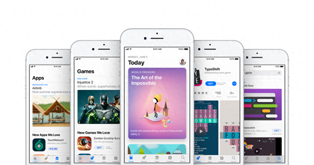
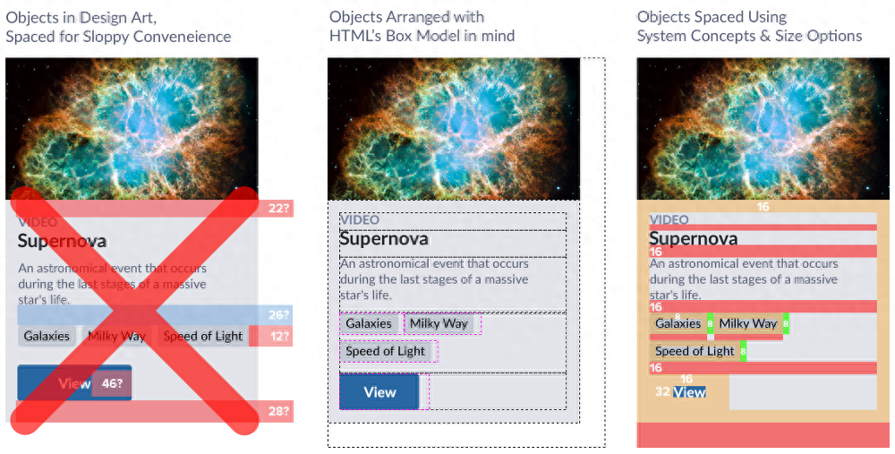
Graphics are the soul of the interface, and they are also an important part of conveying visual language well. How to ensure the consistency of graphics and create a more visual design in the interface?
This is a big point, and it can be expanded into many aspects, including brand symbols, a series of icon illustration elements, and so on.
Summary
Design language is a very large design system, including fonts, grid systems, colors, graphics, etc., including how to define components and then pages after defining atoms later.
Here we draw lessons from some foreign design language websites. If you are interested, you can also learn from these websites and see how others do it.
Author: sky, WeChat public account "Our Design Diary"
This article was originally published by @sky on Everyone is a Product Manager. Reprinting without permission is prohibited.
Provided by the author of the title picture
Articles are uploaded by users and are for non-commercial browsing only. Posted by: Lomu, please indicate the source: https://www.daogebangong.com/en/articles/detail/ru-he-zui-zhong-qiao-ding-yi-tao-she-ji-yu-yan.html
 支付宝扫一扫
评论列表(196条)
测试