- Picture and text skills
When we use WPS tables for data processing, if we want to show the relationship between numerical variables, we can use bubble charts.
It is similar to a scatter chart, but a bubble chart compares groups of three values. So how to make a bubble chart?
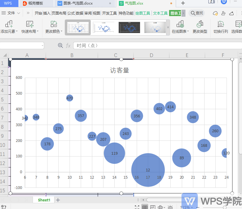

▪Take this data table as an example.
Suppose we want to draw a bubble chart of the conversion rate of daily visitors to the website.
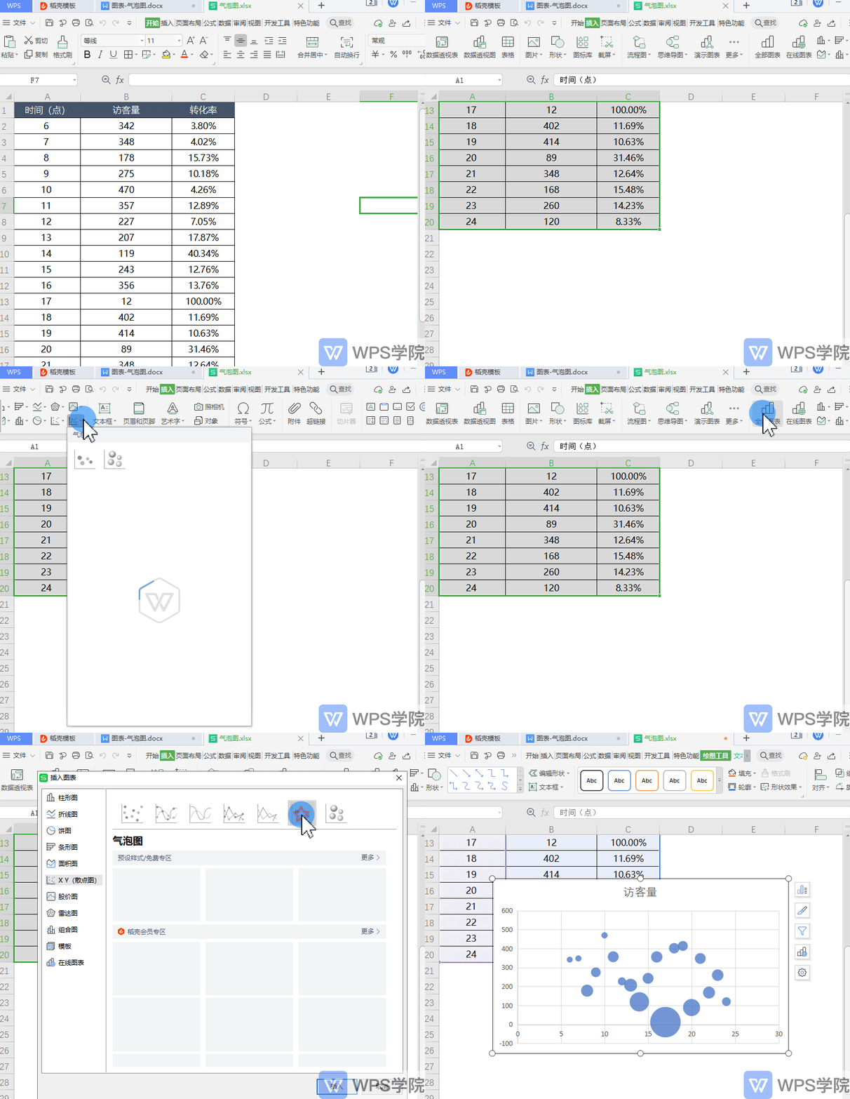
Select the table data and click Insert - Insert Bubble Chart in the menu bar above. You can also click to insert-All charts-Scatter chart -Bubble chart.
This way you can insert a bubble chart.
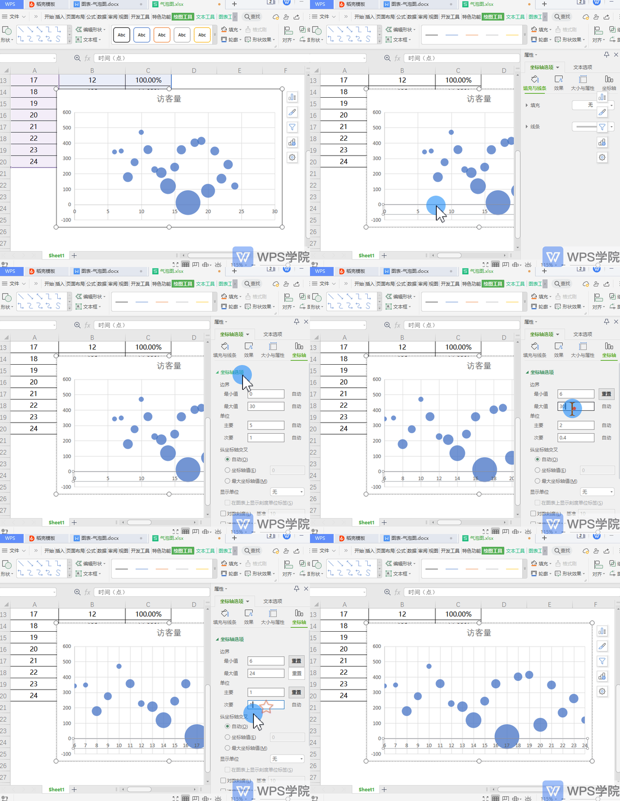
▪ We can see that the abscissa axis starts with the value 0. How to change the value of the abscissa axis?
Double-click the abscissa axis, and the properties sidebar will pop up.
Modify the maximum and minimum values of the boundary in Coordinate Options-Coordinate Axis, so that you can change the value of the abscissa axis.
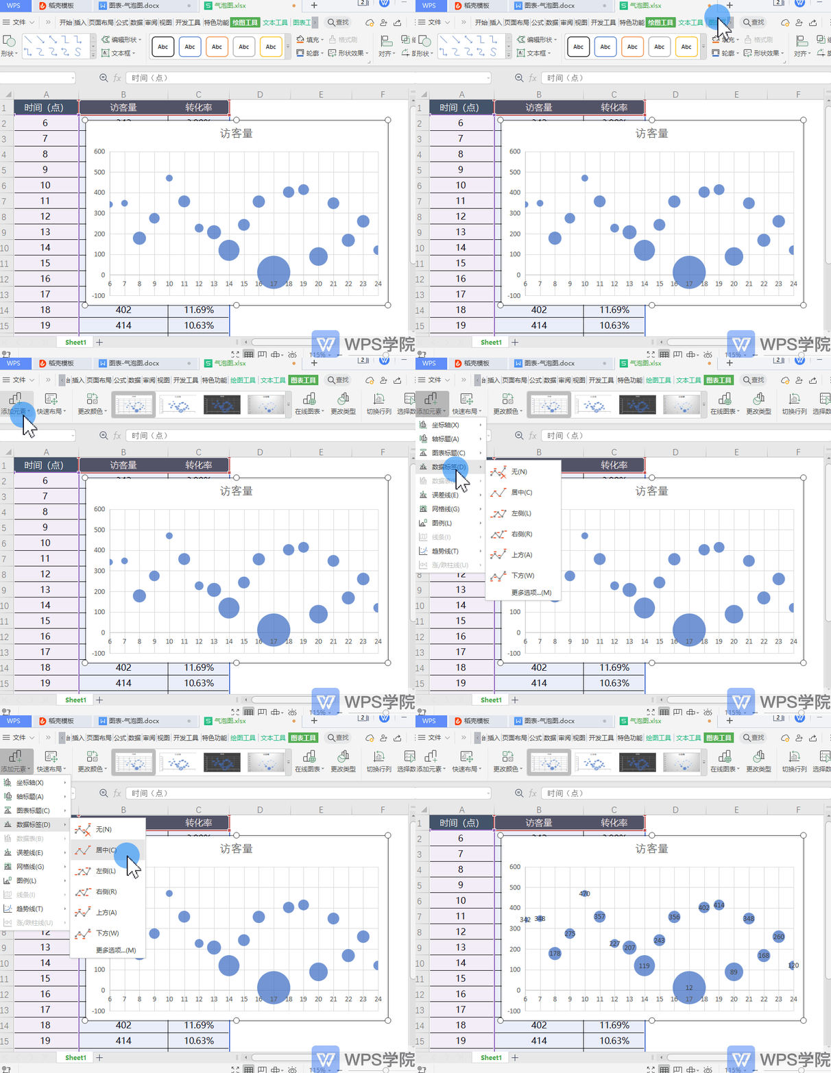
▪Data labels can be added in Chart Tools-Add Elements.
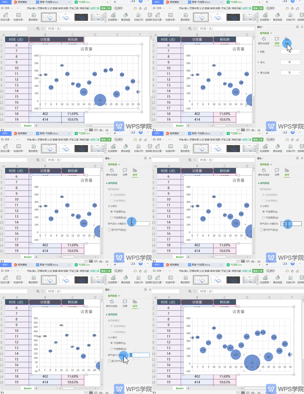
▪How to change the size of bubbles?
Double-click the bubble, and the properties sidebar will pop up.In the sequence option-sequence, you can set Bubble size zoom, so you can adjust the bubble size.
Do you understand this practical function?
Articles are uploaded by users and are for non-commercial browsing only. Posted by: Lomu, please indicate the source: https://www.daogebangong.com/en/articles/detail/ru-he-zhi-zuo-qi-pao-tu.html

 支付宝扫一扫
评论列表(196条)
测试