Let me ask you a question first:
What resume did you use during your interview?
Maybe many people use resumes in WORD documents. But in Japan, if designers are looking for a job, most of them will use PPT to create their resume, which can attract the interviewer's attention even more! Increase your chances of getting an interview!
I found a Japanese PPT resume. The whole style is very Japanese. After reading it, many netizens couldn’t help but praise: It’s so excellent! Too easy! And texture!
Today, let’s take a look at this Japanese PPT and see what it can learn from for our PPT design!
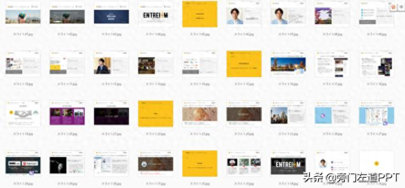
This Japanese PPT has a total of 36 pages! The content is very substantial!
After forwarding the article, click on my avatar and send a private message with the keyword [Japan] to get the full version of the PPT file!
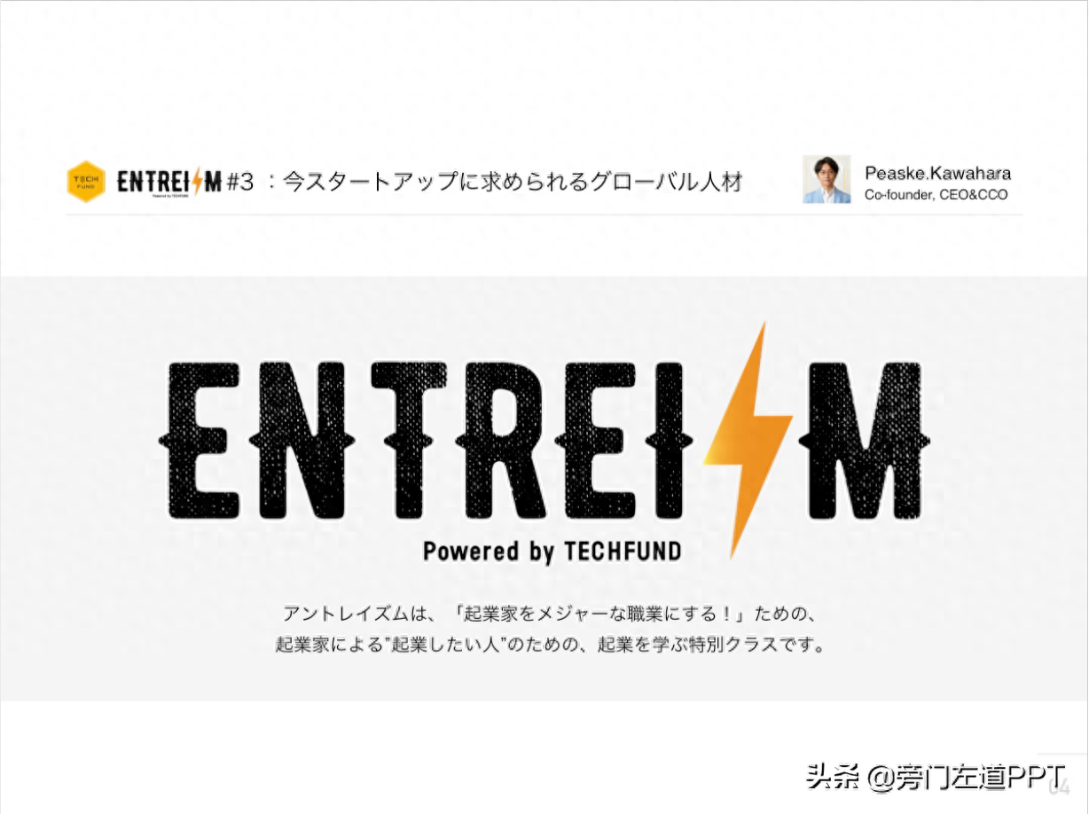
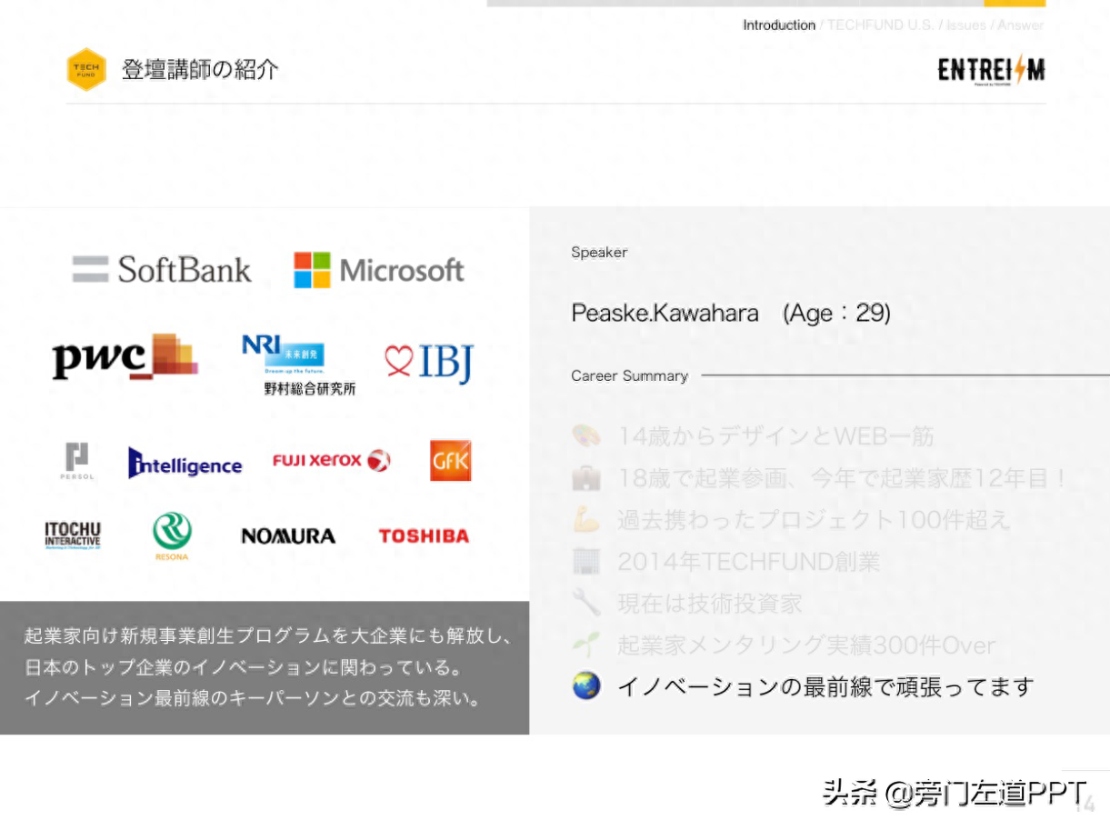
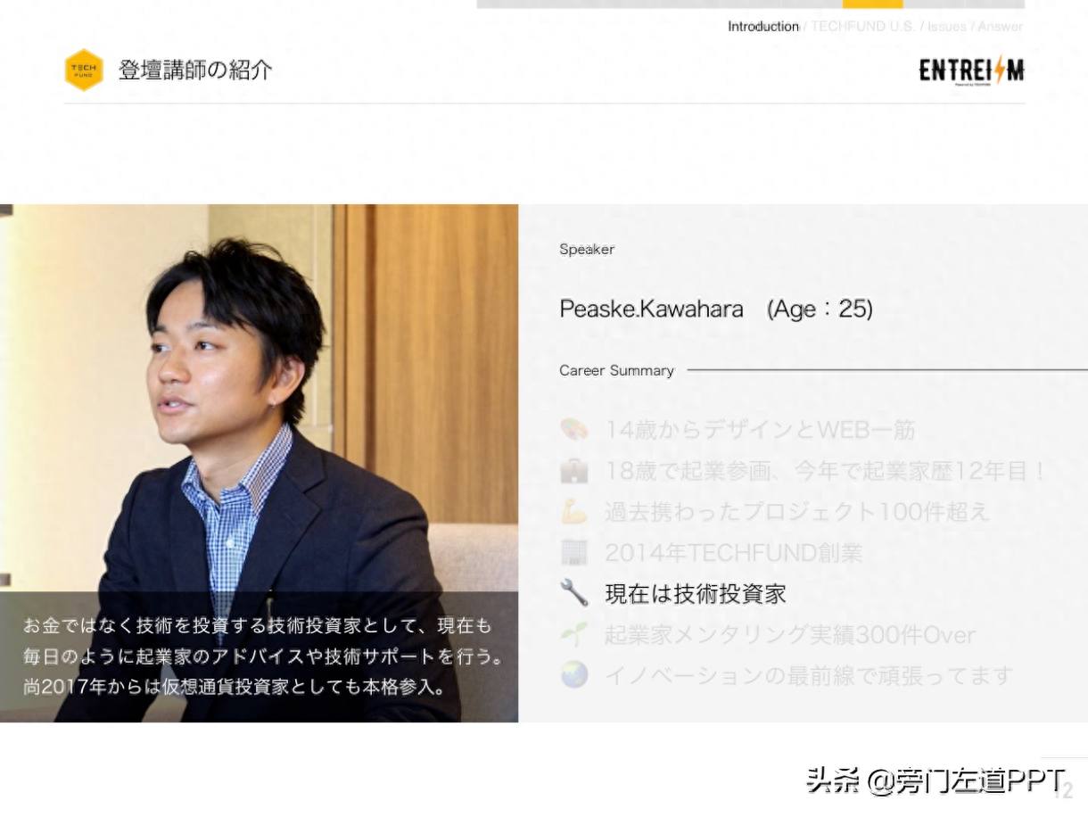
Let me first state that this is a personal introduction PPT of a Japanese designer. You can understand it as a resume for job hunting. The content of the page is not our main purpose this time (mainly because we can’t understand Japanese). We appreciate this Japanese PPT more from a design perspective!
There is one point in this PPT that is worth learning from -Simplicity comes first! Simplicity is reflected in many designs! Simply extract a few points to share with you:
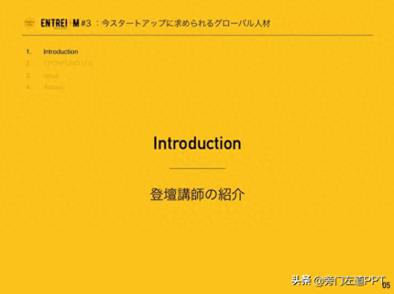
A simple colors
The design of the entire PPT is very simple, without too many colors, and is basically white:
Paired with a simple accent color - yellow, to form the entire PPT:

Yellow is simply grabbed on the page and used as a secondary color throughout the entire PPT, which is very comfortable!
B Simple layout
In addition to the color, the layout design is also very simple!
On the work introduction page, the left and right layouts are basically used:
The layout methods of different sections are close to uniform, which can help us better identify the content:
For example, in this section:
Almost all of them use the layout of text on the left and picture on the right:
Very clever!
C layout is unified and concise
In this Japanese PPT, we will find a very good quality - standards!
The margin processing of this PPT is exactly the same:
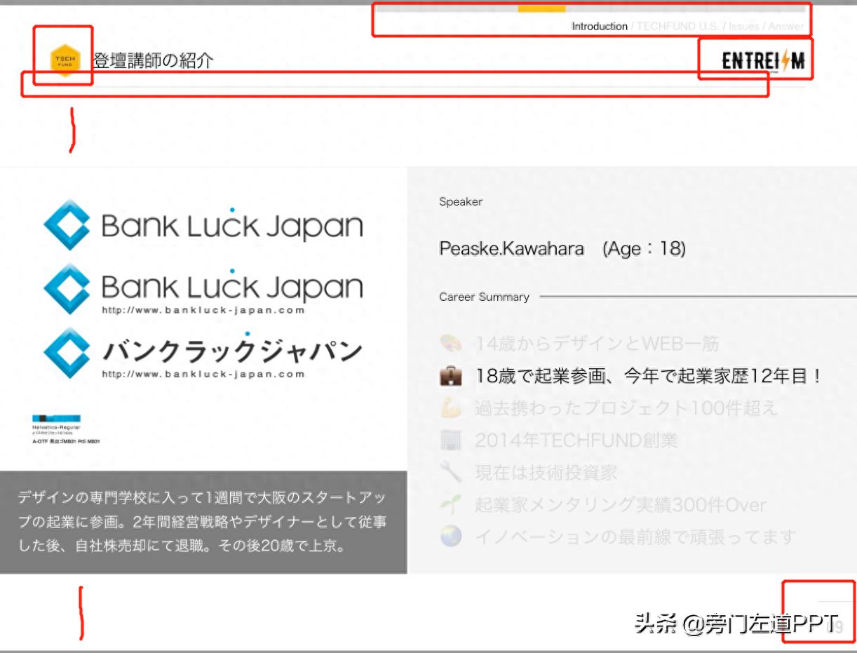
The red mark spacing is exactly the same on any page
This benefit makes the page tidier and easier to read! It can also reflect the exquisiteness of the designer!
There is another clever point about this design:
During the continuous broadcast, since the layout of the page does not change much, there is a sense of smoothness like a web page:
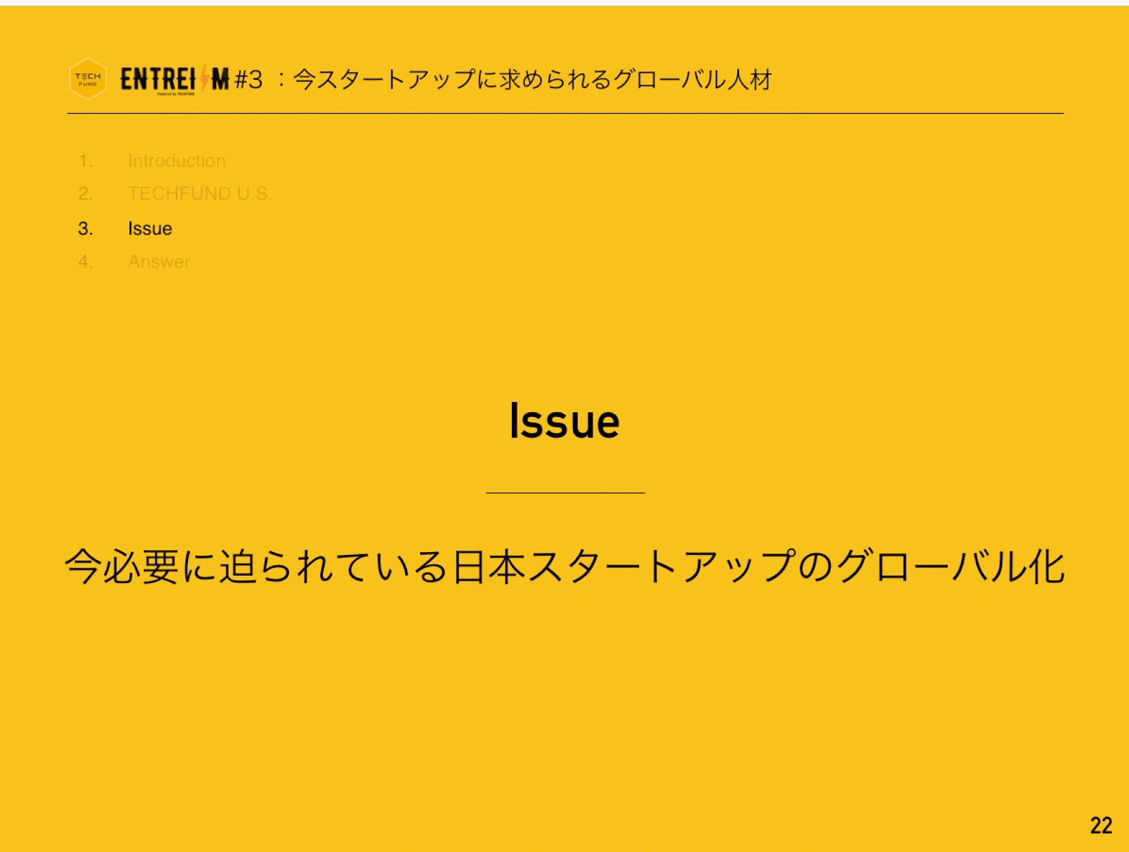
Pay attention to the navigation bar on the upper right! It can let us know the progress very clearly!
Okay, there are many things that can be highlighted in this PPT, I will just talk about it from a small point! For example, the use of icons in this PPT is great! You can learn by yourself!
In addition, I have a little question for you: Why are Japanese PPTs in 4:3 size?
I have also prepared the full version of this Japanese PPT for you. If you need it, you can download it and study!
After forwarding the article, click on my avatar and send a private message with the keyword [Japan] to get the full version of the PPT file!
Articles are uploaded by users and are for non-commercial browsing only. Posted by: Lomu, please indicate the source: https://www.daogebangong.com/en/articles/detail/ri-ben-de-ding-jian-ji-PPT-zhang-shen-me-yang-zi-wang-you-kan-wan-hou-ping-lun-jian-dan-dan-chao-you-zhi-gan.html
 支付宝扫一扫
评论列表(196条)
测试