This is a font learning course that Pearl (Tencent CDC designer) wrote for himself two years ago. Looking back now, there are many things worth understanding and learning. Pearl: The original intention at the beginning was to solve some questions about fonts at work (such as typesetting, LOGO design, etc.), and at the same time, I also wanted to improve myself by reviewing the basic knowledge of design. So I gave myself this topic. As a beginner, I have only scratched the surface. I will sort it out and share it. Please correct me if there are any shortcomings. All reference articles are marked at the end of the article.

This is a font learning course for yourself.
The original intention at the beginning was to solve some questions about fonts at work (such as typesetting, LOGO design, etc.), and at the same time, I also wanted to improve myself by reviewing the basic knowledge of design.
So I gave myself this topic. As a beginner, I have only scratched the surface. I will sort it out and share it. Please correct me if there are any shortcomings. All reference articles are marked at the end of the article.
"Typography" is located at the intersection of language, culture, technology, and aesthetics. It is a big topic with rich connotations and extensions. This time I will only share some basic and useful knowledge.
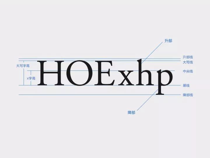
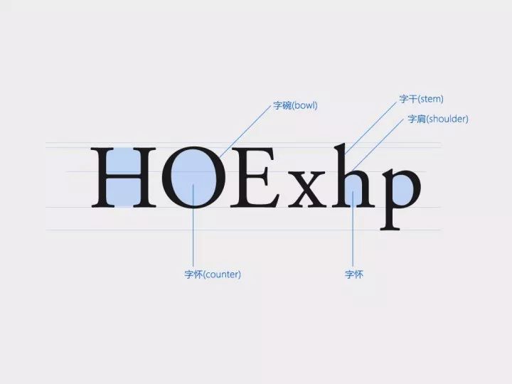
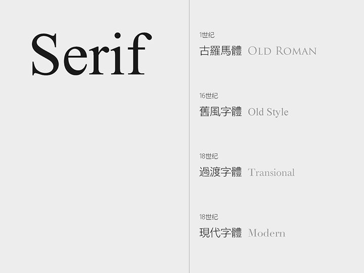
The simplest classification of English fonts: serif, sans-serif. The difference between the two is that the serif body has claw-shaped serifs and changes in stroke thickness.
1. serif
Very old stone pillar inscriptions dating back to the Roman period. It is classical and formal in style, with historical tradition and significance.
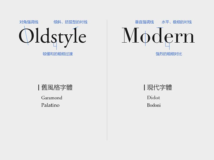
According to the order of historical development, serifs can be classified into: Old roman, Old style, Transitional, and Modern. We select two of the nodes-Old style and Modern fonts. By comparing the characteristics of the two, we can understand the development of the entire serif font.
Old style:
Features: diagonal emphasis lines, slanted and bracketed serifs, gentle weight transitions.
Style: Traditional, commonly used in the layout of books, newspapers and magazines.
Modern font:
Characteristics: vertical emphasis lines, horizontal, very thin serifs, strong contrast between thick and thin.
Style: Horizontal and vertical, modern, cool.
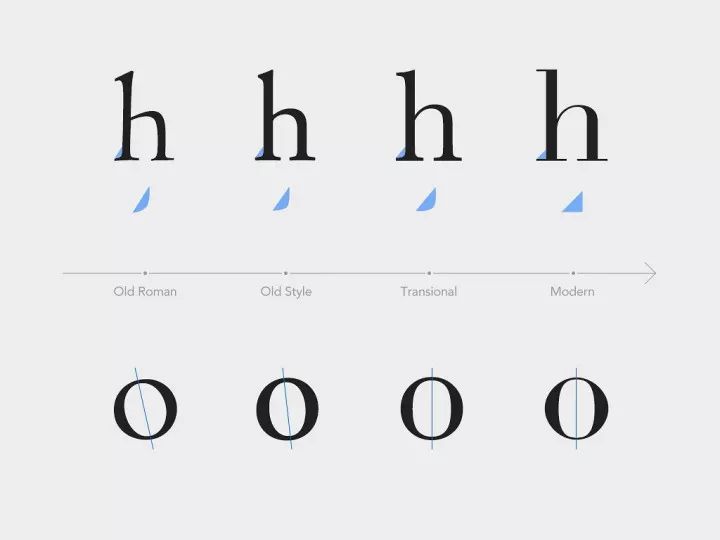
To sum up, throughout the development of serif fonts, the stroke contrast has become more and more intense, the serifs have become sharper and slender, and the stroke thickness and serif arc of transitional fonts are right between Old style and Modern. One of the main reasons is that the skills of engraving masters are becoming more and more advanced, and the engraving work has become more delicate, making precise lines and finer thickness contrast possible. The inclination angle of the emphasized line has gradually been replaced by "
Articles are uploaded by users and are for non-commercial browsing only. Posted by: Lomu, please indicate the source: https://www.daogebangong.com/en/articles/detail/quan-fang-wei-jing-tong-ying-wen-zi-ti-she-ji-ji-chu.html
 支付宝扫一扫


评论列表(196条)
测试