
Pictures/Text j
Fonts are everywhere in our lives, whether they are signboards, street signs or various signs. These fonts come in various shapes and have a wide range of uses. Understanding them in depth is a good starting point for learning fonts.
But how do we make people understand this highly visual and difficult-to-express content? Especially Chinese fonts, due to the long-term lack of systematic organization, make it more difficult to learn, even though this is something we have been exposed to since childhood.
Here is a description of a Chinese font: This font is characterized by a tight center, a higher center of gravity, and an overall shape that is slim and waisted, showing the traditional beauty of Chinese characters. The strokes have the charm of regular script, and the special adjustment of the cut corners makes the font appear energetic.
But what do these jargon actually mean? Why does a font have a waist? How can boldface characters have the charm of regular script? What does the so-called spiritual font look like? This sounds so professional.

It’s just a smile.
These professional terms are actually very core concepts in Chinese font design. They are closely related to the "skeleton" of the font and help us judge the character of a font. These concepts are not that difficult to understand, and there are many examples in life that can help us understand better.
Next, I will briefly introduce these concepts through some examples of signboards and book covers:
Shape
The so-called shape refers to the "Gestalt" impression a word gives you - is it wide and flat, square or slender? Chinese characters are mostly constructed within boxes. The shape of the box determines how the words grow, and the words naturally retain the shape defined by the box.
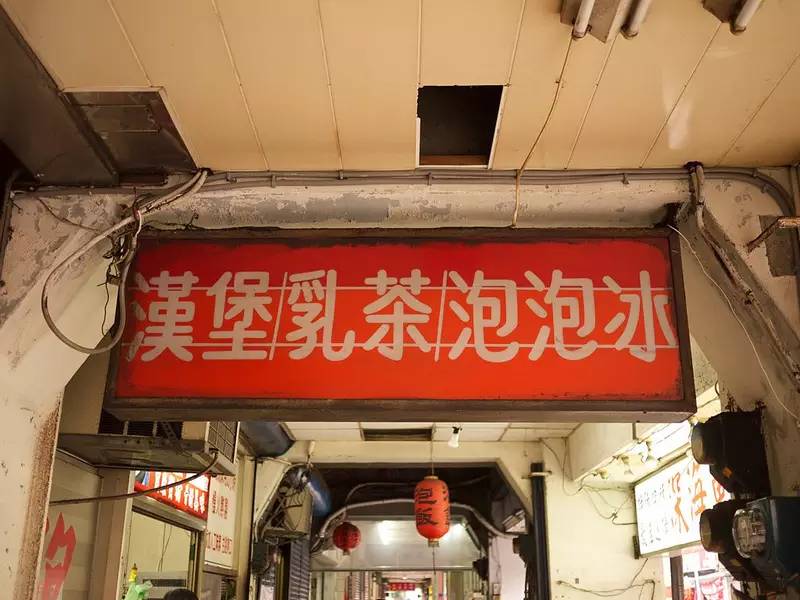
For example, the font under the sign of Dalongdong Clinic gives people a wide and flat impression.
In contrast, the main title's regular script is a wide, flat rectangle in shape.
The signboard of this breakfast shop gives people a slim impression.
Upright rectangular font: Just like people are tall, short, fat or thin, the gestalt impression of a font will also affect our perception of the "body" of the text.

Volume
Comparing Kotsuka Hyperbold and Hiragino W8, which one has a stronger visual impact? This is the concept of "volume".
The same thickness, but different impact intensity, partly due to the line shape, and partly due to the different proportions of black and white space distribution.
"Volume" is a metaphor. The greater the visual impact of a word, the more conspicuous it is, just like the louder the sound, the more attention it attracts. The conspicuousness of a font comes from the degree of "fullness", which is a concept of proportion: the greater the proportion of black and the smaller the proportion of white, the more full it looks.

Articles are uploaded by users and are for non-commercial browsing only. Posted by: Lomu, please indicate the source: https://www.daogebangong.com/en/articles/detail/qing-song-zhang-wo-zhong-wen-zi-ti-de-te-zhi.html
 支付宝扫一扫
评论列表(196条)
测试