- Image and text skills
In the last issue, I explained to you how to determine whether the data meets the standards by setting reference lines on the chart.
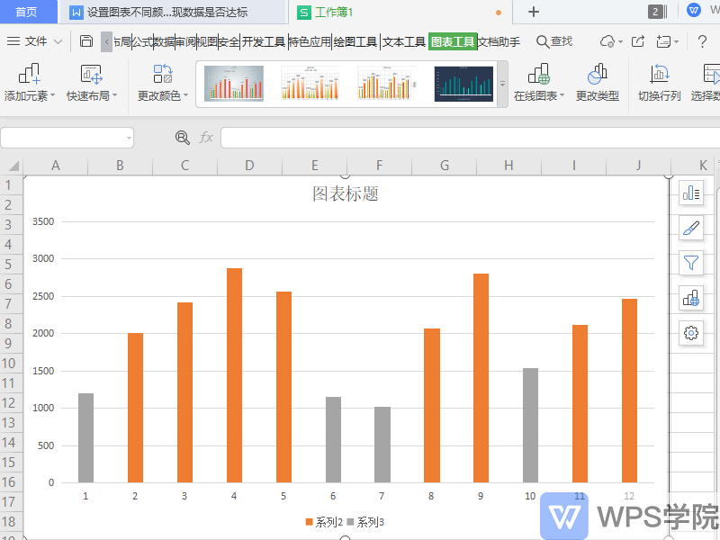
In this issue, I will explain to you another way to tell whether the data meets the standards - setting different colors for the chart data.
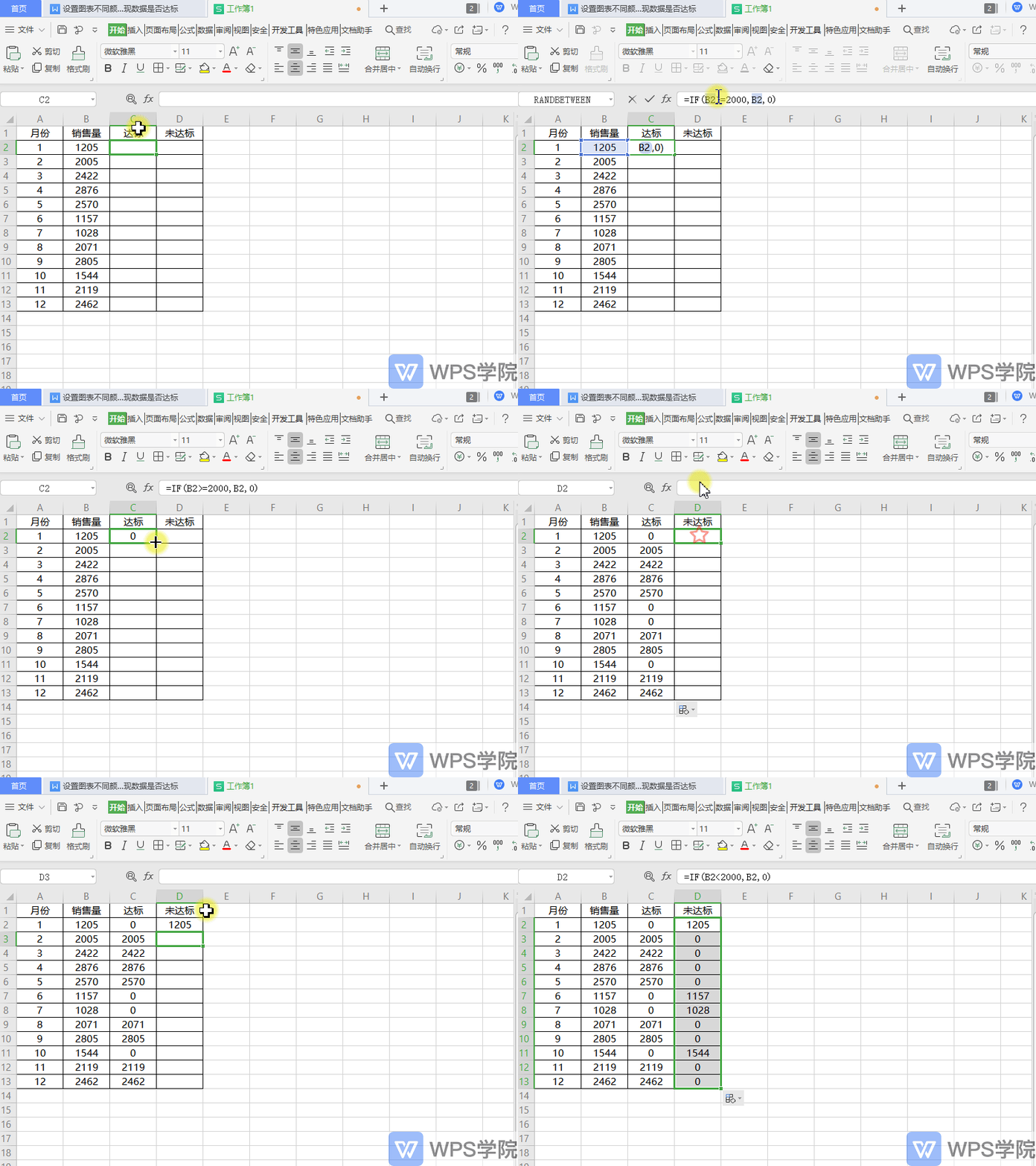
Taking this data table as an example, suppose our standard data is 2000.


◾First we insert two auxiliary columns, which are the standard column and the non-standard column.
Enter the formula =IF(B2>=2000,B2,0) in the standard column.
This means that if the B2 data is greater than or equal to 2000, this data will be returned, otherwise 0 will be returned.
Enter the formula =IF(B2<2000,B2,0) in the unattained column.
This means that if the B2 data is less than 2000, this data will be returned, otherwise 0 will be returned.

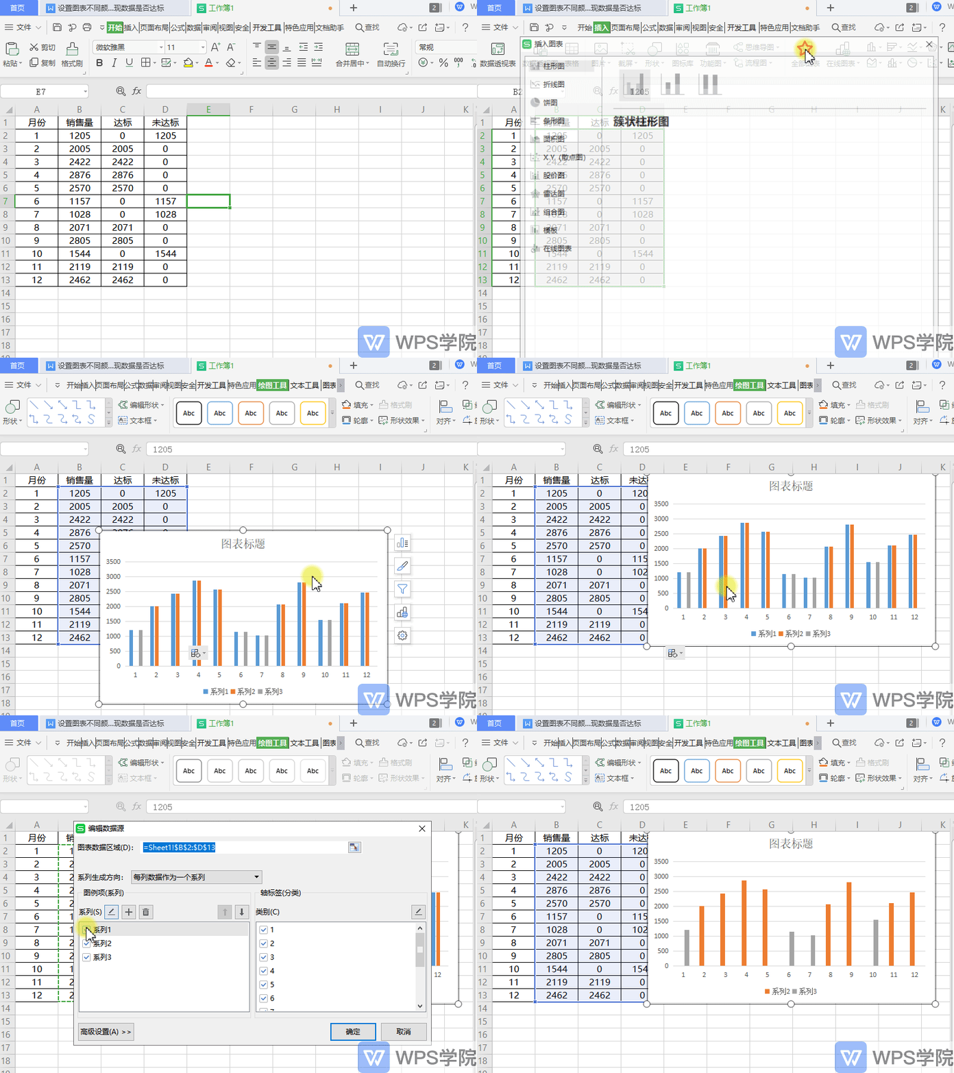
◾Then select the data area and insert the column chart.
Click on the chart, right-click on "Select Data", and uncheck the data in column B.

◾At this point, we can see that the distance distribution in the column chart is uneven.
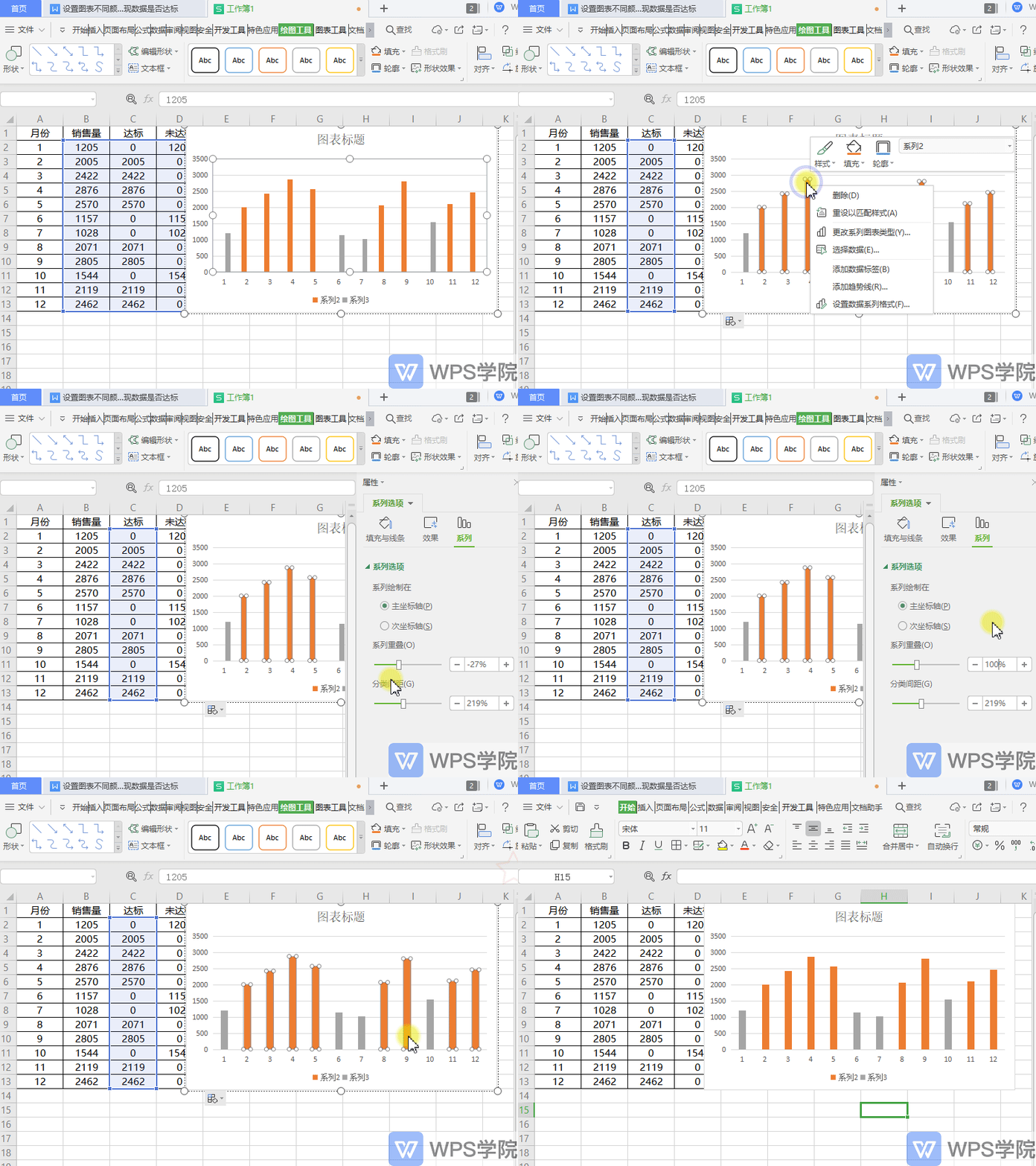
Select any data series, right-click "Format Data Series".
Enter 100% in "Series Overlap" for even distribution.
In this way, you can set different colors of the chart data to show whether the data meets the standards.

Articles are uploaded by users and are for non-commercial browsing only. Posted by: Lomu, please indicate the source: https://www.daogebangong.com/en/articles/detail/nian-zhong-hui-bao-ji-qiao-she-zhi-tu-biao-bu-tong-yan-se-lai-zhan-xian-shu-ju-shi-fou-da-biao.html

 支付宝扫一扫
评论列表(196条)
测试